Introduction
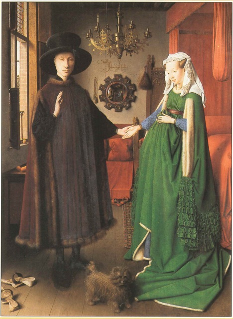
When in 1841, John Rand, an American painter invented the collapsible metal tube, I hardly think he knew what a door he was opening for his fellow painters. That tube, which replaced what was a messy business of pig’s bladders, turned the world into a studio forever. Armed with a few brushes, a fresh canvas and some tubes, painters could take their trade to the brooks and the hills, to the fields and the sunsets, but also to the brothels and to the Cathedrals at all hours of the day. In a short time, official portraits, languid ladies on sofas, angels in baby blue skies and stately Madonnas were replaced as subjects by dancers in little guingette restaurants, picnics in the nude, and peasants sleeping on haystacks.
Strangely, it was most probably the first time the art world would provide a technical invention to become a bestseller in all fields, from tomato paste to toothpaste when, usually, it had been industry –the dying of cloth, the glazing of ceramics– that had needed new techniques for their much more widespread and lucrative businesses and had devised new tricks and colours, which were then imported into the art world, improving and widening the palette and the options of artists along the way.
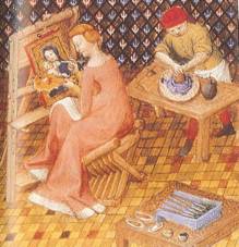 That single tube, which freed the painter from his studio where all his colours were made and available, also created the possibility that the maker of art and the maker of art materials would not be the same and one person. For centuries, every painter would have been first an apprentice in a guild or under the wing of a master. His first years would most probably have consisted of many tedious hours of grinding pigments (imagine turning malachite into a powder!!), of making fresh temperas (the eggs would rot after a few days… hum), of dosing with precision oils and coloured particles. Painting, for all those centuries, was considered a trade. Secrets were handed down like treasures and battles were fought for a cargo of cochineal red. However nobody could argue that the painter’s main business is… to paint! And so, as soon as a few companies made it their business to create artist quality paint, artists only too delighted by the extra time and freedom from the strictly technical side of their work seized the opportunity. These companies made it a business of their own to be creative and so the times also saw incredible developments in the quality and variety of artist materials… a trend which seems to have never stopped since!
Much has been gained for the modern artist. Some knowledge has been lost too. I often see in the eyes of my clients one of these little ‘lost’ moments, when I justify for example the differences in price between a series 1 and a series 9 by the price of the pigment they contain. To some young artists, brought up on being able to add 5% more magenta on a screen, the materiality of the medium seems a little bit strange, perhaps even dated. You mean they don’t just pour ‘colour’ into those tubes? No they don’t, they put pigments –sometimes expensive ones– binders and a lot of know-how…
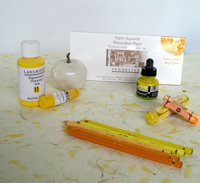 Yes, paint, pencils, inks, watercolours, pastels… all mark making materials are roughly made of 2 things: pigment(s) which brings the colour, binder(s) that holds the pigment together in this or that particular form.
Sometimes, as in frescoes or rag papers for example, the support acts as a sort of binder when it sucks in the pigment and captures it, then pigment alone (dry if the support is wet or simply diluted in water if the support is dry) can do the job. More often however a binder will be used to which are added thinners (from turps to water) to make application with a brush possible or easier and with a number of other additives, facilitating drying, appearance or other actions sometimes thrown in the mix. So let’s enter this fascinating world of what goes in our art materials by defining and classifying pigments.
Scroll down if you want to read the pigments section in its entirety or click on titles below to go directly to the section you are most interested in…
- Pigments vs Dyes;
- Pigment classification by characteristics;
- Inorganic vs Organic Pigments;
- Historical vs Modern Pigments
- Prehistory
- Antiquity
- the next 15 centuries
Colours and families of pigments
- A description of the most commonly found colours organised in broader categories: blues, greens etc.
- A bit about the most important families: the Cadmiums, the Earth, the Quinacridones, etc.
A little bit about binders and making your paint
Pigments – What is a pigment?
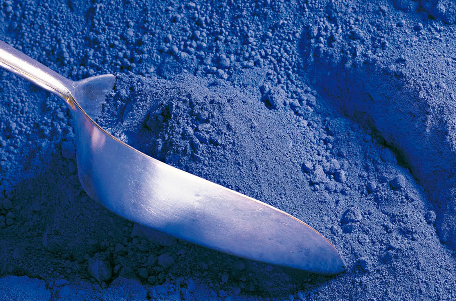 Pigments are small particles of pure colour, insoluble in either oils, resins or water. As soon as you mix these with any kind of binder to make a paint or a paste you will somewhat alter the dazzling beauty and full strength of the colours. Moreover you might find two kinds of chlorophyll pigments in spinach which gives it a deep green color and two accessory pigments beta-carotene and lutein, both yellowish-red pigments, try as you might you will never make a useful paint out of these… shame when you think how much men have wanted to paint beautiful landscapes and how few green pigments there were for all those centuries past but, as most, these pigments are not suitable for an artist’s purpose, mainly because they are not lightfast enough to do the job.
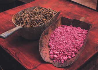
Dyes are also colouring materials but soluble. They are not used in artists’ paints unless they are attached to an insoluble particle. When a dye, chemically or electrically is attached to a particle, preventing it from bleeding or migrating it is called a lake. That lake can then be ground like any mineral pigment. (The whole thing is quite a process really and has only been worth it for rare colours, like red. Rose Madder Lake is probably the most famous one in an artist’s palette.)
Without light, we can’t see colours… do they exist in the dark, do they exist at all? Or are they produced “for our eyes only” as soon as a minimum light can play with the pigments of our planet? Yes, in a way that is how the miracle of colour happens. And other living beings see other colours (the infra reds, the ultra violets) that we do not. However… they do “exist”!
All pigments with rare exception, have crystalline structures that dictate their colour, and even small changes at this level can alter which wavelengths are absorbed or reflected. Phtalo blue for example, has two types of crystal formations, responsible for the red or green shade. Minor changes to the crystal lattice of Quinacridones is responsible for its broad range that runs from the reds to the deep magentas and violet. Cadmium sulfide, which is yellow in its pure state, is made progressively redder and redder by replacing the sulphur in the crystal lattice with increasing amounts of selenium. This substitution broadens the amount of the spectrum that can be absorbed, and if enough selenium is added cadmium can actually appear black.
As you probably know, when you work with paint, you are working with what is quite confusingly (I think) called substractive colour. (Additive is when you work with coloured light, the convergence of which gives you white light.)
In the subtractive world of colour when you put down a colour on your canvas, you actually see it because it gets rid, “subtracts” the other colours’ wave lengths around it. When you add another colour to that one, it gets rid (or subtracts) other wave lengths etc etc with each new colour, which explains why soon enough you will get a beautiful… muddy brown! No wavelengths left really. Nothing much at all for you to see.
Pigments are classified in an amazing variety of way
1) For one, they have names! Their real real name (also know as their colour index name) is made of two letters –NR, for natural reds, PB for Pigment Blue, PBk for black, PBr for browns, etc. with green, orange, violet, white and yellow– followed by a digit or two, its serial number. PY 83 is Diarylide Yellow for example. They are christened thus by the Society of Dyers and Colourists and the American Association of Textile Chemists and Colorists. In any brand worth its salt these days, you should find that Color Index name on the tube somewhere.
Unfortunately, references for pigment are tricky too: the first numbers can be the same (and dutifully printed on the label) but the subnumbers differ making all the difference in quality and price!!! (Pure Cadmium red is labelled PR108 but PR108:1 is the name of Cadmium lithopone red an economical version of 108 used in cheaper brands but not always labelled correctly… hum I wonder why?) So, it pays to get to know your labels and your brands to understand what you are getting for your dollars as serious companies label the contents of their tubes properly, they also have a good name they have worked decades to get and so you can mostly trust them to offer you a quality pigment/paint.
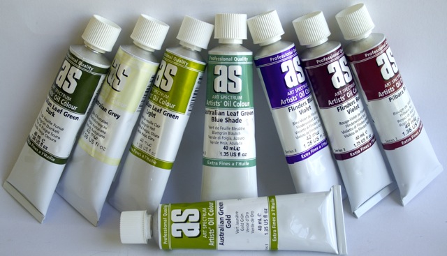 Of course paint in tubes is not always mono-pigmented and some “colours” are made of more than one pigment… when you see an “Australian olive green” or a “Flinders Blue Violet” well that’s evocative but usually not the name of a pigment. (Most answer to the delightfully charming Napthol, Phtalocyanine, Quinacridone, Zinc, Dioxazine, Nickel Azo, Indanthrone, Diarylide, Cadmium, Pyrrole, Anthraquinone or Perylene this or that). And while there can be some further confusion because of certain historical names like Vermillion, Madder Rose, or Ultramarine that have names that resonate poetically for us (and a generally accepted substitute pigment number that goes with it these days) mainly the names that make you dream like Southern Seas Blue are a mix and, in a weird way, the name does warns you about that. If you are aware of it, like the colour as it comes out of the tube and take care not mix it too much… perfect! However, when you buy a Cadium Red that’s what it should be, Cadium red pigment with whatever binder: linseed oil, polymer emulsion, Arabic gum etc. But… beware! Despite some companies trying hard to inform you, there still is no real international regulation to force paint producers to state anything on tubes except dangerous contents. The added fillers, extenders (needed some time in minute quantities to stabilize etc.) do not need to be mentioned with the result that you are often buying… nothing! AND, the names are sometimes used to label the hue. I sell the cheapest Red Cad in Australia: $12.25 for a 500gr tube!!! Yes, it’s cheaper but it not caviar, only some other egg fish not mentioned on the packaging… and that’s OK! (Well legal anyway…) These mixes of cheaper pigments to produce an approximation of a Cad red colour are not only cheating the client, they also makes it hard, when you use them, to get any clean colour out of them, especially when mixed with others of the same calibre as the more pigments you’ll mix, the less interesting your colour will become… remember how frustrating it was as a kid when your paint always muddied ? Even if you are not using kid’s paints, on a more subtle scale not so great quality paints or premixed colours will do this to you…
2) Pigments are also classified according to their characteristics:
1) Vivacity of tone, 2) Sensibility to light, 3) Mixing permanence,
4) Covering power, 5) Colouring power, 6) Siccativity, 7) Suspension power, 8) Fineness, 9) Compatibility with other pigments and techniques, 10) Resistance to bad weather, 11) Stability in high temperature, 12) Toxicity, 13) Weight, 14) Density… the reason we need all these classifications is that there are no two similar pigments which explains why some tubes are heavier than others, some you need a minute little blob vs a big splash because their tinting power is so great, some colours are more opaque than others, some need a trickle of stabilizer etc. Lightfastness is also given a rating of I if they are considered excellent or II if they are very good. Where lightfastness ratings have not been obtained according to ASTM test protocol, “N/A” is used. In those cases, data from pigment manufacturers and an appropriate description assigned under permanency is sometimes available from the paint company.
The pigment’s opacity for example comes from each of its particle’s ability to scatter light, which relies primarily on a particle’s refractive index and size. The larger the difference in the refractive index between a particle and its surrounding medium, the more light is scattered and the underlying layer obscured. Conversely, the closer these numbers are, the more transparent a particle will appear. The high refractive index of Cad yellow and Titanium white, for instance, is almost solely responsible for their tremendous hiding power and sense of opacity, while Zinc white and Hansa yellow appear more transparent because their refractive indexes are considerably closer to that of an acrylic polymer.
Also, as a particle becomes smaller it scatters light more effectively until a certain optimal size is reached, after which this aspect begins to drop off sharply. Titanium white for example if carefully manufactured to optimise its particle size for maximum light scattering and hence opacity. A 1 cm wide crystal of titanium dioxide is completely transparent, and it is only as the crystals gets smaller that scattering becomes dominant and we sense the pigment as inherently white. Should Titanium Dioxide be ground even further, down to a nano particle scale, it would actually become completely transparent. (By the way this is how they get the transparency in some colours, like the lovely transparent Red Oxide.)
Finally, yes! although not labelled as such some pigments are more expensive than others –that’s why all professional paints have series!! Gold and clays would hardly cost the same… but why is this not obvious anymore? When painters needed to travel to Venice in order to buy the pigments to paint the commissioned altar piece for the Florence monastery, certain pigments were part of the contract they were so dear: the Ultramarine, the Cochineal red…
So far all these differences between pigments defines them but has no implications on the quality of the paint… All artist ranges have some cheaper pigment series, some dearer. And today’s pigments being mainly synthetic are in fact cheaper than ever, making most colours available to us at affordable prices. There is however many more tricky differences in between brands… when you notice for example that some tubes are heavier than the same pigment in another brand it’s most probably because they have far more pigment and no filler. Because of the extreme disparity in tinting power between one pigment and another, student grade paints often takes low tinting colours as their starting point and bring the quantity of pigment down (and the quantity of fillers up) in the other colours to match this one. And in a way, for the beginner, it makes things easier. For kids it’s fine… for anyone wanting seriously to study painting and learn the technique, it’s absurd to buy these ones, I think.
3) Pigments are further classified as:
– Mineral, Earth or Inorganic pigments. These pigments range from abundant, inexpensive pigments like the earths ones: iron oxides, ochres and clays offering a palette ranging from browns to reds to yellows, even in some places some natural violets or greens, chalk or kaolin -a white stone- to semi-precious or even precious stones like gold and lapis-lazuli. Inorganic pigments can also be synthetically manufactured (iron oxide, carbon black, etc) or may also be produced using a combination of these two processes.
Some very early chemistry made use of not so friendly iron and arsenic ores to produce Flake (lead) White or Naples Yellow for example. And some modern organic pigments are still both mined and manufactured: the Cadmiums, Cobalts, and Titaniums. The last fifty years also saw the addition to the palette of many new pigments attached to mica and other metals or ground glass creating the lovely iridescent (pearly) and interference metallic hues.
– Organic pigments are made with something that was once alive: as in plants (roots, bark, charred wood, leaves and stems, seeds and blossoms all have been used to produce colour) or animals (carmine lice or cochineal, marine snails, oysters, egg shells, ivory, bones crushed or charred…). Organic pigments can be natural, as above or manufactured, as made from complex hydrocarbons. Examples of ancient organic manufactured pigments are indigo and Indian yellow, while modern manufactured organic pigments, having been originally derived from petroleum, coal tar and natural gas, now include almost any shade imaginable. Many of these pigments have their roots in the chemistry of the last two centuries although widespread production didn’t really begin until after the war. Even though they have only been available for several decades, organic pigments have demonstrated remarkable abilities to withstand the impact of light and weather.
4) Some companies/books prefer to refer to modern vs historical pigments:
Some books label pigments as “historical” all those that existed before 1704 –when the first synthetic mineral pigment, Prussian blue, was invented by chemistry and calling those developed afterwards “modern” pigments. Many companies however seem to label these days as “modern” only the very recent organic synthetic pigments…. can’t really help you there, I’ve hunted high and low but a clear, definitive definition of where modern begins I have not found… yet!
The “Historical” inorganic earth pigments: ochres, oxides, etc. are still around as their cost is not high. These colors are usually very opaque with a low tinting power and definitely found at the end of the ranges to separate them from the synthetic pigment paints… another rather confusing presentation for most beginning artists looking for their red oxides in the red section, the Umbers and Siennas with the yellows, etc.
Besides those earth colours, all the others “historical colours” including those previously derived from plants, roots, shells, etc. are now produced in a lab –synthetically– and so are labelled under the umbrella of “organic colours”… which is really a bit confusing. Also, when some basic ingredient has been totally altered, serious companies make sure theirs are referenced as hues, i.e. an interpretation of the original colour. Among them Naples Yellow, Terre Verte, Van Dyck Brown, Sap Green, Aureolin… to name a few of the most famous ones. Today’s Naples Yellow for example is not made with lead anymore (except in a couple of companies) but an interpretation of that colour is produced synthetically and so, a hue is available… slightly different from brand to brand… this, and the fact that these hues are often clustered together on the colour charts or even in the stands can be somewhat adding to the confusion!
As a rule, most of the very recent additions, the Hansas, Pyrroles etc. are less opaque than the earlier ‘modern’ Cadmiums for example. Still, better to get to know them well as, with all pigments, some of these modern ones are opaque and some are not, some are tinting and some are not depending on their nature. These days information is much more freely available and many companies now have charts or indexes on the tubes to let you know what’s what… at the very minimum the pigment index classification should be there… if not, hum, I would worry a bit.
Historical pigments
The more I learn and the more I read and the more fascinated I am by the amount of time, energy, ingenuity, effort, man has put into stealing colours from nature and appropriating them for himself: colours to adorn his body –directly on (or under!) the skin or in layers of the most colourful and sophisticated threads; to embellish his sacred spaces –from caves to cathedrals to the humble home; to represent and preserve his visions – from imaginary inner worlds to the more mundane renditions of every day life and beauty. For whatever purpose, it is obvious by traces of their passage that humans have wanted, perhaps needed, colour in their lives in all places and at all times. And have gone to extreme lengths and expenses to acquire it.
The first pigments of men were inorganic minerals found in the soils:
- clays and oxides offering them a palette ranging from browns to reds to yellows, with, in some places, some natural violets or greens
- chalks and crushed bones providing white
- charred wood or bones adding black
 The names used today for these colours are: Yellow Ochre, Burnt Sienna, Spanish Red, Burnt Umber, Turkey Brown, Raw Sienna, Raw Umber, Lamp Black, Carbon Black, Furnace Black, Bone Black
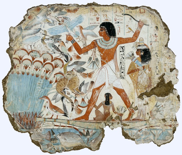
But, as long ago as 8 000BC, Egyptian artists discovered how to process many more natural minerals, animal products or vegetable matter into useful and more or less stable colorants. As is the case even now, pigment manufacture in Antiquity was a by product of more daily necessities: glazing, dying, soap and glass making… but there is no question that the Egyptians had a genuine command of chemistry. Around 3500B.C., they discovered how to win cooper from its ores and take the leap from physical to chemical manufacturing.
 Like their predecessors, an early palette would have included many ground natural minerals, to which they added some synthetic ones of their invention:
- Copper ores malachite (green) and azurite (blue)
- Arsenic sulfides orpiment (yellow) and realgar (orange)
- Reds from cinnabar and iron (a mercury ore)
- Lead white which became such an important pigment for the Greeks and Romans was probably already in use in Egypt since lead was liberated from its ores as early as the third millennium B.C.
- There was also the gorgeous Egyptian blue or frit –used above– which is found as early as 2 500 BC… this is the oldest synthetic pigment and a recipe lost for a long time after. Just to give you an idea of the complexity of it there goes: 1 part lime (calcium oxide), one part copper oxide and 4 four parts quartz (silica) were blended together. These raw ingredients are minerals: chalk or limestone, a copper mineral as malachite and sand. Fired in a kiln between 800 to 900 degrees celsius (and this temperature is crucial so we can deduct from that that the Egyptians had found ways to master that art too) it produced a brittle blue material which could be ground to a fine pigment. This whole operation shows highly specialized knowledge combined with practical mastery.
Whether their invention or not, Egyptian dyers also enjoyed the deep red of kermes –a little insect. Turning this dye into a usable carmine lake pigment is one of the tour de force of early chemistry but worth the effort obviously to obtain the beautiful carmin red. One they repeated with the deep red even purplish root of the madder plant.
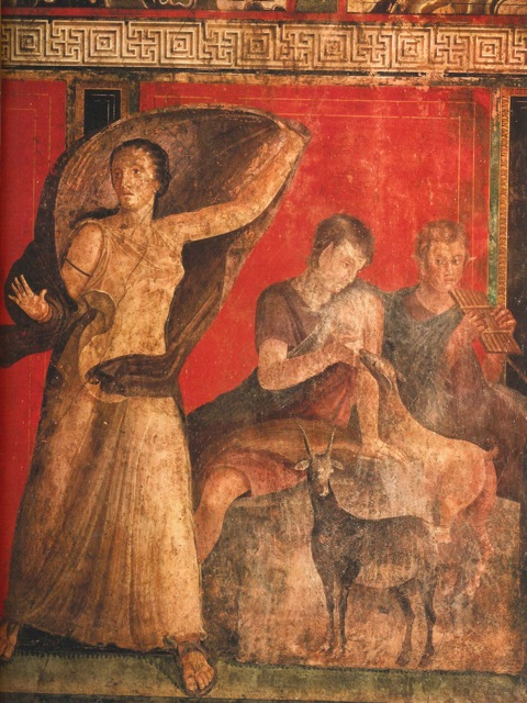 Although the Greeks had a fine reputation as painters and it is presumed Greek painters were at work both on the Pompei frescoes and in the gorgeous encaustic Fayum portraits, there are virtually no certified Greek paintings remaining. Certainly though it was around that time that White Lead began to be extensively used even as make up under the name of ceruse (by the way… that’s not a good idea at all!) Probably the earliest artificial pigment still in use today (although forbidden in many countries now because of it lead content), this pigment, also called Flake white or Creminitz white, is produced by leaving for a few weeks lead in thin slices with vinegar, under animal manure which keeps it warm. Microscopic little white crystals then form on the lead and they can be picked like little flowers.
 The blue-green pigment verdigris was made in a similar process, by corroding cooper metal with vinegar fumes.
From exposure to fire white lead can be transformed into red lead. That pigment was also known and used lavishly in Oriental art although it is then called lead cinnabar.
During the next centuries, some processes were forgotten and other improved as, on the whole, more and more sophisticated ways of processing materials were devised. Iron oxides were mined extensively and processed by heating, water washing and other means into a range of red, yellow, green and dull purples. More complex processing resulted in producing smalt, king’s yellow and the delightful ultramarine blue from lapis lazuli. On the organic side: resinous materials produced reddish dyes (better know as the exciting dragon’s blood), while vegetable and animals materials were turned into ever more gorgeous
reds (the sepias, bistres, and cochineals),
yellows (think turmeric, saffron, Indian yellow, quercitron),
blues (thanks to indigo)
and greens (sap green).
 Some would argue however that the most central technological innovation of medieval painting was the synthesis of vermillion… a truly alchemical affair! A pigment as costly as gold for a long time, it was first used sparingly, until more sophisticated forms of manufacture made it affordable. The Dutch dry method, in which mercury and sulfur was combined to create a black form of mercury sulfide that was then pulverized and sublimated by strong heating and converted into red vermilion was the first step. Later came a less laborious and costly wet process with ammonium…. what would you not do for a good Vermilion?
As you go through older books or historical pigment descriptions, don’t attach yourself tooooo much to names however as most colours ended over time with quite a range of names here and there on the globe whereas some names served for a variety of hues!
Here’s one fun example of that: Caput mortuum (or mortem), also known as Cardinal purple. This name was given to a purple variety of haematite iron oxide pigment. It was a very popular colour for painting the robes of religious figures and important personages. It may have come from the alchemical usage, since iron oxide (rust) is the useless residue of oxidization. It was originally a byproduct of sulfuric acid manufacture during the 17th & 18th centuries, and was possibly an early form of the copperas process used for the manufacture of Venetian red and copperas red. But Caput mortuum is also sometimes used as an alternative name for Mummy brown, a pigment that was originally made in the 16th and 17th centuries from ground-up mummies, and whose use was discontinued in the 19th century… when artists became aware of its ingredients!
 Still many pigments were discovered and had to be abandoned –usually as time would prove them not lightfast enough– or used with great caution as they would alter chemically other colours around or mixed with them.
Much of these improvements were no doubt due to years of trial and error and recipes passed on like secrets from master to apprentices, monk to monk, calligrapher to calligrapher, miniature artist to miniature artist. Supports evolved too and with them the concept of hanging art on a wall –rather than painting the wall itself– was introduced. Canvas, then paper made the transport of artworks ever more easy and versatile. Art could change hands and countries as it never had before and, with that, knowledge was passed on too.
A historical palette at a glance…
The chart of Rublev colours below –a small American brand which strictly sticks to the historical pigments– is what the painter had at its disposal before 1704 when the earliest synthetic mineral pigment, Prussian blue, was invented by chemistry. (If you exclude the Ultramarine made from the synthetic pigment which replaces the real deal, ie lapis lazuli, far too expensive). I think you can appreciate at a glance here that although many many masterpieces were painted before that time, not that many pigments were in fact available…
Modern pigments
Although some companies only call modern the very recent organic pigments, I am choosing to start the list of modern pigments in 1704 when the earliest synthetic mineral pigment was invented by chemistry: Prussian blue. (It is debatable but until I know for sure where the line is, I’m simply keeping this date as a useful landmark.)
 The next years brought all the colours that we now take for granted:
In 1751, the composition of Zinc White was found but, strangely, it was not commercialised until 1850. It was followed by Cobalt green in 1780, blue in 1802, violet in 1859. Then an artificial Ultramarine blue, red and violet were all discovered at once in 1828. Some time during that century followed Aureolin, Viridian, Mars Black, Brown, Violet, Red, Orange and Yellow, and most of the Cadmiums around 1840s.
These new colours, more intense and vibrant than anything available before which arrived at the same time as John Rand’s invention of the collapsible metal tube (which replaced what was a messy business of pig’s bladders) opened so many avenues and options to painters that it is hardly surprising that new movements in art arose in the wake of these technical changes.
 In 1857, William Perkin, a chemist trying to find a remedy for malaria, stumbled upon a new permanent colour which became the absolute rage of fashion victims from England’s drawing rooms to Parisiennes’ soirees… all over the Western world, women were in mauve! Artists had to follow suit and used the same pigment to paint the ladies in question.
A few years more and Cerulean blue, Chromium Oxide Green, and Manganese violet was out of the tube.
The first synthesis of a natural organic pigment, i.e. chemistry imitating a chemical composition available in nature is Alizarin Crimson in 1869.
The 20th century extended further the palette to
Arylide yellow in 1919
end of the 20s: the Phtalos: blue, green and the Cadmium-bariums
in the 30s: all the Quinacridones: orange, crimson, red, scarlet, violet
and Manganese Blue
the 40s: Green gold,
the post war: Dioxazine purple, Nickel Azo, Indanthrone blue, Diarylide Yellow, Cadmium Vermillion, Pyrrole orange and red, Anthraquinone red, Perylene deep red, vermillion and maroon.
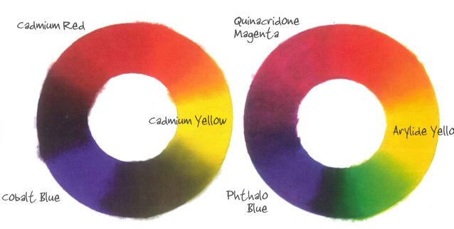
Most of these modern-modern pigments are a lot less opaque than the earlier-modern pigments. Compare below a couple of them…
 which means that when you mix them you get a lot more interesting colours along the way. See it for yourself in these two colour wheels. Check out the purples, the greens, the oranges…
The next pigments to arrive on the stage were, in the 60’s, the crazy fluorescents. As previously, artists went wild over the new colours offered to them, simply because they had never seen these before!
 The most recent and craziest touches to the palette being of course the phosphorescents, the iridescents and interferences colours and… more to come, that’s for sure!
PS: Strangely some modern pigments are virtually extinct. Yes! pigments do die too… before it happened if they became too rare in the natural world, now it is more a question of not being loved enough to keep them in the race since we, the art world, represent such a minute part of the pigment market. When Guerra Paints’ stock of Prussian and Manganese blue to name a famous couple will be used up, well, they will truly be history (we’re talking the real stuff here of course, not the hue). And so the world goes full circle from Prussian blue’s birth to Prussian blue’s extinction… weird, hey?
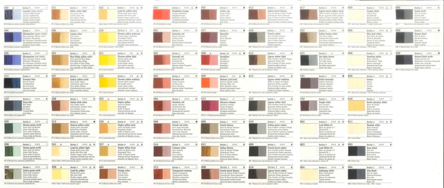
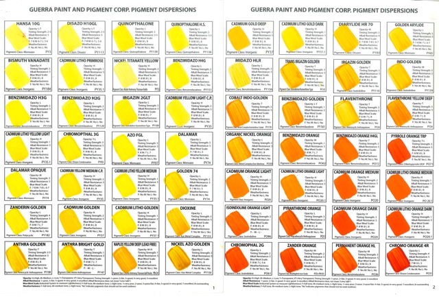
PPS: Couldn’t resist adding a sample of Guerra pigments charts just for the yellows/oranges… compare it to the chart at the end of the historical pigments if you will and see how many more options you have these days!
Colours and Families of Pigments
Colours in art stores’ racks are usually huddled together in hues and families: beginning with the yellows then oranges, reds, pinks, violets, blues, teals and greens followed by all the Earth colours (Siennas, Umbers, Oxides; etc.) grouped at the end, followed again by the blacks and the whites at the very end. And, if applicable, all the fun ones separated yet again: the metallics, the iridescents, the fluos.
Grouped or not, colours in conversation are often referred to in families: the Cadmiums, the Quinacridones, the Pyrroles, the iridescents, the fluos, etc. and it’s sometimes interesting to know a bit more about them.
Below, I have only dealt with pigments and colours you will find in commercial ranges today and tried to cover both approaches… the order then is alphabetical only. (If you have an interest in historical colours, please click here to read the relevant section.)
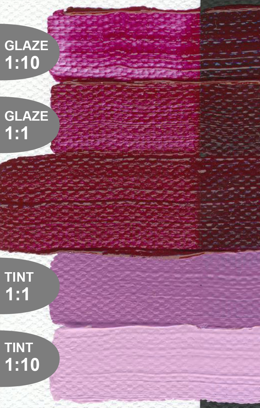
Descriptions of colours refer to the masstone, the colour in full strength as it comes out of the tube but, of course, as you mix that colour with white or when glazing, a masstone can shift dramatically. Sometimes pigments look pretty similar to start with but will go very different directions. I think it pays to really ‘learn’ colours pretty intimately to know where you can take them (rather than them taking you for a ride!) Some companies sometimes do a great job of displaying masstone/tints/glazes on white and black backgrounds in their website (Golden even does a great poster of all their Heavy Body colours you can buy and pin on your studio wall).
PS. The little hearts attempt to represent the masstone colour! Yes, they are little but that’s the only I found in WordPress to do this… hope it helps to give you an idea at least.

Colours
I have compiled this list by merging six companies’ charts and descriptions of their hues: Daniel Smith, Gamblin, Golden, R & F, Sennelier and Willamsburg… may they be thanked for their informative and colourful (verging on the poetic sometimes) resources!
Blacks
 Some artists believe no black should ever be used… only mixes of colours until you reach a black effect. And in fact, in its pure state, black literally does not exist as all substances that appear black really only have the capacity to absorb the entire range of colours found in white light! If you insist on buying black ready made hereafter the most common ones; some are organic some inorganic, take your pick!
♥ Black Lake : Synthetic aniline black that is velvety and intense. In tints, takes on a slightly bluish hue. Average lightfastness.
♥ Bone Black is also called Ivory Black and was invented by the Romans as a general purpose black and, for the best grades, pure ivory was burned instead of ordinary animal bones. Thus it started with 2 separate names. True Ivory Black is a deep velvety black and has a higher carbon content than Bone Black and so is more intense. The genuine pigment is still made in tiny quantities from ivory harvested from animals that have died naturally but is almost as expensive as genuine Lapis Lazuli. Both forms are very slow driers in oil and should never be used in underpainting. A good, all-purpose black that’s a solid choice for mixing greys, tinting, and mixing with other colors. Slightly warm in its transparency with a weak tinting strength.
♥ Carbon Black is also called Lamp Black and was produced originally by burning oils in little lamps and collecting the soot that formed on the sides of the cones on top of the lamps. Today it is produced by burning tar, creosote, naphthalene or other petroleum products. Lamp Black is the oldest pigment made by a deliberate industrial process. It is one of the slowest drying pigments in oil and should never be used underneath other colors unless mixed with a fast drier such as Umber. While Lamp Black has an honorable history, most artists prefer Ivory Black or Mars Black for most purposes. Intense carbon black is sometimes available as a colour, it is the blackest of all blacks but can unbalance the rest of the palette. Best for special effects, it has reddish undertone and tints.
♥ Charcoal Black is ground charcoal made from willow, it is a pigment used in many drawing materials but which is a very poor paint pigment and, as such, is not used much anymore.
♥ Furnace Black is almost pure carbon and offers a dense and intense black used in industrial coatings but less commonly for artist’s paint due to a tendency to make ‘streaky’ tints. It is produced by burning gas.
♥ Mars Black is closely related chemically to the naturally occurring red and yellow earths, however is it a relatively recent pigment. Often available in acrylic ranges as Ivory Black was not at first as happy in acrylic as it was in oils (you find it now). It is the only major black pigment that is considered 100% safe, the only one that is a good drier, the only one used to over paint as it is the only one that produces a hard fairly flexible oil paint. It can be used in all media without reservation. Slightly warm in its tint, this leanest (more matte) black dries more quickly than Ivory Black. Though not as black as Ivory Black, Mars Black has approximately three times the tinting strength and is very opaque. Cool in its masstone and strong, Mars Black is often the choice of those who want to make black opaque marks in thick wet paintings.
♥ Vine Black is also called Drop Black, Frankfort Black, Peach Black, Spanish Black, Blue Black. These variations on black were made by burning grape vines, cork and other woods or vegetable products, they are all inferior to Lamp Black. Peach Black was reputed to be the best of a bad bunch. They were all bluish in undertone hence the common name from years past – Blue Black. Nowadays if that color is available it is sold under the name Blue Black and is usually a mixture of Ultramarine and Ivory Black.
Blues
 ♥ Anthaquidrone Blue The color of night sky or shadows, very dark, reddish, semi-opaque blue with strong tinting, also known as Indanthrone. A versatile alternative to Ultramarine yet not as overpowering as Phthalo.
♥ Azurite (Hue) has replaced what was Manganese Blue Genuine until the dangers of its manufacture led to its disappearance. Azure is made from synthetic organic pigments phthalocyanine blue and barium sulfate. Very lightfast, it provides a bright, luminous, turquoise blue shade. Historical azurite, from copper carbonate minerals, lacks the stability and durability required for modern painting, this mixture affordably approximates azurite’s deep greenish blue.
♥ Cerulean Blue was invented around 1850, under the name Celestial blue. Derived from cobalt blue, in a harmonious, blue-green hue, it is opaque, very lightfast and stable in mixtures. Very precious pigment. Mixed metal oxide from the early 19th century with an important place on the mineral palette because blues are rarely shifted to the cool, green side, like this one. Very muted in its tint so most valuable as a pure hue.
♥ Cerulean extra Pale Unlike most blues, when mixed with white, Cerulean takes on a softness that in juxtaposition with cool colors makes it seem slightly grayish and neutral, with warm colors a beautiful pale blue.
♥ Cerulean Blue Hue is based on barium sulfate and phthalocyanine blue. This substitute, an imitation of genuine cerulean blue, provides remarkable lightfastness and has a very high tinting strength. A medium, semi-transparent blue, Cerulean Blue Hue has a higher tinting strength than its namesake. A complicated color. It is quite greenish laid next to cobalt blue and yet under fluorescent light, it can take on a violet cast. Its large particle size makes it a little gritty but also adds to its luminosity.
♥ Cerulean Blue Chromium is closely related to Cobalt and Cerulean, but this chromium variation is a slightly more transparent and more neutral blue well suited for skies in landscape paintings. Highly permanent and extremely low-staining, Cerulean Blue creates exciting granulation and settling washes in watercolours.
♥ Cobalt Blue In the 19th century, the French chemist Thénard successfully obtained this pigment from a natural mineral. A very pure blue shade. Excellent lightfastness, very stable in mixtures. “True blue” is well worth the price because of its working properties and unique color, which cannot be mixed. The “true” blue, because it is distinct from Cerulean on the green side and Ultramarine on the red. Makes muted greens when mixed with cadmium yellow.
♥ Cobalt Blue Deep The varying temperatures at which it is calcinated accounts for the many different shades of Cobalt Blue. Bright, deep blue with excellent lightfast properties that mixes very well with other pigments.
♥ Cobalt Teal An elegant and intense pure hue that replaces Turquoise.
♥ Cobalt Turquoise A unique deep, opaque turquoise hue whose brightness cannot be matched in other mixtures. This paint is very green in the masstone and reveals more blue in its undertone and glazes. Excellent lightfastness. To retain its unique vividness in oil painting, use it with a non-yellowing oil (safflower).
♥ French Ultramarine This medium-to-dark warm reddish-blue is highly lightfast and of medium tinting strength. Its sedimentary quality increases its versatility. Mixed with various portions of other blues, French Ultramarine is a wonderful sky pigment. Modify it with Quinacridone Gold for delightful greens that remain color-coordinated. Mix French Ultramarine with Quinacridone Burnt Orange and be rewarded with an amazing range of blue to brown grays. Mixed with either Quinacridone Rose or Pink, a range of purples result.
♥ Indigo Blue is usually now a synthetic organic pigment which reproduces the genuine indigo, a deep, intense blue. Very high tinting strength. Remarkable lightfastness. Provides a semi-opaque film. An excellent, all-purpose blue with a beautiful, smoky glaze. Very dark, blackish-blue top tone. Earthy greenish-blue undertone. Has an edgy feel to it. Great for line work.
♥ King’s blue Very warm, soft light blue. With cool colors, can be almost neutral. With warm colors, hints of lavender, like a blue that’s hiding a rose.
♥ Manganese Blue (Hue) Many companies have an interpretaion of the original color to replace this obsolete pigment. Cool, transparent blue with green undertone; especially useful for painting sky and water.
♥ Phthalocyanine Blue aka Phthalo Blue is a pure synthetic organic pigment with exceptionally high tinting strength. It is often offered in two nuances, a red or green shade. Very good lightfastness. Suitable for all techniques. Because of its powerful tinting strength, use it with discretion. When used thickly it is dark and opaque, but Phthalo makes beautiful transparent glazes. Provides a blue palette ranging from pale sky blue to dark, somber tones similar to Prussian blue. In mixtures, use it to create an infinite range of greens.
♥ Phtalo blue red shade The reddish variation on this very powerful tinting versatile blue.
♥ Phtalo blue green shade The greenish variation on this very powerful tinting versatile blue.
♥ Phtalo Turquoise Perfect transparent marriage of blue and green, this transparent Turquoise has high tinting strength and makes a high key tint. Excellent for painting tropical water. A more blue Turquoise that is a very strong tinting color that reveals cool gem tones in glazing.
♥ Provence Blue A color similar to soft blues often used by Matisse. It is a neutral blue next to warm hues but becomes violet when set against cool ones.
♥ Prussian Blue Discovered in Prussia at the beginning of the 18th century, this pigment is difficult to grind and moisten. Very high tinting strength. Good lightfastness (contrary to its reputation) except in oil colours, where it tends to darken. Strong, transparent tone. Dries out oily binders. First synthetic color of the Industrial Revolution, discovered by accident in 1704 while a chemist was trying to formulate artificial crimson. Cool blue with more muted tint than Phthalo Blue. It is especially beautiful in its transparency. Deepest, reddest of all blues. Powerful and very, very velvety. Slightly grainy texture.
♥ Smalt Blue (hue) Transparent color originally made from ground cobalt glass and used in 16th and 17th century European paintings in place of Ultramarine. Historically Smalt loses color over time, but this modern formula offers a classic deep blue that is permanent.
♥ Teal A mixture of Phthalo Blue and Green with Titanium White for a strong tinting, opaque, Teal. It is a cheaper version of the Cobalt Teal.
♥ Ultramarine Blue Light is made in the same way as Ultramarine Blue.
♥ Ultramarine Blue is made in the same way as Ultramarine Blue light. In 1828, the chemist Guillemet managed to synthetically reproduced the natural colour of Lapis Lazuli, which had been in use since antiquity. Variations in the hue result from the size of its microparticles. The preparation of ultramarine blue is quite complex, and varies according to the desired individual shade. This deep, very intense shade, is more purple than the light version. Very lightfast. An important colour on most artists’ palettes. A great glazing color, warm Ultra Blue is one of the few mineral colors that is completely transparent. Lightfast with moderate tinting strength. Mixes well with other pigments, but, since it contains sulfur, should not be mixed with Flake White or chrome based pigments. Consider using Alizarin Permanent instead of Alizarin Crimson to mix violets.
Browns (see also the earth colours)
 Old Masters’ paintings were mostly brown because earth colors were the only lightfast pigments available. Found all over the earth in various shades of brown and muted shades of red, orange, yellow and green, earth colors have been on artists’ palettes for more than 40,000 years. Apart from Sepi, hereafter are only the ones actually called Brown, go to the next section for all the others.
♥ Brown Pink Dark reddish-brown top tone. Fiery pinkish-brown undertone. Like an intense burnt sienna. Excellent glaze
♥ Madder Brown is a transparent “azo” pigment. This very intense, transparent, reddish brown has high tinting strength.
♥ Red Brown Iron oxide. Good covering brown, very lightfast and stable in mixtures.
♥ Sepia Sepia ink was commonly used in Greco-Roman civilization. Named after the rich brown pigment derived from the ink sac of the common cuttlefish Sepia, Sepia is now a lightfast mixture of modern pigments.
♥ Van Dyck Brown Iron oxide. Purple brown. Very lightfast and stable in mixtures. Van Dyke Brown dates back to the 17th century from the Cologne and Kassel regions of Germany, GOLDEN has captured its rich peat undertone by using Transparent Red Iron Oxide and adding just enough Carbon Black to create a clean sepia tone.
Earths
Of course the earth has a pretty amazing palette when you hit the ochres and the oxides! The colours are given here more as an indication as variations exists from brand to brand (even to the despair of paint makers from batch to batch… as much as they try not to… t’is a natural product after all!) If you would like to see a whole bunch of them, including some rarer ones than mentioned below, click here to go to the website of Natural Pigments, it has a nice selection.
♥ Burnt Sienna: Natural calcined (roasted) earth pigment. More opaque today than 200 years ago. Additional heating, or firing of the natural earth pigment creates the darker variation of a classic Sienna earth color.
♥ Burnt Umber: Vigorous drier due to high manganese content. Burnt Umber provides the deep brown earth tone that painters have used for centuries, it is a most useful underpainting drawing color. Because of high oil content, use thinly in under layers.
♥ Brown Ochre Rich, dark brown formulated from natural clays and synthetic pigments.
♥ Indian Red is a pigment composed of naturally occurring iron oxides that is widely used in India. Other shades of iron oxides include Venetian Red, a light and warm (somewhat unsaturated) pigment that is a darker shade of scarlet, derived from nearly pure ferric oxide of the hematite type. Modern versions are frequently made with synthetic red iron oxide.
♥ Cassell Earth The texture and sheen is both dry and tarlike at the same time. Cassel Earth is a naturally slow drier and tints to a warm and subtle gray. It is not a strong mixer but does impart a warm glow when used in place of black. Only moderate in lightfastness, Williamsburg recommends a final, UV protective varnish for maximum durability.
Mars yellow, orange, red and violet are discussed in the respective colours
♥ Raw Sienna Traditional earth yellow glazing color, originally mined in Tuscany. Consider using Gamblin Transparent Earth Yellow for more transparency. Natural Iron-Oxide is the basis for this single-pigment color, named after the region in Italy where it was first mined. Raw Sienna retains more of its yellowish color because is created prior to the heating process that creates “burnt” sienna.
♥ Raw Umber Vigorous drier due to high manganese content (which also gives Umbers their dark color). Umber is essentially clay, and this variation on the PBr7 pigment is the lighter (un-burnt) version of this classic earth tone that originated in the Umbria region of Italy.
♥ Red Ochre Calcified yellow ochre.
♥ Red Oxide One of the first red pigments known to man, this earth tone is a staple on many artists’ palettes. It’s incomparably opaque and lightfast, sometimes called Venetian Red, it is warmer than Indian or English Red.
♥ Sanguine Eart Light Pinkish red, like the worn facing on aged brick. The sanguine series duplicates the reddish chalks of the Renaissance masters. These are less dense than Mars colors to allow for sensuous fleshy undertones. ♥ Sanguine Earth Medium Warm, orange hue of wet red clay. ♥ Sanguine Earth deep Plum-red maroon earth.
♥ Transparent Brown Iron Oxide A mixture of Violet Oxide and Carbon black, this transparent color has a very dark masstone that tints and glazes to a rich gold-brown.
♥ Transparent Red Iron Oxide One of our most popular glazing colors, the brown masstone belies the rich amber-red colors that come through in tints and glazes.
♥ Transparent Yellow Iron Oxide The transparent nature of this pigment give it a beautiful glazing quality that is unique among earth tones.
♥ Turkey Umber Greenish Like a brackish Raw Umber. Very edgy.
♥ Violet Oxide A reddish iron-oxide pigment is the basis for this brown that has a naturally light brown mass-tone that appears more red as it becomes extended in tints and glazes.
♥ Yellow ochre Natural, clay-base yellow. A warm, slightly transparent colour. One of the earliest pigments known to man, ochres are mineral oxides used in colors from the reddish brown to, in this case, yellow-brown range. This very opaque and lightfast color is often considered essential to a painters’ palette
♥ Yellow Oxide Part of the earth tone family, Yellow Oxide’s is slightly more opaque than it’s neighbors (Yellow Ochre) and less red, but with similar lightfastness and durability.
Above are the most common ones and I will not go into each and every earth and ochre variation. If you have an interest however check our some companies, like Willamsburg oils for example who really have made it their specialty to carry a huge range of earth colours. In their line you will find Bohemian Green earth, Cyprus Orange, Stil de Grain, German and Spanish earth but also a comprehensive line of Italian and French Ochres and Green earths.
And, if you like playing with watercolours, I suggest you look closely at the most amazing range of earth and minerals: the Daniel Smith one. On top of an impressive choice in ochres and siennas, they also have their Primatek range of rare minerals: Rhodonite, Purpurite, Amethyst, Kyanite, Sodalite, Amazonite, etc. Some are truly singular and they have bought huge quantity of these special veins when they were discovered in order to insure a consistency in quality for a very long time!
Greens
♥ Cadmium Green A bright, light green mixture of Viridian and Cadmium Yellow. Opaque and useful to make muted colors of the natural world.
♥ Celadon Green A delicate cool, slightly yellowish green that can act as neutral to some colors, as subtle green to others. Historically, it was an iron-based compound related to green earth, used in Europe from Medieval times to the 17th century. The famous Chinese ceramic glaze got its name from this color. Mix it with Iridescent Pearl to effect that glaze-like color.
♥ Chromium Oxide Green A muted, earthy, very opaque green used by landscape painters. Excellent tinting strength and covering power. Very good lightfastness and stability in mixtures. When used in oil, provides a very buttery, easy-to-use paste.
♥ Cobalt Green Light Combination of zinc and cobalt green. Cold, pale green with a lovely tonality, pulling toward turquoise. A pure colour with good covering power, low tinting strength. Very lightfast and stable in mixture.
♥ Cobalt Green An undervalued cool green with moderate masstone and very muted tint. No combination of blue and yellow can compete with this unusual color. Our single-pigment Cobalt Green is deep, slightly bluish green with great opacity and lightfastness.
♥ Courbet Green Like a green version of Indigo. Alongside other dark colors, it is a somber earthy green. Surprising blue undertone.
♥ Emerald Green In the 19th century, Pannetier created this transparent shade, which was rapidly adopted by painters for its remarkable properties, especially for glazing. “Hydrated” chromium oxide. Deep, intense green. Very good lightfastness, stable in mixture. Especially well-suited to oil glazes. Less vibrant, and with a lower tinting strength than Emerald Green Substitute. Avoid applying it in very thick layers.
♥ Emerald Green (hue) This mixed color replaces the toxic arsenic-based original by Phthalocyanine and extenders. Close in appearance to genuine emerald green, but at a much more reasonable price. Luminous green with high tinting strength. Good lightfastness and stability in mixtures. An important color for painters who prefer the direct painting techniques of the Impressionists.
♥ Green Gold For a modern pigment, Green Gold has a fairly muted, olive green masstone. Its most interesting quality is its warm, glowing transparency. Excellent for glazing. High tinting strength. A mixture of green and yellow prized for its warm jewel tones and glazing. This relatively modern color is very unusual and most popular. Its top tone is a muted, almost brownish green. But its undertone, when used as a glaze, has the effect of an antique yellow patina. The yellow predominates over the green as the color is extended out.
♥ Hookers Green (hue) Hookers Green was originally a mixture of Prussian Blue and Gamboge before a single pigment Hookers was developed.The hue uses Anthraquinone Blue, Nickel Azo Yellow and Quin Magenta, for a dark masstone and rich blue-green undertone.
♥ Jenkins Green A rich, warm, green blend created by Golden for painter and abstract phenomenist Paul Jenkins.
♥ Malachite Green Named after the mineral color that is chemically associated with azurite. Malachite and azurite were some of the only bright greens and blues from ancient times through the 18th Century. Our malachite green shares a similar bond with our azure blue. Warm hues bring out the malachite’s bluishness.
♥ Permanent Green light The color of the first shoots of spring grass-bright and warm.
♥ Phtalo Green (blue shade) Its characteristics are identical to those of Phthalocyanine Blue, but in a brillant rich green hue. A dark bluish green more closely resembles Verdigris than Viridian. First manufactured in 1927, Phthalo Green has a very high tinting strength and transparency. Consider using Phthalo Emerald, a warmer and more natural-looking color.
♥ Phtalo Yellow Green A bright, beautiful lime green with power and tinting strength characteristic of all phthalo pigments. Made from Phthalocyanine Green (yellow shade) and Arylide Yellow.
♥ Phthalo Emerald or Phthalo Green Yellow Shade (depending on companies) Had this warm version of Phthalo Green been made first, Phthalo Emerald would be a very popular color today. Phthalocyanine is among the strongest tinting pigments available, this green is semi-opaque, with a warmer yellow-green undertone.
♥ Sap Green (hue) Originally made with Buckthorn berries native to the near east, but cultivated in Europe since Roman times. The ripe berries make a pink dye, while the unripe berries produce a yellow juice or sap used as a dye and to make a yellow Sap Green pigment. This true lightfast color is now a predictable mixture that can be easily warmed with Hansa Yellows or cooled with blues.
♥ Terre Verte (hue) Historically used as a bole for gilding and as underpainting for flesh tones in Medieval painting (verdaccio), Terre Verte, or green earth, was made from volcanic celadonite and/or a mineral of sedimentary origin. Terre Verte is an excellent color for grisaille; it has a weak masstone and very muted tint. Every blend recreates an intrepretation of this color, so expect discrepancies.
♥ Veronese Green (hue) Genuine Veronese Green, which is a copper arsenate, is quite toxic. This bright, luminous hue reproduces the original with modern pigments-mononitrogenous “azo”, Phthalocyanine, and extenders. Pale green tone. Luminous, good covering power, low tinting strength. Very lightfast.
♥ Viridian Green (hue) Guignet of Paris patented the process for manufacturing Viridian Green in 1859. Nontoxic Viridian replaced Verdigris and Emerald Green as a glazing color by the turn of the 20th century. The popularity of this bright, exceedingly clear blue-green color led some to believe that it could eventually replace all other greens, both ancient and modern.
Greys
♥ Graphite Grey Actual Graphite pigment gives this fairly neutral, single pigment gray a slightly metallic sheen.
♥ Titanium Buff Arguably this one could sit in the yellows as it is a light yellow-grey. Made from a compound of titanium dioxide and iron oxide, this popular color is valuable in figurative and landscape painting.
♥ Payne’s Grey Named after British painter William Payne (1760-1830), early formulas contained indigo, alizarin lake, and ivory black. Today more commonly a mixture of ultramarine blue and black, it is considered easier to control and less intense than black as a mixing color. Very deep eggplant violet. Good replacement for black, since it will not sully other colors, yet can act as a neutral.
Oranges

♥ Alizarin Orange A translucent color with a muted orange mass tone that is between cadmium and mars orange. But its undertone is a surprising fiery orange-yellow that becomes lemony when extended out.
♥ Cadmium Orange Chemically pure, Cadmium Orange was the first true orange. It is a pure hue with excellent opacity and low toxicity compared to its predecessors. No health labeling required.
♥ Mars orange A bright, very, very light red. It is almost pinkish against darker colors.
♥ Pyrrole Orange A deeper orange with Vermillion qualities, Pyrrole has very good lightfast qualities even in tints and glazes.
♥ Permanent Orange A modern high key color with a pure hue and the same masstone (but more transparent) than Cadmium Orange, and it remains brighter in its tint when mixed with white. Painters cannot mix a secondary with the same purity of this pure hue Orange. When you use it thinly a rich glowing glaze is created.
♥ Quinacridone Burnt Orange While providing a classic brown masstone, this single-pigment color reveals luscious red orange undertones in glazes.
♥ Quinacridone Nickel Azo Gold The addition of Quinacridone Gold to Nickel Azo Yellow accelerates the amber tones seen in glazes and make this a most popular transparent colors for that purpose.
♥ Transparent Pyrrole Orange More of a reddish orange, brings out a brilliant candy-like orange color in glazes. Excellent lightfastness.
♥ Vat Orange Some times referred to as “Perinone” Orange, can be used as substitute for Cadmium, Vat Orange is redder and darker than Cadmium orange.
♥ Vermillion I know this one is more considered a red but to my eyes at least it deserves to be in the oranges too. (for description go below)
Reds (and Pinks)
 ♥ Alizarin Crimson It was 1868 before Alizarin was extracted from the madder root. This cool, slightly bluish red with smoky glaze is a “lake” color made by the fusing of a dye onto a substrate. Only Alizarin Crimson is still commonly used by painters today, however it is the least permanent red color found in today’s artists’ palette.
♥ Alizarin Permanent Cool, slightly bluish red with smoky glaze. This mixed pigment hue is a true replacement for Alizarin Crimson, slightly less intense in tint, but an excellent match in masstone and transparency.
♥ Alizarin Scarlet Lake Nitrogenous “azo” lake. Bright, extremely luminous, transparent red. Average lightfastness. In oil, used primarily in glazes, because when applied in thick pastes,it is prone to cracking.
♥ Burnt Scarlet This is a translucent color made with quinacridone pigment. It has a rich earthy blackish red top tone with a powerful pinkish undertone. It bridges the gap between earth colors and deep violets.
♥ Cadmium RedLight is an orange/red first synthesized in 1910. Because of its muted tints, excellent color for natural light painting.
♥ Cadmium Red Medium (often labelled only Cadmium Red) is useful with strong opaque masstone and muted tint; light will not penetrate its surface. Opaque mineral pigment with excellent covering power. Completely lightfast and stable in mixtures in any binder. Do not mix with flake white.
♥ Cadmium Red Dark/Deep has a very muted tint. Consider Perylene Red if you prefer a brighter tint or mix Perylene Red with the tint of Cad Red Deep.
Cadmium Red Substitutes (Light, Deep, Purple, and Orange) : Nitrogenous “azo” pigments, zinc oxide, extenders. As with cadmium yellow substitutes, cadmium red substitutes are composed of several pigments reproducing the genuine cadmium shade.
♥ Dianthus Pink Gaudy, in-your-face, ultra-sweet, violent, vivid, outrageous, hot-house pink. More intense than deKooning’s pinks, but adding a little white easily takes it down.
♥ Mars Red Iron oxide. Dark, rich brownish red. Provides a transparent film with an excellent tinting strength. Very lightfast and stable in mixtures. Intensely red, yet in a high key painting it appears almost brown. Surrounded by low key colors, it can be strikingly saturated but never electric. Makes salmon pink tints. Similar to the natural ochres: English Red or Light Red.
♥ Naphtol Red Modern organic warm red that closely matches Cadmium Red Medium in masstone. Makes more intense tints, more transparent. Excellent for high key painting.
♥ Naphtol Scarlet Intense warm modern red that replaces Vermillion. Clean, bold, fiery and opaque, it commands attention in juicy brushstrokes straight from the tube and is just as powerful when mixed with white to produce noteworthy pinks.
♥ Permanent RedPermanent Red is a yellow shade, semi transparent Naphthol pigment.
♥ Permanent Red Deep Calcium lake and extenders. Synthetic organic red that imparts bright, intense carmine red shades. Good tinting strength, average lightfastness.
♥ Perylene Crimson A permanent; deep rich crimson with cool overtones and warm, yellowish undertones. This colour is warmer than Permanent Crimson (anthraquinone).
♥ Perylene Maroon In the mid-yellow to red zone of the color wheel is this exciting find, Perylene Maroon, a semi-transparent super staining dark red-brown. Its semi-transparency makes Perylene Maroon special for browns.
♥ Perylene Red Elegant modern cool red with yellow undertone. Its transparency looks like the inside color of a flame. Makes high key mixtures. Using transparent red like Perylene opens possibilities unthinkable before this century. Instead of making glazes by thinning down an opaque color (which doesn’t increase transparency) or choosing the less lightfast alizarins, painters can use Perylene Red, a warm lightfast red that is completely transparent.
♥ Potter’s Pink Semi-transparent Potter’s Pink is a deep pinkish brown in mass tone with good tinting strength. When mixed with white it becomes a delicate, neutral rose pink.
♥ Pyrrole Red This pigment is also used in automotive finishes because it is exceptionally lightfast, and a very clean, bright red.
♥ Rose madder Orangey-red version of Alizarin Crimson. Blood red top tone, the orange appears in the undertone, hence, a beautiful glaze. Not sufficiently lightfast in tints.
♥ Scarlet extra pale A subtle and less garish pink compared to Dianthus Pink. It works as a very delicate pink or a warm neutral, depending on its context with other colors.
♥ Solferino Lake (Tyrian Rose) Calcified aluminum hydrate base lake. Very bright pink. Poor lightfastness, excellent tinting strength. Because of its fugitive nature, use with discretion.
♥ Quinacridone Magenta Coolest quinacridone red. Makes high key tints and in mixtures makes beautiful transparent violets.
♥ Quinacridone Red Organic pigment with very high tinting strength ; very lightfast. An intense, vibrant red that is transparent and therefore outstanding for glazing. In mixtures with white, provides a luminous, delicate pink. Cool lightfast modern red with high key tint. Useful in place of Alizarin Crimson where more intense masstone and mixtures are desired.
♥ Quinacridone Crimson A mixture of two Quinacridone Pigments, this Crimson offers artists a very deep semi-transparent red that reveals more warmth than intensity in tints and glazes.
♥ Venetian Red Venetian Red is a light and warm (somewhat unsaturated) pigment that is a darker shade of scarlet, derived from nearly pure ferric oxide of the hematite type. Modern versions are frequently made with synthetic red iron oxide.
♥ Vermillion genuine vermillion is hardly used anymore, have a read of the subsitutes below:
♥ French Vermilion Substitute The mineral known as Cinnabar dates back to antiquity; the Romans called it minium. In 1687, Schulte used mercury to create the Vermilion pigment, named after “Vermeil” (bright red). As a result of its toxicity and its poor stability, notably in mixtures with flake white, artists since the early 20th century have increasingly replaced it with this substitute, made from nitrogenous “azo” and extenders. Bright, luminous orange-red with high tinting strength. Good lightfastness.
♥ Chinese Vermilion Substitute Toluidine red and extenders. Deep, lake-like red. Average lightfastness.
♥ Warm Pink An intense salmon hue.
♥ Warm Rose Bluer than Warm Pink. A soft magenta shade.
Violets
 ♥ Cobalt Violet Light A delicate, almost ephemeral, pinkish violet. Very weak tinting strength
♥ Cobalt Violet Deep violet that is cool in its masstone (and less red than Manganese Violet), Cobalt Violet is a pure hue that cannot be mixed from other colors. Although very muted in its tint, it is a marvel as a top coat color. Cobalt Violet greys down considerably when mixed with white.
♥ Cobalt Violet Deep Cobalt phosphate. Dark purple hue, very lightfast and stable in mixtures. Low tinting strength but good covering power. Very royal purple, leans a little to the red. Used by Monet for his intense purple shadows
♥ Dioxazine Purple A cold color with the strongest tinting strength and deepest transparency of all pigments, modern Diox is useful as a high key tint. This purple is so strong that some use it as a black as it makes a cold intense tint. Use sparingly!
♥ Egyptian Violet The strongest of violets, perhaps even more intense than the Phthalos. Very bluish undertone, like Ultramarine Violet, but with a very dark top tone that is almost blackish.
♥ French Mauve Bluish Made with the beautiful violets of the Impressionist palette in mind. With the development of synthetic pigments and dyes in the 19th century, new violets became the rage, though not all were permanent. Leans toward lavender.
♥ French Mauve Reddish Same as above but a lilac hue.
♥ Manganese Violet A good drying color that makes a natural-looking tint, this warm, reddish, semi-transparent violet is made from the compound manganese phosphate, first discovered in 1868.
♥ Mars Violet Similar to Indian Red. A low intensity deep bluish-red earth. Makes lavender tints.
♥ Mineral Violet Manganese phosphate. Red-purple hue. Good covering power, average tinting strength, good lightfastness. Suitable for all mediums except fresco and water-based techniques.
♥ Quinacridone Violet More intense than Ultramarine Violet, warmer than Manganese Violet. A very deep red-violet, this is single-pigment paint has great lightfastness and durability.
♥ Ultramarine Violet Silico aluminate of sodium. Mineral pigment. Low tinting strength. Provides a transparent, muted, red-violet film. Very lightfast. Mineral color that greys into the colors of the natural world. Warmer than Cobalt Violet, cooler than Manganese Violet and more transparent than either, Ultramarine Violet is one of many specialty pigments made by German chemists during the color revolution of the 19th century.
Whites
 When selecting white, consider tinting strength. The more opaque the white, the higher its tinting strength and the more it will “reduce” the color. The higher the tinting strength, the lighter the value of the color/white mixture (tint).
Also, some artist buy cheap white, after all what can go wrong with Titanium white, right ? Well, apart from not really getting your money’s worth in pigment, hence in tinting power, nothing much I reckon. But if you can’t really afford top quality paints, listen to this. Some professional artists don’t either but buy the very very best white : Flake white from Blockx or Tit, Zinc, Tit/Zinc from any good brand. They say that 50% of their painting –if not more- is composed of white and by doing so they feel they are considerably improving the overall quality of their paints ! There are more than two shades of white but definitely two schools here…
◊ Ceramic White This color is very stable; moreover, it is excellent in white shade, staining power, obliterating power, and vividness or clearness of color mixing. This is an ideal light-resistant white without yellow degeneration or limitations.
◊ Flake White also called lead white or Cremnitz white. This white is well known since antiquity – the Romans called it “ceruse”. Blockx still prepares it following the same ancient methods. Flake white is traditionally considered to be the most structurally sound underpainting layer for oil painting, possessing a combination of flexibility, toughness, and permanence not found in other paints, and certainly not in the other white pigments. Avoid mixtures with cadmiums and ultramarine blues. Use with caution, due to its toxic nature. Not recommended for water-based techniques.
◊ Mixed White is 7/8 parts zinc white, and 1/8 lead white – combines the qualities of both; more opaque that zinc white, can be used for underpainting, dries faster than zinc white.
◊ Neutral white Along side Titanium-Zinc, it looks almost brown. With spectrum colors, it looks white and does not tend to “pop” out like Titanium-Zinc. Not a good mixing white.
◊ Permanent White mixed in colors that otherwise would be too strong (Prussian blue) – not used on its own in oil painting.
◊ Radiant White A good choice where the color white is critical, radiant white -the brightest and whitest- was formulated for painters who want a “refrigerator white”. Same tinting strength and opacity as Titanium White. A good choice where the color white is critical, Radiant White formulated for painters who want a “refrigerator white” white. Same tinting strength and opacity as Titanium White. Excellent for abstract paintings. Bright and opaque Titanium Dioxide is bound with safflower oil, the clearest oil binder. Because safflower oil is almost colorless, the bright white of the Titanium pigment shows through Radiant White.
♥ Titanium Buff A light, yellow-grey made from a compound of titanium dioxide and iron oxide. This popular color is valuable in figurative and landscape painting.
◊ Titanium White Reflecting 97.5% of all available light, this most opaque white is the perfect choice for direct painting (and useful for painting out mistakes!). The covering power of Titanium White is useful for creating opaque layers, but T-Z or zinc White alone is preferable for color-mixing. Reflecting 97.5% of all available light, this most opaque white is the perfect choice for direct painting. Monet would have loved it because he wanted his paintings to look soft, like velvet. The covering power of Titanium White is useful for creating opaque layers, but T-Z White is preferable for color-mixing.
◊ Titanium-Zinc White Most useful all-purpose oil painting white. An excellent mixing white, T-Z White combines the soft texture and opacity of Titanium with the creamy transparency of Zinc for less “chalky” mixtures. Consider using T-Z White for color-mixing because it takes so much color to tint Titanium.
◊ Zinc white colder than lead white, non poisonous, slow drying, flowing consistency “slippery”, not as opaque as lead white, will become transparent over time when painted thin. This pigment mixes well with all colours. Use it in thin layers, or in combination with titanium white. Used most frequently in oil, gouache, and watercolour. The most transparent white, Zinc is recommended for glazing, scumbling and alla prima painting. Compared with all other whites, Zinc White has less hiding power. Zinc White dries slowly, so painters who want to paint wet into wet over a long time will find it useful. Because it’s brittle, painters should not consider it as a general painting white unless painting on panel.
PS: There is a little American company, Rublev Oil paints who also offer historical pigments oils and they have… 8 whites on their catalogue (without any Zinc or Titanium in sight as these are modern pigments!!). Check them out if you really want to play with white.
Yellows
 ♥ Aureolin (hue) Also known as Cobalt Yellow, Aureolin replaced Gamboge, an Asian yellow gum pigment used until the 19th century. Aureolin was popular with landscape painters; it is a bright mixer adding vibrant, earthy warmth without dulling.
♥ Cadmium Lemon is the coolest shade of Cadmium Yellow.
♥ Cadmium Yellow Light is a bright, cool chemically pure Cadmium color – one step warmer than Cadmium Lemon. Excellent opacity.
♥ Cadmium Yellow Medium is pure yellow with great opacity and naturally muted tint. This chemically pure cadmium color replaced toxic chrome yellow for the Impressionists. Most useful for natural light painting. Suitable for all techniques. Do not mix with flake white or chrome yellows.
♥ Cadmium Yellow Deep is a chemically pure deep yellow color which has excellent opacity and muted tint.
Cadmium Yellow Substitute: All dry pigments designated as substitutes are made from a combination of synthetic organic pigments that reproduce the genuine pigment colour, but at a much lower price. Cadmium yellow substitute is a stable compound of inert, mononitrogenous “azo” pigments and extenders.
♥ Cobalt Yellow Has a mustardy top tone but a vivid golden undertone. This is an excellent glazing color. One of the only transparent yellows that is reliably light fast. Mixes slightly to the greenish.
♥ Diarylide Yellow On the border of our orange colors, Diarylide Yellow is based on dichlorobenzidine pigment, which offers excellent opacity, lightfastness and durability.
♥ Hansa Yellow Light Hansa Yellows are not Cadmium wannabes! Coolest yellow. Cleaner in masstone, brighter in tint, more transparent, try using Hansa Yellow Light instead of Cad Yellow Light where transparency is desired. Also useful to intensify tint of Cadmium Yellows.
♥ Hansa Yellow Medium: Its masstone is very similar to Cadmium Yellow Medium but semi- transparent. Clean, bright tint. Use in place of Cadmium Yellow where higher key tint is desired. Also Hansa Yellows’ transparencies make them useful for mixing cleaner, brighter secondaries.
♥ Hansa yellow deep While this golden yellow has not been tested for Lightfastness by ASTM, it is being used to paint the yellow stripe on city streets!
♥ Indian Yellow (hue) Composition of nitrogenous “azo” pigments that reproduce the genuine Indian Yellow shade. This color has been prized for hundreds of years. But only now has the color been made with a completely lightfast pigment. This luminous, transparent pigment is frequently employed for warming up hues. A deep rich translucent yellow. The original Indian Yellow came from India. It was processed from cow’s urine and used in Europe in the 18th and 19th centuries for watercolor. It was fugitive in oil. The modern version has the same warm tones as the original. Its permanence is equal to that of alizarin crimson, stable in full color, less so in tints.
♥ Jaune Brillant Deeper, warmer, slightly orange version of Naples Yellow. The French name is traditional.
♥ Lemon Yellow Formerly used in the form of zinc yellow, whose weaknesses led to the formulation of lemon yellow from synthetic organic mononitrogenous “azo” pigments. Very good lightfastness. Suitable for use in all binders, and provides very stable mixtures. Good tinting strength.
♥ Mars Yellow Nitrogenous “azo” pigment and natural earth. At one time, this pigment was obtained from a concentrate of animal urine from India, but for more than 50 years, it has been reproduced with modern pigments. Transparent, very lightfast pigment. High tinting strength.
♥ Mars yellow deep Warm, slightly reddish. Top tone is a bit like raw sienna but denser and brighter.
♥ Mars Yellow Light The shade most associated with yellow ochre. A soft very slightly greenish yellow. Against darker colors, it is almost brilliant.
♥ Naples Yellow (hue) : True Naples Yellow is a lead antimonate that was frequently employed in past centuries. Its properties have now been rediscovered. But since genuine Naples Yellow is toxic, the hue is a substitute usually based on zinc oxide, titanium dioxide, and mononitrogenous “azo” yellow. A luminous, very lightfast colour, this yellow yields a rich, beautiful, dense paste. A pale opaque earthy yellow.
♥ Nickel Azo yellow ‘The “Azo” is short for Azomethine, Nickel Azo pigment produces a transparent, brownish yellow at full strength but with enormous range. Excellent for creating rich amber glazes or extending further for high-pitched yellows. Tint with white for a bright, sunshine yellow.
♥ Nickel-Titanate yellow: An opaque, relatively muted yellow. Whereas most muted yellows, such as Yellow Ochre and Naples Yellow Hue, lean toward the warm side of yellow, Nickel Titanate is a cool, greenish yellow. Its tendency to grey down in tints and mixtures makes it valuable for painting natural light, as well as having a color resonance that abstract painters will find valuable.
♥ Titanium Buff A light, yellow-grey made from a compound of titanium dioxide and iron oxide. This popular color is valuable in figurative and landscape painting.
♥ Zinc Yellow is a luminous mixture of Zinc white and Cadmium yellow. Very pale it allows for less bleached tints than mixing with pure white.
Colour Families
The Azos Family
The name azo comes from azote, the French name for nitrogen that is derived from the Greek a (not) + zoe (to live). Most colored textile and leather articles are treated with azo dyes and pigments. Azo pigments consist of colorless particles (typically earths or clays) colored using an azo compound. Azo pigments are important in a variety of paints including artist’s paints. They have excellent coloring properties, mainly in the yellow to red range, as well as good lightfastness. The lightfastness depends not only on the properties of the organic azo compound, but also on the way they have been absorbed on the pigment carrier.
The Cadmium Family
Around 1820, yellow cadmium sulfide was discovered as an impurity in the processing of zinc ores. The name cadmium is derived from cadmia fornacum, a type of furnace used to smelt zinc. In experiments, chemists used hydrogen sulfide to precipitate the yellow colorant from solutions of cadmium salts. By 1880, they further discovered by gradually increasing the amount of selenium, they could produce deeper shades of cadmium orange and all shades of cadmium red.
The Cadmiums found in most ranges go from the glowingly bright Cadmium Yellow Primrose to the deep Cadmium Red Purple. Some ranges also carry a Cadmium Green in both medium green and light green with yellow undertones. As a class of pigments, the Cadmiums are some of the most opaque of all colorants. Additionally, within their hue range they provide some of the most intensely vibrant mass tones. Because of their opacity, when mixed with other colorants they tend to produce rather dull hues. Cadmiums do mix with other Cadmiums quite well. Mixing a Cadmium Orange with a Cadmium Yellow for example will produce a deep yellow or light orange. However, if you want a really clean orange, as this colour is available as a mono pigment, I would suggest that if you can afford it you go for it as you will always get a more vibrant result.
 Cadmiums have been considered somewhat controversial as a pigment class because of the claims of toxicity of the pigment. Soluble Cadmium can be quite dangerous and produce heavy metal poisoning but most of the Cadmiums used in paint making have gone through extensive testing to assure that they have extremely low soluble Cadmium content. This is not the end of the controversy though, since more recent theories have suggested that even non-soluble Cadmium pigments could potentially be toxic. If you are the kind of artist who eats the ends of their brush or paint with their fingers a lot, I would suggest a switch to the vibrant Pyrrole red and Orange, and the Yellow Hansa.
The Cobalt Family
Cobalt blue in impure forms had long been used in Chinese porcelain, but it was independently discovered as a pure alumina-based pigment by Louis Jacques Thénard in 1802. Commercial production began in France but the leading world manufacturer of cobalt blue in the 19th century was Benjamin Wegner’s Norwegian company Blaafarveværket. Germany was also famous for production, especially the “blue colour works” (Blaufarbenwerke) in the Ore Mountains of Saxony. Cobalt blue is toxic when inhaled or ingested, so take care if you are thinking of making your own paint from the pigment.
The Cobalt pigments offer artists a range of colors including Cerulean Blue and Blue Deep (these contain both Cobalt and Chromium), Cobalt Blue, Cobalt Green, Cobalt Titanate Green, Cobalt Turquoise, and Cobalt Teal. Cobalt Teal is an unusually clean and high chroma shade that possesses excellent lightfastness and opacity.
The Earth Family
Ochres are a family of earth pigments that have been in use since prehistory. These coloured clays, which contain iron oxide found in the earth, generally come from France and Italy and include yellow ochre, red ochre, purple ochre, sienna, and umber. The major ingredient of all the ochres is iron oxide-hydroxide, known as limonite which gives them a yellow color.
- Yellow ochre is a hydrated iron hydroxide (limonite) also called gold ochre.
- Red ochre takes its reddish color from the mineral hematite, which is an anhydrous iron oxide.
- Purple ochre, is identical to red ochre chemically but of a different hue caused by different light diffraction properties associated with a greater average particle size.
- Brown ochre, (goethite), is a partly hydrated iron oxide.
- Sienna contains both limonite and a small amount of manganese oxide (less than five percent), which makes it darker than ochre.
- Umber pigments contain a larger proportion of manganese (five to twenty percent) which make them a dark brown.
When natural sienna and umber pigments are heated, they are dehydrated and some of the limonite is transformed into hematite, giving them more reddish colors, called burnt sienna and burnt umber.
Iron oxides are chemical compounds composed of iron and oxygen. All together, there are sixteen known iron oxides and oxyhydroxides. Widespread in nature, they play an important role in many geological and biological processes, and are widely used as inexpensive, durable pigments in paints, coatings and colored concretes. Colors commonly available are in the “earthy” end of the yellow/orange/red/brown/black range.
All natural earth colours are rated ASTM Lightfastness I – the highest lightfastness rating and are stable in mixtures. Most are opaque and can be quite dull in comparison with more synthetic modern pigments. Recently however more and more companies offer some lovely transparent versions of brown, red and yellow iron oxides obtained by further grinding the same pigment. Since earths naturally have excellent drying properties, avoid adding drying agents.
The Fluorescents
Fluorescent pigments which result from the pigments’ ability to transform light, provide unique tonalities that only exist outside nature. These pigments are extremely unstable, and are recommended only for temporary artworks. Very poor lightfastness. Usually available in Chartreuse/Yellow, Orange, Pink, Blue and Green, the Flashe range extends the Fluos to variations of Yellows, Oranges, Fire and Bengal Reds and even… White (don’t ask me, I’ve yet to try!)
The Hansa family
Hansa yellow pigments were first made in Germany just before World War I. They are organic pigments that are semi-transparent and lightfast (Hansa Yellow Light is Lightfastness II, and Hansa Yellow Medium & Deep are Lightfastness I). In their masstones, Hansa Yellows resemble Cadmium Yellows but the similarity ends there. Hansa Yellows make more intense tints and cleaner secondaries, especially when mixed with other organic (modern) colors like Phthalo Blue and Green. Because they are more transparent, Hansa Yellows have great value as glazing colors. Painters can also take advantage of the “temperature” shifts of the Hansas –from coolest yellow (Hansa Yellow Light) to warm golden yellow (Hansa Yellow Deep).
The Iridescents
The iridescents undergo surface treatment with mica ; their level of iridescence varies according to the mica content. As a result of reflections and light interference, they may take on very different colours. Extremely lightfast, excellent covering power, non-toxic. Used for a wide range of applications, including cosmetics. Suitable in all binders, including oils, vinyl paints, resins, etc… Avoid grinding iridescent pigments ; grinding may destroy their “mother-of-pearl” effect.
The Lakes
Synthetic alizarin was formulated from tar in 1868 by Groebe and Libermann. It perfectly reproduces Madder (Garance), traditionally extracted from the ground root “Rubian tinctorium”.
The Metallics
The metallic pigments are produced from metal alloy powders that have undergone surface treatment. Apply a varnish over metallic colors to prevent oxidation. Usually available in Cooper, Gold, Pearl, Pewter, Silver, Bronze, Brass
The Phosphorescents
Yellow-green : Inorganic, phosphorescent Zinc sulfide powders. Recommended for use with water-based binders (except fresco). Since excessive grinding weakens their phosphorescent qualities, pigments should be mixed gently with a binder, or ground lightly. Humidity and ultraviolet rays can darken these pigments. If the colours are exposed to direct light, keep the humidity of the environment under 50%. Applied in favourable conditions, the special properties of these pigments can last for years.
The Phthalocyanine Family
The Phthalos as they are known, were developed in the mid-1930, and so are as the oldest organic pigments, hence the oldest of the modern-modern pigments if you will.
A common component on the artist’s palette, phthalo blue is a cool blue with a bias towards green. It is usually offered in two shades (Green Shade and Red Shade), has intense tinting strength and easily overpowers the mix when combined with other colors. It is a transparent staining color and can be applied using glazing techniques. Racks often offer now too Phthalo Green (Yellow Shade) and Phthalo Green (Blue Shade) as well as Phtalo Turquoise, rarer is the Phtalo Yellow Green.
The Pyrrole Family
The Pyrrole family is one of the newer pigment families to be developed. The Pyrroles are almost as opaque and, in fact, brighter than Cadmium colors. Pyrrole Orange, Pyrrole Red Light, and Pyrrole Red exhibit excellent opacity and lightfastness. They also offer clean mixing with other organics, unlike their Cadmium counterparts, which produce muddier blends.
The Quinacridone Family
Can there be too many Quinacridones? More and more companies are introducing these delightfully intense colors ranging from deep yellow to vibrant violet. All of the Quinacridones, because of their vibrant undertones and high transparencies, tend to be excellent mixing colors. They tend not to muddy or gray, retaining their brightness.
They are synthetic organic pigments, created in the world’s most advanced color laboratories. Minuscule pigment particles are exceptionally uniform in size and shape, which translates to unfailing behavior in the paint. The quinacridone color range – rich golds, oranges, pinks, reds and violets – covers a wide swath of the spectrum. Many artists have substituted the traditional ochres and siennas for these fantastic earthy golds and oranges, instantly super-charging their palettes with these intense and extremely lightfast colors.
What follows is the list and description of the range of Daniel Smith’s Quins followed by other hues in the Golden range… I can’t compete, I can’t leave out, I just had to copy/paste !
- Quinacridone Purple A rich, powerful and juicy purple with a slight reddish cast. It’s non-granulating, so washes are smooth and controlled and it mixes beautifully. A luscious, versatile color.
- Quinacridone Violet Disperses evenly with slight granulation and moves from deep darks to clear, glowing washes. Like all Quinacridones, it is an extremely lightfast organic pigment. In terms of complementary couples, Quinacridone Violet mixes best with a cleaner primary green.
- Quinacridone Sienna The ultimate low-staining glazing pigment, certainly finer than any Burnt Sienna. Quinacridone Sienna divides yellows from reds, falling on the orange line. Quinacridone Sienna is easy to mix without revealing a hidden gray. It works especially well in damp under painting, with over painted full-bodied pigments such as Indigo or Payne’s Gray.
- Quinacridone Magenta This deep red violet disperses evenly with slight granulation and moves from deep darks to clear, glowing washes. In terms of complementary couples Quinacridone Magenta works especially well with yellow greens.
- Quinacridone Burnt Scarlet This slightly sedimentary rich dark red-brown could lighten, brighten and eliminate mud browns in all your paintings. Use with Quinacridone Coral for branch and blossom paintings.
- Quinacridone Pink is a precise perfect low-staining pink. Try with Indigo for deep dusty purples, or Indanthrone Blue for rich, clear purples. Quinacridone Pink can be mixed with Quinacridone Sienna or Burnt Orange in dilute wash states to create flesh tones or convincing sunsets.
- Quinacridone Coral A treat for the eyes of both painter and viewer, this intense Quinacridone color is a clear red tinged with pink and orange.
- Quinacridone Burnt Orange Add to French Ultramarine sky washes to gray the blue mix and render a full value scale. Use Quinacridone Burnt Orange to modify Sap Green in landscapes to achieve rich, mossy greens that coordinate land with sky.
- Quinacridone Rose Its red-violet color, lends itself to fabulous purples. Try with Indigo for deep dusty purples, or Indanthrone Blue for rich, clear purples. Quinacridone Rose can be mixed with Quinacridone Sienna or Burnt Orange in dilute wash states to create flesh tones or convincing sunsets.
- Quinacridone Gold Everyone’s favorite, Quinacridone Gold replaces Raw Sienna and adds versatility with its glazing and mixing capabilities. It is an excellent low-staining golden yellow pigment that can enhance any mixture. Try glazing an old “failure” with Quinacridone Gold to begin a rescue operation.
- Quinacridone Red A true, pure medium-staining red. Drop Naples Yellow into Quinacridone Red and create a peach, or paint dry brush strokes onto apples. Quinacridone Red, Red Lt., Magenta and Violet produce high intensity pinks through lavenders when mixed with white. Golden paints recommends using these colors when a punch of a fuchsia or fluorescent color is needed, yet permanency is also required, for a particular work of art.
- Quinacridone Fuchsia A necessary watercolor for painters who embrace color – a brilliant, slightly violet, red. Never bashful, Quinacridone Fuchsia remains strong even when mixed with water. Your light washes will be bold, and at full strength, few paints can compare to the uncompromising richness of Quinacridone Fuchsia. Completely transparent and satiny smooth, this radiant watercolor is sure to become a staple on your palette.
- Quinacridone Crimson, a color with excellent lightfastness and similar working qualities to the more fugitive Alizarin Crimson. Quinacridone Crimson possesses the deep burgundy mass tone as well as the bright, rosy undertone of traditional Alizarin. Like all Quinacridones, Crimson is exceptionally transparent and works particularly well as a mixing color (with Phthalo Green B/S it will almost magically produce one of the deepest blacks imaginable).
- Quinacridone/Nickel Azo Gold has a luminosity that rivals the richest oil colors. Its mass tone tends to be quite dark, yet the undertone is incredibly vibrant. Quinacridone/Nickel Azo Gold looks very close to a Burnt Sienna in its mass tone, yet its undertone has a yellow fire not found in any Sienna.
A little bit about binders and making your paint
Art might be dead but pushing colour around with a brush, a rag, a finger whether to create a realist, surrealist or abstract view of our inner and outer worlds, still give us as much pleasure as, I’m sure, the very first guys that did it had. And if knowing what’s in the paint is not strictly necessary to a painter, I believe it a truly fascinating domain which can also give artists incredible pleasure as it will increase their technical options. You might discover if you stick to your practice, that, as many do, you will play for months and sometimes for years with a paint, its mediums, grounds and finishes, only to change at some stage… in a effort to find the paint that best reflects your vision at that time.
Compare these two paintings from Andrew Wyeth: same talent, same subject, virtually same angle but the first one is painted with watercolour and the other in tempera paint and, although both are delightful, what a difference between them!
You obviously cannot play with all the materials and paints (I do but then… I’ve bought the shop!) but don’t panic or despair in art stores either. Slowly you probably will build quite an art supplies “wardrobe”… some shoes not often worn, some evening dresses once a life time, some on every other day! Yes, we are sooooo lucky to have that many options these days but you might never use some of them or even be attracted! Just remember (my advice and I’ll stick my guns whatever your art teacher tells you) to buy the best paint or materials you can afford on any given day. Quality is really an issue with materials and substandard ones simply do not do the job.
And so, back to the beginning.
All art books, begin with the prehistoric cave paintings our ancestors left us: to our eyes, extremely free and modern artworks that cover the walls of caves in Europe, Africa and Australia. And yet I believe that these mark makings came after thousands of years of humans playing with colour already. Men and women perhaps not so interested in making marks, i.e. in leaving traces of their existence on earth, but happy to play in the here and now of timelessness nevertheless. Every civilisation, men everywhere, seem to have found the same delight in adorning themselves, changing themselves, highlighting themselves. Body painting, primitive versions of make up, masks must be in every man’s collective memory or unconscious. Apparently useless tattoos have preceded sensible pullovers by centuries and centuries it seems. And I believe that each of us, containing all of the past forms within us just as we preserve the older layer of cortical development within the physical brain, have the same pure joy at colouring, at seeing under our hands something radically transform and come to life. I say joy but perhaps I should say fear too. When we come to realize we have creation and radical transformation in our hands, there is magic, there is power and there is awe too.
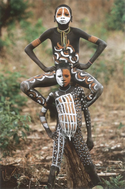
To celebrate and colour the body, ochres and clays are all that was and is needed. Mixed with water, these will -for a little time at least- stick to bodies, to hair. To increase that bond, they can easily be mixed with fat, resin, blood. All sorts of glues, Nature offers generously and were probably easily discovered by men… We can only guess all of this if course since, whether they lasted a day or a life time under skin, they have gone with them. Probably the reason why art history never goes back that far, true art being only lasting art in the critics view of the world. A position most disputed these days…
Had the rock paintings of the Gwion Gwion in the Kimberleys kept their organic binding agents, we would be able to date them. As it is, all traces of how the inorganic ochre (and thus undatable) pigments were technically bound to these cave walls is gone however. The only “precise” datation possible so far, is a fossilized wasps’ nest that was caught between the earth and the walls of a cave when it collapsed. Have you ever wondered what was the point of wasps at all? Well, now you’ve got at least one good reason to be thankful for their existence… as that mere nest has put the date of the earliest works of Australian rock art back to some 25,000 to 35,000 years ago (as a marker earliest Egyptian art is maximum 7000 years old).

Remoteness, specific geological and climatic conditions have thus preserved here or there on the planet some of these “artworks”. Maybe many many more have been created by our ancestors making each of us the legitimate son or daughter of a painter… who knows? The binding medium is gone and with it, usually, the work. We can presume on vegetable juices, animal fats etc. but actually, in the case of these surviving works, the media has obviously not been decisively important to the preservation of the artwork as usually all that is left is the colour maker: the pigment.
I go into the details of each binder (and other additives) in the relevant sections, including all the drawing materials, however most paints and colouring materials are the result of a mixture of –at the very minimum– pigment and a binder of some sort.
- Arabic gum in Watercolours and Gouache;
- Wax and resin in Encaustic
- Wax (mineral or natural) is also found as a binding medium in oil sticks, oil pastels, pencils and crayons
- Chinese ink (better known under the English misnomer: Indian ink) is made of lamp black pigment ground in water with a little shellac dissolved in alcohol to make it water resistant and lacquer like.
- Tempera is the name given to colours which are bound with an emulsion (a mixture of substances, some soluble and some insoluble in water) and stabilized with an emulsifying agent such as a egg or casein glue. Tempera can be made with a variety of emulsions: egg alone, egg and oil, gum emulsions, wax emulsions, even oil alone.
- Oil is obviously the binder in oil paint. These days it is usually linseed oil or –as linseed does tend to yellow a bit– in better brands, stand oil –a sub-product generated by heating linseed oil for a few days at near 300°c– while poppy seed is also used in some ranges for the lighter colours.
- Acrylic resins are a subgroup of vinyls and polymerization of the acrylic acid molecule leads to various forms of plastics. These variations can be dispersed in water, producing a familiar milky liquid. The common name for that product is a “polymer dispersion”. That is the binder in acrylic paint.
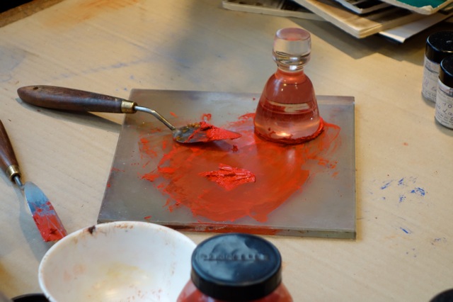 You can make your one paint, you can even make your own pastels. There are some ready made binders on the market or you can go ahead and reinvent the wheel. You will need a muller and a slab, both available in glass in most art stores that also sell pigments. You might need a bit of patience and wrist grease too but the exhilaration of actually making your paint is beyond belief. (If you are making an acrylic paint I would personally begin from a pigment dispersion as that first stage of dispersion in water can be a bit tricky. These are now quite easily found on the market.)
If you want to use these paints as soon as they are done, you should be fine. If you want to preserve them, you might have to really document each paint and pigment you are using… some pigments need stabilizers and temperas rot in a few days for example!
On the whole I would say: “Don’t do it to save money!” Do it for fun, do it to get to know and understand what goes into a paint. Do it for technical reasons if you will too. I have an artist who usually paints a series with the same background colour. He premixes the colour of his choice using pigments and an acrylic binder. It saves him money because he needs such a huge quantity of the same colour and it makes his life easier to start from the same batch each work, giving him too the consistency he craves.
For whatever reasons, go ahead… give it a go!


Recently moved into botanical art and busy exploring watercolours – what a fantastic contribution to my researches and trials – many, many thanks for expanding my knowledge – and now ……. back to the palette and brushes and hopefully some much better images.
This is totally fascinating. I am tempted to print it out in colour as a fabulous text book. Thank you for all your research and passing it on for others!
Feel free to do so or share the blog address and… yes! this one took a really really long time to get together.
This was the single most informative piece of writing about art materials I have ever read anywhere, and well written enough to keep my attention the entire way thru. Thank you. Your blog is something of a miracle of information for any artist -experienced or beginner!
Thank you so much… you made my day!