WHAT?
II. What’s in paint?

You might be surprised that I include supports in our paint ingredients and as the very first one, too, but I have good reasons. This is where it all begins… and, in the end, not only will it have become part and parcel of your artwork but an integral part of the viewer’s experience, too.1 This book, however, is no place to go over all the ‘things’ humans have decided to cover with paint: rock faces and grottos; the Parthenon’s gods; 8000 terracotta soldiers + 130 chariots + their 520 horses + another 150 cavalry horses; kilometres of corridors nobody would ever see in the dark recesses of sealed pyramids; entire cathedral facades; and, on a smaller scale, wooden caskets, turtle shell pill boxes, ivory pendants, stone Christs and plaster Buddhas, mud dwellings, emperor marble busts, glass perfume phials, tin goblets, leather war banners and all manner of animal hides turned into parchments, of rags turned into paper, kilometres of silk, hemp, cotton, papyrus scrolls… the list goes on.
But while pondering this incredible variety of supports, it became clear that what was interesting about them was not the infinite diversity of their materials (although) but rather how they had been used and approached. I ended up putting them into three different baskets or categories, if I dare call them that.
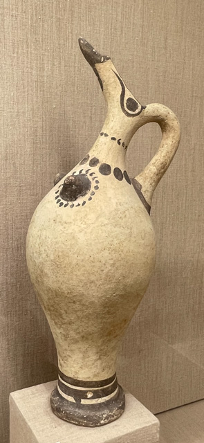
Basket one) If you’re painting a wooden angel, the saints on a cathedral, or an ivory hippopotamus, the artwork’s format and form precede your choice. The finished work is already there; you are colouring it in (sometimes with gusto, as above, and beautiful embellishments, of course) but, at the end of the day it’s still a water jug, an angel or a hippotamus.

Daniel Gonzalez, Linocut
Basket two) If you are given the Sistine Chapel, however, or choose this particular cave or object for an effect you have in mind, that ‘blank’ 3D canvas will, in due course, reveal your vision. Sure, you still have to deal with the given framework (the angles and shape of the structure, the viewer’s experience from below, etc.) and perhaps even a theme, but beyond that context, artistic licence is free to roam. Maybe some of you have even chosen that surface’s structure and shape to enhance an idea or accentuate the feeling that the beasts on that cave’s wall are alive and running (as suggested in the case of Chauvet.) Artists from the above categories will have limited freedom; they’ll have to choose a paint, perhaps even a technique, suitable for the surface they are tackling but, at the end of the day, it won’t just be a cave or a room but a work of art.
Basket three) is the world of free choice… the blank canvas, sheet of paper; the ivory, wooden, masonite or metal board, etc. The size and material of these, primarily two-dimensional, supports are up to you. And while your choice might imply a specific paint, it will be your choice all along. Most supports in an art store will fall into this category.
Why should we even bother about supports? Well… supports, support your paint (obviously, you can’t paint on… nothing), but in another dimension, they also support you and your artistic vision. I would even venture into the idea that they might inspire you. I see artists in my store debating at length with themselves before choosing a canvas: the quality, the material, the size/shape, and I know of many who, before they start painting, will apply an extra layer of gesso or a background layer on them to get a feel for their chosen one… a sort of dance with the yet-invisible in front of the space of the blank canvas.
In the National Gallery in London, I chanced on this quote from Robert Gibbings’ Thoughts on Wood:
“It seemed a lot of finicky gouging to get a few lines that might have been obtained more easily with a pen or brush. But slowly a love of the wood came upon me. I began to enjoy the crisp purr of the graver as it furrowed the polished surface.”2

And indeed, perhaps weirdly to some, a love of a particular support might be why you will choose this or that paint or even technique. My natural inclination will always go to paper vs canvas, so I play with watercolours—without realising for a long time that both materials had more in common than initially seemed. In fact, neither canvas nor paper would have existed where I come from without a plant with a fragile pale blue flower, which they both needed to turn into such different products.
I have acquired a genuine reverence for linen alongside my growing love of pigments. In truth, I’m not quite sure what European artists would have done without that modest one: linen seeds giving us the perfect binder/medium for our oil paints and linen flax from the stems, which can be woven into this sturdy, flexible cloth on which masterpieces have been painted for all these centuries. As a painting support, linen canvas might have its origins in the sails of Venice, as the floating city’s humid atmosphere was not ideally compatible with the wooden panels used at the time. The tiny maritime Republic producing virtually nothing, the sails had quite possibly been spun in Flanders from sturdy ‘Belgian’ linen (to this day the bestest one.) Perhaps it was even exchanged for pigments. One can dream… Yet, wherever linen sails took us on the Seven Seas, these would eventually turn into rags that could be pulped and used to make paper… rag paper. Cennini even describes, around 1400, a soot pigment made from the burning of linseed oil. That recipe hasn’t stood the test of time yet, virtually, and if you only wanted to paint in black, you could get support, pigment and binder medium all from the one plant!!3 & 4
None of that scenario would have come to be without the apparition of oil paint, however, as in that case support and binder quite go hand in hand. Oil produces a much more flexible paint film than tempera (think of dried egg on the side of the plate you forgot to wash as you were in a hurry that morning… it’s stuck to that plate, no doubt, but it’s also a thin and brittle film) and, as a result, oil was better suited for the slight ‘give’ canvas has. So that, soon enough and not only in Venice, of course, the sturdy but heavy and cumbersome wooden panels previously used were replaced by canvas stretched on much lighter frames. (With the added advantage of easily un-stretching and rolling them up, too, if a change of heart or home justified the exercise.)
Most supports need to be prepared to receive paint. Walls were covered with varying layers of lime/sand/plaster mixes to prepare the surface for alfresco painting (traditionally, there were three methods: buon, secco, and mezzo.) Paper is sized (either internally during the pulping process or a top layer is added) with starch, gelatine, or a glue of some ilk, which helps it hold the soaking and repeated wetting from waterborne paints. It also allows the paint to not just sink into the paper, so more colour remains on the surface. Wood panels or canvas are usually first sized (i.e. covered in a transparent glue which fills the grain lines and helps the wood absorb the paint in an even way or stiffens the textile fibres), then primed, and what often does the trick is some variation of gesso.5 Think of that layer as the foundation, the ‘ground’ of your painting (which is why we call them grounds! But also primers or often just gesso.) That barrier between support and paint is useful to both sides. It helps paint adhere to the surface (giving it the ‘grip’ your paint needs) with less flaking or cracking further down the track. And it prevents the support’s possible degradation from the pigments’ corrosive chemistry and, in the case of canvas, the rotting of the fibres from drying oils. Vice-versa, it also prevents wood tannins, for example, from leaching back to the surface.
The recipe for tempera on wood panels and other rigid supports (calcium carbonate, also known as Whiting, in a 10% solution of rabbit skin glue and water) was found too brittle for canvas, so oil was added to the mix (with, often, a rabbit-skin glue sizing before application.) For a more brilliant white surface, Lead White pigment was often added, too. Layer upon layer, each pretty slow-drying… one had to be soooo patient! I don’t think many artists today could bear the wait, and so, when ready-made acrylic-based gessoes (and ready-made primed canvases) became available, they rapidly replaced all the traditional methods.6 &7&8
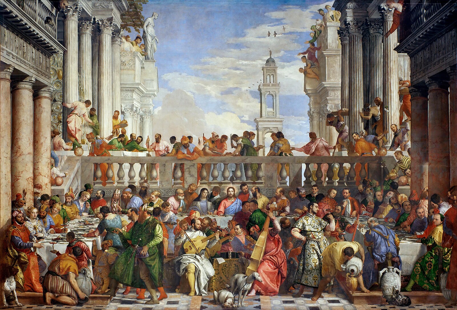
My father once told me that gesso, the word, came from gettare “to throw” in Italian and that gesso had given its name to the Venice ghetto, as the Jewish men of Venice were also its plasterers. Maybe, indeed, their trade somehow gave its name to their area, the first of its kind to be named thus and the first time Jews, anywhere, were allowed to have their own quarters but, researching this, it seems it’s rather from the copper foundry that existed there before the arrival of the Jews, which was known as ghèto. It would be nice to think this awful concept came from an art material and, far more importantly, from freely chosen living arrangements in which the doors closing at night were a mutually agreeable decision, yet nothing seems to confirm this, and most sources derive the Italian gesso meaning now “chalk” or “plaster” quite simply from the Latin gypsum, its main constituent, which makes sense even if its a tad less fascinating. Whatever its etymology, one of the consequences of gessoed canvases was the innovating possibility of producing monumental works—only painted directly on walls before that. Perhaps Veronese’s Wedding Feast at Cana was the most famous first of its kind, a nearly ten by over six and a half meters work (22.2 by 32.6 feet.) It was made of six strips of linen, stitched together as tightly as a sail so that they might appear as a single piece of cloth, which could resist the tempests of… Time! (It did.)
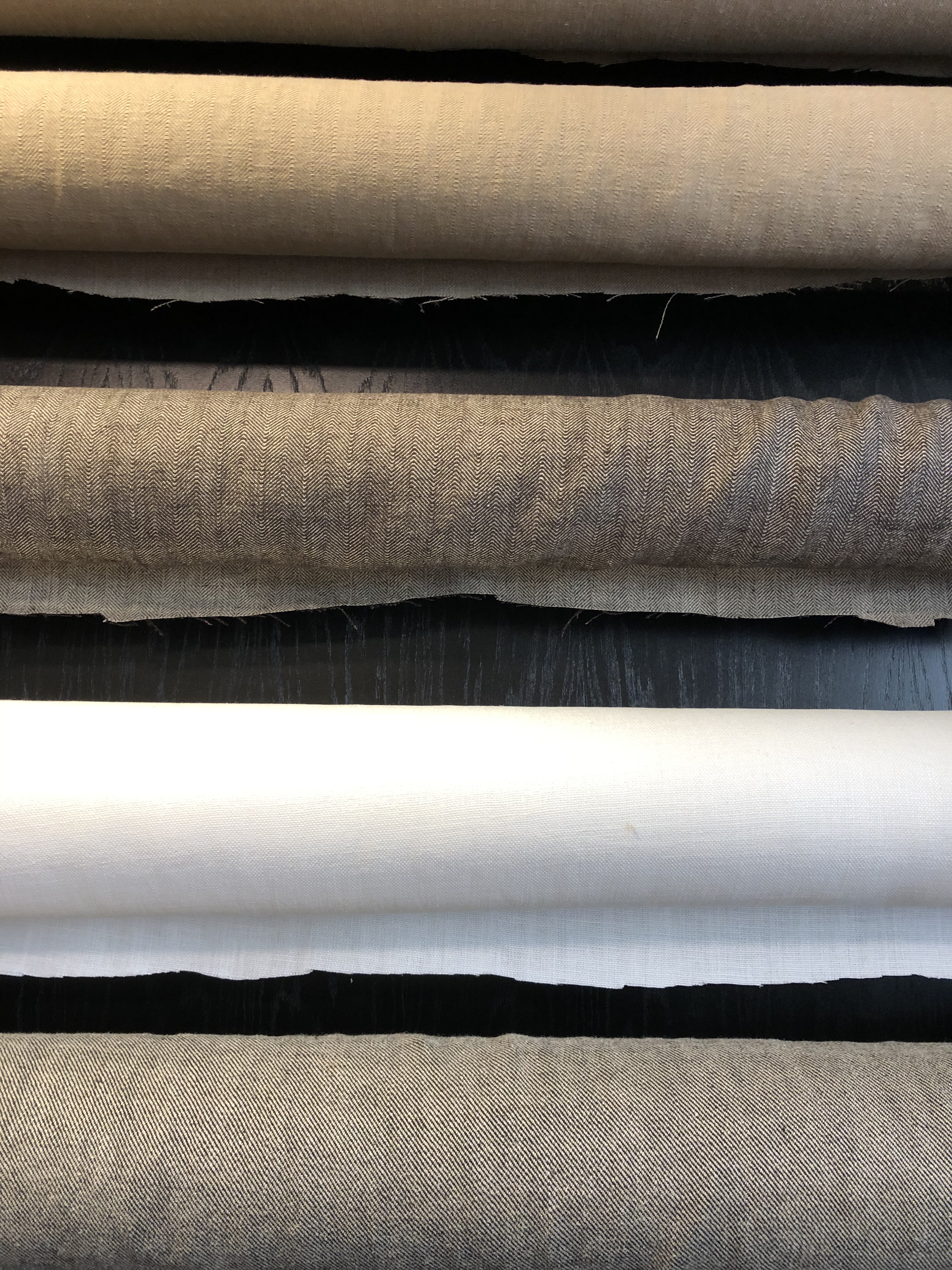
In Western countries, “oil on linen” is still, by far, the most elegant label for an artwork. It subtly conveys that the painter is a ‘serious’ artist… perhaps because he has invested in excellent and expensive materials? (If you really want to impress, and have the means, go for “oil on Belgian linen.”) Acrylic on cotton canvas doesn’t sound quite the real deal in comparison. Both are just fine, of course, and yet there are real reasons some artists still prefer linen. Like your shirt, when moisture is applied (I’m talking about the paint’s oil, not your perspiration, you will have understood), there is a ‘give’ to that textile which is most pleasant to play with. The other advantage is that, when linen dries, it returns to its original stiffness (like your un-ironable shirt precisely.) Flax also doesn’t produce a perfectly smooth surface; its weave creates bumps and streaks here and there, which you will probably still see in your finished painting. Cotton has less… character, we could say. Its weave is regular. But if you want the ultimate smoooooth, go for polycotton, a recent blend material which will give you this.

Brush or scroll painting, as Asian watercolour painting is referred to, was initially done on silk, yet expanded exponentially with the production of mulberry paper as the faster process, invented in China around the 2nd century, allowed such a cheaper product. Papermaking then spread to Japan and Korea, using locally available fibres. When the technique reached Europe in the 13th century, we were still using calf vellum, sheep parchment, and other such animal hides needing lengthy and costly preparations (and yes, a sort of gouache.) Pulped linen rags turned into paper dramatically changed the game. Durer, probably watercolour’s earliest and most famous Western adept, jumped on it, but weirdly, after him and until the 19th century, watercolour on paper was mainly used for sketches, copies or cartoons (not the Walt Disney type, of course.) What helped the incredible infatuation with watercolour was the apparition of machines able to grind pigments finer than ever before and much cheaper papers made with pulped cotton and, later, wood. (It would take us a while to understand the acidity issues inherent to the presence of lignite in wood-based paper and to come up with acid-free paper, however.)
If you are playing with paper, though… it’s quite the same thing as canvas! Today, the best art rag paper is made from 100% cotton and is still elegant. To further the comparison to a garment, it usually comes in three ‘feels’ (the choice is yours): rough (your shirt straight from the clothesline), cold-pressed (after you’ve ironed it with a cold iron… some creases and bumps are still there) and hot-pressed (smooth but… with character, it’s a natural fibre after all!)
There are hundreds of beautiful other papers to play with and… the most incredible names to their sizes, too. I mean, where else could you find, happily stacked together, an Emperor, an Antiquarian, a Grand Eagle, an Octavo, a Half-Raisin, and a Double Elephant (pink, I presume) except in a paper shop or an art store?9 Sadly, this is not the place to talk more about them. Just a note, though, that, amazingly, since it is fragile, paper is also the chosen support for much heavier paints, such as all printmaking ‘inks’ (even if those are now available in water-based rather than the heavier oil-based versions.) But then, the paint only kisses the paper, in one quick impregnation rather than really makes love with it…
You can play with your support… leaving some areas unprimed for that particular effect, for example. Or you can also apply the quite recently available transparent gesso and leave some of the linen’s lovely colour apparent. You can even paint on totally un-primed textiles, too, of course. You’ll simply lose most of your paint, which will sink in the fabric… a technique that was perfected in Japan around the 9th century on silk. Silk has a unique transparency, and so artists have played with painting both sides of the cloth. When it is woven hiraori style— a crisscross armature of warp yarn and weft thread — hues applied to the reverse of the fabric and seen through it will be soft and delicate while those on the front will be enhanced. It also brings an eerie depth to the work. Jakuchū (1716-1800) was a master of this urazaishiki, “reverse colouration” technique, and all his works in The Colourful Kingdom of Living Beings, in which he used both pigments and dyes for different effects in the cloth—solid, layered and textured pigmented areas juxtaposing subtly diffused dyed ones—are among the most exquisite ones Japan has ever produced. Jakuchū even understood that adding a deep grey barrier of bamboo paper at the back of the silk would bring out even more contrast to his colours… talk of interesting layers of ‘background’ painting!

All these traditional supports are still used by artists today. Walls are still painted, even if street art leans more towards the zero preparation of support and use of acrylic paint in a can. Paper, sadly often offered in A4/3/2 sizes only, is still many artists’ happy place. Wood panels have recently had a true revival, while aluminium or even copper panels offer a stable alternative for those who understand the benefits and the joy of a firm surface, while painting on silk or canvas has never stopped. Yet endless surprising new supports exist, and it’s probably safe to say that artists have tried… just about everything by now! So that, up to a point, whatever grabs your imagination goes. (If you prep it correctly, it might even be OK in terms of conservation.)

Just remember that, prepared or not, supports will become an integral part of your work and, apart from the terrifying strappato—a radical procedure consisting of gluing canvas onto a fresco and then tearing it away from its wall—if your support gets damaged, your artwork is often irretrievable. In the same vein, I hope you now understand that buying good supports is money well spent. The foundations of your artwork/house will be sound and durable.
Nevertheless, and even if you’ve done your best, paint is not always happy to adhere to a surface forever. In the end, most paint just gives up, its binder thinned by exposure to rain and shine or decomposed by chemical reactions of all ilks. The little grains of pigments are eventually released—some, simply, by repeated usage and caresses. Pigments are virtually eternal, but the paint wears out. So many cathedrals that were (garishly perhaps) all painted are a beautiful stone grey these days, and the proud, buried army cited above, chariots, horses, warriors and all, lost their 2,200-year-old colourful lacquered layer within the first minutes of being exposed to air! Only in those places where artworks have been looked after, the elements been kind, where the temperatures have been stable, or where light has not penetrated (caves, temples, books) has there been more permanence. Oddly enough, a volcano eruption seems to work too; after all, thanks to two, we are still enjoying both the beautiful Pompeii and Thera/Santorini frescoes.
The culprit is Binder. There are some more or less resistant binders, as we shall now see since the time has come for a closer look at the second (or the first actual) component in our paint duo, the ‘liquid’ Mr Binder, who might not be as flamboyant as the ‘solid’ Ms Pigment but is, perhaps, leading the dance?

Jump to the next section of the book by clicking here
Alternatively click on the Table of Contents to browse the sections.
You can also subscribe to my blog at the bottom of this page,
and you’ll receive Hues in Tubes in your inbox… as it gets published!
Additional information & references
- In fact, when a painting is restored, the back of the artwork is where it starts. Has the canvas become so worn and frail that it needs relining? Do the wood panels need reinforcements? Should the auxiliary supports, such as stretcher bars, be replaced? etc. ↩︎
- Ed Hadfield, J. (1961) Thoughts on Wood, The Saturday Book 21, Hutchinson & Co. Ltd, London ↩︎
- Cennini, C. (c. 1400AD) Il libro dell’Arte, CenLA chap. XXX-VII. Translated by Thompson, D.V.Jr. (1960) The Craftmans’s handbook. New York, U.S.A., Dover Publications Inc. ↩︎
- You’ll even find some linen involved in lino printing, as linoleum, your relief surface, is, in fact, made from pine rosin, ground cork dust, wood flour, some mineral fillers and… solidified linseed oil! (Hence the name, of course.) ↩︎
- Note that you can always add a layer or two of thinned gesso to any paper you choose, and it will accept a reasonable amount of paint. ↩︎
- If you wanted to err on the pedantic side, you might ask the shop assistant for an “acrylic dispersion ground” (its proper name), but then she might not have a clue what you’re after either… Hu, do you mean gesso? ↩︎
- Ready-made primed canvases became available via colourmen in the 18th century but, from what I understand, were still made to order—nothing like the incredible variety of ready-made ones available today in a good art store. ↩︎
- Although there is a certain old-world elegance to the process, which makes some artists still prepare their canvases in that way, acrylic-based gessos, being more flexible, are now recognised as better grounds regarding the longevity of the artwork. You can also paint on acrylic with acrylic paint! (And, of course, Titanium White has replaced Lead White… a good thing for everyone’s health!) ↩︎
- Want more funny paper size names? Check this out: https://en.wikipedia.org/wiki/Paper_size. But do not mention to me these horrid declensions of A0 (A1/A2/A3, etc.) that just don’t work for artists, even if I understand well that these no-waste sizes are perfect for papermakers and their equipment. ↩︎
Discover more from in bed with mona lisa
Subscribe to get the latest posts sent to your email.

I love your “essays” I’m not a painter but an art historian, but I start to think about “why I should not paint?”
love Katty
Oh thank you, that’s so nice to hear… both that you’re enjoying what I write AND that it might prompt you to paint!! (I highly recommend it, it’s one of the most delicious (albeit at times maddening) things to do… let me know how you go!