WHEN?
Pigments in History
A few years ago, the art world received this shocking piece of in-news one morning: Vantablack, an exciting new black pigment that had been all the buzz, had just been ‘bought’ by artist Anish Kapoor for his exclusive usage. A new colour is cause for much celebration and, by that, I mean a new pigment, of course. Because Ha! “to hear never-heard sounds, to see never-seen colours and shapes”, as Dejan Stojanovic suggests1, that would be the day, would it not?
Still, a new pigment is fun, and what artist would not rejoice when she hears of the birth of a new particle enriching the collective colour space… collective being the bone of contention in that case, of course! Nevertheless, we’ve been quite lucky recently. Blessed with a novel blue, YInMn, which potentially has an entire hue family up its sleeve, we can also play with a new pink—courtesy of another artist, Stuart Semple. Just call it ‘PINK’, pronouncing the caps (if you know how) to emphasise that it’s not just one more rosy shade… but the PINKest of all pinks. Buying it does come with a pledge, however: 1) that you are not Anish Kapoor; 2) that you are not affiliated to Anish Kapoor; 3) that you are not buying it for Anish Kapoor or an associate of Anish Kapoor… Stuart Semple’s way of giving AK a “taste of his own medicine!”

Without even going into the sophisticated technical side of ‘making’ a new pigment, you surely agree that excitement and a little protocol around the birth of one is the least we can do, so you will not be surprised at all to hear that putting one to rest might require a bit of decorum too! Because, did you know that while some pigments are born, some also die? Present at the scene in their London home as the nephew of the Burne-Jones’ (and I wouldn’t presume to recount the following episode better than him), Rudyard Kipling describes: “He [Burne-Jones] descended in broad daylight with a tube of Mummy Brown in his hand, saying that he had discovered it was made of dead Pharaohs and we must bury it accordingly. So we all went out and helped—according to the rites of Mizraim and Memphis, I hope—and to this day, I could drive a spade within a foot of where that tube lies.”2

Alas! Alas! Not all defunct pigments get such a grandiose burial. But then Mummy Brown was the only one made of body remains so perhaps the exception comes from kin compassion! Most pigments discreetly fall off the shelves, in fact slowly replaced by better, cheaper, less toxic alternatives…. and, overall, that’s a good thing, except when they result in tragedies such as was prompted by the appearance of synthetic indigo or madder, which deprived so many of their livelihood.
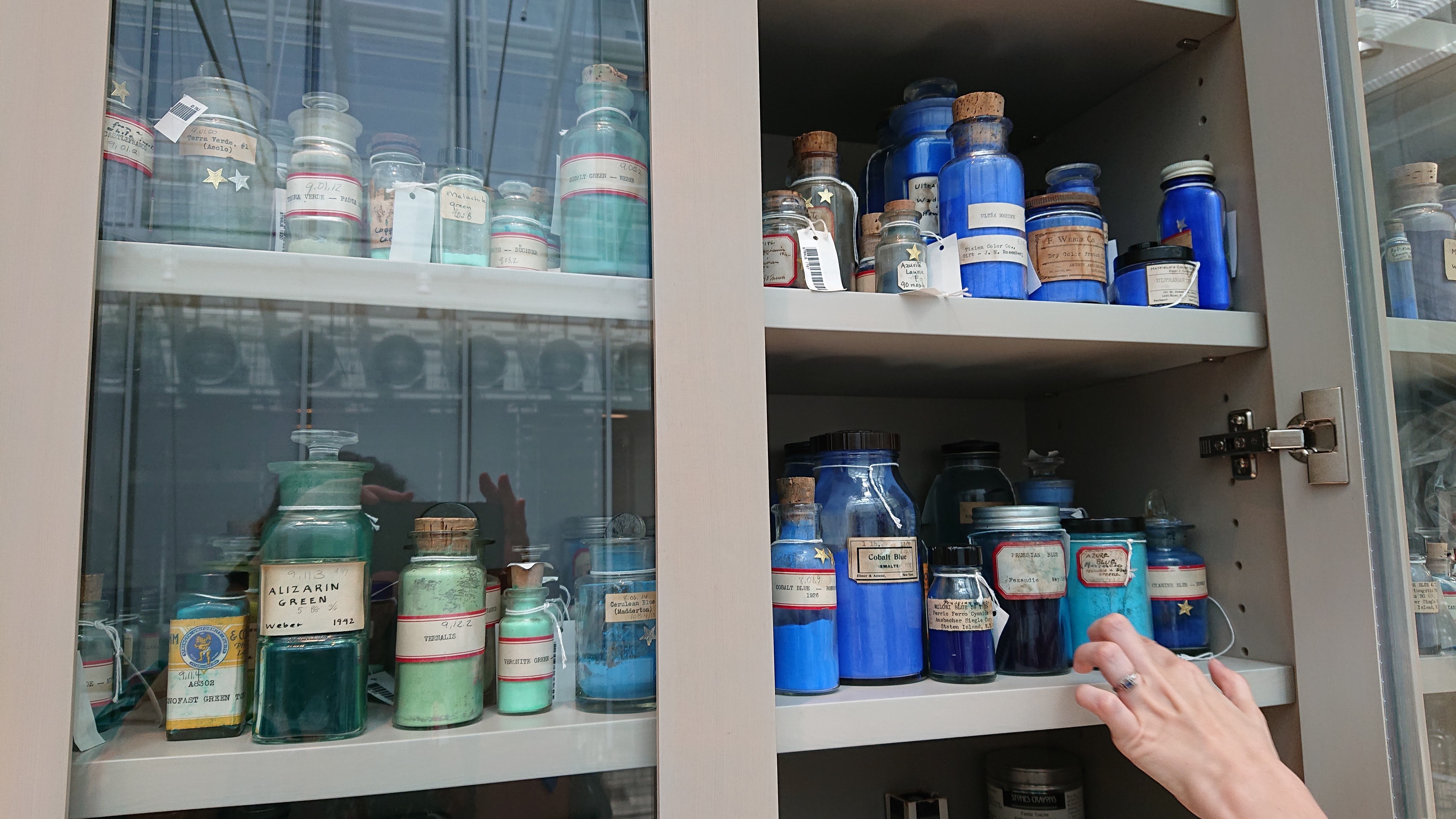
Sometimes, we run out and have none of that pigment left on planet Earth, and that’s an appalling thing; maybe not on par with a species becoming extinct, but not so different either. Sometimes, a civilisation crumbles, and we forget the recipe (Egyptian Blue), or the production of Tyrian purple for the Byzantine empire ceases, prompting Western royalty and clergy to decide on another colour to represent them asap. Sometimes, too, the arrival on the scene of a new binder makes a pigment redundant—it behaves poorly in that medium. Some pigments also fall out of fashion, like the yummy Quinacridone Gold produced mainly for the automotive industry. When the manufacturer saw the demand drop, he immediately warned Daniel Smith that he had decided to cease production. But that was one of the watercolourists’ favourites… what was Daniel Smith to do? He bought the remaining lot and kept artists happy for many more years. Until recently, when he, too, had to give up on the original formula as stocks had run dry.
We are at the mercy of much more substantial colour players, and we can cry, we can miss those colours bitterly, but as very few pigments are made by art paint companies, there’s not much else we can do. Enjoy the few exceptions, perhaps? Winsor still produces their sought-after Rose Madder genuine and sells it for a little fortune as a result—granted, it’s not easy to make that one. Natural Pigments still grind their pigments to their chosen particle size with happy results, such as the same pigment giving you two rare hues and their additive, filler, and stabiliser-free paints giving you a feel for a traditional painting experience. While Daniel Smith turns into watercolour paint a remarkable array of pigments extracted just for them…. just for us!
It has always been the trademark of that company, which considers itself “a pigment company… that makes paint”, to send their mineralogist on journeys by plane, jeep or even mule (they boast!) to some mighty remote locations to identify high-quality veins of newly found ores and buy entire cargo loads of these IF they can be turned into a usable paint. Because and it might be obvious, but it’s still a huge gamble every time. And, as a paint company, you cannot afford to run out of that rare pigment once you’ve put it on the market. After sourcing, testing and producing, consistency becomes your next obsession, and it is highly unlikely you will ever again find a similar vein of that shade of Zoisite, Diopside, Jadeite, Sugilite, Serpentine or Pipestone. It also happens, more often than not, that when that diamond, silver or gold mine (which revealed inadvertently that other mineral of interest) is abandoned, it will get flooded, and so you have to buy the whole vein when you chance upon it. An investment you might sit on… for decades!
So in random ways, for better, for worse, some pigments are born, some pigments die, and I will soon walk you down memory lane. It’s not strictly necessary to know when a pigment existed or if it’s still around, but I hope you can afford this little detour and are not too much in a hurry to get to the more technical stuff, as it’s a pleasant walk.
Before I take your hand for that stroll, I owe you first an apology, although there is not much I can do to rectify the premises I function from. I was born in Paris, France, which, as all French people know, is not only the centre of France (technically it is not) but also the centre of the world (which definitely it isn’t.) As a result, I have this more than déjà-vu Mediterranean-centric timeline and banal knowledge of art/art history. Found in a basket not far from where the famous hanging gardens of Babylon would hang some twenty-four centuries later, ‘civilisation’ grew and became more refined over the centuries of coded Egyptian rule; then the Persians took over, the Minoans and Phoenicians played a part, but eventually, it was the Greeks who assimilated and ‘elevated’ it to the top of their marbled temples, with the Romans finally gobbling up the spoils. After their demise, sure, there was the glorious Byzantine period. Still, it is often forgotten in favour of a sad tale of centuries of darkness and gloom falling upon ‘us’ until Light shone again in a Cistercian scriptorium somewhere on our blessed shores. From there, it’s all rock & roll with a new type of vault invented every other century and, if still a bit on the static side, the whole world really beginning to dance when a Re-naissance came about in places that mostly didn’t have a naissance in the first place but hop the Flemish Primitives, hop Florence, Venice, Naples and its cascade of Masters, hop the Loire valley and its castles, hop the glorious painters of Germany, hop the Americas and its wealth pouring into lands previously poor as… After that, we can breathe again and watch a couple of centuries go by at a more relaxed pace—not to say they didn’t contribute artworks and some measure of ‘civilisation’, of course. However, one Prussian blue day perhaps, or in any case over a very very short time (considering the before timeline), we are hit by a train; we can turn a light switch, get our teeth whitened and check our followers every other minute.
As, all of us, now, do.
But that never was and still isn’t the whole story. There are people living today in mud dwellings with no modern appliances whatsoever, and yesterday, brimming with life and creativity, there were men and women in China, India, Indonesia, Australia, Peru, New and old Mexico, on some Pacific islands, in Mali and Botswana, collecting pigments and clays, making paper and brushes, with which and on which they would carve, sculpt, model, erect, and paint, yes, paint too of course. I know too little about these people, and learning more about their art materials is arduous. Books, research, and conservation seem mainly preoccupied with documenting over and over again the achievements of ‘my’ world to the quasi-eradication of any other civilisation through, if not disdain, at the very least gross neglect.
Although, to be fair, that is changing, and restorers and conservators are now engaging with the materials of artworks in novel ways. Rather than classifying works solely as coming from this provenance or that dynasty and made from this or that raw material, they are keen now to observe a fingerprint here, a struggle with the “pen” there or engage with the possibility the artist ran out of paint and had to remix (not quite the same hue) to finish the job. Details like these bring us so much closer to those craftsmen and women, and I thirst for information coming from other “intelligent” hands and eyes who, as the original artists did, take the time to engage and feel. Learning in this way was a privilege offered to me when I helped my mother with some unimportant part of massive paintings or while climbing scaffoldings to bring more plaster, more cottonwool and the like. Still, I was too young (and then mostly uninterested) to take it in, to understand what I was manipulating and seeing. So that, sadly, and even if I’ve tried to add here or there the morsels of information I’ve come across from other cultures, I can only contribute timelines and materials reliably evidenced in books and museums…

During my MA, I decided to begin my enquiry on pigments by choosing, then sourcing and finally producing a timeline of pigments. But the “line” in the timeline did not suit me. For one, I visualise pigments better on a colour wheel, displayed in their hue niche, as rings of outwardly expanding chromatic circles. Also, I wanted to show what was available to us at the start, and the contribution of each epoch, to visualise how our time has dictate our colours… and their chroma too!
In these six time circles3, I introduce pigments in order of apparition in the hands of a painter. (Choosing that definition excludes when it might have been used earlier as a dye or a glaze.) Either a datable artwork/production testifies of this or, in the case of more recent pigments, when it is known to have been available to artists, i.e. commercialised rather than invented. As you will soon see, there are many occurrences of quite a long time happening between the discovery of a pigment and its usage/availability.
It’s a simplification of facts, as graphs tend to be, but it seems to offer a richer interpretation than other representations, so hopefully, this will compensate for that. (Munsell would probably not be very impressed either as, despite Modern hues having much higher chromas, which should, in his system, expand them out of the sphere, they are contained here.)
I chose 88 pigments for my timeline—70 at first, but that left out too many essential contenders. The number 88 also seemed to subtly give an ∞infinity∞ taste of all the hues possible despite not differing in chemical composition enough to merit another Colour Index number (or from the combination of these) and, too, in the variations available in a pigment’s family, which I could not show. Some did have two entries, however—such as Cadmium Yellow and Cadmium Red—as the availability of both pigments offered artists unmatched new colours on their palettes. (Similarly, I included a natural pigment and its artificial counterpart when both were true revolutions for the artists: Cinnabar/Vermillion, Lapis/Ultramarine, Madder/Alizarin Crimson, Malachite/Green Verditer, Azurite/Blue Verditer.) Still, I could not represent the entire Quinacridone family (as much as I love them all) for fear of crowding the forest so much, one couldn’t see any tree!4
Beginning our exploration from a historical perspective so that you meet at least a few pigments5 (and, in my view, the most important) before we jump into their characteristics does mean that some of the information shared might still be a bit obscure. I apologise for that but the horse and the cart in all this made it sometimes hard to decide what needed to come first! (All will be explained at some stage, of course, and you can return to this section later if you are interested.)
Jump to the next section of the book by clicking here
Alternatively click on the Table of Contents to browse the sections.
You can also subscribe to my blog at the bottom of this page,
and you’ll receive Hues in Tubes in your inbox… as it gets published!
Additional information & references
- In his beautiful poem Task of a Poet. [Online]. [Accessed 11th December 2024]. Available at: https://www.dejanstojanovic.info/task-of-a-poet.html ↩︎
- Pinney, T. (ed) (1990) Rudyard Kipling: Something of Myself and other Autobiographical Writings. Cambridge University Press, Cambridge, UK ↩︎
- Six time-circles definitely reflecting Mediterranean-centric history as each of these periods often brought about new materials while others were discarded. ↩︎
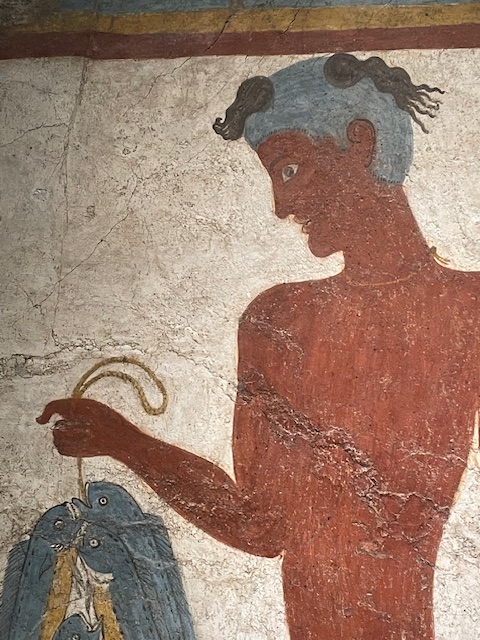
- Not only is it heartbreaking to exclude some of them, (I simply had to), but then you discover a new art pigment!! Glaucophane was used, as well as Egyptian blue/frit, in the stunning Minoan frescoes of Thera (Santorini), so said the legend in the little Santorini museum. (I love it when the pigments used in artworks are listed in a museum.) I had never heard of it! It’s beautiful too… bluish? greyish? greenish? Hard to decide. Something reflected in it’s Greek name: glaukos, sky-blue/bluish-green (depending on sources) and phainestai “to appear”. (Later, Wiki explained to me that this mineral pigment exists only here and there on our planet, including the Cyclades Islands of Greece, which explains how it ended up in an artwork there… unlike others, didn’t have far to go!) ↩︎
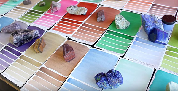
- Every pigment will tell a bit of its story and is introduced with two photographs: in its pigment state and as a painted swatch (gouache) on Khadi paper. (That handmade paper is quite textured and, as you’ll see, some glassy or rebellious pigments do not perform ideally on it.) ↩︎
Discover more from in bed with mona lisa
Subscribe to get the latest posts sent to your email.
