WHEN?
Pigments in History
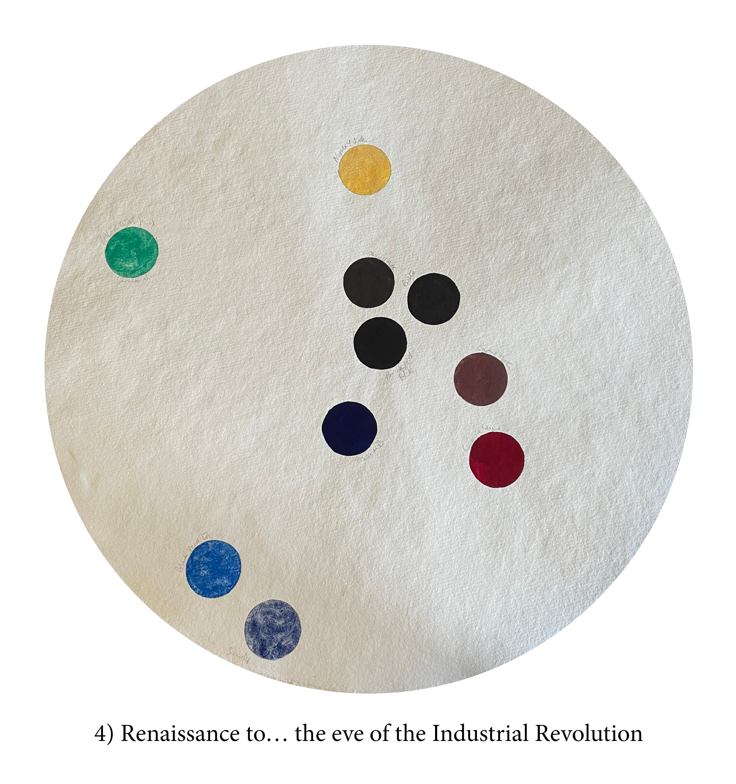
The fourth circle
You might be surprised at the number of centuries/art periods I have chosen to group into this circle. Yet, compared to the astonishing explosion of new pigments in the previous centuries, the Renaissance/Baroque/Classical/Romantic periods can hardly claim but a handful. I’m not debating the number of masterpieces produced during those centuries, of course, but merely being Pigment’s advocate.
The English painter Richard Wilson (1714–1782) is even famous for saying when told of a new pigment: “Too many colours already.” So, maybe that was a prevalent feeling then. After all, despite some colour spaces not being very rich yet, if you flick back, I suppose you’ve got your basics covered. (I’m greedy, so I don’t count.)
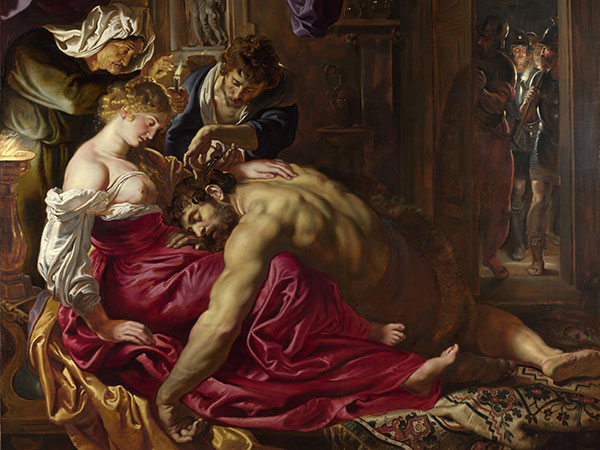
Maybe, though, the whole thing is Cennino Cennini’s fault! The early Renaissance Ralph Mayer’s how-to bible on painting, Il libro dell’arte, was not only a book about brushes, pigments etc. but a true How to… just about everything! Instructions for underpainting faces with Terre Verte1, choosing this colour for that effect, ageing a varnish, or even drinking moderately so that your hand would not waver seem to have influenced most artists of his time and beyond. Although others had preceded him, those earlier manuals often concentrated on pigment-making and dyeing techniques, while Cennini’s imperative recommendations were somewhat more artistic, which, maybe, set in stone certain practices and preempted the need to look or demand for more… everything!

In truth, the main change at that time was the more or less permanent and mighty switch to oil painting. That binder did exclude a few pigments, which did not perform as well in it but, on the other hand, allowed ease of mixing, blending, glazing, etc., which opened up many more options with the remaining pigments as was possible earlier in other binders. The time had come to hone techniques and tweak medium recipes rather than add colours. Perhaps, too, as the standard of living increased, sophisticated banking systems emerged, and the discovery of new shipping routes expanded the world, resources previously dear or inaccessible landed on painters’ palettes and then, over time, artists increasingly relied on these pigments, and local recipes and knowledge receded.
Kermes and Lac, however, were no competition for the red brilliance of the New World’s cochineal. Nor could any previous pale yellow compete with the density and opacity of Naples Yellow genuine. Often nicknamed Giallolino, and so confused with the earlier Lead Tin Yellow, the pigment was, in fact, Lead Antimonate Yellow. Both yellows were most important during those periods, but for some reason, and we have no clue why, painters gave up the stable and lightfast lead-tin one in the middle of the 18th century. The pigment slipped quietly into oblivion until some two hundred years later when it was identified in one, then many other paintings from the 13th to the 18th century.
Despite all that’s been shared above, a very mellow industrial revolution did happen during the 16th and 17th centuries. As often during the later Industrial Revolution, other processes needed for entirely different productions would bring new options to the palette. As a result, these were slow and inconsistent in reaching the artist. Nevertheless, glass making provided a good supply of Smalt; nitric acid, used in silver-refining, brought on Blue and Green Verditer (synthetic Azurite and Malachite), while sulphuric acid, used in textile bleaching, opened the door to synthetic iron oxide pigments, such as Caput Mortuum.
And, of course, another revolution was in action too. Not that Antiquity had not considered painting as a liberal art, the Greeks and Romans educating their young people in the intricacies of the palette along with writing, geometry and music, but during the Medieval period, painting was truly relegated to a craft, a manual skill of little social standing. Renaissance painters were out there to reconquer and further enhance that social position, so perhaps downplaying their craft’s technical and material aspects was part of the ploy. For some, who sought perhaps even a mystical transmission from the Divine world, materials were far too… material.
Disegno (the craftsmanship of drawing), said the Florentine painters, was infinitely superior to Colore, a mere colouring in of the exquisite lines drawn by the artist. While the Venetians retorted that if “In nature, light creates the color; in the picture, color creates light”2 and that the creation of ‘light’ was the true pursuit of the artist, putting him, if not on par, at least in the league of The Creator itself. This oversimplifies the arguments, and, as both Disegno and Colore end up using pigments and paint, I could dismiss the case. Especially since what was at stake for both sides was, primarily, the recognition of the individual’s talent and the unique signature of the creator, which would classify his/her works as Art. The slight condescension for materials implied here, especially by one team, was nevertheless a true shift we still feel the consequences of. Even, perhaps, paying the price of—despite however peculiar this debate, which raged for centuries bringing no resolution to either camp, might seem to our eyes nowadays. (And I’ll let you have a guess at which of the two options was considered the feminine one… Colore? Disegno?)

Yet along the way, it is obvious not only that painting became recognised as an art, but indeed, it became what we think of first when we hear the word Art. (Apologies to writers and musicians, yet both might be fine with the concept of their work as a craft, but doubt those into geometry would feel any offence at not being thought of as artists… today!)
Would you be interested in having a look at
and read a little story about the eight pigments in my fourth circle?
Click here
Jump to the next section of the book by clicking here
Alternatively click on the Table of Contents to browse the sections.
You can also subscribe to my blog at the bottom of this page,
and you’ll receive Hues in Tubes in your inbox… as it gets published!
Additional information & references
- As can be seen below in Duccio’s Annunciation in which, sadly, the rosy tones of the complexions, not being lightfast, have all but faded leaving the Terre Verte underpainting… and a rather sickly looking angel and Virgin Mary. ↩︎
- This is a contemporary quote from American artist Hans Hofmann, 1880 – 1966, but I found it summed up the case nicely. ↩︎
Discover more from in bed with mona lisa
Subscribe to get the latest posts sent to your email.
