WHICH?
Pigment Characteristics
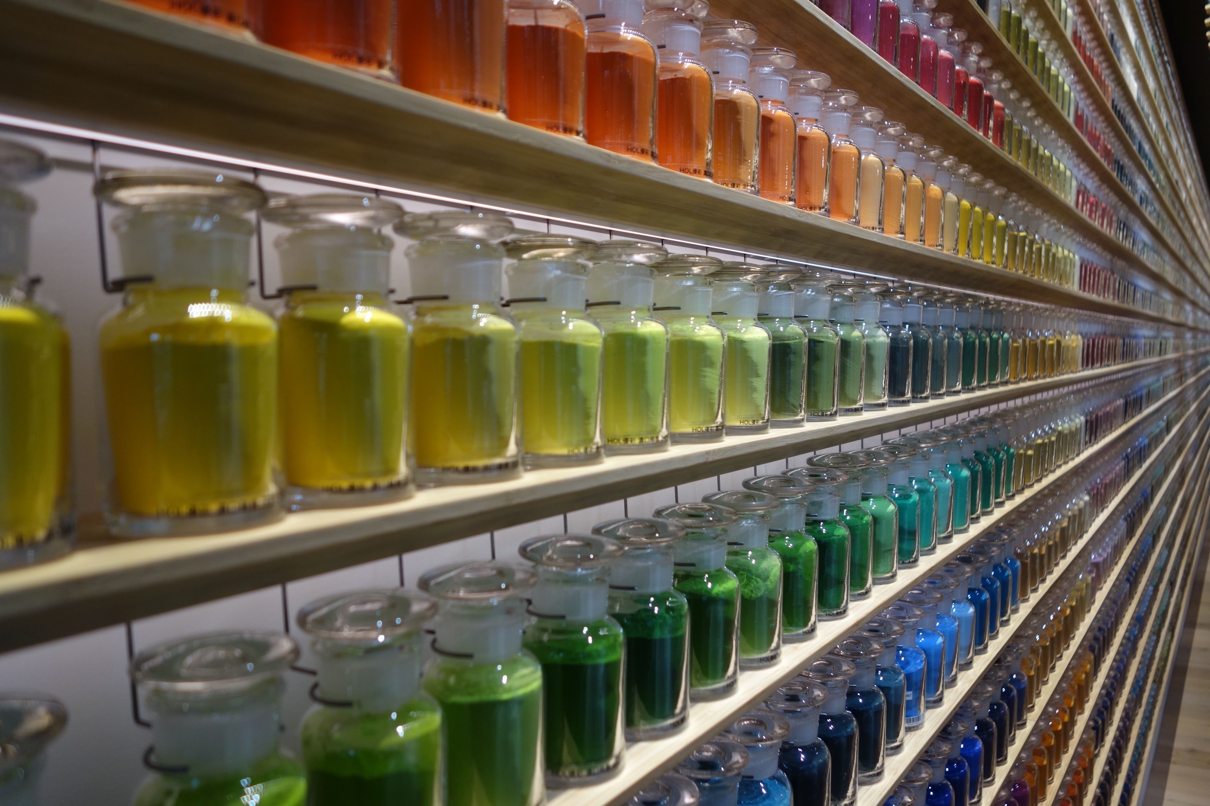
I think it’s now time to introduce you in-depth to some of the kids in this class. Because, when you see them neatly stacked in similar little jars on shelves, it is hard at first to comprehend, besides their variety of hues of course, what powerful and different chemistry is sitting there looking sweet and innocent. (Nothing could be further from the truth as what’s important here is invisible to the eye.) Yet take the official class photo, release them into freedom, and the pure energy of their composition will soon display their singularities.
In his Naturalis Historia, published c.77A.D., pigments were classified by Pliny the Elder as either native or factitious, depending on their provenance and, more subjectively, as either florid or austere.1 My beloved ochres belonging to the native and austere categories, of course, and the fiery Red Lead most certainly to the factitious and florid (you could probably guess that from its name!)
But today, when to be perfectly described even mayonnaise seems to need
“six dimensions of appearance (colour, colour intensity, chroma, shine, lumpiness, and bubbles), ten dimensions of texture (adhesiveness to lips, firmness, denseness, and so on), and fourteen dimensions of flavour, split among three subgroups—aromatics (eggy, mustardy, and so forth); basic tastes (salty, sour, and sweet); and chemical-feeling factors (burn, pungent, astringent)”2
are you surprised to hear our artistic colouring agents needs quite a few classifications and categories too?
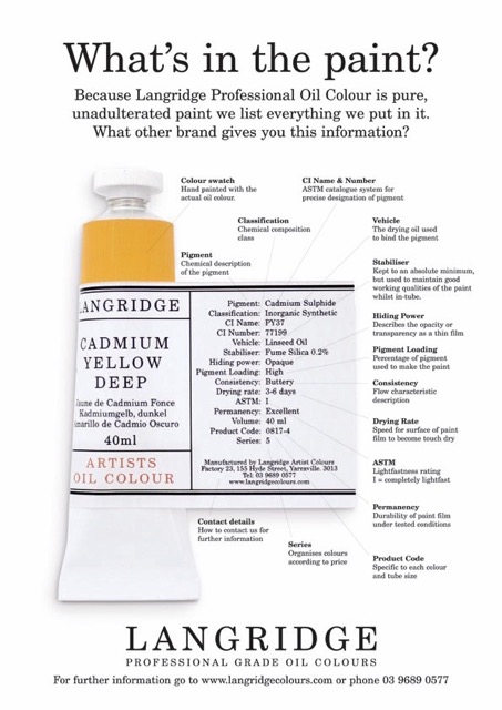
One often hears of organic vs inorganic, of transparency vs opacity, of lightfastness and permanence. Most paint tubes from good companies tell you about these characteristics, which might help… if these words mean something to you!
At first, most were obscure, to say the least. Then I found out the list was way longer…
1) Vivacity of tone,
2) Sensibility to light,
3) Mixing permanence,
4) Covering power,
5) Colouring power,
6) Siccativity,
7) Suspension power,
8) Fineness,
9) Compatibility with other pigments and techniques,
10) Resistance to bad weather,
11) Stability in high temperature,
12) Toxicity,
13) Weight,
14) Density… and that’s not even mentioning if they are Historical pigments or Modern ones, if they are cheap or expensive, glossy or matt, gritty or silky. The list could go on and mostly did not resonate with me much, although the terms are more obvious. Most artists would probably not even see the point of knowing any of this if it adds no benefit to their practice, and yet, understanding the implications of your colour being organic, for example, could be most relevant to its possible tinting strength or opacity, and certainly doesn’t mean you should consider it safe or edible!
Still, some of what follows are simply classifications that might interest you or not. It’s intellectual knowledge and not needed to paint better or at all. While other categories come from observation and point to distinctive pigment traits in this or that binder (as binders can impact pigment behaviour.) These are truly useful to painters, and knowledge not so readily accessible or easy to understand sometimes. Having walked the miles to answer my questions and those of artists, I will now try to share some of my understandings in the most simple, hopefully even amusing way… as I’ve often found the interest of painters in serious books about either materials or Colour to be somewhat slim! (Hopefully, my sharings will not be too technical either, for those who read this out of curiosity about an art material’s journey rather than use paint themselves.)
Before we go into the specifics, however, there is one premise I’d like you to keep in mind throughout all that follows—it might even help you understand why no two paints are quite the same or behave in the same way, even if their hues are very similar, even if they are made by the same company, in the same quality. (Great news: the culprit is not you… it’s them!) So there goes the only rule about pigments: There are no pigment rules. You cannot generalise anything about them. While some pigments are… this, some pigments are… that, and while some might be both, some might not even be this or that! You don’t believe me? Read on…
Jump to the next section of the book by clicking here
Alternatively click on the Table of Contents to browse the sections.
You can also subscribe to my blog at the bottom of this page,
and you’ll receive Hues in Tubes in your inbox… as it gets published!
Additional information & references
- “Florid pigments (floridi colores) which were bright in colour, rare, expensive and frequently supplied by the employer or house owner. Examples are minium or red lead (vermillion), armenium (azurite), chrysocolla (malachite), cinnabaris (a plant resin from dracaena or dragon’s blood), indigo and Tyrian purple.
‘Austere’ or sombre pigments were dull common earth pigments such as ochres, green earths, chalks and the synthetic compound known as Egyptian blue.
Pliny, like Theophrastus, further subdivides the two main groups of pigments into ‘native’, meaning naturally found, and ‘factitious’, meaning synthetic.” [Online]. [Accessed 2 February 2025]. Available at: https://edu.rsc.org/resources/roman-commerce-in-pigments/1959.article ↩︎ - Malcolm Gladwell, Blink, The Power of Thinking without Thinking, p.85, 2005. Allen Lane, London, UK. ↩︎
Discover more from in bed with mona lisa
Subscribe to get the latest posts sent to your email.

One Comment Add yours