WHICH?
Pigment Characteristics
Lightfastness!1 Don’t we love the word nowadays? Every company assures you of it, and most painters question it too. They have perhaps not even given a thought about their art surviving into the next decade—forget century—but in our precarious world, it has become the #1 quality of a paint, it seems. Hence one which should be clearly defined and practical to understand, you would imagine…
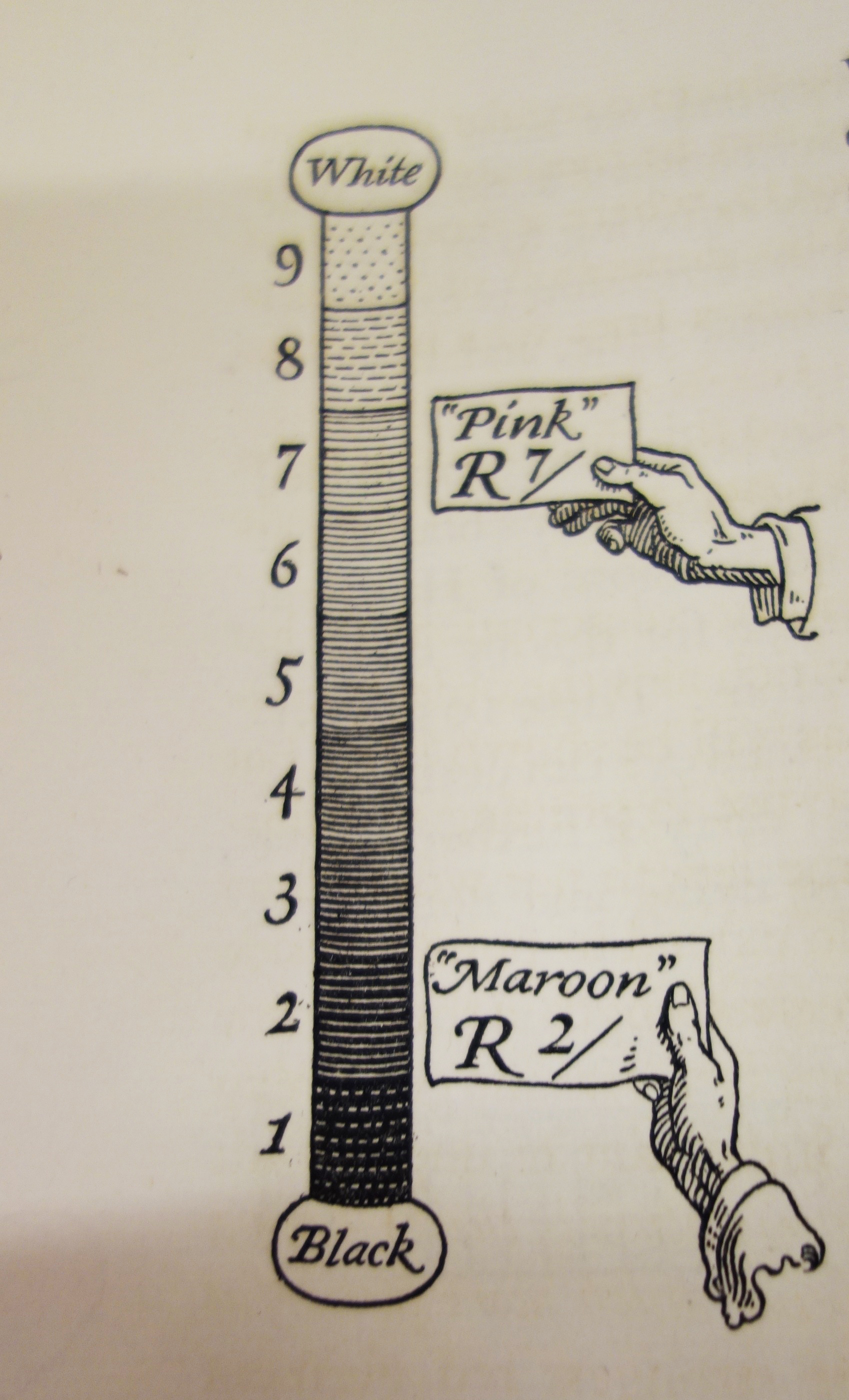
I’ve noticed virtually no one can remember if 10 is black or white on the value scale, and lightfastness notations seem to provoke the exact same confused panic. I am regularly asked if “I” means it’s artist quality or if “III” is the better one. Being higher, it could seem like a superior rating. And, of course, and as ever, it depends on which system you are reading at the back of your tube. If the tests have been carried out by the ASTM, the American Society for Testing and Materials, III is actually poor! However, if you are looking at three *** on a Holbein tube that refers to “absolutely permanent colors”, yet on a Schmincke tube that’s only average lightfastness, and you’ll need to hunt for five ***** to be sure that colour is “extremely lightfast.” Please do not confuse either III with (iii), which on a Winsor and Newton tube means that acids can bleach it or an acidic atmosphere, while only AA will guarantee you an “extremely permanent.” AA, haha, don’t these guys understand we’re all getting a bit older every day and already have so many passwords to remember?
OK, to be fair, and despite paint manufacturers outside the U.S. possibly all having their in-house testing methods we usually know nothing about (have they even been tested and how?) and rating symbols (which vary from brand to brand), these companies in order to please the crucial American market, often add the ASTM rating as well on their tubes these days, which helps I suppose.
As with everything the Society tests, ASTM tests are carried out by a dedicated group of volunteers—made up of anyone concerned or interested from the industry in question. In our art materials case (ASTM D01.57), scientists, chemists, painters and paintmakers are usually on board, but you can attend if you will. You can vote only if you are a paying member, however. Lightfastness tests consist of accelerated ageing tests which try to reproduce (both by direct exposure to intense sun in dry and humid conditions and mechanically in a Xenon arc light chamber) the equivalent light exposure the pigment would be submitted to over a hundred years in museum conditions. Artworks are hardly ever treated so kindly, but it’s at least some reference. Paint samples are read by spectrophotometers rather than against the dyers’ system of old, the Blue Wool Scale, although sometimes, if rarely, you find BWS on tubes of paint (and, of course! it’s the opposite in that system where 8 is fab and 0, extremely poor, haha.) Changes vs the unexposed paint swatch are measured and consequently, an ASTM D4303 rating of I to VIII is given, with only I and II deemed suitable for artists.2 Easy? Yes, it is, and it’s better than nothing for sure, but… but… but…
for 1) the pigment tested back then might be quite different from the one used today. Pigments are modified over time for various reasons, usually linked to other industries’ needs. Yet paintmakers use that old ASTM result and… pass it on.
for 2) from one pigment manufacturer to the next, there can be quite substantial differences in how a given pigment is produced, with impacts on its final quality. Yet paintmakers use the technical information provided by the manufacturer and… pass it on.
for 3) ASTM lightfastness ratings are, in fact, not the result of measuring changes in masstone but of what happens to a pigment when it is weakened a) by a wash down in water in the case of watercolours b) when tinted with white in the case of oils and acrylics. An exact mix ensues to reach as close as possible to a 40% reflectance tint—that percentage being the amount of light reflected back to your eyes. In acrylics, Titanium White is used, from the same brand as the pigment tested. In oils, it’s a slightly weird ASTM ‘recipe’ of, by weight, 39.5% blanc fixe or barite, 30% rutile titanium dioxide, 6% zinc oxide and 2% aluminium stearate milled in safflower oil. Ha, you might say, but a different white then could change everything and, sadly, I have to inform you that… it does! This is also when we begin to suspect/worry that adding two pigments with a rating of I, might not even give you a guarantee that the mixture will earn the same score… and, sadly, that’s the case! For example, a Prussian Blue oil paint (PB60/ASTM I) mixed with a Titanium White (PW6/ASTM I) will turn into an ASTM II lightfast mixture. With Flake White, it’s only a IV mixture, but (surprise!) in the ASTM mix, it does really well. Things get worse…
for 4) even the binder modifies the lightfastness of a pigment. For example, Alizarin Crimson is usually rated II in oils and IV in watercolours. ASTM ratings take the binder into consideration, of course—and they have different standards for acrylics, oils, resins and alkyls—but that’s something you should know and not take for granted, so double-check the tubes if you switch mediums.

All of the above means that from one paint manufacturer to another, the ‘same’ pigment, let’s say Hansa Yellow PY 73, might vary in lightfastness. Because it could have been somewhat differently produced and might be in a differently formulated polymer emulsion and reacting differently to a slightly different Titanium White.
And this is what they recently noticed at Golden Artists Color when they randomly retested some of their pigments—as these incredible guys restlessly do. The following three pigments performed well and as expected in oil and watercolour paint. In acrylic, Hansa Yellow opaque PY74 passed the test and still deserved its ASTM I rating but Hansa Yellow Medium PY73 and especially PY3, Hansa Yellow Light, came back with shocking and worrying results. The lab then went down three paths. The first one was to research if the pigment manufacturer had, at some stage, modified its processes. It had. They had slightly modified the size of the pigment’s particles a few years prior. The second avenue they pursued was to test all the brands available on the market, producing acrylic paint with PY3. The differences between 12 brands using the ‘same’ pigment were incredible. Only one received the “Excellent I” accolade (which all brands dutifully print on their tubes… according to ASTM). Another one got a “Very Good II.” Eight were only a “Fair III”, while two were even given a “Fugitive IV”. They had also wondered if the white used (in each case the same as the brand tested) could impact the results significantly, so they had duplicated the test using their Regular Gel gloss in its stead. Defiantly the pigment preferred the gel…
Golden then took the only decent (but probably extremely costly) decision and researched some more until it could offer a substitute for these two colours in their ranges: Benzimidazolone was the winner. More significantly, perhaps, they then reformulated with the new yellow pigment all their mixtures that had used PY3 and 73.3
So in fine , what are we to do, us poor mortals, when even professionals confronted by such an incredible number of variables can’t possibly ever test them all? (Above experiment required exposure of 3,000 separate applications on primed aluminium cards!) We could do our own testing of the colours we like in the brands we enjoy.4 Not so easy but doable, I suppose. We could turn to more time-tested pigments. All the Earth pigments have at least proven their lightfastness, and most of the historical ones too, and we are pretty informed on their performance over time.
We could also decide not to care about posterity and accept that some of our colours will dull and shift under our very eyes. Van Gogh, always the romantic, was well aware of the issues of the new pigments of his time: “All the colours that Impressionism has made fashionable are unstable,” he wrote to his brother Theo in 1888, adding in another letter later that “paintings fade like flowers.” Yet this is hardly an option for most professional artists who usually want their works to be around for a while—even if they cannot resist a new colour when it comes on the market and opens a whole new colour space. No more than Van Gogh could resist that new Geranium Lake or Golden Yellow Lead Chromate, could Rothko resist Lithol Red, nor artists in the 1960s resist the fluorescents when they hit the market (nor today for that matter) even if their drawbacks are well known. Alas, the geranium faded, Rothko’s Harvard paintings have shifted beyond recognition (or restoration), and so have all these fluoros. Still, they are fun to use and exciting while they last.
However, I really think that before going into total LAD5, there are a few things we can do. To begin with, we should praise and support with our wallets those companies that genuinely test their pigments… this might encourage those who don’t to do so. We could also ask serious paintmakers worldwide to kindly agree on testing standards and stick to them so we could trust our mono-pigmented paints. (While we’re at it, let’s also beg them to find a universal rating language we could easily understand and remember.) After that, I don’t know… maybe we leave the mixes of pigments to the gods (perhaps all of them up there on the Parthenon?) because, really now, we’ve only got this one life that we know of and so much painting to do!
Jump to the next section of the book by clicking here
Alternatively click on the Table of Contents to browse the sections.
You can also subscribe to my blog at the bottom of this page,
and you’ll receive Hues in Tubes in your inbox… as it gets published!
Additional information and references
- Lightfastness measures how chemically stable a material is when exposed to light / UV radiation (about 10% of the total solar radiation output.) In scientific terms, a chemical reaction called photo-degradation happens when light hits a surface. This is when the chemical bonds between the molecules alter or break, causing fading or a colour change. The longer it resists, the more lightfast it is. ↩︎
- Where lightfastness ratings have not been obtained according to ASTM test protocol, “N/A” is used. In those cases, data from pigment manufacturers and an appropriate description assigned under permanency is sometimes available from the paint company. ↩︎
- Read the whole story here: https://justpaint.org/hansa-update/ ↩︎
- For suggestions about making your lightfastness tests, go to this altogether fantastic website, informative and reliable: https://www.handprint.com/HP/WCL/pigmt9.html ↩︎
- Lightfastness Anxiety Disorder is the title of a very clever blog post by Louis L. Bispo [Online]. [Accessed 2 February 2025]. Available at: https://sunsikell.wordpress.com/2011/05/01/lightfastness-anxiety-disorder/ ↩︎
Discover more from in bed with mona lisa
Subscribe to get the latest posts sent to your email.

One Comment Add yours