WHICH?
Pigment Characteristics

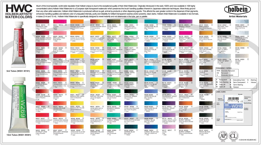
OK, we need a break from ‘serious facts’, so here’s this classification, a bit of trivia on the side. Thought I would share—not to mock—the confusion of the beginner holding his little piece of paper and desperate to find some colours on the list. I have no idea why they’ve made it so hard for him, but yes, Yellow/Brown/Red Oxide, Burnt Sienna, Raw Umber and a few others do not sit where, by hue, they belong. Most paint racks will start with the yellows and proceed naturally to the oranges, reds, violets, blues and greens. Then the Earth colours, displayed in a second mini colour wheel, will roll out again the yellows, oranges, light browns, etc. These natural ochres and oxides are interrupted, however, with (and look, nothing against them per se but are these entitled to be stacked with the ‘true’ Earth pigments?) sometimes Naples Yellow (this ancient one, combining heated lead and antimony, is today a hue, usually a mix of Modern synthetic pigments, but always was an artificial pigment); sometimes by Quinacridone Burnt Orange (an entirely synthetic pigment); usually too with Caput Mortuum, Mars Orange, Mars Brown, Venetian and Indian Red (which are artificial iron oxides), and Van Dyke Brown, which will vary in composition from paintmaker to paintmaker yet always incorporates at least some measure of Earth pigment.
The last rack mainly tidies up the loose ends with a display of greys, blacks and whites. (White doesn’t always like to show off its nothingness, though; so sometimes Zinc, Titanium and other mixing white paints jump the whole queue to end up… first in line!) If available in the range you are looking at, all the unusual new ones—the metallic, iridescent and interference colours, plus the fluorescents—will close the list.

This said, if you are buying a delightful tube of Japanese watercolour, beware that their ranges begin with deep red, then after a declension of reds turns to orange, then yellow, then green, blue, but after the violets, what do we find? The Earth colours too.
I don’t mind Earth colours being separated from the rest of them, I question why tis all and have found no answer. Also, the fact that it’s inconsistent and that many of those said “Earth colours” are now boosted with modern organic pigments makes the whole thing even more confusing. OK, it’s a tradition of sorts, but…

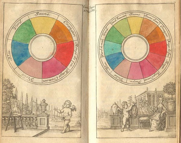
Yet, to go back to our confused beginner who might have just bought the colour wheel on his list, we’ll have to warn him that things might be going the other way! Most printed colour wheels on the market today go round “anti-colour-clockwise.” A personal opinion that, but for me stacking paint tubes on racks all week long, one that became a genuinely annoying detail. So yellow’s at the top of them wheels, but then, surely, we should proceed clockwise to orange and not to green unless, perhaps, we’re Japanese! Also, so many colours are missing on the wheels: the browns, pinks, black, white and it’s, of course, because these lack a dimension. In a 3D colour space, things are a bit more coherent and realistic… but go explain to a beginner that he’s looking at a map of the world, not a globe! And not even a very round globe at that, as maximum chroma differs for the different hues, making all these bits stick out, as Munsell quite rightly understood. Quite a different vision, you must agree…

I now must apologise to Japanese paint companies1 and admit my narrow-minded Western mind led me astray. Of course, one (blue? red?) day, I finally understood that their system has a logic to it (while ‘ours’ doesn’t). It begins with the highest electromagnetic waves we can perceive, i.e. reds at 700 nanometers, then gradually their stands walk down the spectrum via the oranges, yellows, greens and blues to end up in the lowest frequency, violet at 400 nanometers. Why do they do it that way rather than ascending, i.e. begin with violet, I have no idea, but Gosh! Can’t we agree at least about that?
During my meanderings in the art materials world, I came across Richard Frumness, the charming entrepreneur-artist behind the R&F oils sticks and encaustic company. For Richard, the colour wheel should be… squarish and friendly! For one, he thinks linear stripes on racks are not the go as they do not help artists. When colours are displayed in a grid format, with greens not too far from the teals and close to the blues, it only makes more sense. It’s more about kinship than formality… This is how their ranges and charts are set up—even their delightfully messy help-yourself pigeon-holes in the workshop space of their factory (Is messy even the right word, I now wonder? Maybe intuitive or organic are better ones.) In front of it, Richard shakes his head: “I don’t know how this got to be so crazy, but it’s terribly crazy”, and that seems to sum up the whole colour adventure for him!

So, maybe we, too, should laugh at the whole thing and take it with a pinch of pigment…
Jump to the next section of the book by clicking here
Alternatively click on the Table of Contents to browse the sections.
You can also subscribe to my blog at the bottom of this page,
and you’ll receive Hues in Tubes in your inbox… as it gets published!
Additional information & references
- And apologies to the rainbow too (that somehow got it right, haha.) ↩︎
Discover more from in bed with mona lisa
Subscribe to get the latest posts sent to your email.
One Comment Add yours