WHICH?
Pigment Characteristics

There was a time, not so very long ago, when the effort, skills and raw materials used in the making of any object were intrinsically valued. Regardless of the beauty or how impressive the final product was. An intricate, well-knitted sweater you would wear for years even if it scratched a bit. A painted Madonna where the artist had used lapis-lazuli for her gown, gold for her halo and carmine for the seat on which she sat was esteemed for the richness of the materials as much as for the delicacy of the lady’s appearance and appreciated, de facto, as a treasure.
We have changed in that regard.
Most of us, I would also venture, are pretty unsure of the actual value of anything these days! The man sitting on the plane next to you could have found a ticket much cheaper than yours, his tee-shirt could be worth 100 dollars (it does have a brand name on it so… perhaps?) or 5 dollars (if it’s a ‘fake’, or the logo in question is just a supermarket’s brand) but its real worth? Who knows? So much so that when beginners venture into a ‘proper’ art store (you know, those that smell interesting) and discover that some colours are more expensive than others—professional paints can have up to nine series—they really are astonished. Plus, last time they bought a bunch of paint tubes at the dollar store, they were all the same price, right?

Yet yellow ochre (abundant on the planet, accessible, can be used virtually as is) and gold (rare, difficult to extract and process) would hardly cost the same. Why is this not obvious anymore?1 In fact, I believe the art shop might just be one of the very last stores where you’ll get your money’s worth. And, while you might still feel like lamenting at the till, in truth, we’ve never had Colour this cheap or accessible before. When painters needed to travel to Venice or Florence to buy the pigments to execute their commissioned altarpiece, certain pigments were listed as part of the contract, they were so dear. Moreover, when they arrived, the naive could be sold an inferior grade of lazurite or, even worse, Ultramarine ash, the lowest quality blue. They might even be robbed of their precious goods on the way home! Many a boat has thus been lost to the Pirates of the Caribbean (mostly, in fact, English ships with Crown approval attacking Spanish fleets for their precious colour cargo!) So, yes, times have changed.
But even today, despite advanced production methods, there are still considerable differences in the price of pigments, usually dictated by their rarity or the sheer costs and complexity of production. Above Ultramarine, now labelled Lapis lazuli genuine, didn’t gain the nickname “the diamond of all colours” only for its sparkling effects (seen only in the crushed stone variety and under the microscope.) In 2020, top-quality lapis pigment retailed at one of the best suppliers at 1,640 euros, before taxes, for 100grs. In contrast, the same quantity of its synthetic replacement, the Ultramarine in your tube, went for 3.60 euros! Even without venturing into the rarefied or near-obsolete pigments, some families of colours are produced with costly elements. Separating the metal in cadmium and cobalt ores is an expensive process. Compounded with sulphur and selenium (Cadmium Yellow and Red), zinc (Cobalt Green), tin (Cerulean Blue) or aluminium (Cobalt Blue), these then need to be fused. In the case of Cobalt Blue, for example, it takes ten hours in an oven at 1100ºc, another expensive procedure. So it isn’t surprising that 100grs of happy artist quality Cobalt Blue costs $16.50, more than five times the price of Ultramarine in the same catalogue. Even in the case of organic pigments produced from crude oil, a cheap starting point, the process involves many steps, sometimes up to 20 syntheses, and may take up to months (even if pigment manufacturers usually do not perform all of these). So, that’s the first consideration.
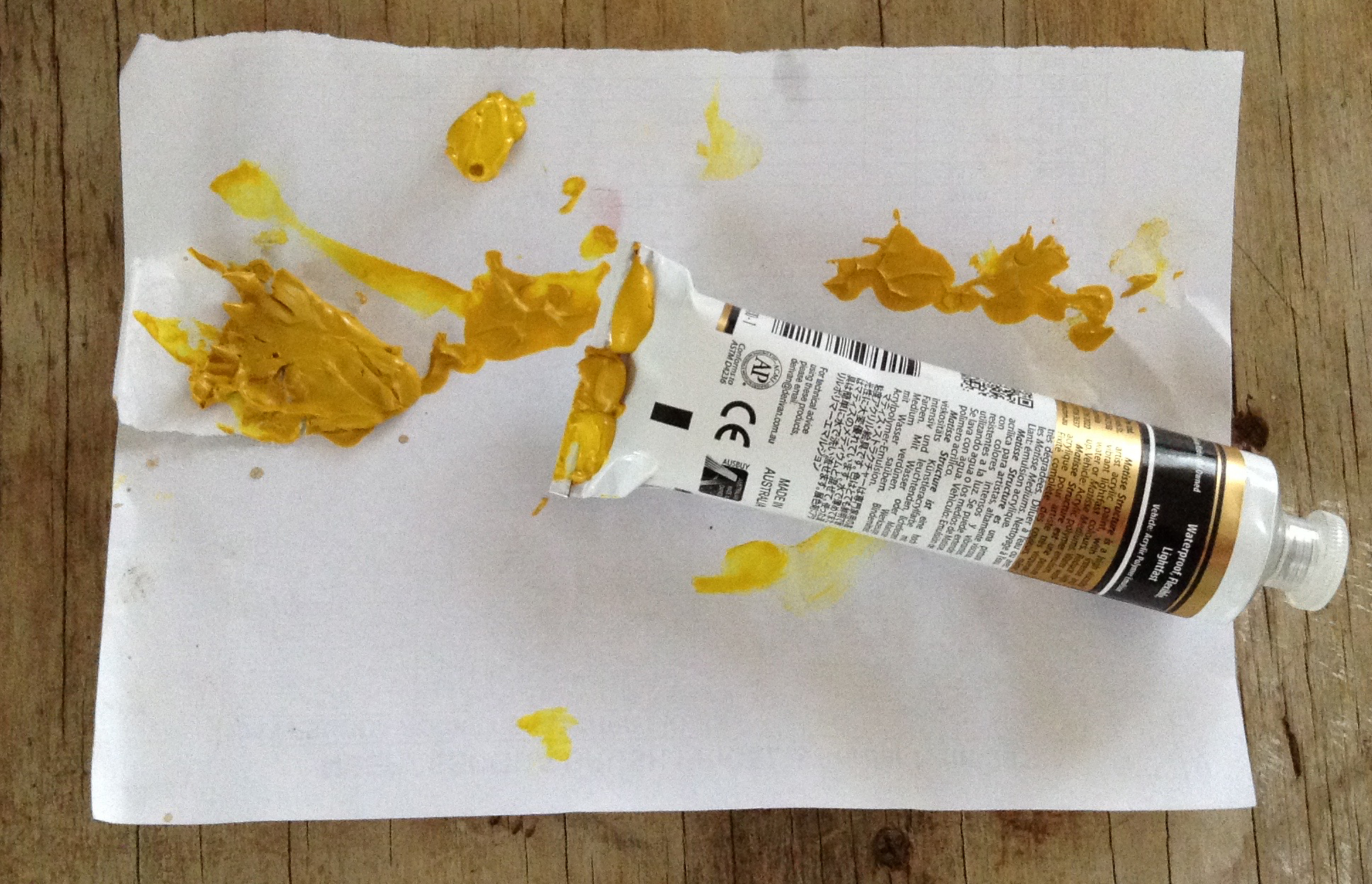
The second is the time it takes to make paint. In good factories, it’s longer. And longer yet for some pigments which need more time to be wetted, more passes in the mill to be adequately coated, etc. I say good companies because the cheaper brands skip some of these steps without any consideration as to your problem as an artist if each and every pigment particle is not entirely separated from its friends and coated with the relevant binder (these clusters can explode in bursts of very unwelcome colour!) Also, some pigments’ ongoing quirks might imply an ageing period. One day in my store, I discovered a tube of Aureolin had exploded its mustardy yellow on all the racks and tubes below it. The sheer force of the active chemistry going on in there had managed to push back the triple crimping at the bottom of the tube and ‘liberate’ the paint. I immediately checked the other tubes, and they all looked similarly near bursting point, while the 250 and 500ml plastic tubs in the same acrylic company were literally round instead of square! They apologised and swapped them kindly for me… only for it all to happen again a few months later. Aureolin is banned in that range in my store, but it’s a shame, as probably all the paint needed was a little ‘rest’ before being tubed.
Same with many pigments in oil. Exhausted after the passage in the triple mill, they seem quite subdued then, but if tubed immediately after, paint with no stabiliser will often separate. (Waxy stabilisers are frequently used to prevent this, but these can degrade your paintings further down the track.) Pressing a tube and squishing out only oil ain’t charming, but dealing with the hardened colour left at the other end of the tube isn’t much more fun. So either to minimise or even totally avoid stabilisers, an ageing period of a few days to weeks is usually the way to go. And, of course, Time is money, and Space is money—your money. Better companies are also more rigorous on consistency, take further precautions to avoid minor issues, and regularly conduct numerous tests of all ilk. (Can’t help but share this hilarious list I came across on Golden Artists Colors’ website: “We bend paint, freeze paint, heat paint, peel paint, scratch paint, scrub paint, soak paint, stain paint, stretch paint, and give paint “suntans”.) And so, yes, some companies search and research new options/products/pigments ceaselessly, and this is what you pay for and get your true money’s worth for.
So far, all these differences between pigments define them but have insufficient implications to justify investing your hard-earned cash, you might think. Well, to start with, if there are still some costly pigments in today’s tubes, it’s for the obvious reason that nothing cheaper has quite rivalled their beauty or usefulness. “On ne marchande pas avec l’immortalité”2 Guyton de Morveau concluded in his report on the advantages of Zinc White (more expensive at the time) over Lead white, so perhaps you feel the same, that haggling about the price of pigments vs the immortality of your works is not worth it but… there could be other good reasons to pick an expensive one.
You might be fooled at first by the similarity of, say, a Naphthol Red and a Cadmium Red, but if you go on to use them, you will soon notice that their handling properties, opacity/transparency, shift in hue when mixed make them very different paints in actual fact. I’m not saying that this difference will matter to you, but maybe, on the day you win the lotto, you could give Cad a try (or even Lead White!!) and discover for yourself.

There’s another tricky difference, this time between ranges, not so easy to notice but as essential to understand. Because of the extreme disparity in tinting power between one pigment and another, student-grade paints often take low-tinting colours as their starting point and bring the quantity of pigment down (and the amount of fillers up) in the other colours to match this one. In a way, for the apprentice, it makes things easier; every colour handles more or less the same. For craft, for fun, for kids, it’s absolutely fine. For anyone wanting to study painting and learn the true nature of pigments and paint, it’s about as absurd to buy these as for a woodworker apprentice to buy a set of plastic tools. (Another personal opinion that one, but, in truth, you are still paying a fair amount of money for… fillers, i.e. virtually nothing!) Decide whether that makes sense to you, but my dividing line is to be confident I can achieve what I aim without questioning the quality of the paint, brush, canvas or paper I am using.
Without hitting total rock bottom quality, however, there are some cheaper grades of paint that reliable paintmakers have developed and that your purse might force you to try. I see no other reason to use them. Labels should help you know what you’re getting into. Artist/finest/extra-fine/super fine define top-quality paint. Professional or fine is usually one step down and, two down, you’ll find student quality with all colours offered at the same price. That paint is made using cheaper or less pigment, and if produced by reputable companies, these can still be OK. Gamblin, for example, is transparent about making its 1980 student line with as much care but precisely 50% extender pigment to 50% of the pigment load in its artist colours. They also try to find an extender pigment with qualities (opacity, transparency, heaviness, etc.) matching those of the pigment they are replacing.

A little warning too that, were you in the mood to make your own paint, ensure you are buying artist-grade pigments. There are considerable variations in the quality/price of the ‘same’ pigments on the market, so beware! If after small quantities, you are sure to find them in any good art store, and more significant amounts can be ordered more cheaply. These higher quality ones might still have attributes, such as particle shape and size, dictated by requirements from Industry rather than by Art’s, but there are more significant differences than that in quality, which would be impossible to detect if you were ordering them online, for example.
In a globalised world such as ours has become, it is actually a challenging task for paintmakers to make sure they’re buying good quality pigment and even professional companies share they have to be ultra-cautious these days when picking theirs. So, weirdly, maybe things haven’t changed much since dishonest Venetian vendecolori sold you second extraction quality Oltramarino!3
Jump to the next section of the book by clicking here
Alternatively click on the Table of Contents to browse the sections.
You can also subscribe to my blog at the bottom of this page,
and you’ll receive Hues in Tubes in your inbox… as it gets published!
Additional information & references
- Even Pliny the Elder reports that “cinnabar (mercury sulphide), a costly alternative to red ocher, was so desirable that a maximum price was established by law. In fact, cinnabar was twice the cost of Egyptian blue, and Egyptian blue—made with copper ore imported from Cyprus heated with lime and an alkali—was four times as expensive as yellow ocher. Pigments derived from the plant and animal kingdom could also range in price. Pink was produced from the root of the Rubia tinctorum plant, but purple was far more expensive since the murex necessary for its production in antiquity could be produced only from a specific kind of carnivorous sea snail. Black, commonly made from soot, was a popular background color for many of the grand rooms of Pompeii, yet Pliny also mentions expensive black pigments, including one imported from India.” [Online]. [Accessed 2 February 2025]. Available at: https://www.pompeiiincolor.com/theme/process-materials-and-making ↩︎
- One doesn’t haggle with immortality! ↩︎
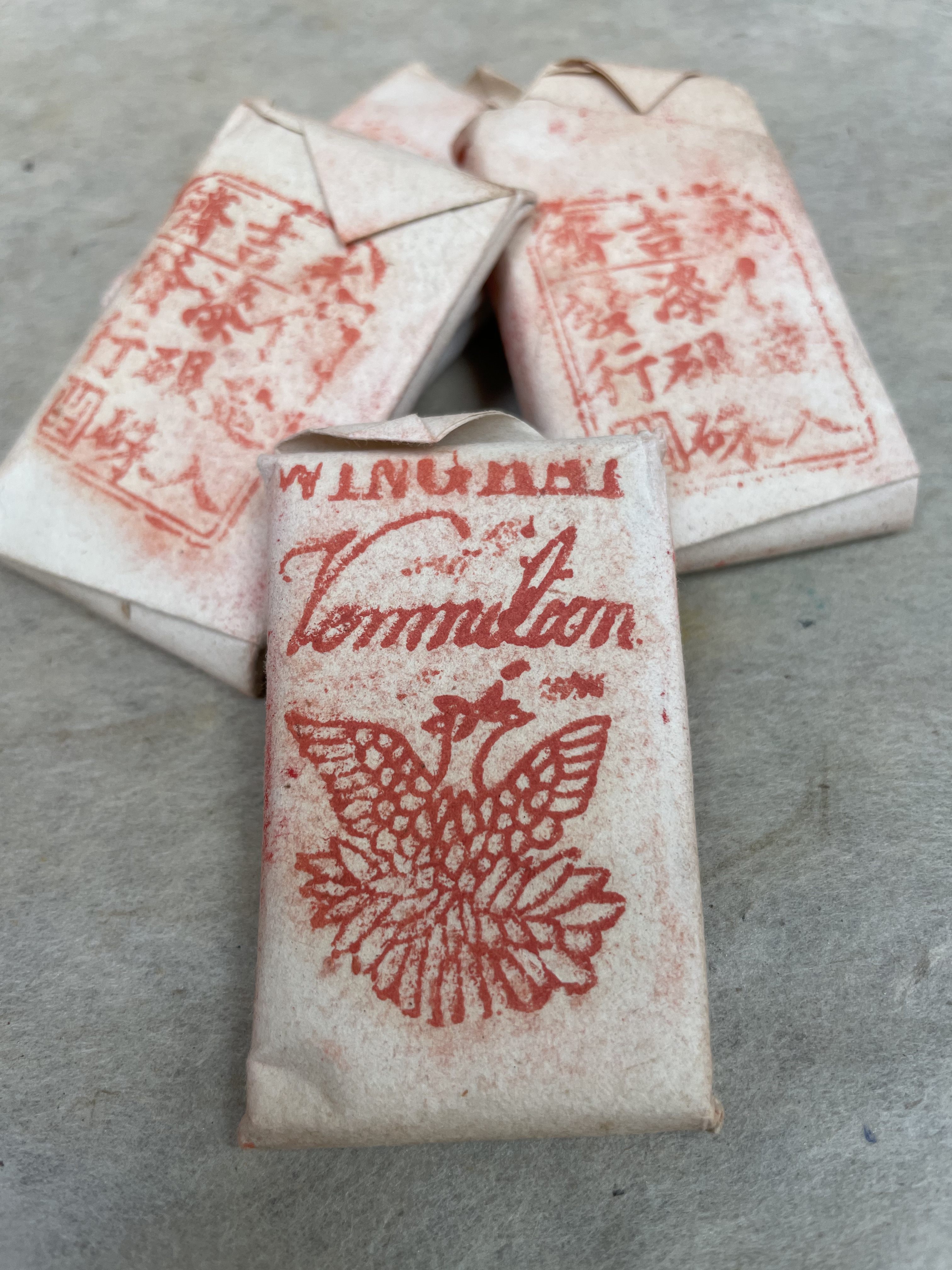
- From the 18th century, Chinese Vermillion was imported into England, and its reputation grew to the point that ‘fake’ little packages of 14 ounces of the pigment (presumably English vermillion inside, which was poor) with Chinese characters printed on them began to circulate everywhere… So who’s to say if these delicious little ones I found in Cornelissen’s archive are genuine Vermillion? Probably the only way would be to try making some paint with it! ↩︎
Discover more from in bed with mona lisa
Subscribe to get the latest posts sent to your email.

One Comment Add yours