WHICH?
Pigment Characteristics
There is a famous question every kid in France has heard in his childhood, which goes thus: What is heavier, a kilo of feathers or a kilo of lead? The kid (not quite aware of the difference between weight and volume, which at five is quite understandable) usually answers lead. What’s weird is that this confusion seems to remain with most of us into adulthood. Or at least, me.
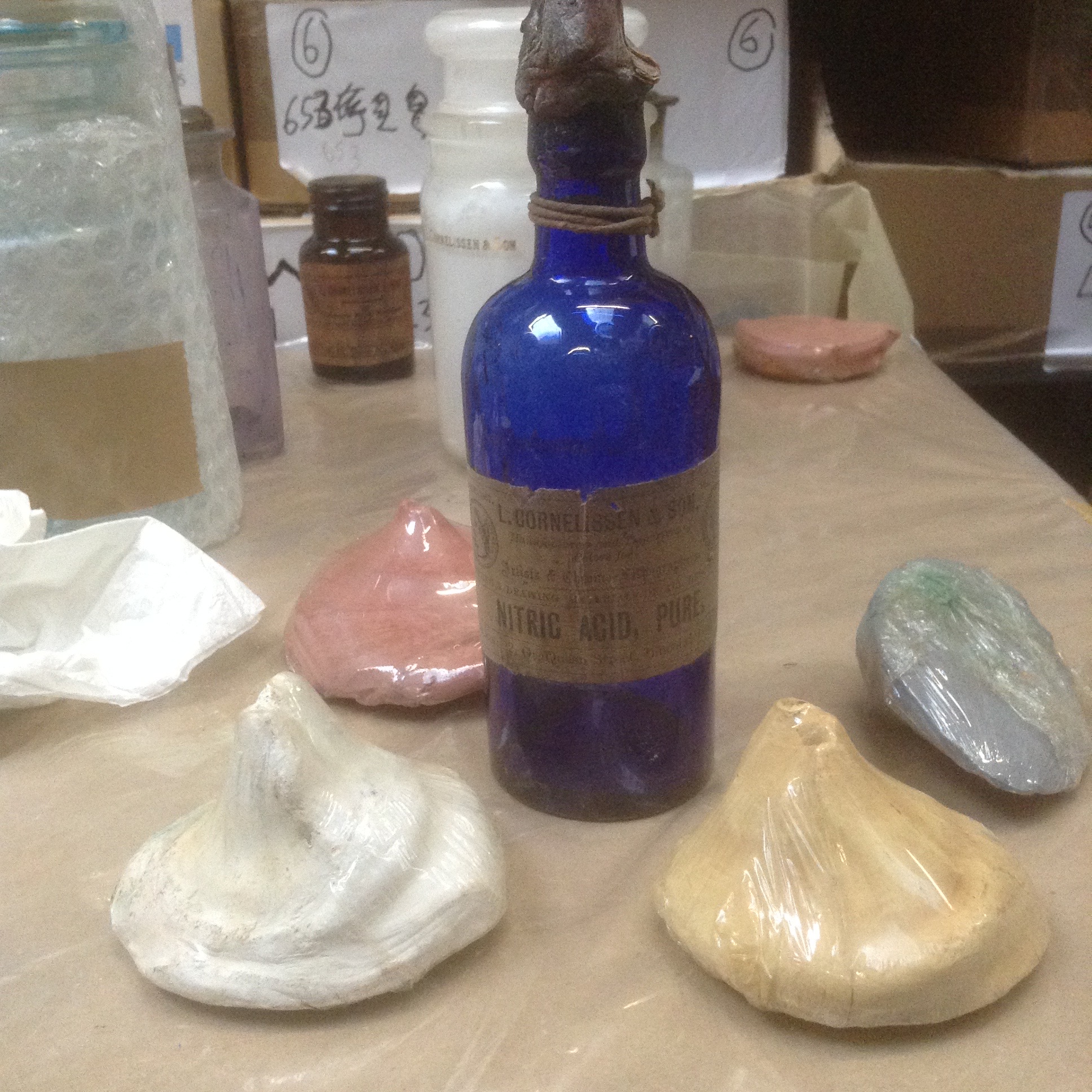
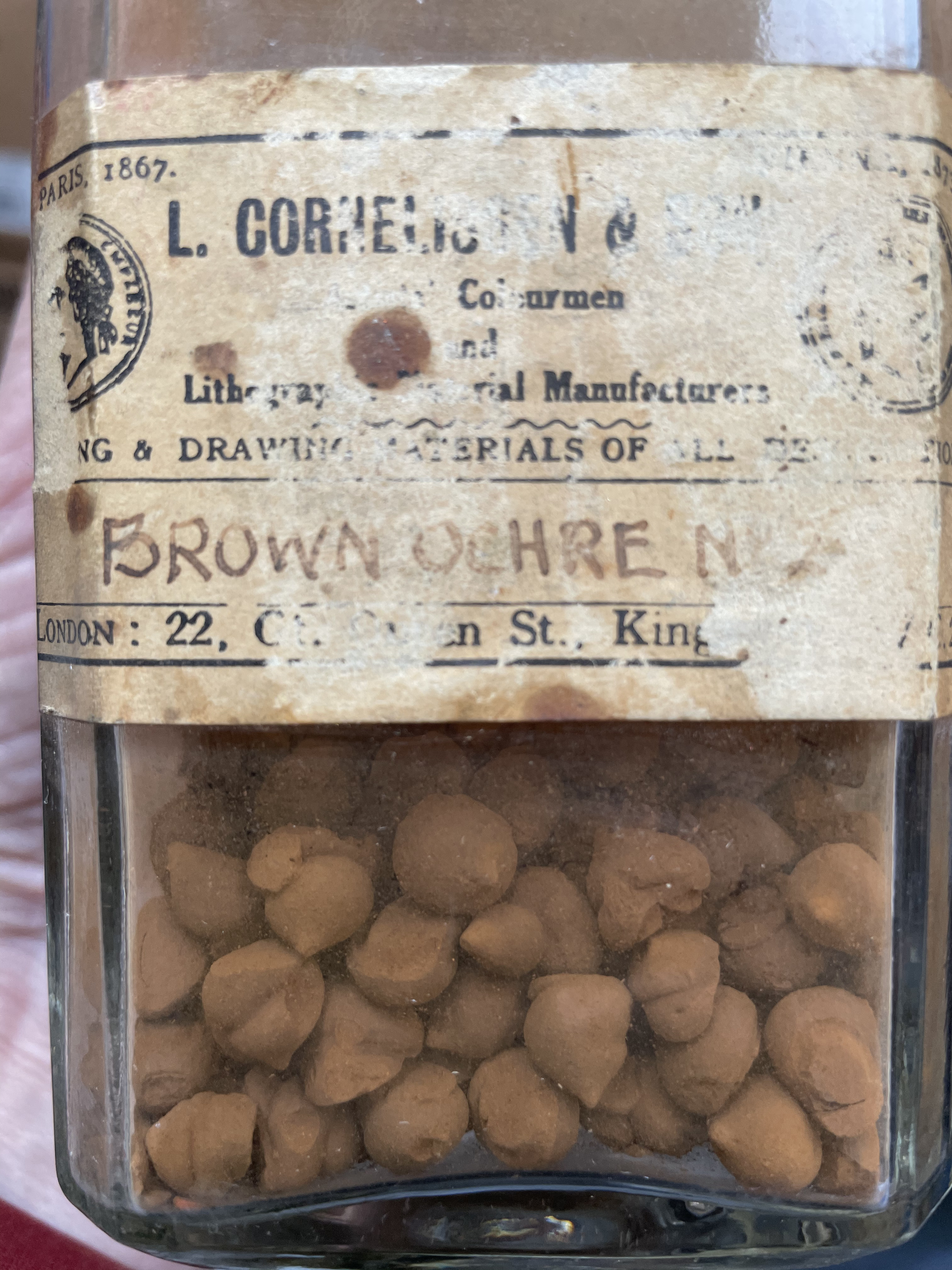
In the Cornelissen archives, I found a large jar filled with marble-sized pellets of Brown Ochre one day and wondered about this presentation. Then, a few weeks later, I stumbled upon much larger ones individually wrapped and had to ask what these were. The charming Lucy then took me by the hand to check out one of their treasures in Nicholas Walt’s office (he’s the present owner.) There, under a globe, sat a mesmerising blue ‘cake’ slightly smaller than my hand but a good finger in height of pure Cobalt Blue. They haven’t a clue how that one came to be… surely no artist would ever need that much! But it seems that colourmen often turned pigments into cakes, solid forms they would sell by weight, probably to save time, but also handling the volatile material. To do so, they would compress the dry pigments, sometimes add a little alcohol, or, in the case of laked pigments, some of the residual water, and the wetted pigment could then be extruded into teardrop shapes or left to dry in moulds. The idea was a good one, but I supposed there must have been some price chart by weight because some pigments are heavy as nightmares and some light as dreams…

Are you surprised to hear that Lead White must be one of my weightiest tubes of paint? In comparison, the same size tube of Quinacridone Magenta is easily four times lighter.
I used to believe I could compare quality thus. And I suppose you could. IF you had two brands with the same quantity, say 40ml tubes, of the same exact pigment, then perhaps, you could deduce that the heavier one definitely had more pigment. In actual fact, especially in oil paints, weight often has more to do with how much pigment is in the tube vs oil. As we saw, some pigments need little oil and a good example of a super ‘lean’ one is Stack Lead White precisely. Michael Harding says his has only 11% oil to 89% pigment, and Lead white, in general, only needs around 15 grams of oil for 100 grams of pigment, so the weight is definitely in the pigment. On the whole, pigments are heavier than oil. Over the years, too, pigment load in tubes increased to stiffen the paint and answer the needs of artists working in impasto or using palette knives (the prevalent reasoning then and now being that it’s actually quite easy to loosen paint but not to stiffen it). But when the pigment content is very low, oil might account for most of the weight in the tube, which could give you a not-very-interesting or wrong answer. Our thirsty Lamp black tube has an average of 75% oil content, representing 160 grams of oil for 100 grams of pigment so most of the weight (in this rare case) is indeed in the oil. Weight measurements are more user-friendly than percentages of oil if you ever want to make paint, so they have a use. But the really relevant information about your paint is not in the weight of ingredients, but the volume of oil vs pigment, in order to determine which ‘fat’ paints you shouldn’t use in your underpainting layers, for example. Results there are quite different, and you will find that, despite the weight disparity, Flake White’s 51% oil content sits right in the middle of the average oil content of most paints (45 to 55%). In fact, only a few ‘fat’ paints stand out of this bracket: Burnt Sienna, Raw Umber and, of course, Lamp Black.
You might remember, too, that the Critical Pigment Volume Concentration is a choice made by each company. And so, hoping to determine the ratio of pigment to oil to deduce if the weight in that tube implies more pigment than in the other tube (+ the possible presence/weight of fillers or additives)… is only going to give you a headache really. In fact, I would suggest forgetting the guesswork or trying to equate quality to weight altogether. Sure, some tubes are heavier, that’s what they are, usually because they contain a pigment that is heavy, but squeezing some interesting or pertinent information out of that, I don’t think so!
Onwards then…

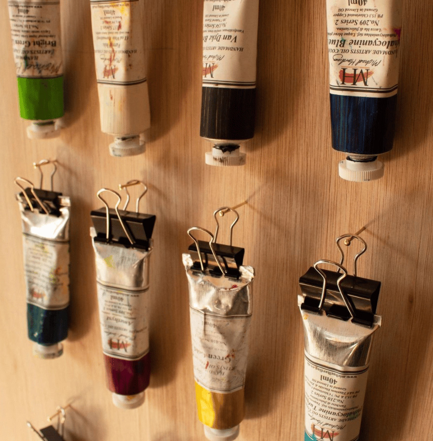
Yet, while we’re on weight, a little post scriptum. Despite their possible affinity and the force with which they’ve been milled, pigment and binder do tend to separate over time. This is obvious in transparent containers of acrylic ink or high-flow paints. You can see that’s happened, and some stirring/shaking should solve the issue. Metal tubes are more tricky, of course, but the same thing happens in there (to a degree), so that’s it is not uncommon to get pure oil oozing out around the tube’s cap (or even crimp!) or gum Arabic gushing out when you first open a watercolour tube. (Please don’t bring your tube back to the store! Keep pressing, and you’ll get the pigment eventually, which you can remix with the binder easily on your palette.) To avoid that, however, some artists shake their tubes before they open them, especially if these have been unused for quite a while, but it’s not obvious to know when the job’s done as, of course, you can’t see what’s going on in there! Pigment being heavier than binder, another trick is to do the opposite of what stores do, i.e. hang them not from the cap but from the crimp. Office clips should do the trick, and your studio wall will look divine with all these upside-down hanging tubes + you might be able to find the one you need faster that way!
Jump to the next section of the book by clicking here
Alternatively click on the Table of Contents to browse the sections.
You can also subscribe to my blog at the bottom of this page,
and you’ll receive Hues in Tubes in your inbox… as it gets published!
Discover more from in bed with mona lisa
Subscribe to get the latest posts sent to your email.

One Comment Add yours