WHICH?
PIgment Characteristics

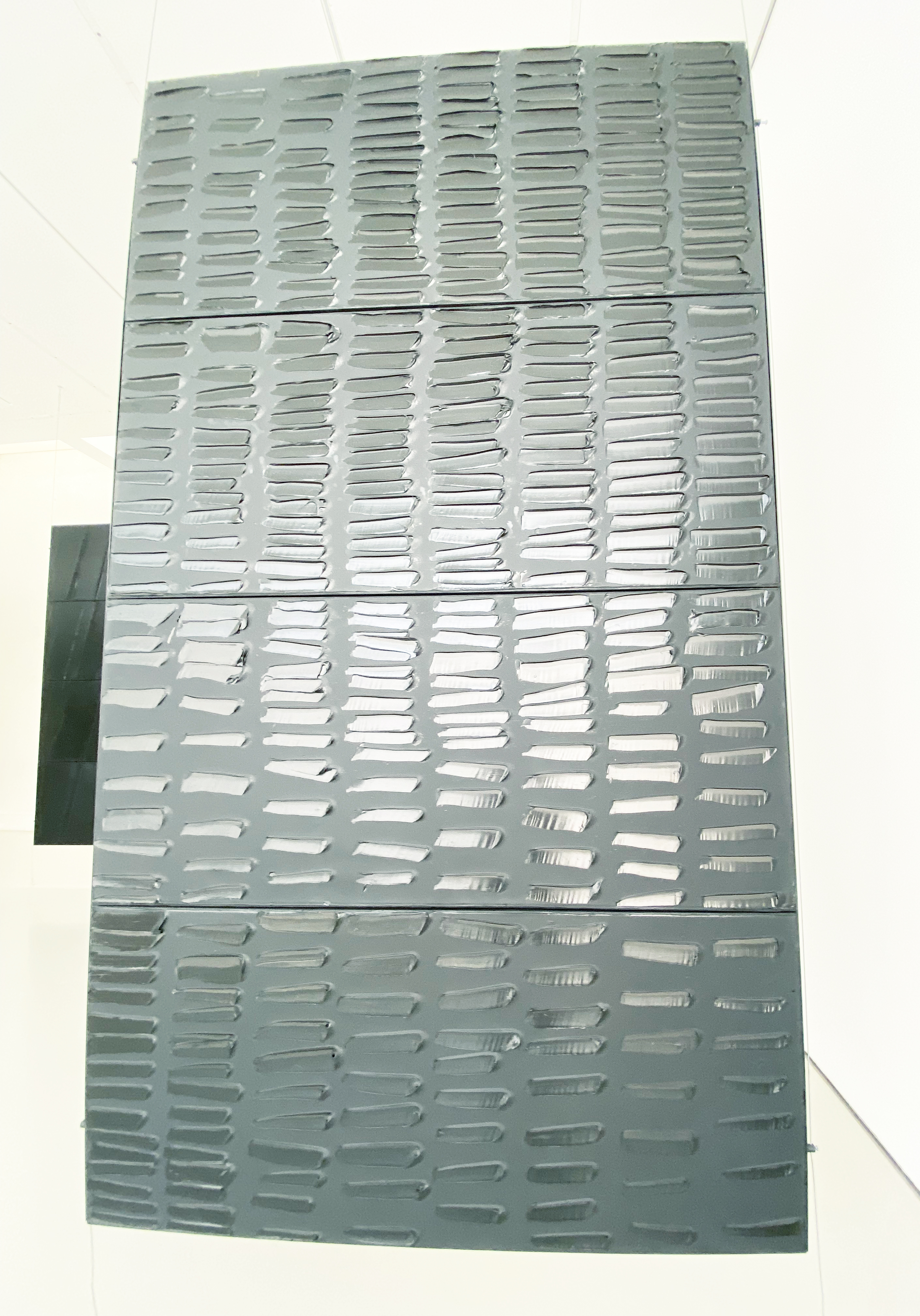
“Might’nt shiny black and matt black have different colour names?” mused Ludwig Wittgenstein in his Remarks on Colour. (But they do, dear Ludwig… just check above image!) And yet, open jar after jar of dry pigment and see for yourselves. As luscious as they are, all of them are totally matt. For sure, there are exceptions. The metallics will shine, and the ‘effect’ mica pigments, too. There are even a few mineral pigments, such as Amethyst, that have a natural sparkle, but most other ‘nanorocks’ (particles) look like pebbles out of water… not dull precisely but dry.
Adding a glossy oil or polymer emulsion will change that instantly, and, in principle, when you have a well-manufactured product, paints will usually dry somewhere in the middle between gloss and matt. If too much binder has been added, the paint film will be hyper glossy, as well as loose and without tensile strength. If too much pigment has been added, the particles take over the scene, and your paint film will be matt, chalky even—somewhat like in their dry state—and also very fragile, permeable. So somewhere in the middle (usually between 45 to 55%) sits both the Critical Pigment Volume Concentration (aka Highest Emotional Resonance) that perfectly coats the particles, and a delectable semi-gloss sheen. (Not that I’ve ever heard of paints called satin, semi-matt or semi-gloss; varnish, yes, wall paint too, but not fine art paints.) Yes, I suppose you could expect that result, and mostly it’s correct, but if you’ve read this much of the book and don’t expect something just that little bit more complicated from your particles by now, I would be very disappointed. Plus, even if you haven’t tried them all, have you not seen for yourselves the swatches of paint on tubes and noticed the huge differences in sheen? (At least in the professional colours. Student brands tend to be uniformed by additives to make them… less challenging, perhaps?)
As we have seen earlier, some pigments are thirsty, need much more oil, and can still dry dull and matt. A phenomenon aggravated by most grounds coating painting surfaces, such as acrylic gessos, being very absorbent. But sometimes sheen is the by-product of something quite different when a pigment has such tinting strength that it can hardly be used by artists in full-on doses, a paintmaker might choose to put only a ‘reasonable’ amount of pigment in his tube. However, whenever the pigment load is low and for whatever reason (sadly, it’s usually to save money), it implies a higher ratio of oil/acrylic binder, which will result in very glossy paint.
More commonly, though, the sheen will differ for nearly the same reason as other variations: particle size and particle shape of the pigment. As we have seen, particle size is, up to a point, a choice, but shape is not something that can be controlled in the same way. When pigments are ground, some will end up with spherical particles (round and regular), others nodular (i.e. round but irregularly so), some will be shardy or, if you want the nerdy term, acicular, while quite a few with lamellar structures will be platy (yes, that’s an existing word!) The mineral Azurite, for example, is chemically absolutely similar to its synthetic counterpart, Blue Verditer, yet Verditer’s particles are more regular and round when ground.
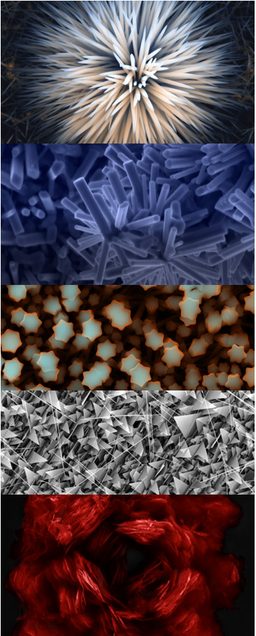
Of course, things are again a bit more complex than that because today, we, in fact, can shape particles at our will, and researchers are doing so in order precisely to study the impact of shape on the properties of similar samples. When you see the results, magnified 500,000 times via a transmission electron, of zinc oxide in its multiple guises, for example, it is simply mind-blowing… and easy to understand that these differences will obviously impact how they reflect the light back to our eyes.1
(This being said, if you are no specialist and I’m certainly not, it’s still quite hard to give a pigment a definite shape. When I had the opportunity of peering down a microscope at some of them for a project at Art school, it was easy to notice that their size differed. Still, I had a tough time deciding which shape was genuinely representative of the pigment—especially on a 2D representation—some seemed ever so multi-faceted… see for yourselves!)

The implications of particle size on the sheen, however, is perhaps even more significant, yet was something I found a bit harder to comprehend. However, it’s pretty obvious. If you have to cover more surface, you need more of that covering stuff, right? When painting your wall, doubling the surface means doubling the amount of paint you need, no-brainer. When coating your many, many, tiny, tiny particles, it also means a lot more surface needing to be covered, which will demand more binder, but also produce many more facets which will play with the binder and each other—hence more reflection and more gloss. A good example is our Dioxazine Purple, which has sub-micron particles and, as a result, will dry super glossy in acrylic and oil paint. That won’t be the case in watercolours, however. So now you understand, the real sheen game-changer is… the binder of course!
Please don’t let the above worry you too much. Apart from real problems of some colours sinking in, which can be sorted by oiling out, by the time you have mixed all your colours, spread them, added layers, etc., you’ll usually end up with a coherent surface. Even if it’s not so, you can add an isolation medium/topcoat, which should unify your work beautifully, and the chosen sheen of your varnish should sort it all out.
Jump to the next section of the book by clicking here
Alternatively click on the Table of Contents to browse the sections.
You can also subscribe to my blog at the bottom of this page,
and you’ll receive Hues in Tubes in your inbox… as it gets published!
Additional information and references
- Palumbo, M. et al. (2009) From Stems (and Stars) to Roses: Shape-Controlled Synthesis of Zinc Oxide Crystals. [Online]. [Accessed 2 February 2025]. Available at: https://pubs.acs.org/doi/10.1021/cg8013333 ↩︎
Discover more from in bed with mona lisa
Subscribe to get the latest posts sent to your email.

Bonjour et merci pour ce blog… j’aime beaucoup ces textes, chaque semaine je me réjouis de te lire.
Bonne continuation
Françoise
Merci Françoise, ça me fait bien plaisir que tu te regales de mes petites offrandes septimanales… et, de mon cote, c’est un bonheur aussi de les fignoler et finaliser chaque semaine… alors, oui, je continue jusqu’au bout du livre! xoxo