WHICH?
Pigment Characteristics
Where goes the white when melts the snow?
Shakespeare (perhaps)
A long time ago, I read that titanium dioxide is entirely transparent. Only when ground, as the crystals get smaller and light scattering becomes more intense, slowly but surely do we begin to ‘see’ the pigment as white, until… we don’t! Keep grinding titanium dioxide down to nanoparticle size and beyond, and it will ‘return’ to being completely transparent. This smashing information had stayed with me, but I had yet to understand its principle.
There is no magic behind this feat, however. As usual, as ever, it is an optical not so much illusion as ongoing deception. Because we forget, have never known or are not even prepared to believe colour does not exist intrinsically in or on anything. Yet it doesn’t. So that this other red or blue rock will only be seen as red or blue until you grind it to a size, outside the visible light region, where our eyes cannot detect reflection any more and thus our brains have nothing to interpret as colour either. If you choose to call it thus, the red and blue have become ‘transparent’… in-visible might be a better word, or, Shakespeare might say, melted into insignificance.
This characteristic of pigment has mostly to do with its ability to scatter light, while this, in turn, is determined chiefly by the size of its particle size (and the paint binder’s ability to scatter light as well, but we will get to that later.) As particles become finer, they scatter light more effectively, and this bounce-back effect makes it more difficult for our eyes to see the background they are coating—hence an accrued opacity. But then comes a point of diminishing return, and opacity decreases. This counter-performance, if you will, is something paintmakers play with, as it allows them to produce from the same pigment, PY42, for example, both a Yellow Oxide paint, side by side with a Transparent Yellow Oxide. (This is not to say that two different pigments with the same chemical composition, in this case two natural Yellow Iron Oxide, both PY43, cannot have different opacities; they can, and they do.)
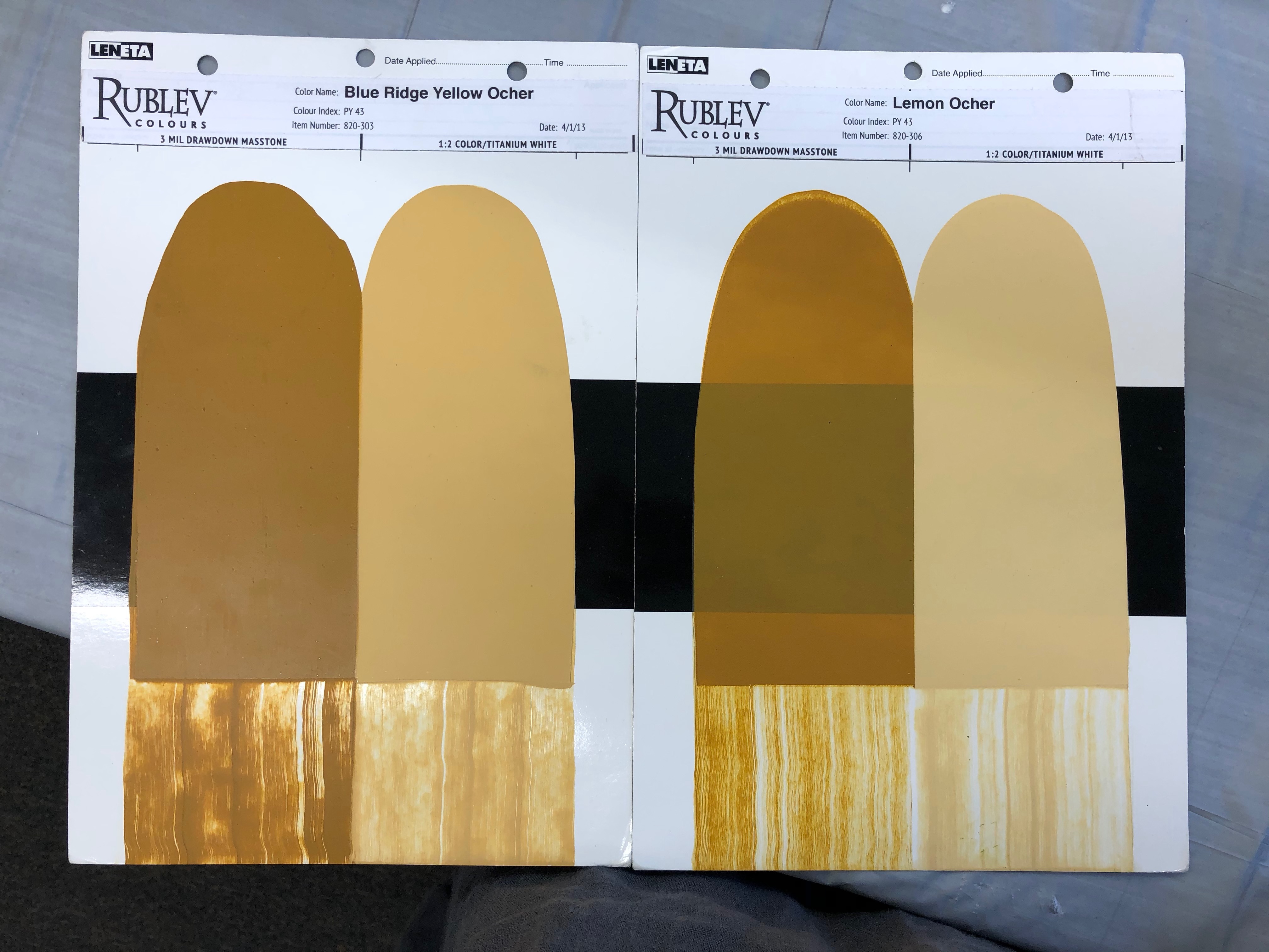
On the whole, pigments are ground to a particle size chosen for today’s hardware industry requirements in opacity and tinting strength. They want to maximise their profits, and a very high hiding and tinting pigment will do just that. If you are painting your wall rather than glazing that area of your artwork, transparency is hardly a quality! Things are far more exciting and subtle in the hands of an artist, however, who might choose to play with the way a transparent paint invites the light into the paint film. She might even know that the same Transparent Yellow Oxide will reduce the value and chroma of other yellows while preventing the cool yellows from going green in mixing shades. Ha! They are not called artists for nothing, these guys. Above is why you find these ‘new’ oxides and Umbers in the first place. Earth colours used to be far more transparent than they are now. The percentage of silica in them gave them that. Although considered an impurity, the transparent silica served the palette well. Unfortunately, these specific deposits producing the traditional Earth pigments for artists have mostly run out, and pigments of mixed origins have replaced them. (Most paintmakers, however, will inform you of the opacity/transparency of that specific mix or pigment on their tubes.1) These, again, prepared for the hardware paint industry, which values opacity, lack the subtlety of old.
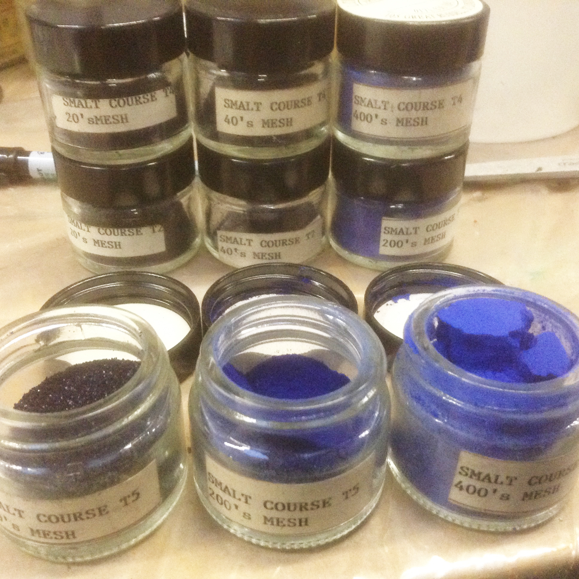
Standards dictate most industries. In Pigment Size World, the standard is a maximum of 44 microns, which corresponds to a 325 mesh sieve. Larger than that, the particles are discarded but much, much finer they usually are. To go back to our Titanium White, its optimum particle size for maximum light scattering is at 0.2 microns, which is why, too, at that tiny size, it quickly loses its hiding power if we keep grinding it.
Uniformity is good if that’s what you seek. Unfortunately, the homogenisation of pigment particles available on the market has also brought about homogeneity across paints in all lines. Only a few paintmakers grind themselves or have their pigments ground to their specifications to offer more variety2 or a coarser feel, closer to the historical pigments ground with a pestle in a mortar, which were on average 70 microns or larger. A shame, too, as these coarser pigments produced more durable oil films, less prone to cracking. As always, something has been gained (consistency), and something has been lost.
Yet rather than cry over the good old days, it could be interesting to encourage those that still take that care while relishing the incredible tinting strength cum transparency of our new hues. Most of these organic pigments (with a medium/average particle size of less than 3 microns ranging from 10 to sub-micron) are either transparent or semi-transparent. A characteristic painters have come to appreciate anew. Maybe artists don’t understand or need to, for that matter, that the Impressionists’ colours recommended to them a long time ago in Art school have quite large particle sizes, making them naturally denser, more matt and opaque. Yet many might be interested to know that working with these mineral inorganic pigments only, they are missing out on the many subtle intermediate shades produced by more transparent organic modern pigments. Plus, it’s not as hard as becoming vegan and changing the entire content of your pantry and all your recipes. You needn’t choose between two ‘systems’ or lifestyles, between cooking only with Julia Child or Yotam Ottolenghi. Have fun getting to know the options, and then play in your works with a Cobalt Violet and a Dioxazine Purple, with a Cadmium Yellow and a Hansa Yellow etc.
I’m suggesting this to tempt you to become a bit more adventurous with your choice of materials. Painters, I have noticed with amusement, are creatures of habit. They want this colour from that brand and this other one from that one, and… fair enough! When you’ve walked the hard miles with your palette knife and become familiar with the road to get to this hue out of that mixture, you have no will to change the recipe. Nevertheless, I wish that those who teach painting and colour mixing were a little bit more daring, perhaps, and not repeatedly making the same suggestions of basic paints as the must-have ones.
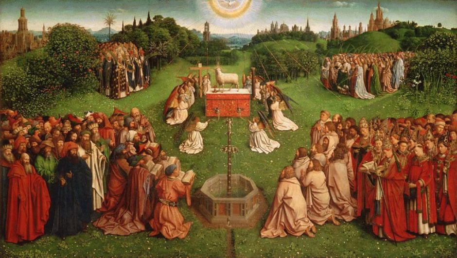
P.S. While cleaning it recently, it has been noticed that Van Eyck, in his masterpiece The Adoration of the Mystic Lamb, superimposed two layers of malachite, ground at different sizes. Did he do this purposefully in order not only to obtain slightly different hues (a shift that occurs under your very eyes as you grind further so he would have known) but also different opacities? Could it be, disappointingly, that the apprentice became lazy and didn’t grind as finely one of the batches? We will never know for sure, of course, but I really grin with delight (and hope you will too) when entertaining the idea that this Master of unequalled technique and observational skills could have, six centuries ago, totally understood, perhaps not, but at least known enough to play with one of the many Tricks of The Particle Size!
Jump to the next section of the book by clicking here
Alternatively click on the Table of Contents to browse the sections.
You can also subscribe to my blog at the bottom of this page,
and you’ll receive Hues in Tubes in your inbox… as it gets published!
Additional information and references
- A little warning from Golden Artist Colors, however: “Currently there are no standards for measuring transparency or opacity and most ratings, including ours, are made through examining similarly prepared samples and rating them relative to one another. The difficulty here is that many pigments that are inherently transparent will seem quite strong and opaque if used full-strength from the tube, especially when made with a high pigment load. Phthalo Blue is an excellent example of this. In a 10 ml drawdown it was ranked on par with more commonly opaque colors such as Cobalt Blue, Pyrrole Red, and Cadmium Orange. However, when applied very thinly, mixed with a gel, or extended with a medium, Phthalo Blue shows another side and becomes a transparent and beautiful glazing color.” [Online]. [Accessed 2 March 2024]. Available at: https://goldenartistcolors.com/technical-specifications-explained ↩︎
- The mercuric sulphides of Vermillion, for example, gave an extensive range of orange to red hues thanks to the different sizes of the ground particles of pigment. Larger crystals produced a duller and less-orange hue. ↩︎
Discover more from in bed with mona lisa
Subscribe to get the latest posts sent to your email.

One Comment Add yours