WHYEVER?
Hues in Tubes… and how they made a name for themselves
I mixed on a glass palette, colours that went beyond Windsor and Isaac Newton—nameless colours…
Derek Jarman, Chroma1
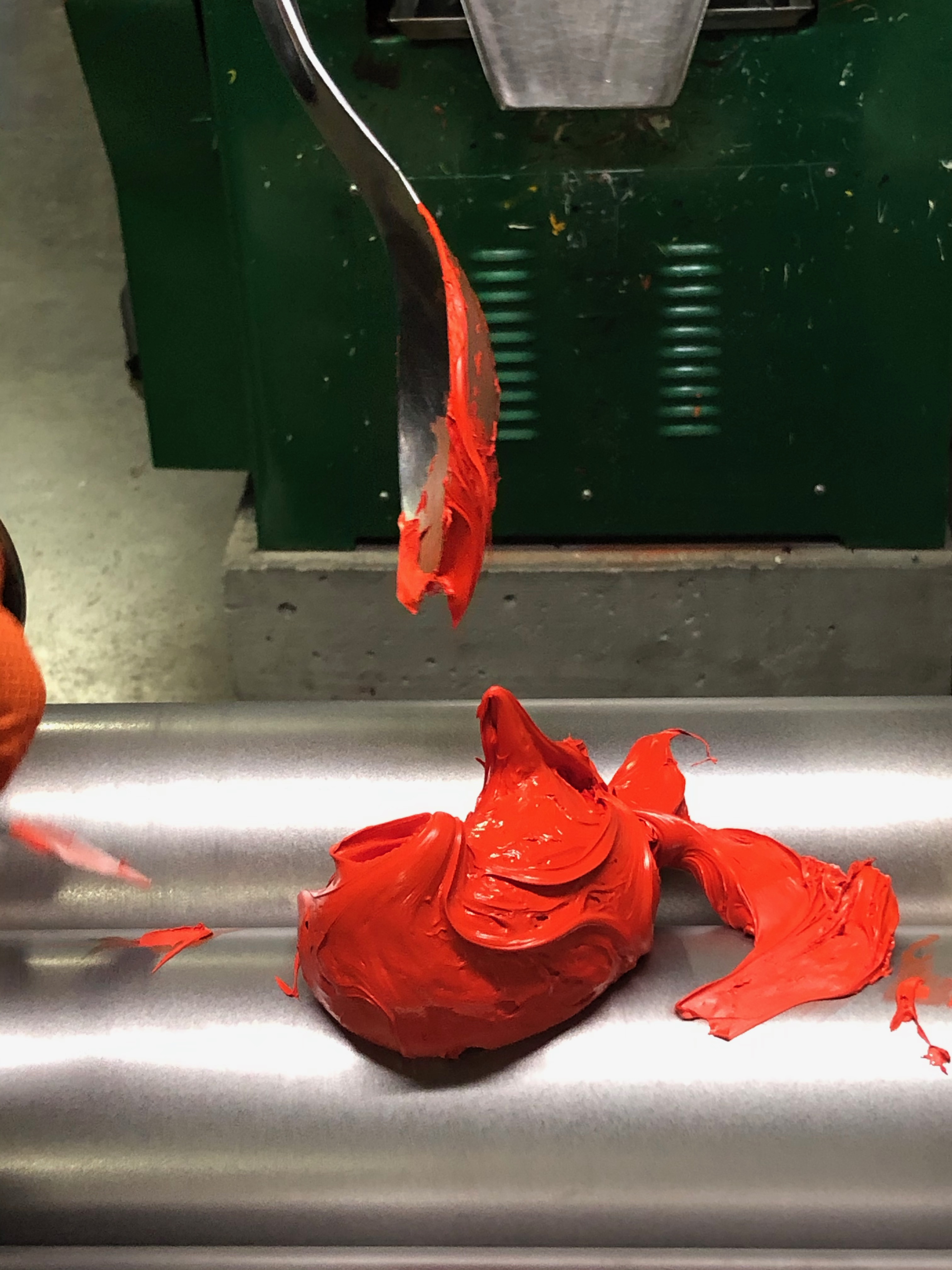
At last, and whatever the binder we have chosen… we… have… PAINT! We could use it all now, if we were greedy, but perhaps not that exciting violet we have just milled (a hint of it is already toooo much!), so let’s tube it. We saw what an excellent idea that one was, yet tubes are not transparent, and we might soon forget what’s in there or even want to share/sell our pretty purple, so how about a label with an enticing name… Imperial Purple? Too snob! Tyrian purple? Déjà vu! Dioxazine Purple? Unpronounceable! PV23? Cold! Cesar Violet? Folks might be thinking of a salad, a flower…
What to do? Could a computer program, an algorithm for our favourite colours, help? Alas! Apparently, it was tried with household paint names, and what came up were mostly silly and less than appealing results: Dorky Brown, Stoner Blue, Coral Grey, Le Cute White, Burf Pink… don’t think these will do to label our beloved Art Pigments, not at all!

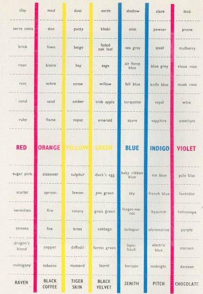
Almost every industry seems to develop its own codes and designations for colours. The textile’s ones will differ from the needs of opticians, horticulturists, or the usage in the Department of Agriculture, the Army and Navy, etc. Past a point, painters rarely seem to care about any number or notation. As said, a few ultra-precise ones speak the Munsell language, but these are rare birds. A few more check the lightfastness of a paint if they are venturing into a new one, and most professionals have also understood that the P something at the back of the tube stands for Pigment and Hue + a number. (Often expecting that this CI number will give them a warranty of both quality and a precise hue inside that tube… but unfortunately, as we saw too, this is hardly the case as these numbers only refer to the chemical composition of the pigment with the result that, under the umbrella of one CI number, variations of shades can breed and prosper. As for quality, the pigment load alone of any given paint would impact so totally on its quality as to render any judgment, based only on the pigment used, pretty useless.)

Today, on the whole then, it seems most painters would agree with Turner, who apparently said: “Your business Winsor is to make colour. Mine is to use them”; they are happy to leave categories, notations, standards and conformity tests to their paintmakers. They’ve done their own testing and, after a few years of living together, most professionals know exactly which colour they want, in which brand, and will not betray their trusted friends. They’ve acquired an intuitive yet reliable understanding of their paints’ quirks, attitudes, possibilities, and how they behave when mixed with this or that other paint. In the end, knowing their true nature probably better than they understand the nature of the partners they sleep and eat with, I would venture.
“I no longer want to know the names of things. I do not care if I am mute or if my tongue is useless for everything but the taste of salt. The verbal map is the wrong map. It is a labyrinth to false treasure. This exotic, wholly liquid place lies outside words but well within the realm of the sensual. The colours come forth for their own sheer ecstasy.” Ellen Meloy2
I suspect, too, that most converse with their brushes/colours/muses a fair bit, murmuring loving and encouraging words to them, but unfortunately, that ‘universal’ language can hardly be used to dialogue with the rest of the world. So how do we talk colour in my colour world? Well, words are the go, but imprecise comparisons or connotations used by other colour professionals will not cut the carmine in this arena, I’m afraid. Still, words will be used and words… Ha! now that was always my delight! And so when I embarked, nearly two decades ago, on this crazy project of adding art supplies to my art gallery and framing store—while I knew nothing about these materials—I discovered a fantastic trove of new words to muster and, more to the point here, learn to equate with a fleeting and elusive colour in my brain. I quickly understood too that, although it would be useful if there were tubes of paint just labelled: red, blue, yellow or green, if nothing else for absolute beginners like myself back then, these were not on offer. Overwhelmed with the choice available in every single hue family, and now getting questions about them all day long, selling these pretty colour wheels but no paint to match… what was I to do?
Well, like every artist since time began, I took the only approach in truth available and plunged. I opened the tubes and got to know the options. I got paint on my hands (and elsewhere!), and because such is my nature, I researched what paint was, how it was made, and what those pigments were. Did you say binders? nanoparticle? masstone? inorganic? siccative? subtractive? dye? lake? hydrophobic? surfactants? flocculation? thixotropic? What on earth could all this possibly mean…
I shall die mostly incompetent in painting but can laugh about the whole learning curve retrospectively as I keep pleasant company now with these crazy and probably mispronounced (by me!) names on the tubes. Too, I know I’ll never be done with knowing more—which is absolutely fantastic. Along the road, I have gained immense respect for the craft of painters, who perceive the colours of the world (whether the real world around them or their inner world) and translate these to us with a bunch of beautiful but limited, toxic, fugitive, etc. in short problematic children: the handful of pigments suitable for artistic purposes. (Even if offer and quality have improved enormously in the last centuries.) Through hours and hours of practice and much-wasted paint, they have taught themselves what no theory can: how to navigate their brushes from these random starting colour spaces to the myriad of “unnamable colours”, as Gauguin called all the mixes not straight out of a tube. These, he believed, could talk precisely from their mystery to our feelings.
I chanced once on a beautiful description by painter Eric Aho of his full creative circle from the real world, to pigment world, to unnameable colour, to the echo of that same reality. I share it here:
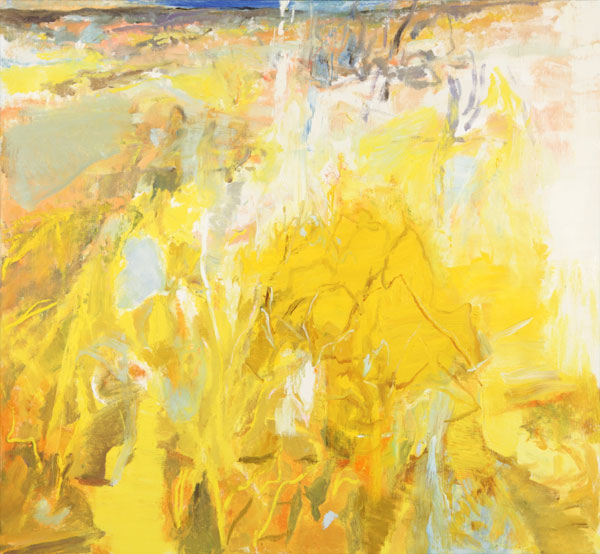
“The Straw Field was painted following a walk to my studio through a sun drenched field in late April. The straw hay, pressed down by that winter’s heavy snow, glowed like amber in the brilliant new springtime light. I like when a color loses its name, that point when you no longer recognize the pigment as ochre, Naples Yellow, or Cadmium Yellow medium. I started The Straw Field with several Yellows on my palette, and looked for ways to influence the color so it would feel both real and invented simultaneously. Soon enough yellow isn’t yellow anymore; it’s sunlight and straw.”3
“Painting is a language which cannot be replaced by another language”, Balthus suggested, and in that language, indeed, you can express yourself with sunlight and straw! Eventually, though, when the need comes for a painter to discuss colour with peers or in their art store—rarely, in fact—then a dialogue might go something like this:
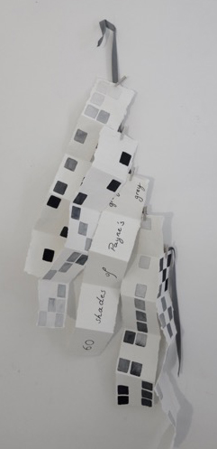
Client: – I’m working on a portrait commission at the moment, but the skin tones are proving tricky; it just feels a bit cold or like she’s got lots of makeup on… I can’t quite figure it out as I’ve used Yellow Ochre, Burnt Sienna and a touch of Vermillion, with white, of course, as my base mix/mid-tone and made my shadow tones with varying degrees of Payne’s Grey, Raw Umber and more Burnt Sienna for the cooler shadows, and then warmed that up with more Vermillion and more Burnt Sienna in the warmer shadows
– Well, (replies the shop assistant and artist herself) I think you always need more Yellow Ochre than you imagine in a fair skin tone to give it that sense of warmth and, actually, the last time I was working on a portrait, I used a small amount of Mars Orange in the mix, across the tones, and it seemed to do the trick!
I could go on, but you get the idea. When painters need to remember a colour or are talking between themselves, they talk shop, they talk fine art paint names. I would even suggest they come to perceive the world’s colours through those options. (It is even said that in the few years before becoming legally blind, Claude Monet was painting his works from memory alone and choosing his colours only by their names on his tubes.) Hear what Rubens had to say about the above same subject (and I chanced upon this long after hearing above conversation, yet same-same):
“Let not your flesh colour freeze; let it not be too cold or purple, for carnation which approaches the whiteness of linen cannot bloom with the signs of life. But Vermilion makes it glow with a more fleshy hue. Endeavour to produce this warmth. […] In painting peasants, shepherds, and mariners, spare not Yellow Ochre with your Vermilion. […] Be careful not to light up the flesh tints in either sex with too much white; no pure white is visible in the living subject.”4
The above can tell us 1) that painting flesh realistically is no easy feat 2) that then and now, the way to go about it is pretty much the same. Some things don’t change… nice!
So does it come as a surprise, when some fine art pigments have been around for centuries, that their names are ever more interesting and diverse than basic hue terminology yet avoid the vaguely descriptive/bubblegummy terms used in most household paint catalogues? What is surprising, though, is that artists and paintmakers still use these names! It’s certainly not a better lexicon; in truth, the accuracy and clarity of fine art paint names are poor. Still, I greatly enjoy those labels which reflect our messy, complex appropriation of Colour. (Be prepared for a happy mic-mac of accurate pigments and invented paint names too.) After ten years, I thought I had more or less got a handle on them. Yet, three things I thought I knew were found to be somewhat wrong or debatable in the course of one week, so I became really curious.
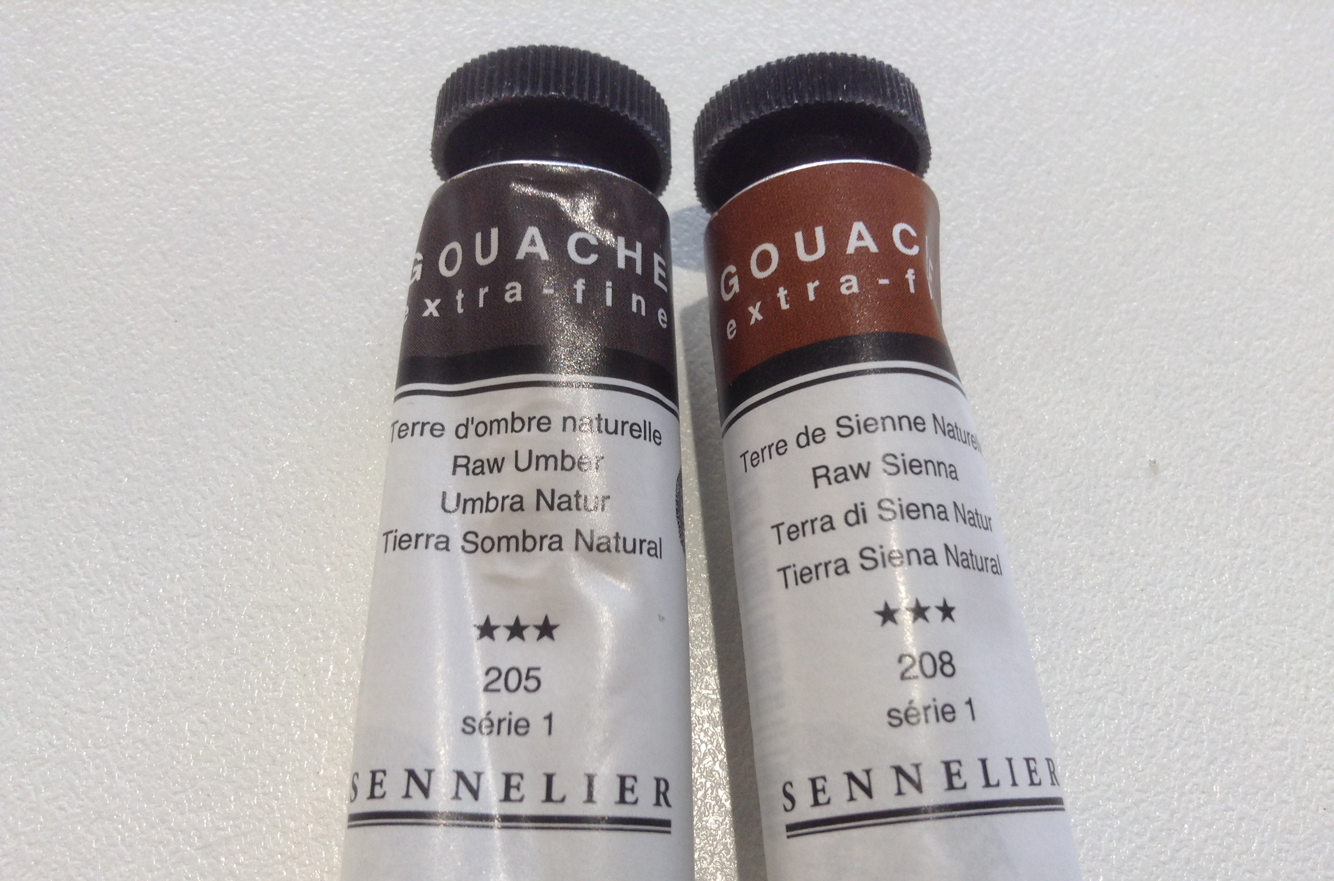
The first incident was a client telling me that whereas Siennas were Earth pigments from the region of Sienna, the Umbers were not from Umbria. Really? No, their name in Italian referred to the shadows they were useful for. Well, Burnt Umber in French is Terre d’ombres brûlée I remembered in a flash, so I realised immediately she was probably right. (She was. When the name was coined, most umbers actually came from Cyprus—not Italy.) I felt a bit stupid. However, the literary side of me immediately thought: Oh, I like it in English! Raw Shadows, Burnt Shadows. Beautiful, romantic. One could even venture aromatic…
A few days later, a lady arrived with a list of paints for an upcoming workshop, among which was Pain’s Grey, spelt just so. I had to laugh. Exactly how many grey shades of pain was she after? I explained the mistake to her but could not say much about the Mister (presumably a Mr) Payne on the tube and made a mental note to look it up later. Unsurprisingly, it was a man.
Finally, in a blog one evening, I found a post claiming that “The color name ‘magenta’ comes from a dye created in 1859 by British chemists George Maule and Chambers Nicolson. The pair named the new dye in honour of the Battle of Magenta, a clash between the Austrians and French in 1859 near the town of Magenta in northern Italy. It is believed the chemists were inspired by the bright reddish trousers worn by Zouave French troops, a highly decorated infantry in the French Army.”5

Well. The Zouave’s pants, as any kid brought up in France knows, were dyed in rouge garance because “Le Rouge Garance, c’est la France.6” This patriotic attachment was also the sad reason why all the French infantry troops were still wearing that bright colour at the start of World War I when most other countries had switched to kaki or brown, realising what a perfect target red made them.7
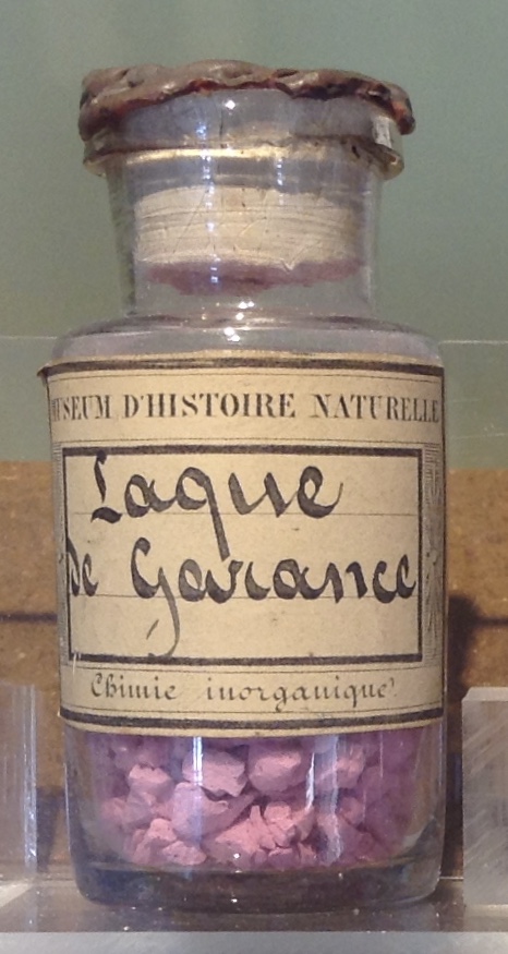
That dye came, originally, from the madder root, which gives it its name in English (although by then, it was synthetic alizarin, no doubt.) Yet in French, the word garance does not come from the plant but from the word garantie, a warranty that you are buying a solid and durable red dye, a refined dyestuff that involved boiling the root in sulphuric acid. I hardly believe the dye was 100% colourfast then so that probably, wash after wash, madder red would slowly turn into a vieux rose madder, yet even that washed-out colour is a far cry from Magenta! (Amusingly, another dye and its kermes ‘grain’, has given us ‘ingrained’ in English, as crimson was heralded such a strong and lasting colour too.)
And as for two British citizens to name anything after a French victory seemed an even more implausible story…
I was piqued. I grabbed a bunch of paint charts, all my pigment books and plunged into discovering the ‘stories’ behind all the names on the tubes, but it wasn’t long before I realised what a world I had naively opened the door to. And look, before I launch into them, I want to clarify again that, as much as I’ve researched, trying to triple-check all my information, sometimes I’ve only come across a fact once or come across such contradictory stories that I probably will never find out for sure which is the correct one.
So I’m suggesting you now sit back and really relax, and while maybe not all of what follows is 100% correct, hopefully, it mostly is. As the Italians say: Se non è vero, è ben trovato8 and that’s why I pass these on to you… such good conversation starters at the diner table!
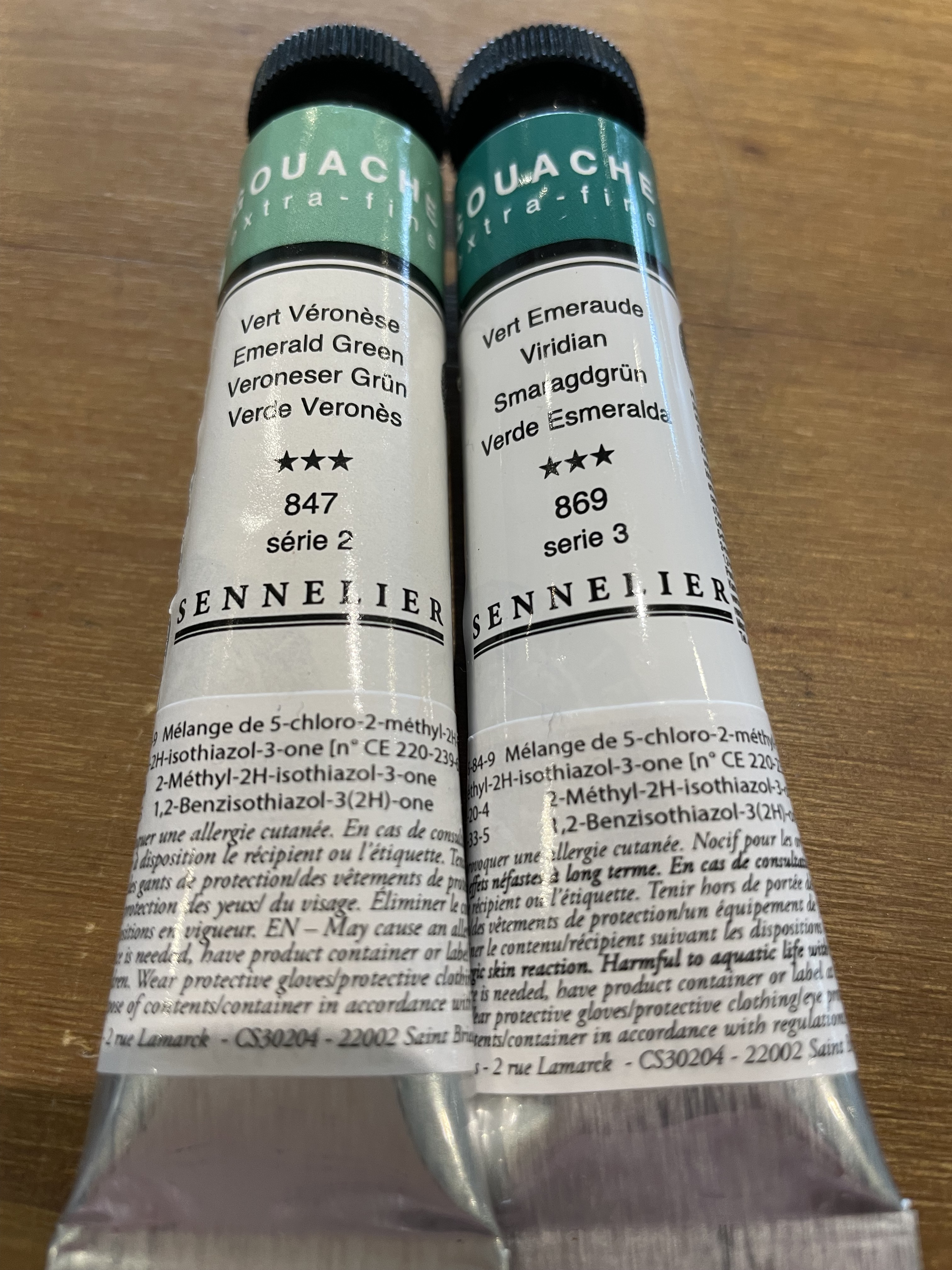
PS: Be aware, too, that most pigments, most confusingly, have been called so many names. I have concentrated on commonly ‘accepted’ names and in English only. It’s yet another world in French, Italian, or German, as you can imagine—especially when the same name is used for another pigment in these languages (such as here Emerald Green turning, in French, into Vert Veronese, whilst Vert Emeraude becomes Viridian in English!!) Overall, it is dangerous to think that a pigment’s name has been consistently correlated to the actual material throughout the ages. Giallorino, as we saw, was commonly used for both lead-tin yellow and lead-antimony yellow for example, or even used as a collective term for the yellows, or Verdigris for copper acetates of different compositions with a varied palette of blues and greens are good examples of this.
Very often, too, a mineral pigment’s name was confused with its synthetical counterpart while classical authors—also known for splitting particles in two and adding their grain of alum by further classification—would make interesting distinguos such as “false sandarach” for Red Lead but “true sandarach” for Realgar while, also depending on provenance (real or imaginary as we shall see), a geographical tag was added to the colour. Azurite was called Mountain Blue by the Germans but German Blue by the French, and Armenian Lapis by the Romans. Depending on where the lead came from, Lead or Flake White went under the name of Vienna, Berlin or Cremnitz White (erroneously as it came from Krems in Austria and not the Hungarian eponym town) and on and on…
Despite today’s myriad classifications, confusion still reigns. Have you ever heard of PR104, aka Molybdate Orange? Probability is never, as it’s still such a rarity in tubes. However, in spite of not being around for long, PR104 has nothing short of 52 ‘doppelgängers’9 you might have come across!
Jump to the next section of the book by clicking here
Alternatively click on the Table of Contents to browse the sections.
You can also subscribe to my blog at the bottom of this page,
and you’ll receive Hues in Tubes in your inbox… as it gets published!
Additional information & references
- I know not if the “Windsor” spelling, which I assume is for Mr William Winsor of Winsor & Newton (not of Isaac fame) is a mistake or a homage to his regal status as a paintmaker, but, of course, I had to leave it the way it’s spelled in Derek’s book! Jarman, D. (2010) Chroma. University of Minnesota Press, Minneapolis, U.S.A. ↩︎
- Meloy, E. (2002). The Anthropology of Turquoise: Reflections on Desert, Sea, Stone, and Sky, p.152. Vintage Books, New York, NY, U.S.A. ↩︎
- As quoted on the Gamblin website. Discover more works by this artist at https://ericaho.com/ ↩︎
- As quoted on the Master Pigments website: https://www.masterpigments.com/cinnabar-pigments/?srsltid=AfmBOor8i48-gACZPgR6WfOkw7fdci9nYbDXEDmEV4ZwDMOtc9Fibi4B ↩︎
- During its long tenure as a dyestuff, madder has developed an association with the military, from the battle dress of the Romans to the English red coats. In ancient Greece, Spartans used to dye their clothes red to hide bloodstains, and Napoleon mandated its use across his officers’ uniforms… for the same reason! ↩︎
- Rouge Garance (madder red) is France! ↩︎
- Burch-Celentano P. (2018) Magnificent magenta. Tulane University, New Orleans, La, U.S.A. [Online]. [Accessed 2 March 2021]. Available at: https://news.tulane.edu/news/magnificent-magenta ↩︎
- If it’s not true… at least it’s entertaining! might be a loose translation. ↩︎
- Courtesy of the fantastic Color of Art Pigment Database: American Vermillion (hue); Australian Cinnabar (hue); Austrian Red; Austrian Cinnabar (hue); Chinese Red; Chromate Red; Chrome Cinnabar (hue); Chrome Red; Chrome Scarlet; Chrome Orange; Chrome Yellow; Chinese Red; Chrome Cinnabar (hue); Chrome Red; Chrome Scarlet; Chrome Orange; Chrome Yellow; Chrome Vermilion; C.I. Pigment Red 104; Crocoite; Derby Red; Garnet Chrome; Golden Orange Yellow; Lead Molybdate Chromate; Laque Mineral; Fast Molybdate Red; Lead Chromate Molybdate Sulfate Red; Mineral Orange; Mineral Red Thiosol; Molibdated Lead Chrome; Molybdate of Lead; Molybdate Chrome; Molybdate Chrome Red; Molybdate Orange Y; Molybdate Red 107; Molybden Red; Molybdenum Orange; Orange Paste; Persian Red; Pigment Orange 21; Pigment Orange 45; Pigment Red 103; Pigment Red 104; Red Lead; Rouge de Perse; Rosetto Chrome; Ruby Red Chrome; Scarlet Chrome; Vauquelin; Victoria Red; Vienna Red! [Online]. [Accessed 2 March 2021]. Available at: https://www.artiscreation.com/red.html#PR104 ↩︎
Discover more from in bed with mona lisa
Subscribe to get the latest posts sent to your email.

One Comment Add yours