WHYEVER?
Hues in Tubes… and how they made a name for themselves
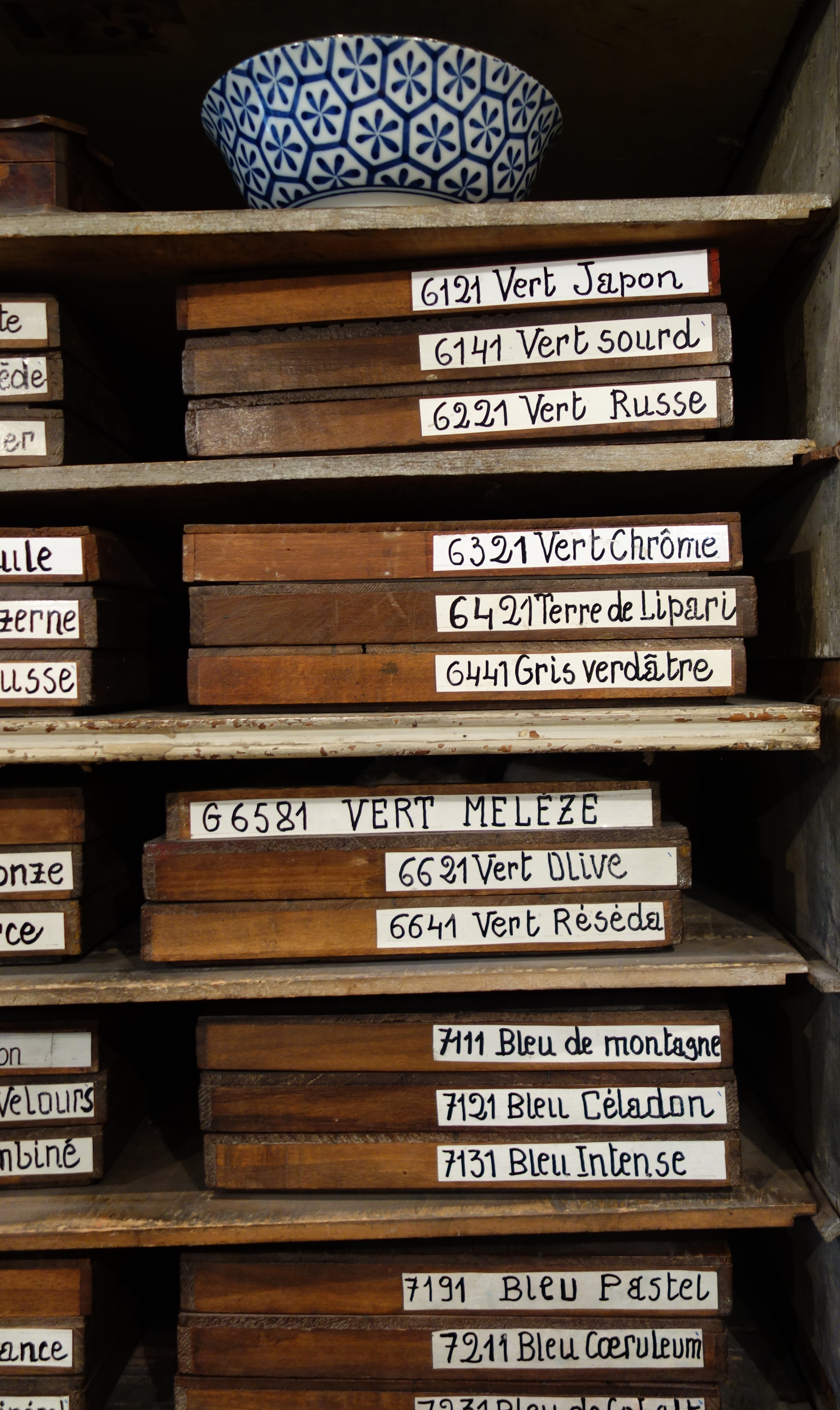
Unlike the pastels in the beautiful Roché little wooden trays, which bear names such as vert feuille morte, vert saule, vert algue, vert rainette and vert perruche (Dead Leaf Green, Willow Green, Algae Green, Tree Frog Green or even Budgie Green), there are but few paints that are named after the colour of something tangible. You see the odd olive, lemon or orange, a few flowers too, from the rose to the primrose, lilac to lavender, violets to fuchsias, add to these a couple of weird animals like the cuttlefish which was—both it and its inky secretion—called sepia in Latin, while we can also meet the mighty buffalo on tubes of Titan Buff (yes, apparently, the name comes from there but, when not blue, don’t ask which part of a buffalo that colour is supposed to refer to!) That’s about it.
If the paint rack bears more than these, it’s because you’ve probably landed in a kids/craft section where they go for flashy names, usually only found in their brand: Sour Lemon next to Sun Yellow, Fire Engine Red next to Chili Pepper, etc. If you’ve altogether missed the arts section and landed into house paints, then you are in for a treat, however! Just take a few of Benjamin Moore’s fifty light, yellow-based greens, and these will take you for a walk on Fresh Cut Grass or Spring Moss, where under either a Yew Green, an Apple Green, or a Snow Cone Green, you will be able to enjoy your Tequila Lime, Lime Tart or Lime Sorbet and, no doubt soon, while you’re enjoying the Sounds of Nature, you will probably Feel the Energy too! (Some names, such as a pale lilac in the Dulux range called “Perplexed”, might induce, on the other hand, a rather interrogative mood, as in “Do I want my study to be painted in “Perplexed”? Is that gonna help with the writing of my book?)
Maybe art paint companies also have marketing people labelling some of their tubes (I somehow doubt it), but in truth, these exotic ones (Southern Ocean Blue, Video Green, Flinders Blue Violet, etc.) should be warning signs that you’ll find a proprietary mix in there so check out the back of the tubes. And why do they do this? Well… it works! People love these places or feelings…
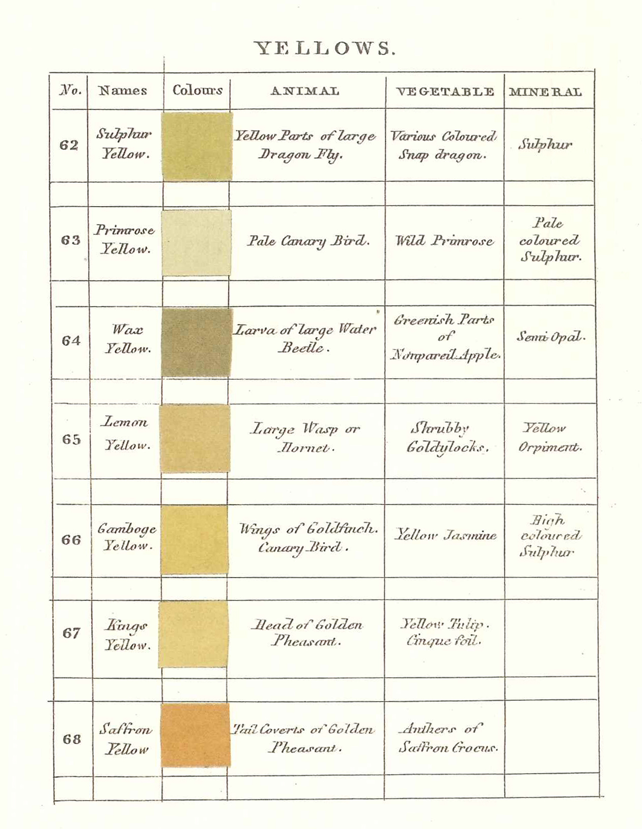
But, apart from these alluring ones, the problem with real, tangible things, flowers or beasts as colour references, is that they mostly underline that we are no Darwin. The fugitive Geranium Lake van Gogh could not resist evokes no definitive hue to me; lilacs, ranging from white to dark blue, are seldom the colour they are in tubes. Even when told more precisely that this yellow is the same as the “wings of a goldfinch”, I am not sure I have a relevant colour immediately come to mind. One that we could all agree on, of course!! (Which is the idea…) That description comes from Abraham Gottlob Werner’s pioneering Nomenclature of Colours1 beloved by Darwin, in which he gave painted swatches a name and number, then proceeded to describe them “accurately” by associating the colour to an animal’s, a vegetable’s and a mineral’s one. For example, Wax Yellow #64 could be seen, according to him, in the “larva of the large water beetle”, in the “greenish parts of Nonpareil Apple”, and in a “Semi Opal”… poetic but maybe somewhat vague for us poor mortals to say the least!

Jump to the next section of the book by clicking here
Alternatively click on the Table of Contents to browse the sections.
You can also subscribe to my blog at the bottom of this page,
and you’ll receive Hues in Tubes in your inbox… as it gets published!
Additional information and references
- Syme, P., Werner’s Nomenclature of Colours adapted to Zoology, Botany, Mineralogy, Anatomy and the Arts. Originally published in 1814, it has been reprinted in 2020 by The Natural History Museum, UK ↩︎
Discover more from in bed with mona lisa
Subscribe to get the latest posts sent to your email.

One Comment Add yours