I thought it might be interesting to be able to scroll down the chronology of these 88 pigments… and have added a little story about each, just because…
(Although most of that information is available elsewhere in the book, it is scattered and might be easier to access thus.)


Making plates and bowls has always been, by far, a more important industry than pictorial art, even when painting was considered indispensable as castle or pyramid embellishments for the powerful and wealthy. As a result, it is often ceramicists playing with their glazes who have discovered new colours including, in all probability, our oldest synthetic pigment Egyptian blue.
For once at least, a colour name was given to honour the Glorious, if Anonymous, Potter who, among so many others, had advanced the cause of Colour by discovering a pigment. In this case, around 1780, a most deliciously muted pink ceramic pigment that, some years later, Winsor &
Newton introduced as a watercolour paint under the name “pinkcolor.”
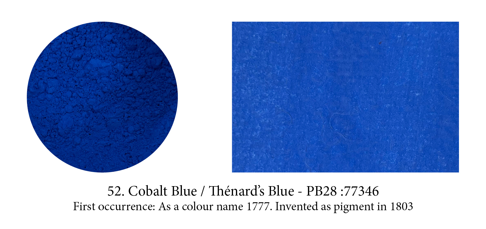
In 1742, Swedish chemist Georg Brandt showed that a blue color was due to a previously unidentified metal, cobalt. The first recorded use of Cobalt Blue as a color name in English was in 1777. It was independently discovered as an alumina-based pigment by Louis Jacques Thénard in 1802. Thénard knew the famous Sevres potteries used salts containing cobalt (smalt) to produce their blue glazes, and in 1802, from a mix of cobalt salts and alumina, he produced a pigment called at first Thenard’s blue. (Those chemists who have had their names attached for a while to a colour (Orr White, Perkins Mauve, Rinman Green, etc.), have often seen the colour’s name altered to something else in time.) With a purer tint than Prussian Blue, Cobalt Blue was immediately taken up by artists.

Maybe Scheele and Sattler are very pleased History has forgotten them as they were behind two of the most toxic, arsenic ridden pigments ever invented: Scheele’s Green and the more durable, intense and totally irresistible, but even more toxic Emerald Green, created by Sattler. Paint sold under the latter name nowadays has none of the above ingredient of course, and only Scheele’s name remains connected to his green, Sattler who created Emerald is not… but the fathers of killer pigments they both were, as these lethal greens were soon found on anything from toys to furniture to wallpaper. Most probably responsible for the death of quite a few little ones and perhaps even Napoleon Bonaparte himself!
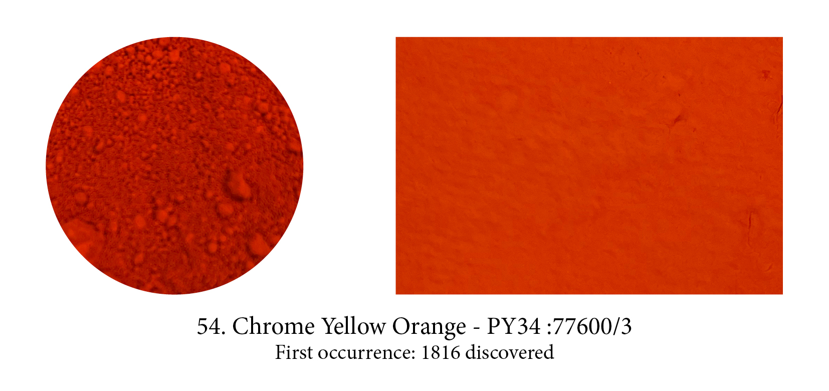
When chrome yellows and oranges were first introduced as pigments, they were an artist’s dream come true: bright and opaque. However, they darkened upon exposure to light. Still, it enjoyed a
brief history of widespread use among 19th artists, such as Turner, Manet, Cézanne, Monet, and Pissarro. Cézanne, like Pissarro and Monet, used the neutralising effect of combining three primary
colors—ultramarine, vermilion and chrome yellow—to make coloured grays. Soon replaced by cadmium colours, they are back on our palette nowadays, as modifications to the original form of the pigments, make them lightfast and resistant to change.

We had waited enough for that one! But, by 1828, the dream came true… Prompted by a reward from the Société d’Encouragement de l’Industrie Française, chemists began researching and within weeks of each other, Guimet understood how to combine and heat a number of elements (china
clay, soda ash, coal, charcoal, silica and sulphur) to produce a cheap alternative to lapis and, too, a German professor, Gmelin, using a slightly different process. Are you surprised to hear the French Société gave the price to Guimet and the new pigment the name of French Ultramarine? Both
commercialised their discovery, and the German version simply ‘stole’ the good old name Oltromarino. Today French Ultramarine still exists in tubes and is a slightly redder blue, but I have not been able to find out if that was the case already back then.

Three yellows were developed from Vauquelin’s element, chromium, all sold under the name Lemon Yellow, and were introduced to the artists’ palette around 1830. The most permanent of these was strontium yellow. Barium yellow was made much the same way, except barium chloride replaces the strontium salt. The third was zinc yellow. All three were semi-transparent; of which strontium yellow was the most opaque. Like all chrome colors, they tended to turn greenish in oil. Blockx preferred barium yellow as he found its permanence to be outstanding after thirty years and that it had an additional advantage of being mixable with all other pigments.

Europe was enamoured with chinoiseries at the time Zinc White appeared on the market and, as result, anything that came from China was both exotic and more fascinating it seems. I have found no less than ten ‘Chinese’ colours and only four actually connected to that part of the world. The astute Mr Winsor got onto the bandwagon too with his patented Chinese White, an “improved by heating at very high temperature” Zinc White which, if we are to believe their website, produced a “demand so high it is reported that London’s Rathbone Place was often blocked by carriages as eager clients tried to get their hands on this exciting new colour.” White, creating such a sensation… really? Isn’t that surprising?

Viridian, a transparent emerald green pigment, came to the rescue of painters in love with the colour but wishing a replacement for the deadly Emerald Green. Named after the Latin for green, viridis, it was first made in Paris by colourman Pannetier who only communicated his secret to Binet who also manufactured it. It is another chrome pigment, more vibrant than Chromium Oxide Green
but both are expensive to produce though so had limited following. It has, however, been found on numerous French impressionist paintings and in paintings by van Gogh. Today Phtalo Green has
virtually replaced it.
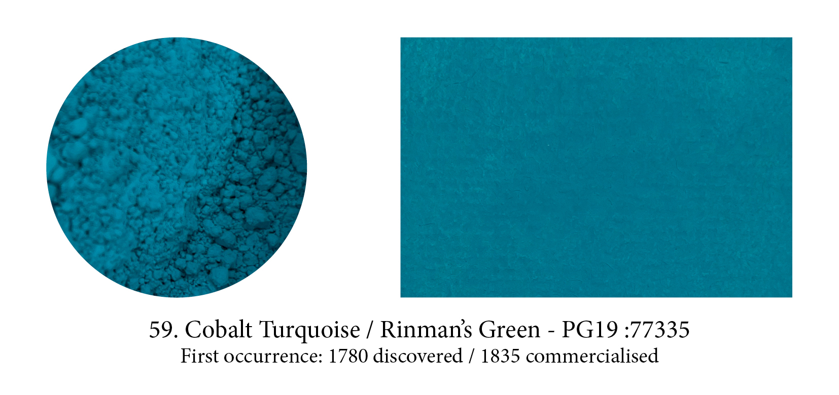
This bluish-green pigment is similar to Cobalt Blue, except that zinc oxide replaces wholly or partly the aluminum oxide in the latter. Although Church at the time described it as “one of the too rare pigments which is at once chemically and artistically perfect” he goes on to say that it was not in great favour because its colour can so easily be imitated by mixtures. (I would disagree, a vibrant turquoise is hard to mix!) Although it was discovered by Rinmann in 1780, it was not until after zinc
oxide became available in large quantities, that this pigment became commercially viable.
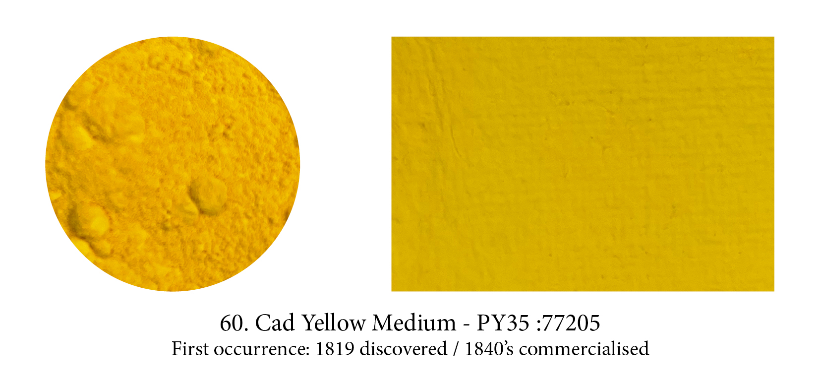
Synthetic cadmium sulfide was suggested as a pigment in 1819 by Stromeyer, although it was not commercially available until the 1840s due to the scarcity of the metal, a bluish-white metallic
element, required for its manufacture. Yellow in its pure state, cadmium sulfide can be turned into orange, red, deep red even black by merely replacing the sulphur in the lattice with increasing
amounts of a totally transparent stuff, selenium, which broadens the spectrum which can be absorbed…. My, I can nearly hear you say: that’s a lot of chemistry! But, still, transparency giving us all these hues, that quite something, no?
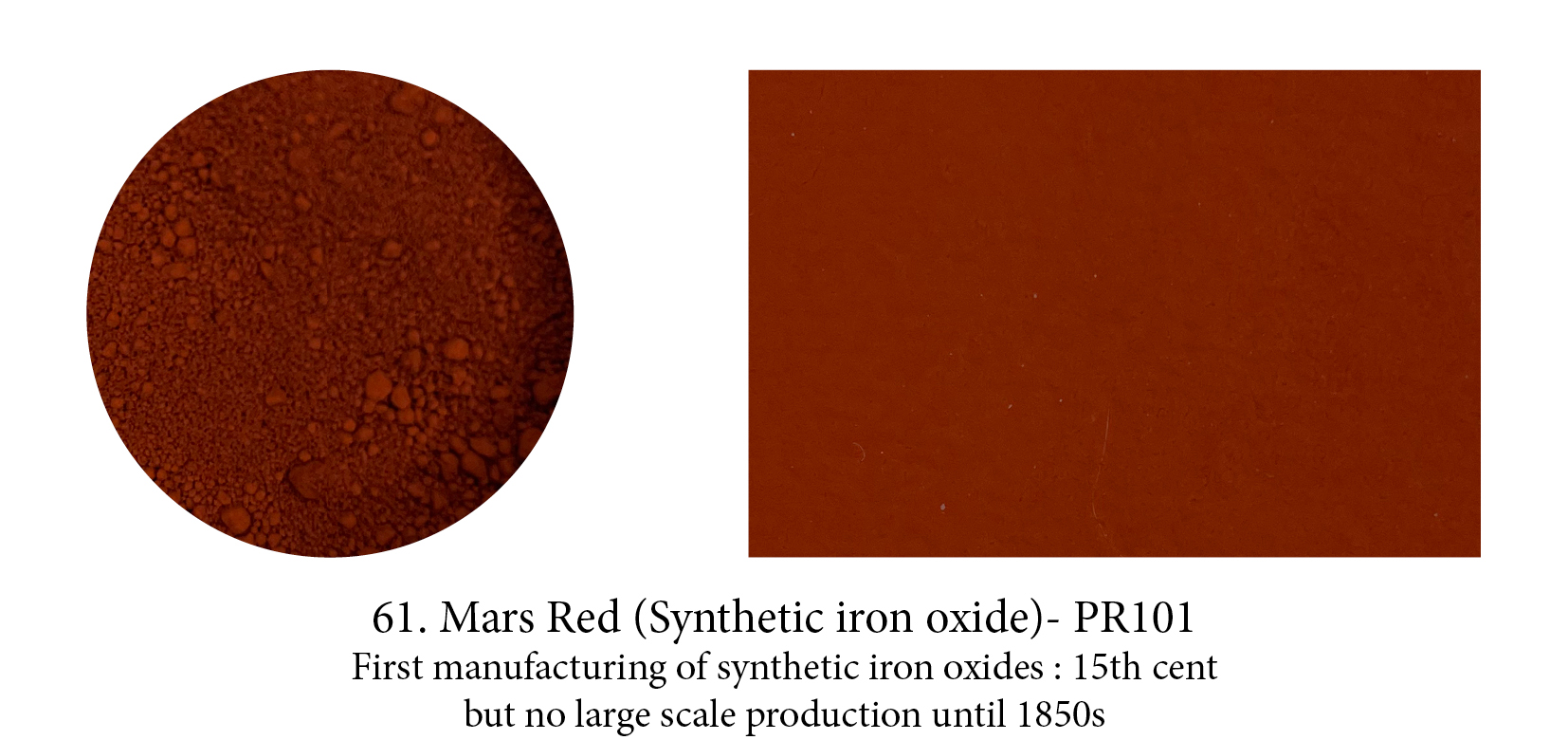
Mars colours, made from iron sulfate mixed with alum then precipitated with an alkali, were the result of a new method of pigment manufacture. Varieties of Mars Yellow were the starting
point for the preparation of the other colours which are heated to various degrees, with increasing temperature promoting the colour change through orange, red, scarlet.
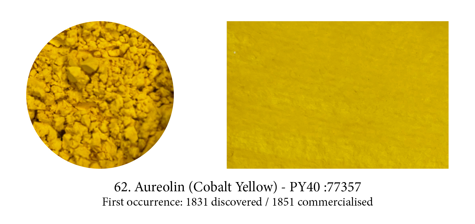
Cobalt, the mineral, is capable of producing a range of different hues – perhaps the most commonly known is Cobalt Blue yet a variety of other colours can be produced; a range of violets, teals and
even a yellow (via a reaction between potassium nitrite and cobalt salts, creating a crystalline mass.) These all became important in the art world. But, whereas all its family seems content to be called Cobalt, something happened when it came to christening the yellow… the Middle English aureole, halo, was chosen: a name which came from golden in Latin, feminine of aureolus. (An early
marketing trick, I believe.)
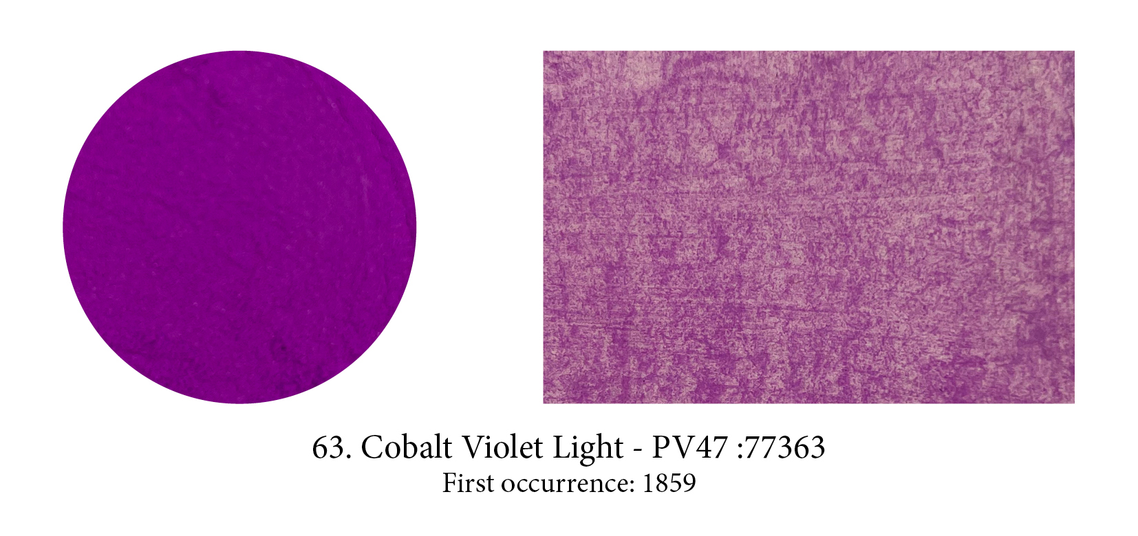
Purple… finally! This colour was probably the most elusive one to produce and, apart from the historical Tyrian Purple dye/lake derived from sea snails of the family Muricidae, and not only prohibitive in price but prohibited often for those that were not Byzantine or Roman Emperors, there was none to be had… ready-made. (You can always mix of course.) So that when Cobalt Violet appeared it made quite a sensation… there’s also quite a few shades of it.

I included this pigment, perhaps not a very well know or used one, more to show that unbeknownst to us there is often a whole family of pigments made from the original one. Ultramarine actually comes in reds, violets and pinkish ones like this one. These hues are obtained by tweaking the original pigment. Violet is obtained by heating a mixture of Ultramarine Blue and ammonium chloride. This pink by treating Ultramarine Violet with gaseous hydrochloric acid at 200°C
for four hours or at a higher temperature with gaseous nitric acid.
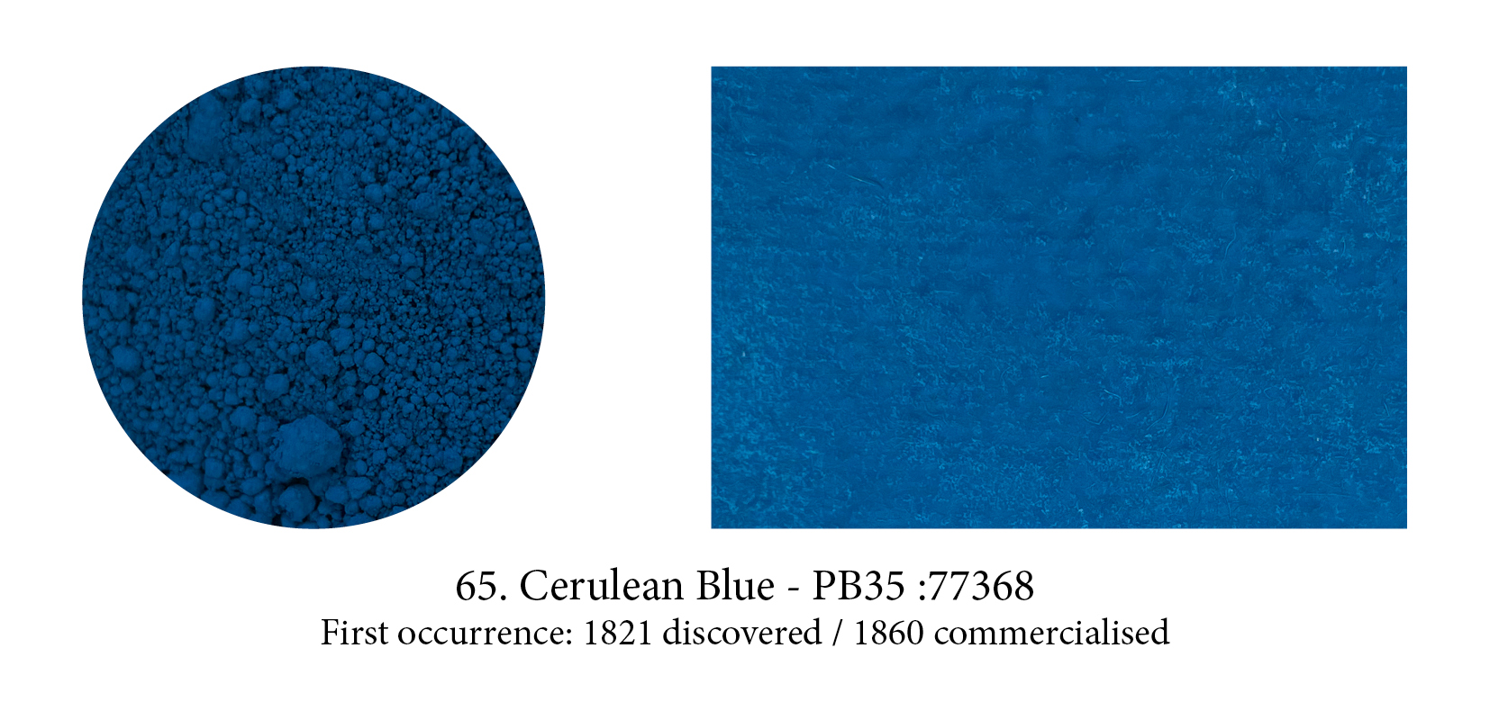
The Romans chose caeruleus, derived from caelum meaning both the blue of the sky and the Heavens, as a perfect generic word to describe all blues, including their synthetic one (whether the previously named ‘Egyptian’ Blue came from Egypt, Scythe, Cyprus or later from Pozzuoli, in Italy.) Over the ages, men forgot how to make this celestial blue… but the name was revived from the old Latin one in the 19th century in honour of a new pigment developed, a cobalt tin oxide compound.
That most heavenly Cerulean Blue is still found on our tubes today.
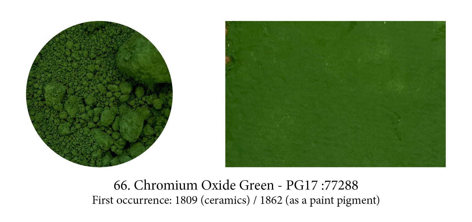
Chromium Oxide Green is one of four oxides of chromium. This “sesquioxide” one is darker and has an olive green tinge that its more vibrant cousin, the “hydrated” Viridian, doesn’t have. It’s very stable, offers high covering power which means its arrival rendered all the shifty, complicated copper greens unnecessary. The pigment requires 100% oil and must stand for a few hours after mulling, when it will again absorb almost as much oil as before… the result is a very slow drying
paint!

Although carbon is the material of virtually all our first blacks (think charcoal, soot, etc.) the Carbon Black in your tubes today comes from a process, formed from the incomplete combustion of natural gas, developed in America for a black more suitable for watercolour. It was widely employed by
1884 and has a finer grain than other blacks allowing it to spread better. (Maybe that’s the reason but it does feel much higher tinting too.)

First synthesised by two German chemists, C. Graebe and C. Lieberman, who reported their discovery in 1868. This one is important in the history of organic chemistry, for alizarin was
the first of the natural dyestuffs to be made synthetically (indigo was soon to follow). Its discovery caused a famine in France and, worldwide, an almost complete disappearance of the
madder-growing industry.
BTW Crimson here is used as a reference to colour and has no relation to the Kermes dye… which is confusing!
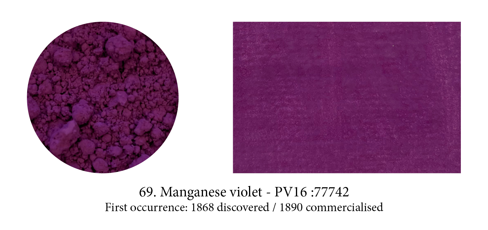
The Impressionists fell in love with this colour, especially Monet who declared it ”the true color of the atmosphere.” And indeed Manganese violet, rather than Cobalt, is to be seen in all the purple shadows and mauve specks of light that enliven his haystacks and waterlilies. He also predicted that three years hence everyone was going to work in violet but, in truth, few found its low tinting strength much to their liking… nor the colour!
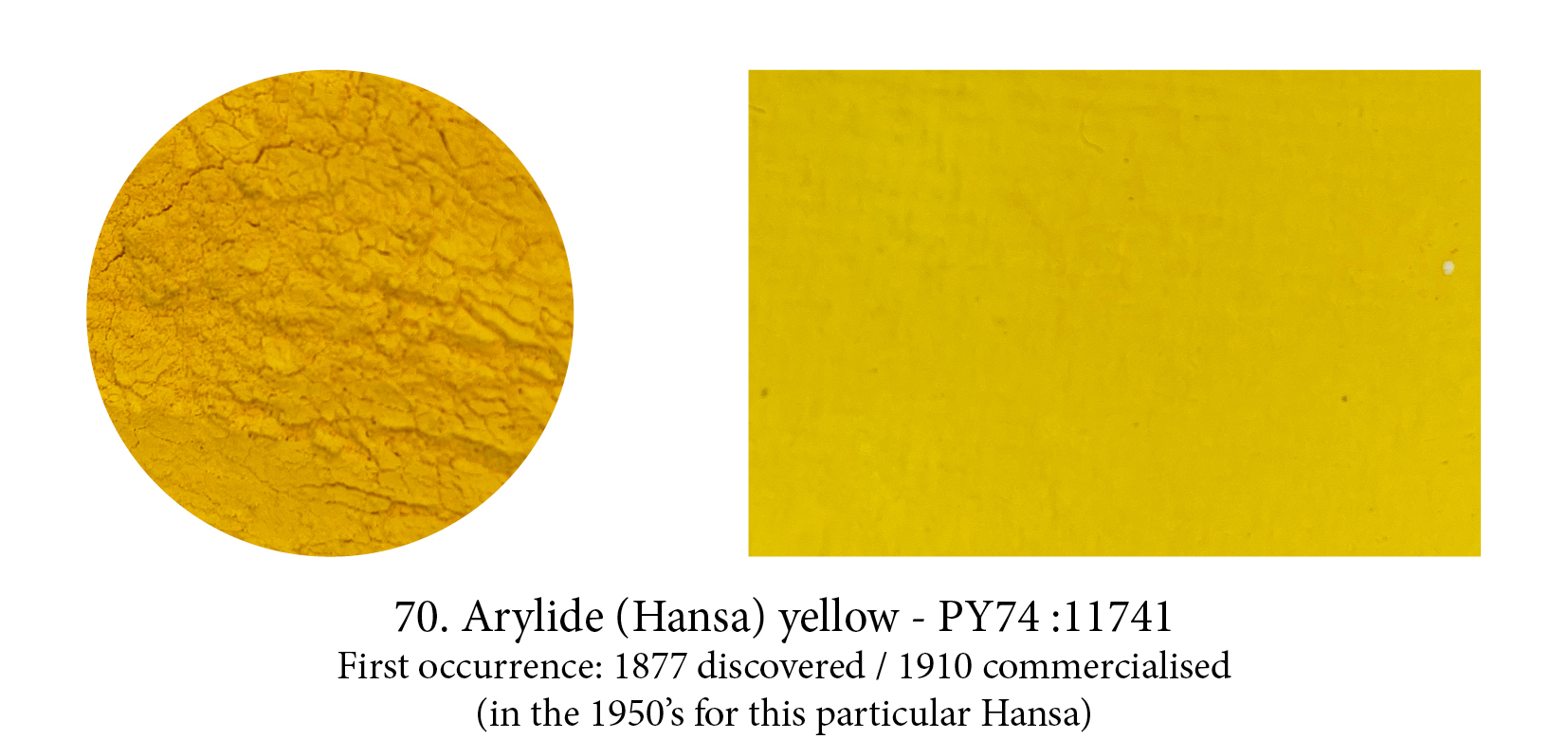
After the discovery of how to synthesise colours, chemists were able to understand better how to build molecules and soon many new colours appeared on the market. The very first azo pigment was Tatrazine Yellow (used in this timeline to simulate Indian Yellow) but there are around 30 azo pigments, primarily monoazos, in the Arylides… almost exclusively yellow. Relatively inexpensive, yet offering only moderately good colourfastness, Hansa Yellow Medium is often bought instead of the dearer and toxic Cadmium Yellow Medium but, unlike it, it’s semi- transparent.
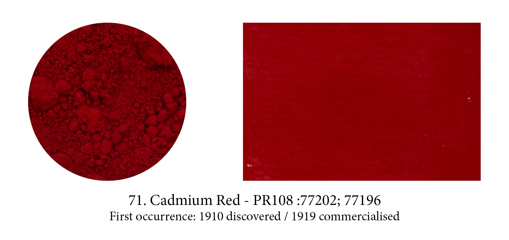
Although this pigment became an overnight success with artists, the TRUE Cadmium Red is hard to define… First of all it could be a hue but not labeled as such (I’ve seen such things), but even if you made sure what was in your tube was a true Cadmium Red, correctly labelled PR108, you would find dozens of red options under that heading. Each with a different shade, from light to dark, from cool to warm… and yet all genuine Cadmium Reds ‘called’ PR108! (Which explains the hue variations you might have noticed from company to company as each has picked the one they liked best.)
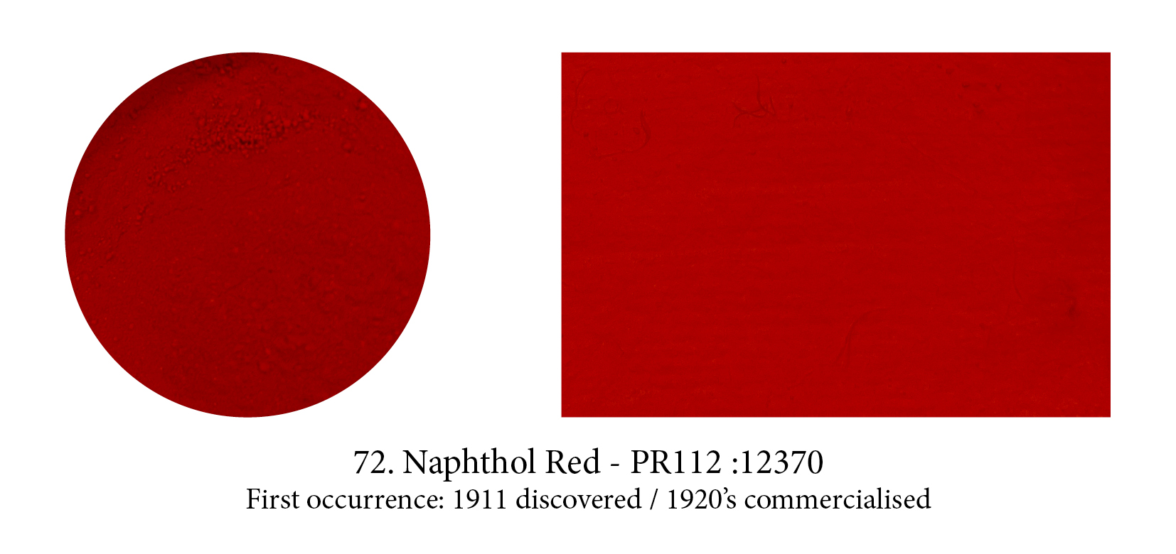
Naphtol is a registered trademark of Hoechst AG; the generic label for the same compounds manufactured by other companies is naphthol, with a second h. The word is from the Greek for “mineral oil”, and salutes the origin of these pigments in petroleum. Developed and patented in 1911, the naphthol compounds represent the single largest group of azo dyes and pigments. (In fact, about 20% of all synthetic organics available and over 50 in the red category alone, are naphthol pigments.) Originally used as cotton dyes, they were soon laked as pigments and were first used in artists’ paints in the 1920’s.
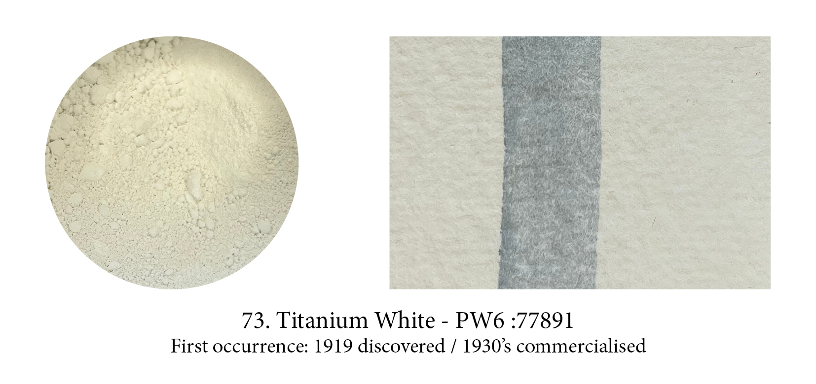
This pigment is really titanium dioxide and generally referred to as a natural pigment and, yes, there is plenty of the titanium ores around —but to get the stuff into a usable bright white pigment requires extensive facilities and power. We were not capable of manufacturing it before the 1920s, when a hydrocarbon-driven modern industrial process finally got it done. After that it struggled
to get a place on the shelves, whether in hardware or artists’ stores. Nowadays, out of concerns for lead poisoning, it has almost entirely replaced Lead White on the artists’ palette. But does this pigment make a good substitute? Many think not!

Cooler and more vibrant than Cerulean or Cobalt Blue, genuine Manganese Blue is a clear greenish azure blue colour. But, today, the one you buy is a hue based on the now obsolete Manganese Blue made of Barium Manganate which no one produces anymore due to environmental concerns and
its toxicity. This beautiful pigment has probably had the shortest lifetime of any!

Phthalo blue or copper phthalocyanine, is an organic blue dyestuff that was developed by chemists under the trade name “Monastral Blue” and presented as a pigment in1935, claiming that it was the
most important blue discovery since Prussian blue in 1704, and artificial ultramarine, in 1824, and was a superior pigment to both.
It’s true it’s an ideal pure blue for it absorbs light almost completely except for the green and blue bands. Watch out for its high tingting strength though which could also deceive you into thinking that pigment is opaque (in masstone it often does look like opacity so it’s confusing.) Phthalo blue or green, both high tinters, are in fact very transparent…
