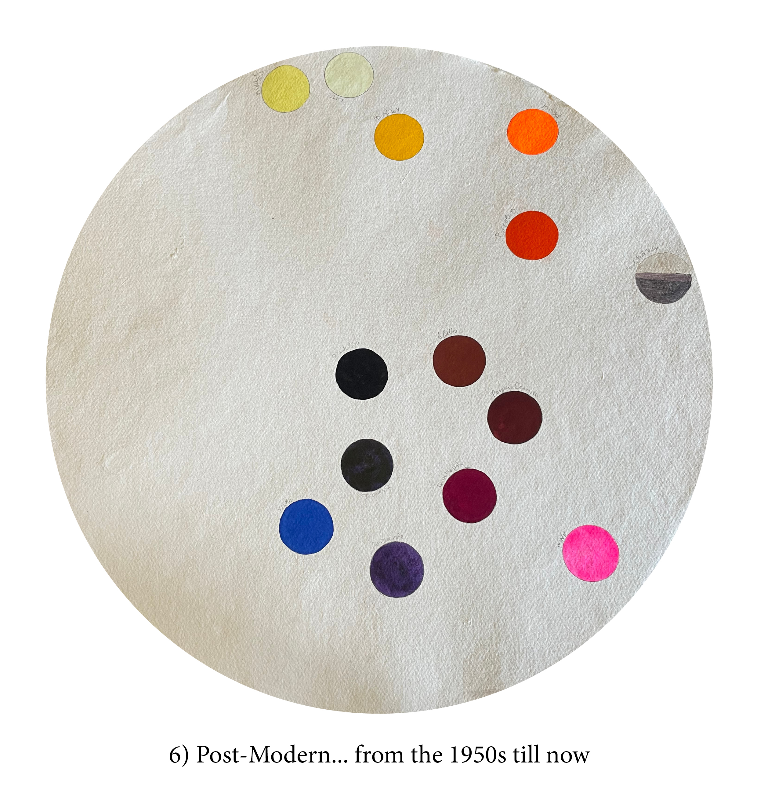
I thought it might be interesting to be able to scroll down the chronology of these 88 pigments… and have added a little story about each, just because…
(Although most of that information is available elsewhere in the book, it is scattered and might be easier to access thus.)
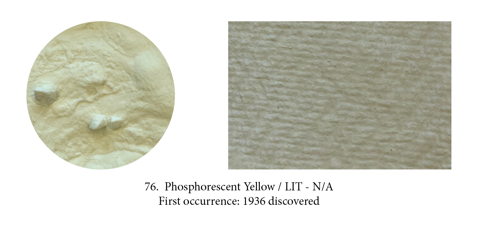
A luminescent pigment was discovered in 1936 when radioactive Radium was first used to create phosphorescent material. Phosphors are a chemical that absorbs energy (the incoming photons excite the phosphor molecules) and re-emits it as visible light, in a way they create their own light as the molecules release the energy they have stored! The one used here is a creation of Stuart Semple who claims it is “the world’s glowiest glow pigment.” It came out in 2018 but many other photoluminescent paints were available before. Phosphorescent pigments are usually green or yellow.

Phosphorescent and luminescent paints are rarely used by artists let’s face it, but fluorescents, who made such in hit in the psychedelic 60’s, are again on the up and up, however. These yellow, pink, orange, red, blue, green tantalising ones (there’s even a white in the Flashe range!) are even more exciting to peer into a jar of. They are not without limitations however — poor lightfastness (they are resin encapsulated dyes) and incompatibility in oil as that binder destroys those unique emitting properties —, yet they are proving irresistible to some artists.
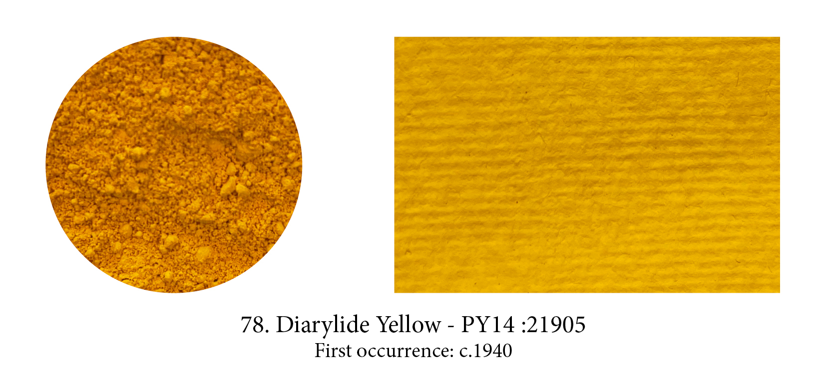
A group of around 30 synthetic ‘diazo’ (diarylide) pigments were first patented as early as 1911 but largely developed around 1940. Variations in the hue arise from differences in the atoms arranged around the outer (end) carbon rings. Although they are often more saturated and have higher tinting strength than the arylides, the doubling of the molecule unfortunately also significantly reduces the lightfastness so that diarylide pigments are more important in printing inks than artist’s paints.
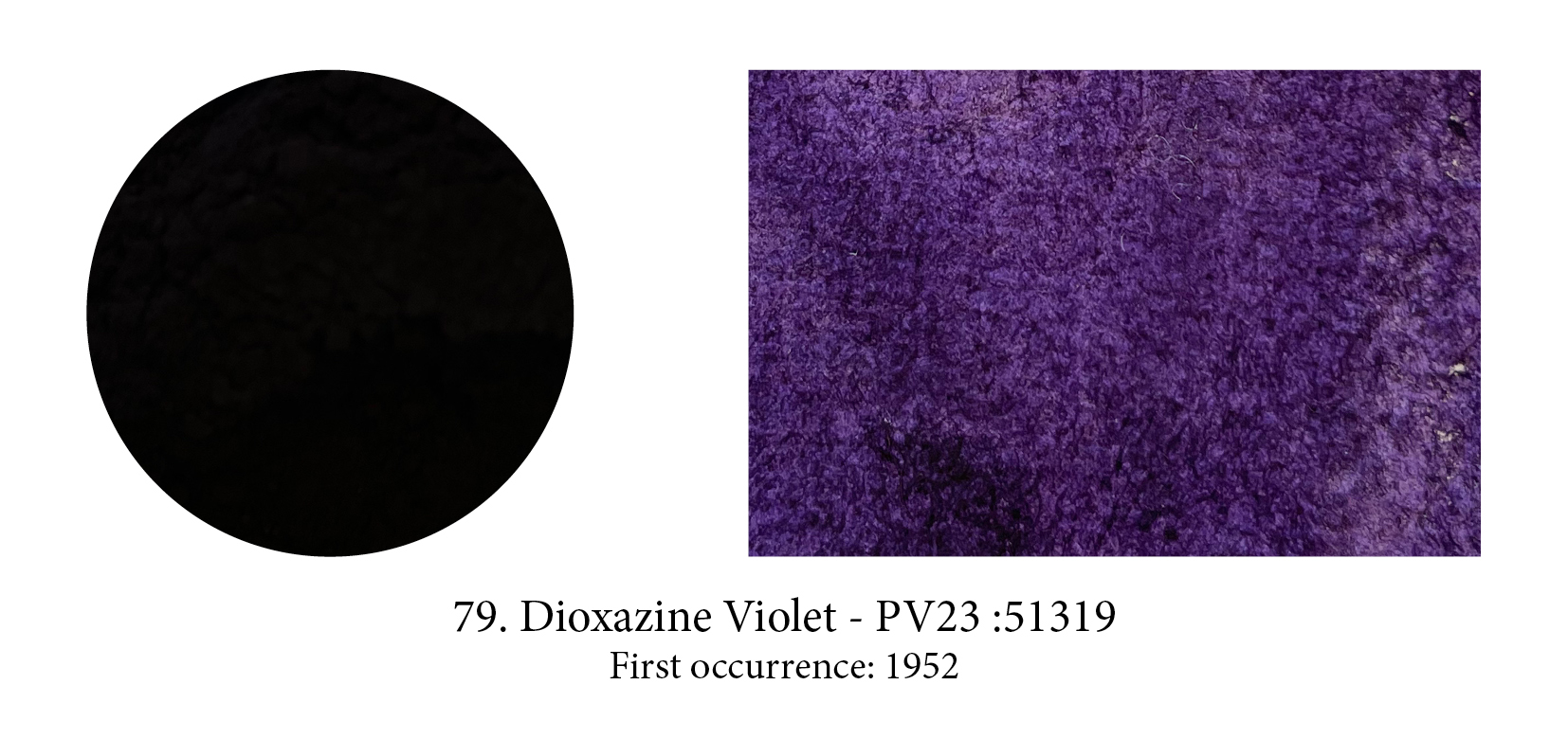
See how dark is this pigment!
From the large polycyclic pigments family, a small group of chloranil derived colorants include one very important pigment, Dioxazine Violet or Purple. Developed in 1952 by Hoechst AG as a dye, and now used in plastics and automotive finishes to warm the color of Phthalo Blue, this pigment is obtained by dissolving the dye in a very hot acid, then washing and salt grinding the precipitate that results. The pigment exists in two crystal modifications, a red and a blue shade, which have the same color index name, are poorly distinguished by manufacturers, and are apparently confused in the lightfastness testing literature too.

The Perylenes are another pigment family in the polycyclic tribe, which was first available as a vat dye around 1912 before becoming available as an artist pigment in the late 1950s. Their structure is a mesh of seven interlocking carbon rings, linked to two outer carbon rings by nitrogen atoms. Differences in color arise from modifications to these two outer rings. Available colors are limited
to moderately saturated scarlets, reds, dark maroons and a very dark green. All the perylenes are nontoxic, mid valued, transparent and strongly staining pigments with very good to excellent lightfastness.
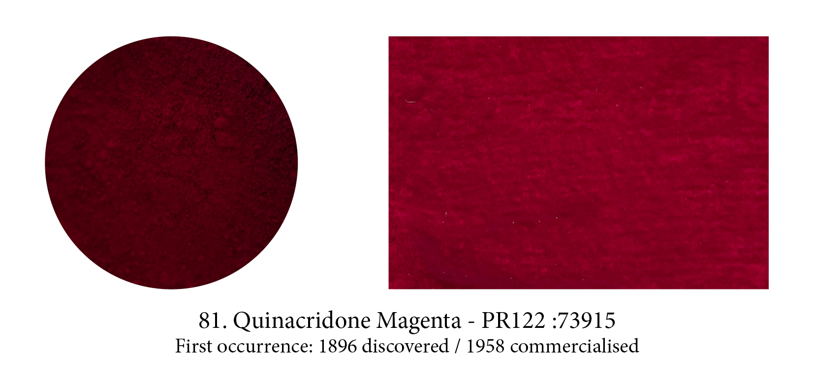
This large family of modern, moderately saturated and highly colourful pigments was repeatedly noticed in chemical research since 1896, but not recognised as useful pigments until 1955. The first quinacridones were marketed in 1958 as automobile colourants and artists’ paints (including the
beloved and now obsolete Quinacridone Gold), which were promptly adopted by New York abstract expressionist painters. Their delicious hues range from golden yellow, through reddish orange, red, coral, rose, magenta, to a reddish violet. In 1996 Winsor & Newton proudly launched their Permanent Carmine, a quinacridone, which is the closest match to the original carmine and has the additional properties of being stable and permanent.
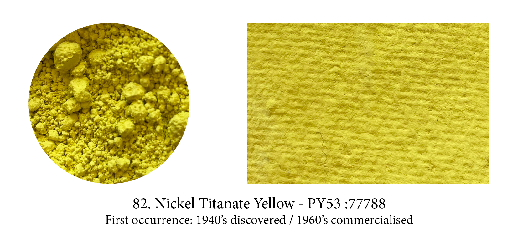
An inorganic pigment, sometimes called just Titanate Yellow, it might be the coolest yellow available. It is very pale and may show a faint greenish cast. The host pigment is titanium but nickel gives this pigment its colour. Nickel itself (an abbreviation of Nicolaus in German) was an evil genius who lived in the mountains and found no other pleasure that to put under the miners’ pickaxes a useless mineral (rather than the hoped-for copper) and also emanated the most toxic vapours!
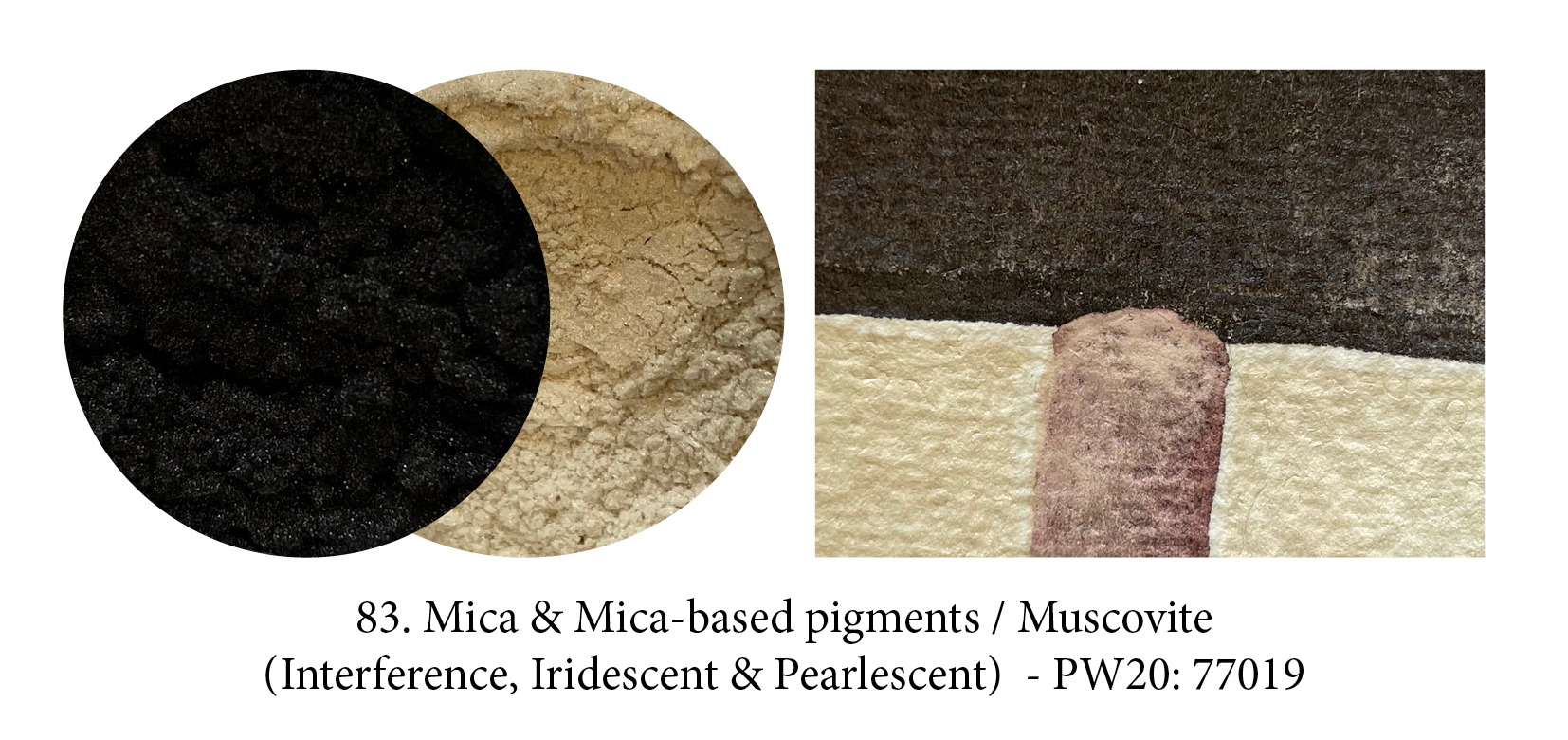
Micas, found in nature in thinly layered laminae, exists in their own right as pigments. They are translucent to opaque with a vitreous or pearly luster, and range from white to green, red to black. Although human use of mica dates back to prehistoric times, mica-based pigments created a revolution not so much when they came out in the 1970s, but when multilayer systems on mica were successfully developed in the 90’s. Opals, rainbows, soap bubbles, mother of pearl, butterfly iridescences could now be reproduced in paints too by attaching colour to mica flakes which had undergone surface treatment. What you see here is natural black mica on the one hand and a pearlescent red pigment made using white mica.
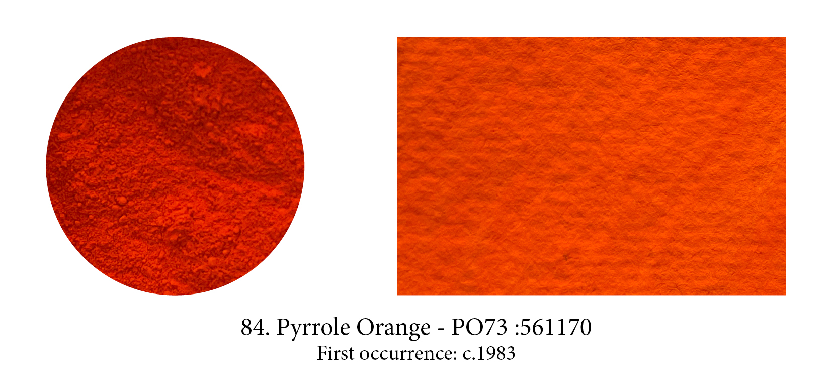
Pyrrole Orange is a yellow-shade cousin of Pyrrole Red, better known perhaps as Ferrari red. When it was developed by Ciba-Geigy it revolutionised the automobile paint industry as red tended to develop a dusty, chalky look prior to it. Both share important qualities for artistic purposes as they are highly opaque (a rarity in modern synthetic pigments), are highly lightfast, very pure and non-toxic. For that reason alone, I suspect these two pigments will, one day, overtake the Cadmiums in the same hues.
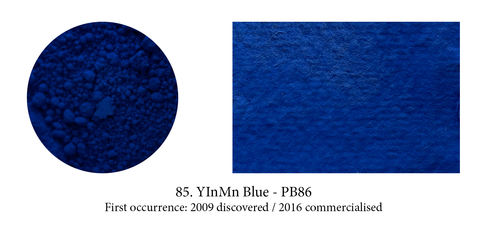
Prussian Blue was the first blue pigment to be discovered by accident in a lab, but, recently, another one saw the light of day in the same manner. In 2009, the chemist Mas Subramanian and his students at Oregon’s State University were investigating new materials that could be used for manufacturing electronics. A graduate student noticed that one of their samples turned a bright blue color when heated, to which Subramanian responded: “Luck favors the alert mind,” a quote
from Louis Pasteur. They named the colour YInMn blue, after its chemical makeup of yttrium, indium, and manganese, and released the pigment for commercial use in 2016. Derivan first turned it into paint, I believe, but it is dear and, so far, of limited impact in the art world.

Will Anish Kapoor be remembered as the man who acquired in 2014 the exclusive rights to the blackest shade of black ever made: Vantablack, which he promptly renamed “Kapoor Black”? The
response of his entire community has been something along the lines of: “Give it your name pal, no worries there but a colour… that belongs to all of us!” Stuart Semple’s response went one step
further… to buy his new PINK you have to swear “ you are not Anish Kapoor, you are in no way affiliated to Anish Kapoor, you are not purchasing this item on behalf of Anish Kapoor or an associate of Anish Kapoor. To the best of your knowledge, information and belief this paint will not make its way into the hands of Anish Kapoor.”

This “super black micronized pigment in a proprietary acrylic matt base” was Semple’s answer to Anish Kapoor’s Vantablack appropriation. It ‘only’ absorbs up to 99% of visible light, compared to Vantablack’s 99.965%. No more than anyone else can I get Kapoor’s black baby, and so contended myself with this one but having seen the real deal in the Forbes pigment collection I can tell you Semple’s has none of that “falling in a hole” feeling. Also “Vertically Aligned NanoTube Arrays” is quite a deliciously frightening name for a black… that black! (Plus it’s my only acronym.)
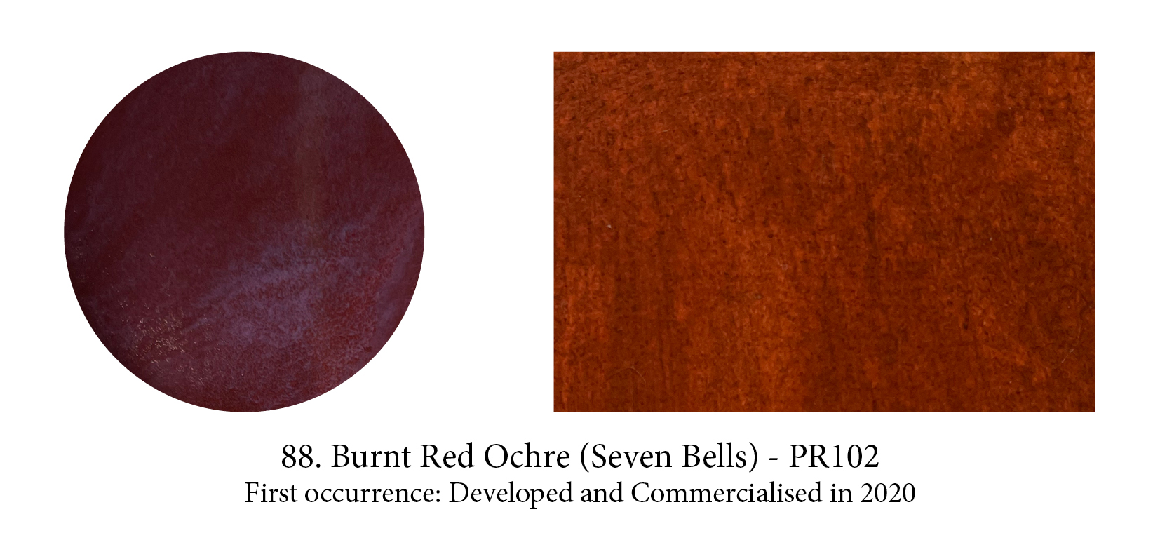
I have been following closely the fascinating development by Onya Mc Causland and The Coal Authority (UK) of paint from recycled ochre residues captured from the treatment of polluting mine water. The pigment is the result of released pyrite minerals which are transported to the surface when the mines flood. These, in contact with air, oxidise in the insoluble ferric form and the hydrated iron oxides then start to precipitate and form ochre particles. Too, I am delighted to close this timeline with a ‘new’ pigment which is the same as the first and oldest one in human hands: Red Ochre.
