I thought it might be interesting to be able to scroll down the chronology of these 88 pigments… and have added a little story about each, just because…
(Although most of that information is available elsewhere in the book, it is scattered and might be easier to access thus.)
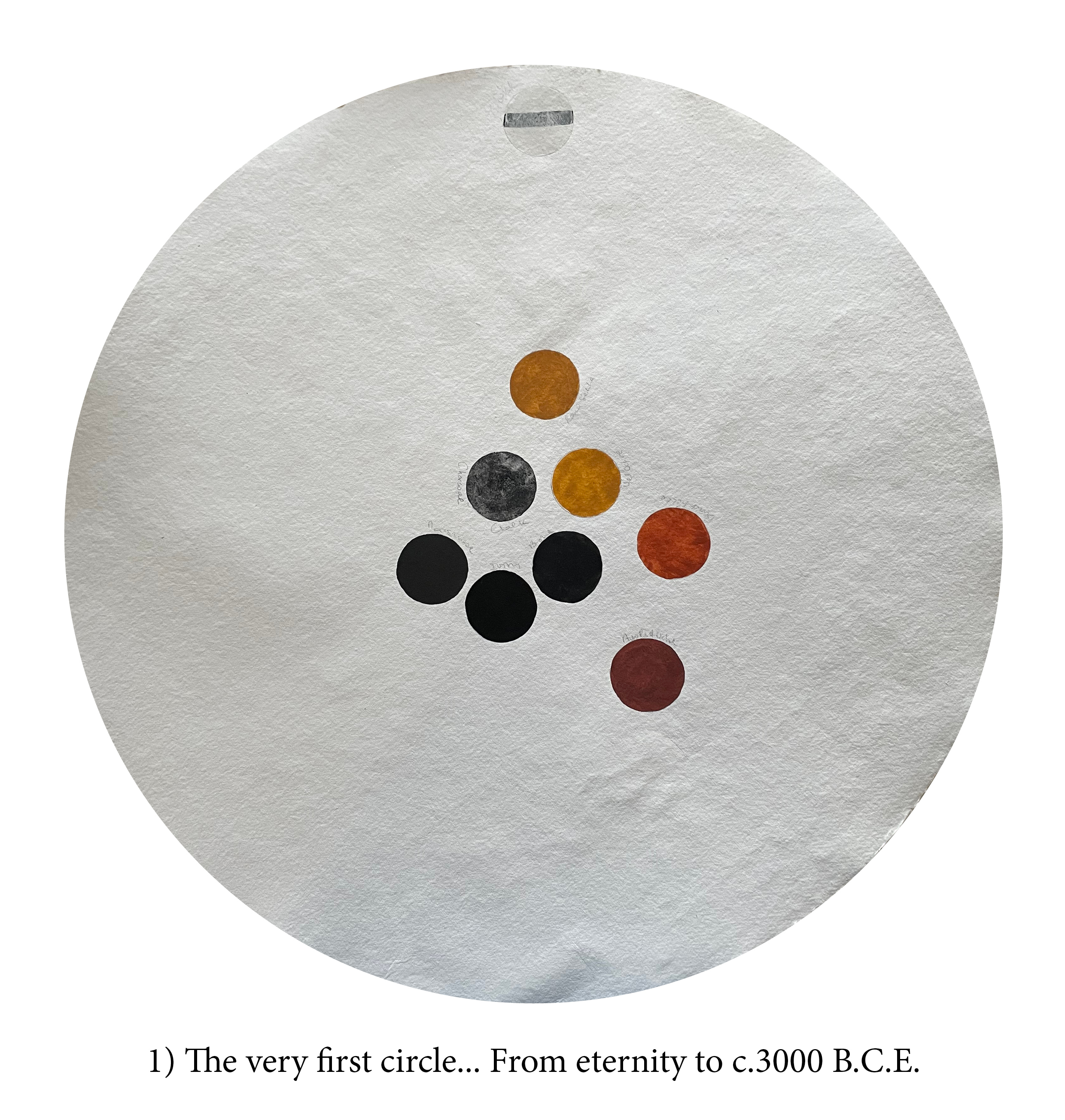

This red ochre comes from South Australia, on (now returned) Aboriginal land. There are many hues under the red ochre label and I choose this one not so much for its colour (there are more flamboyant ones) but because it comes from an ochre site perhaps in continuous use for the last 50000 years! Red ochre, often named after its place of origin, seems to have been our favourite one from the beginning of Time.

Although yellow ochres are far more abundant than red oneson the planet (or maybe because?) they have not been revered and used as much. However, at some stage in the late Pleistocene, we understood how to ‘burn’ ochres and turn yellow into orange, burnt-orange, red! So that when you’re looking at red ochre, even in cave art, it could be yellow ochre!
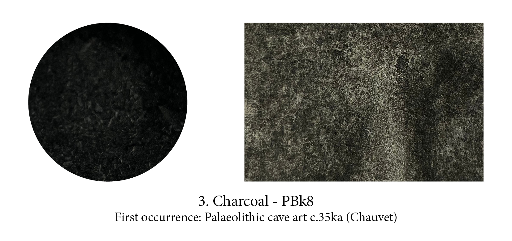
Charcoal, a wonderful ready-made drawing crayon, makes a rather weak paint unfortunately. Artists’ charcoal today is mostly made from calcined willow but you can successfully char peach stones, grape seeds and vine twigs… The Romans sweared by the blue grey tones of vine charcoal and had even found a way to carbonise the dregs (the better the wine, the darker the black apparently!)

Chalk is a specific variety of limestone formed entirely from microscopic, fossilised, phytoplanktonic algae. Present all over the globe and easily used, as these rocks are very fine-grained and generally pure, it had no rival until Lead White was invented. With the advent of oil paints (in which it turns transparent) it was definitely relegated to gesso grounds or used as a extender in pastels.
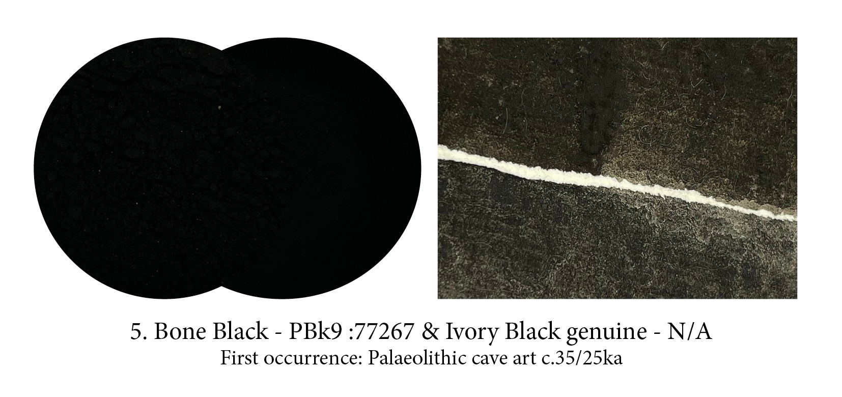
Prepared by charring bones in the absence of air (otherwise you get Bone White) it is rare today for your tube of Ivory Black to contain genuine ivory (for very good reasons) and although you can still procure some, at a price, you’ll have to decide if you can justify the expense — definitely artists always found it offered a deeper, more interesting blackness…. and it really does!

Very few paint companies still offer Manganese black, and yet Lascaux’s ‘artists’, who had other charred blacks (bone, charcoal), were apparently ready to walk more than 250kms to source the scarce complex mixtures of manganese oxide minerals — including groutite, hausmannite and manganite — seen in their artworks.

Siennas are iron hydroxide-rich earths, to which they owe their yellow-brown colour, but are distinct from the ochres in that they contain minor amounts of manganese oxides. Not as abundant on the planet as the ochres, they arrived a bit later on artist’s ‘palettes’ but certainly found a niche there as, even today, most painters couldn’t do without either of these.

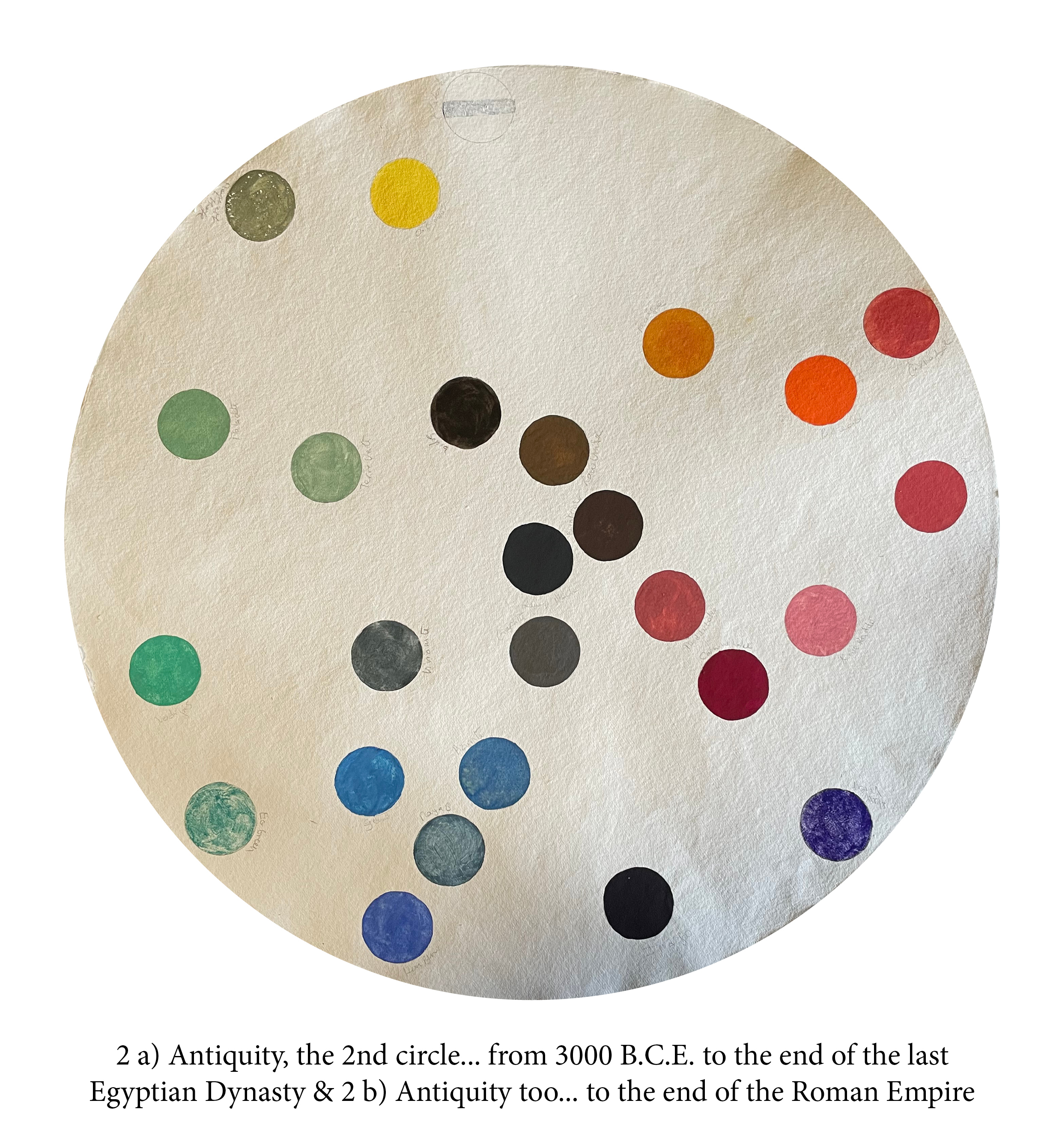
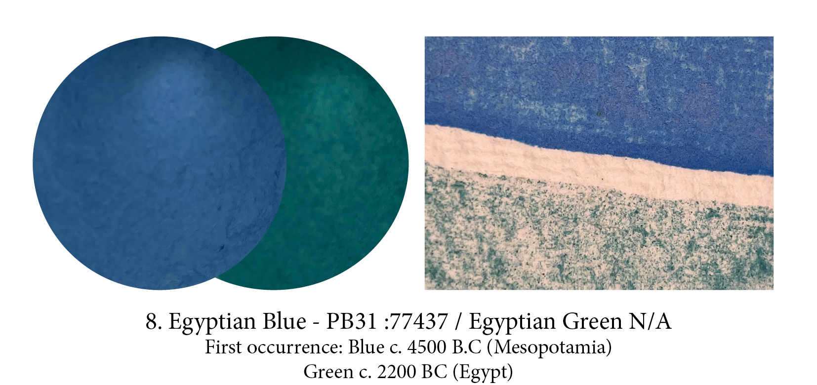
Meet our first ever artificial pigment! This recipe, probably discovered in Mesopotamia, was used throughout Antiquity… and then was lost (or demand had become so scarce that it simply wasn’t made anymore and forgotten). This frit pigment, the Romans called caeruleum, is not glassy but crystalline and is made from calcining copper or bronze powder with quartz sand and limestone in the presence of a potassium or sodium flux… in fact the hardest ingredient to find was the wood needed to keep the kiln burning at 950ºc for 2 days! If the temperature is lower you get green, higher… it turns black.
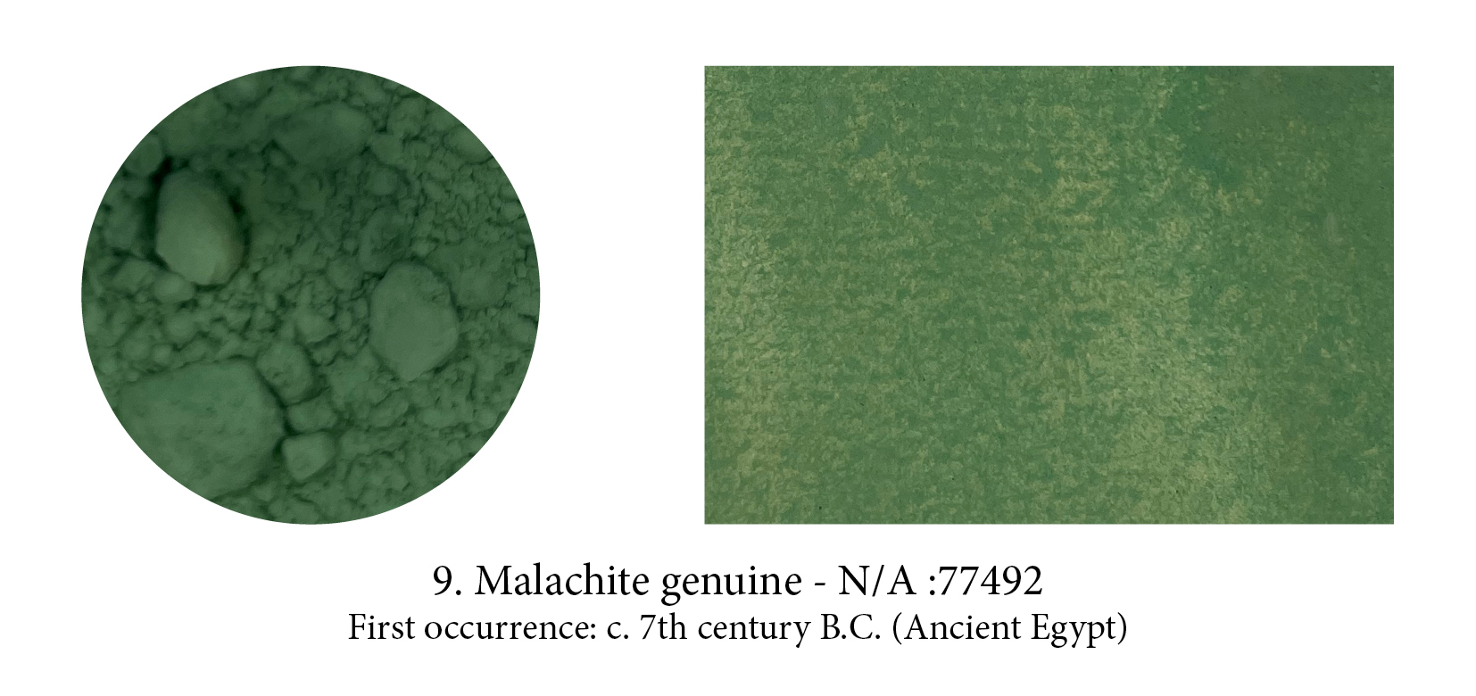
A copper carbonate hydroxide mineral, Malachite was used in Ancient Egyptian painting and particularly in the context of female “green-faced” coffins from the 26th Dynasty. Its green colour was only available in a coarse grind and the pigment turned weak in oils where a finer pigment was needed. Nevertheless, it was still used, layered for effect of its different hues and in a lot of binder in the 15th and 16th centuries… the binder has often reacted to the copper however and discoloured.

Gold is a peculiar pigment that needs pounding and hammering until it is the finest of leaves. These are then glued to a support, burnished to a shine and often enhanced further with incised or drawn patterns. You can turn gold into a watercolour paint (a tedious process) and, as it was once stored in shells, it kept the name of Shell Gold. Manuscripts were illuminated – literally and metaphorically – by gold and silver. The precious metals dazzled the eyes and embodied the most mysterious of God’s creations – light.

Found in nature as a mineral, this yellow arsenic sulfide was known to the Greeks as arsenikon and related to the Persian zarnikh based on the word zar, Persian for gold. Orpiment obviously too simply means gold-pigment. Known since ancient times, used in Persia and Asia as a paint, it was exported from the Yunnan province of China and used at first in Egypt as a cosmetic (not a great idea) as well as, later, as a paint. Despite its toxicity, and the fact that it smells foul, it remained incredibly popular in Medieval illumination.

Cinnabar is a bright red natural mineral: chemically, mercury sulphide. Mined in southeastern Europe as early as 5ka and used profusely by ancient Chinese alchemists in medicines as it was
thought to have almost miraculous properties, also because the liquid metal mercury could easily be extracted from it by heating. The toxicity of the mineral was well known to the Romans and workers in the Almadén mines, in Spain, were slaves or convicts, yet its beautiful red was irresistible. The most expensive pigment found at Pompeii, Cinnabar was brought from there under guarded escort.
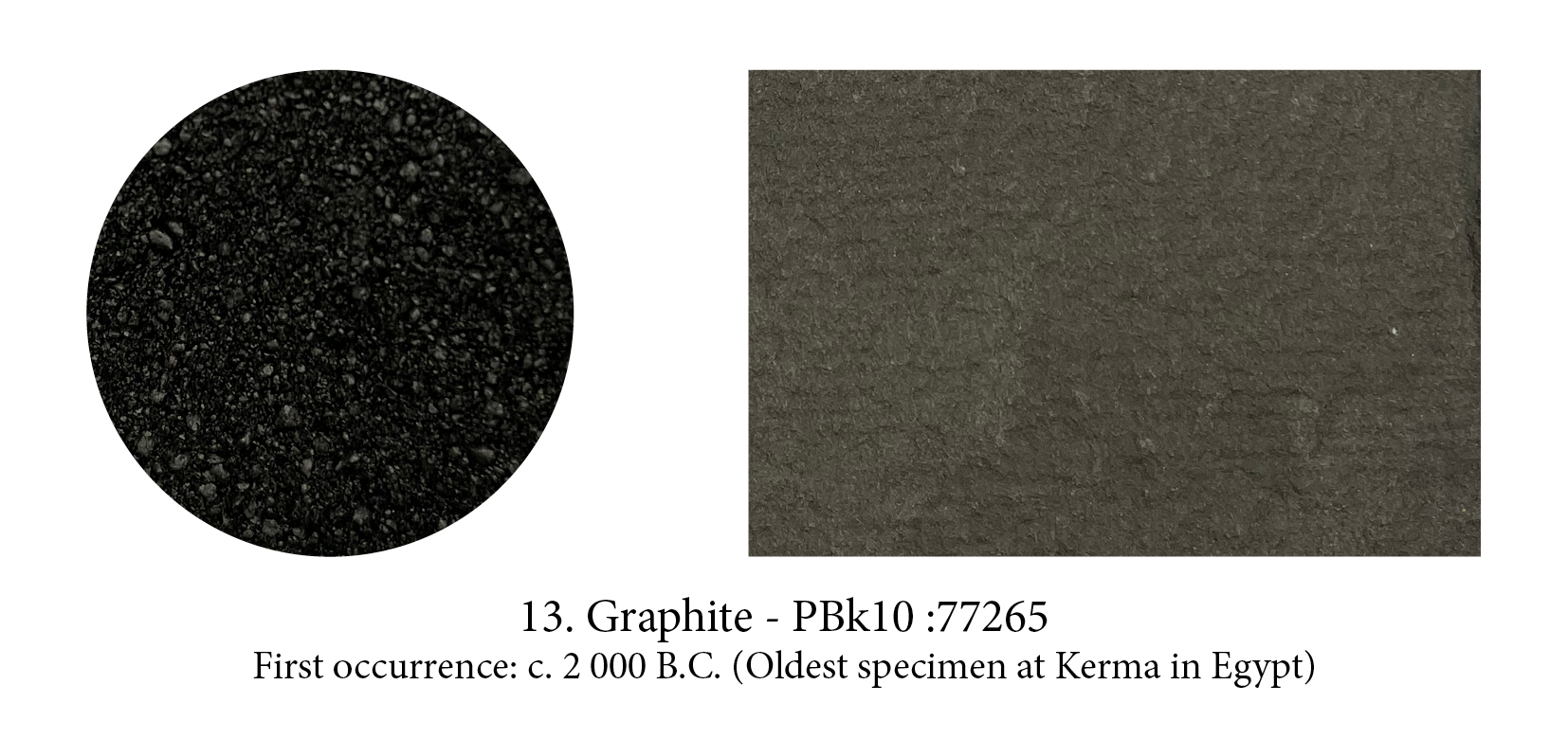
Graphite would one day overtake charcoal as a primary drawing tool and make a name for itself. At first, however, it was thought to be lead (some still insist on buying lead pencils!) and went by the name of plumbago, from the Greek, meaning to write as this pigment is more literary than painterly!
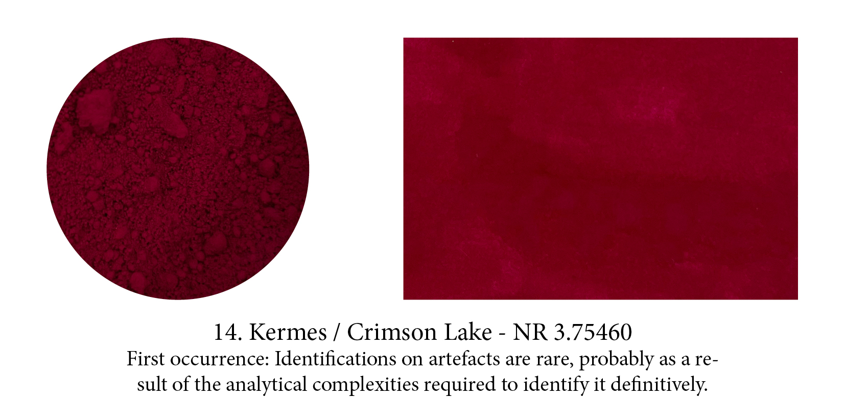
Crimson and Carmine are both derived from the Armenian word kermez which means “little worm” — that little one living on leaves of holm-oak and Kermes shrub oak named after it. Crushed, it releases a beautiful red substance used since at least 2000BC around the Mediterranean to dye cloth or, turned into a lake pigment, to paint with. We were well satisfied with it too until we met coccus cacti, its even more powerful American cousin — another parasite that cochineal one, which feeds off cactuses as its name implies.

Although soot has been used since prehistoric times to make black marks, and ink has been developed just about everywhere on the globe at some stage or another, Indian ink actually comes from China (its French name: Encre de Chine, is the correct one!) It was developed there in the middle of the 3rd millennium BC. replacing plant dyes and graphite which had been used for centuries prior but produced rather greyish results. The new process consisted of allowing little oil lamps with a conic hat to burn until all the oil had disappeared, the lamp left to cool, and the soot then collected. That pigment, mixed with animal glues, would then be kneaded and beaten until it was smooth and malleable enough to be moulded into cakes. Left to dry, the practical little sticks would produce ink-on-demand all over the Empire just by adding water.

Orpiment and Realgar, both natural pigments, are often found together and their Chinese names —“feminine yellow” for Orpiment, “masculine yellow” for Realgar — reflect that.
Realgar, an orangey-red pigment which I always thought sounded pretty regal, actually means in Arabic from which it comes: “rat poison” and with the mineral containing naturally 70% arsenic, yes I think it would have been most efficient indeed! Yet, we had to use it… if we wanted the colour that is, as Realgar was the only pure orange pigment until modern Chrome Orange.

Very many pigments contain copper but Verdigris — from the French Vert de Greece (green from Greece) — is the sun of this blue/green constellation! Until Arab alchemists brought to Europe in the Middle Ages strong acids like sulfuric and nitric acid, it was made by suspending copper sheets above vinegar (+/- salt) and wait until Copper oxide is formed. Verdigris is pretty undefined as it applies to quite a few different corrosions and its colour, as a result, can vary too. Mine here was made by Lucy from “London Pigment” from Victorian copper scraps from the foreshore of the Thames, reacted with vinegar.
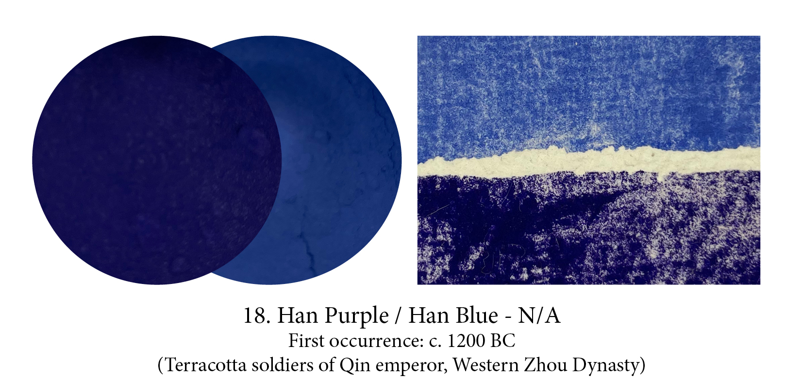
Both Han Purple and Han Blue were barium copper silicates which could be mixed to produce intermediate hues, yet they differed in their formula, structure, and chemical properties. Han Blue is remarkably similar in composition and manufacture to Egyptian blue (a calcium copper silicate, however), if slightly less fluorescent.
Their colour happens in the kiln too, not from a variation in temperature though (900°C will do), but from patience. Han Purple forms first, in around a day, but double the firing time and it will break down and release the blue. What mastery there too!

Some would argue that the innovation most critical to medieval painting was the synthesis of cinnabar, which became known by the name Vermillion — a truly alchemical affair! Imagine combining mercury and sulfur to create a black form of mercury sulfide which, once pulverised and sublimated by intense heating, turns into a divine red that could be sold for its weight in gold… You might even believe you’ve found the philosophical stone itself! Apparently too, the finer you ground this black, the more powerful the red would become… how entrancing.

Umbers contain between 5 and 20% manganese oxides and between 45 and 70% iron oxides. They are rich, warm brown colours which usually sit next to the Siennas on paint racks. However, if these are/were, indeed, from the region of Sienna, the Umbers don’t get their name from Umbria. In Italian, it refers to the shadows they were useful for, and I should have understood that long ago as in French, Burnt Umber is Terre d’ombres brûlée. When I finally understood that, I loved its
potential English translation: Raw Shadows, Burnt Shadows. Beautiful, romantic. One could even venture aromatic…

The cuttlefish was — both it and its inky secretion — called sepia in Latin, and despite the fact you could obtain black ink from the octopus and blue ink from the squid, it seems that golden brown was the winner of the Art ‘ink bag race’. These sacs, carefully extracted and sun-dried, were boiled in a solution of soda or potash in which the colour would dissolve. Once filtered, it was precipitated by the addition of acid. Today it’s really only a colour name (no cuttlefish!) but in the 19th century Sepia became so fashionable to draw with, that it partially displaced Indian ink and Bistre.
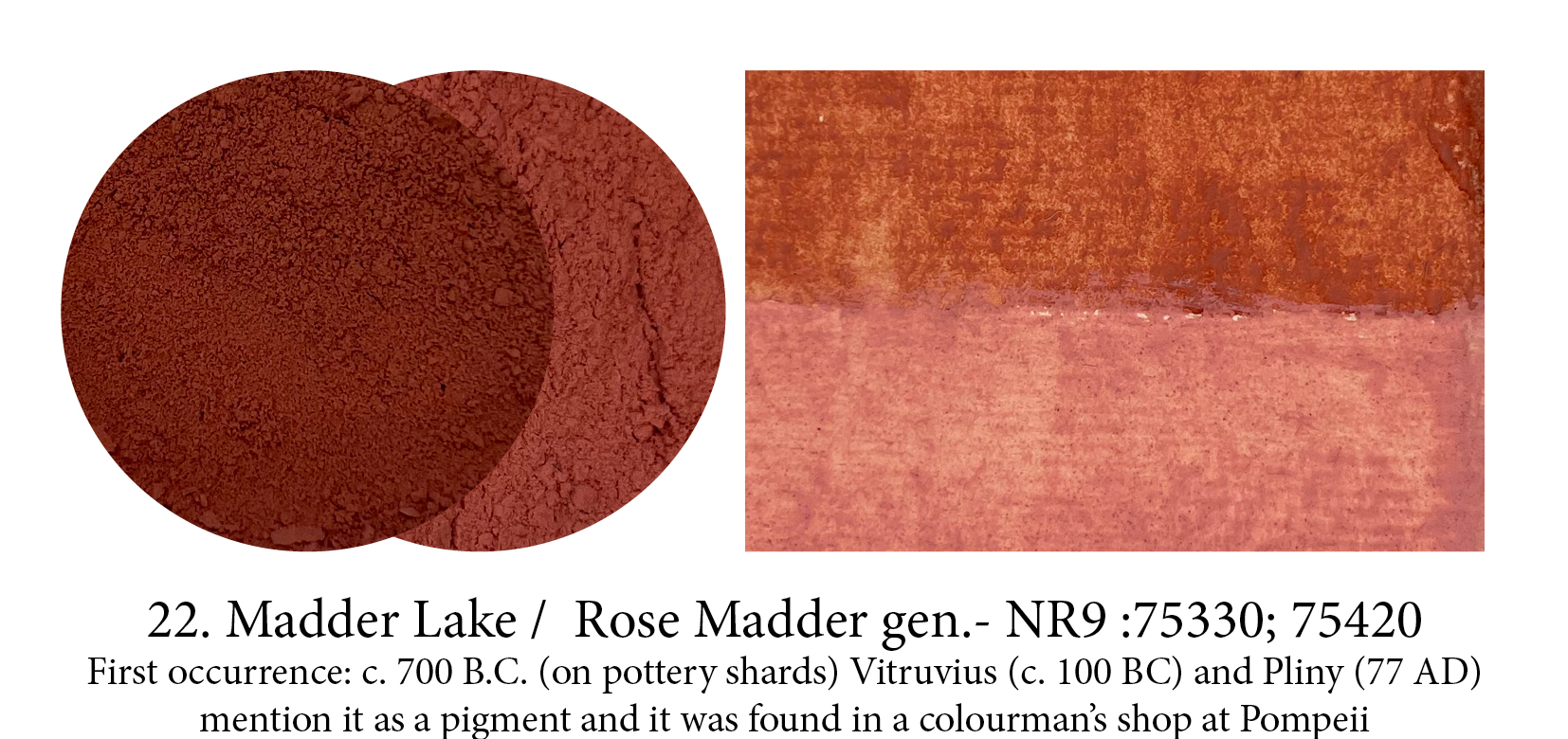
I have chosen to illustrate two of the most famous hues available to artists, however, madder roots can give dyers an infinity of pinks and reds. Being Lake pigments these were never lightfast and yet Rose Madder had such following in watercolour that it is still made today (only by Winsor & Newton). It’s synthetic counterpart, Alizarin Crimson, is (not as) fugitive… but still!

Minium is Lead Red’s natural mineral counterpart, while this artificial one is made just like Lead White, then roasted to a beautiful bright orange (despite its name and it being classified as red.) Pliny called its colour flammeus (flame color) but the pigment was not very happy in frescos where it turns black, until oils, in which it is quite stable. It was used more on paper both in Asia/Persia and, later, in Medieval manuscripts often in conjunction with the more expensive Cinnabar and Vermilion.

Litharge is hardly a useful pigment (its greenish yellow hue is depressing), it grits and doesn’t bind well (as it contains large lead pieces) and it’s toxic… so how did it even make it on this short list?
Well, the thing is, it’s an amazing siccative and was often added to cooked oils, walnut and linseed, when colours were blended or varnishes were made. So… it had its use!
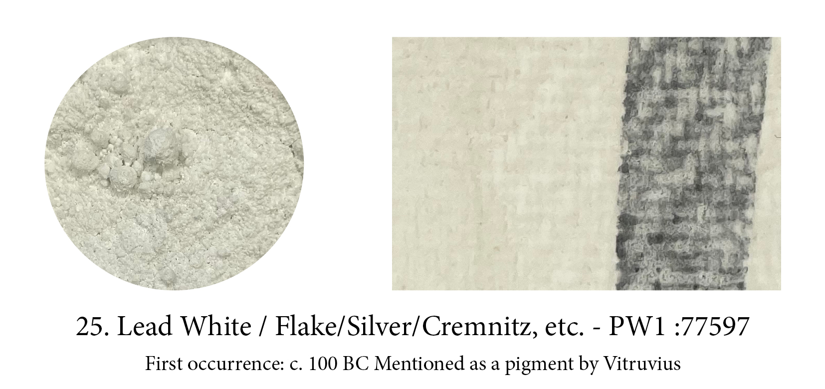
Lead white answers to many names… from its lead component, to its texture: flake (3 months of vinegar vapours will do that!), to its colour: silver, to where the lead came from: Cremnitz or where it was made… Rublev’s oil paint range offer 9 different ones made via the original “stack process” or not, in linseed or walnut oil, etc.
Painters still use it —carefully we hope— despite its toxicity because, unlike Zinc, it’s fast drying and, unlike Titanium, it doesn’t ‘kill’ the other colours!

Vivianite is a most curious one belonging to the group of magnetic pigments… It often goes by the name of Blue Ochre and, yes, it is an Earth pigment but not an ochre. It’s an aqueous iron phosphate that looks like almost transparent glass and only takes on its blue-gray color when ground. In paint it interestingly shifts from grey to blue to green. In 1979, the nearly complete mummy of a bison covered with a blue chalky substance was found in Alaska. That mineral coating of white vivianite was produced when phosphorus from the animal tissue reacted with iron in the soil. When the vivianite was exposed to air, it turned to a brilliant blue, earning the bison the nickname Blue Babe.
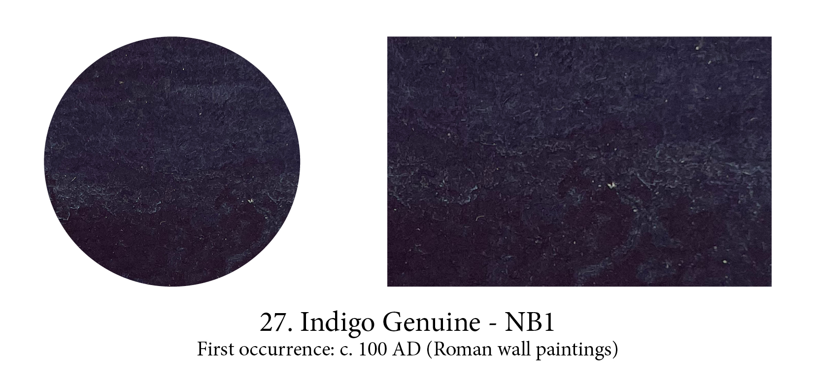
Indigo is a rare one. Despite its undeniable colouring properties in the vat and most of us knowing indigo as a dye, it is, in fact, a pigment. Oh, a lake pigment then. No, a real pigment, a babe which indeed cannot be dissolved into oils, resins or water, so correctly labelled as pigment. You can grind indigo cakes into particles fine enough to be milled in oil or dispersed in water and turn these into paint without need for further processes. The paint produced thus is a rather poor one which was often used however as an alternative to more expensive blues.

Green earths or Terre(s) verte(s) are green-coloured due to concentrations of the clay minerals celadonite or glauconite. Although derived from a mineral source, Terre Verte is not a natural iron oxide pigment, but an iron silicate with clay. For centuries, Terre Verte was mined near Verona in Italy, hence its other name ‘Verona Green’. This deposit is near exhausted and it mostly comes from Cyprus now. Extremely transparent, it has a low tinting strength. Its claim to fame was as a perfect underpainting colour for flesh tones, acting to neutralize them, and can be noticed often in tempera
paintings where the reddish/pink layers have faded.

To be fair to indigo, it must be said that it can make a wonderful paint… if you improve the recipe. It also requires a rather rare ingredient, attapulgite, a very white type of palygorskite clay but once you find it, you can turn it into one of the most durable, lightfast pigment existing. The first fragments were found on Mayan artefacts, and promptly baptised Maya(n) Blue. Analyses
deemed it a clay. (Indigo is virtually insoluble in almost all liquids and solvents remember, so pretty hard to analyse.) It took more sophisticated investigation equipment to understand the unique chemical bond of indigo-dyed-clays… and the right temperature for our recipe! On its way to 300c, indigo molecules dissociate and enter the nanotubes of this particular clay and bond with them, a reaction irreversible. Higher temperatures will give you, as with the dye, endless variations of the blues!


Japanese Pearl White is made from oyster shells. The shells are collected in large heaps by the sea-side in Kyoto, where they rot quickly in the warm and humid climate. Over a decade, the organic compounds decompose, leaving behind the finest pearl white flakes. Ground further, sorted by size, Gofun was the most important white in Japanese art and crafts. Mixed with a rabbit skin solution and applied on a sized ground, it can then be burnished to a gloss with an agate burnisher. There is only one Japanese manufacturer still producing genuine Gofun Shirayuki.

Gamboge, made from the crystallised resin of Garcinia Gummy-Gutta, a sort of latex tree, takes it name from where it grew: Camboja — the antique name of Cambodia. The solidified pigment was sold in the bamboo canes in which it was collected from the trees and often called pipe gamboge as a result. Being a resin, it is a non crystalline, amorphous material with poor lightfastness and probably best remembered as the partner pigment to Prussian Blue in Hooker’s famous green. The man, Royal Horticultural Society’s botanical illustrator, was weary of mixing these two colours all day long and asked his pigment dealer to premix them to save him some time. These days it’s still available, as indeed it is most useful, but as a hue.

It wasn’t until we finally understood the unusual process needed to turn lazurite into a celestial blue that illustrators chose to lavish it in their Bibles. Until recently, it was thought lapis arrived later in Europe yet the most amazing find — the skeleton of an aged woman in the cemetery of what had obviously been a flourishing nunnery in Germany— forced us recently to revise our datation somewhat. The lady died around 1000-1200AD but left behind the most unusual evidence of what her contemplative life had been all about. Embedded in the dental plaque of her teeth, more than a hundred tiny flecks of blue pigment told the tale of a paintbrush repeatedly humected and shaped back into the fine point needed for the detailing work and embellishments of manuscripts… a labour of love no doubt!
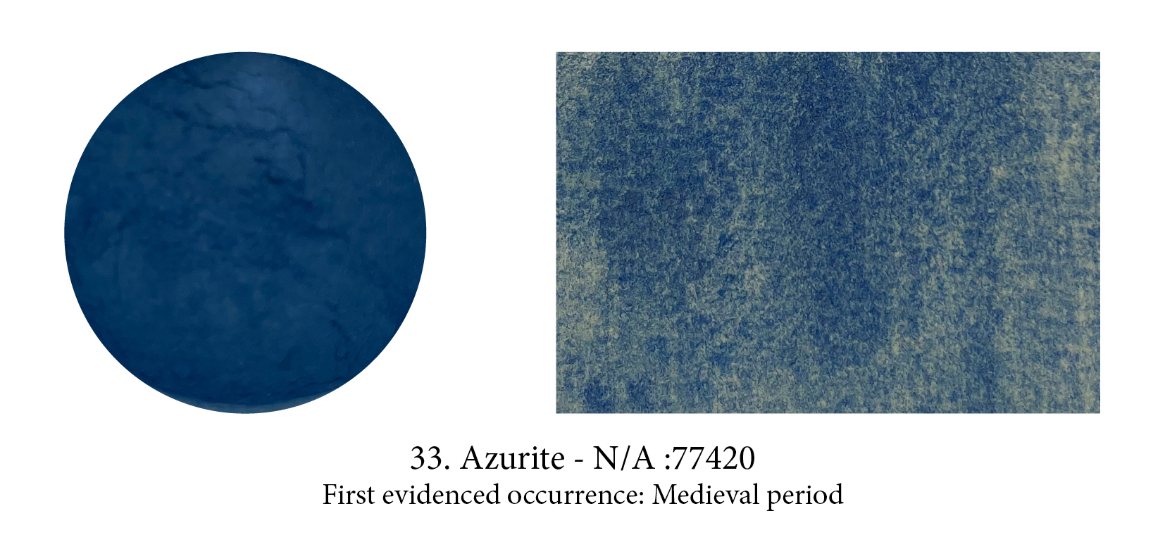
Although naturally and often found with Malachite, Azurite had quite a different destiny. Evidence in graves (and possibly as an exciting eye shadow) has been found at the Neolithic, Central Anatolian site of Çatalhöyük, then attributions in Ancient Egyptian painting are few and disputed but its time was coming… Often used in frescoes and manuscripts in the Middle Ages, then as underpainting or in combination with the dearer Lapis in oils, its multiple hues made it the most important blue pigment in European paintings from the XV to the XVIII century.

Used less frequently than gold in illuminated manuscripts, silver was favoured for the depiction of armour. Saffron glair was often added to silver paint so its not hard to guess which, of gold or silver, was the most valuable of the two then and there (it was not the case in China actually) but the main difference between them is that silver tarnishes when in contact with sulphide-containing pigments, and often now appears black. This was put to good use in silverpoint drawing implements where the extremely fine silver wire would, on prepared grounds, turn black and leave the finest of lines.
PS: Its Latin name argentum also gave a country its name… can you guess which?
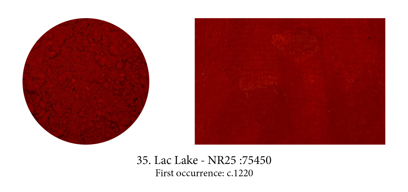
Are you dying to know why lakes are called lakes? Hear the tale of Lac then… Used as a dye as early as c.1500 B.C.E., Lac (or Lack) was later turned into a vibrant, transparent, deep red-violet pigment known as Indian Red. Co-created with the host tree, it was not understood for a long time that it resulted from a sting from a female scale insect and the reaction from the tree. Its name actually comes from the sanskrit word for one hundred thousand… that’s how many were thought to be in a single scarlet resinous secretion! When the same insect was actually left to hatch and fly away, only the resin remained on the branch, a blond substance that was turned into a lacquer, known as shellac. Infinitely cheaper than Vermillion, Lac took the art world by storm. Eventually, its popularity extended its name to all the other insect-based red colours then to all pigments produced from a dye.

Meet the intriguing Dragon’s Blood — a total myth that one. Not that dragons don’t exist of course but this particular shiny and sticky red substance was not collected from a dragon’s belly punctured by an elephant, as Pliny’s commercial blurb went at the time but, more prosaically, from the resin of the Dracaena tree. I know, life is disappointing sometimes, but tell me how could I resist adding it here? “Cinnabar of the Indies”, its other name, was already quite exotic but “Dragon’s Blood” is altogether the best paint name ever in my opinion.

Blue Verditer, also known as Blue bice or ashes, is chemically and structurally analogous to Azurite, a ‘basic copper carbonate’. Produced since the early Medieval period to substitute for more expensive blues, and Azurite itself of course, it had none of the qualities required for a pigment (Fugitive, incompatible with many other colors including Lead White and Vermilion) except perhaps its price which explains why it was still in use in the 19th century but to paint wood panels in homes rather than on any easel painting.

It has been used by the Mesopotamians, the Indians, the Japanese, the Egyptians, the Greeks, the Romans and the Aztecs to caulk boats, waterproof baths and tunnels, consolidate fortifications, cast statuettes, set jewellery, create pavements and as paint too of course or I wouldn’t mention it. In 312B.C.E., the Seleucids and Nabateans fought hard for the place where it occurred naturally. The first oil war not quite, although… Have you guessed what it is? I’ll give you a hint. It was used to soak the shrouds wrapped around bodies, and eventually gave its Persian name, mumiya, to the embalmed corpses themselves. This elusive dark brown glazing friend, annoyingly sticky and beautifully transparent, is known as Bitumen (or Asphalt.) Tar sands are natural occurrences of bitumen, and that name actually sums up its two components: the organic crude oil and non-organic sand.

Eggs seem to play a large part in art materials world… as a binder! There are many variations on the tempera emulsion recipe sometimes using the whole egg, only the white, only the yolk, sometimes some oil is added, and sometimes it’s even emulsified in beeswax. Also, there have been many a criterion found for choosing these eggs over those eggs — with colour of the shell to provenance of the chook (or whether from country or town) giving many a fascinating discussion as you can imagine! — but freshness seems to really be the number one. (However, tempera would rot after a few days… Hum!) However, if your egg is white, don’t throw away the shell as, crushed, it can make a pigment producing “an incomparable white which cannot be surpassed by Lead White” assures us the Secreti di Don Alessio Piemontese, a well-known ‘book of secrets’ that was first published in 1557.
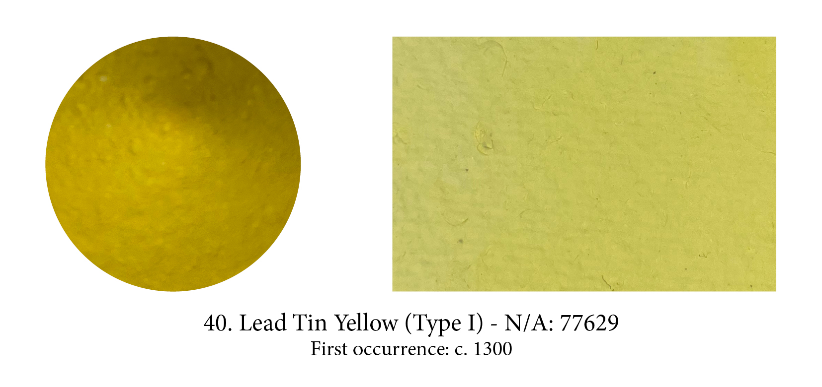
Lead-Tin Yellow type II is, in fact, the earlier pigment (I know, I know but I’ve had nothing to do with this classification and agree it’s just annoying!) Traces of type II lead tin oxides are attested in Roman mosaics, yet as a paint pigment no occurrence of either type have been found before Giotto’s Last Supper, c 1300. After that, a number of paintings use type II, yet type I seems overall to have artists’ ‘preference. What’s the differences between them? Their particle shapes!! We knew they resulted from quite different methods and were slightly different in colour but, even with a microscope you would find nothing else to tell apart the fine particles yet with the higher magnification of an electron microscope, quite different particle shapes are visible… no wonder it took so long to tell them apart!

Today Stil de Grain genuine doesn’t exist on our palettes anymore, yet lingers in a few ranges as a colour name. And Sap Green, its partner pigment, has nothing in common with the original one. Both were produced from buckthorn berries — ripe/unripe would modify the colour. Along the way, I found out that the buckthorn berry was called in French graine d’Avignon, Avignon seed, so graine to Grain seemed a plausible step. Still, if it definitely sounds French, Stil de Grain really means nothing in French. So I did one more check and omg, according to the most respectable Dictionnaire de l’Académie Francaise, Stil de Grain actually derives from the Dutch colour schijtgroen, literally shit green!

Indian Yellow smells. A not unpleasant cow shed sort of smell actually… At the time suggestions were made: a particularly smelly plant? camel urine? castoreum, an anal secretion beavers use to mark their territories? An odd one for sure. Finally, curiosity took over, and the director of Kew Gardens sent Sir Mukharji, an Indian expert in art materials, to check out its production in the village of Mirzapur, where it supposedly came from. He came back with this tale. (No evidence of this strange pigment production survives however… so you chose to believe it or not!) Indian yellow was the result of feeding nothing but mango leaves to some poor cows, he reported, then heating their dark yellow urine to reduce the liquid and turning the dregs obtained into orange-sized balls left to dry in the sun. (Once dry they are no more than lemon-size… or at least the ones I saw/found in the Cornelissen archive.)


Mesoamericans, of course, hadn’t waited for the Conquistadores to show up to discover for themselves that the female of the coccus cacti, a scale insect, produced an incredibly vivid red which could be used both as dye or ink and, when they arrived, production of it was in full swing in Mexico’s southern highlands where the prickly pear cactus thrives. The Spaniards were quick to demand that taxes be paid in that ‘red blood’ and it took some seventy thousand insects to make a pound of dye — despite 20% of cochineal’s body mass being dye! By the time it reached the shores of the Old World, however, the cochineal louse turned into a seed for centuries under the name of grana. A fact some questioned, yet it apparently took the invention of the microscope, enabling the curious to see the little legs of the beastie, to settle that controversy!

Bistre is to the browns what Lamp Black is to the blacks… but not as famous! Made of beech soot mixed with distilled water then cooked down to thicken, the resin then separates from the mixture and, a few washes later, gives you a beautiful ink with hues from pale brown to dark, even near black. It was used often for washes in drawings and easily confused with Sepia, yet this pigment was also used in oils, even watercolours.

A paler colour than natural malachite, Green Verditer, its synthetic counterpart, is also a copper carbonate hydroxide with a crystal structure identical to malachite. When synthetic Azurite often went by the name of Blue bice, Green Verditer was also known under the name of Green bice. Despite the fact there were so few green pigments (and so much green out there!) usage of it in paintings was never as frequent as the blue, although detected in Russian Orthodox frescoes.

This humic Earth, typically associated with the so-called Van Dyke brown, is described as ‘an earth containing bitumen’. However, to quote Terry (1893) “What the original brown used so much by the great van Dyke [sic] was no one can tell.” Today you hardly ever find Cassell Earth in tubes but every range will have a Van Dyke brown and they will all… be different! (In composition and in hue.) Interpretations by paint makers of what that colour was…
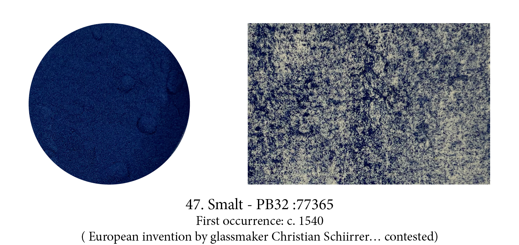
Smalt is gritty and so should a glassy pigment be. Unlike Egyptian blue, another glass pigment which contains copper, this one gets its blue from cobalt. It is quite strange how important this very transparent pigment was from the 15th century to the 18th, especially as it handled badly in oils (but it was very cheap to produce and blues were dear!) This being said, the colour is somewhat unusual and quite pleasant I find.
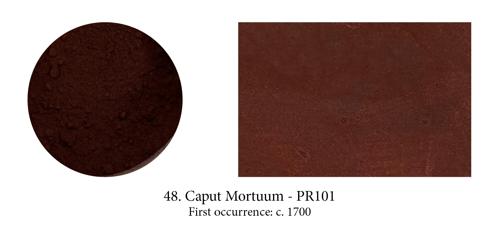
Caput Mortuum’s name was, and is still often, used for Mummy Brown, but that’s a misnomer. This soft mauve-brown synthetic pigment saw the light of day as a byproduct of sulphuric acid manufacturing during the 17th century and is still found in many ranges. Its Latin name is a lure, borrowed from alchemy in which it signifies a useless substance left over from a chemical operation such as sublimation or oxidisation. Alchemists represented this epitome of decay with a stylised human skull, literally a “dead head.” So sorry to disappoint but Caput Mortuum, never made from crushed skulls, is a banal synthetic iron oxide with a fancy name…
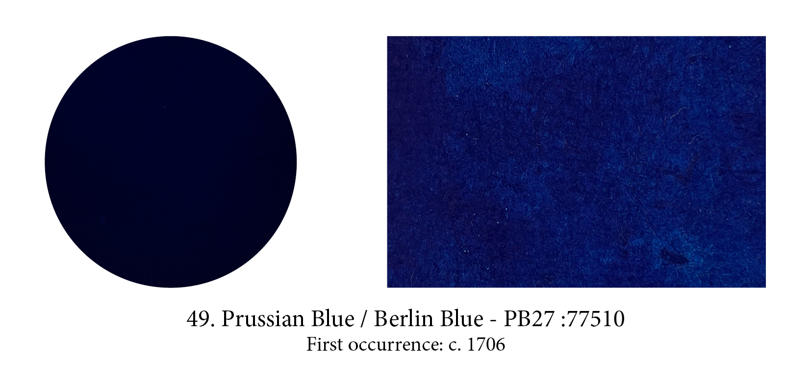
Yes, it was discovered in Berlin, then the capital of Prussia, and so did go under both Berlin and Prussian Blue for a while —geographically correct both of them— and it was the first ‘modern’ synthetic mineral pigment, created entirely in a lab (and entirely by accident too it must be said.) At 10% the price of Lapis, but 10 times its colouring power, this pigment took the art world by storm… The Dutch brought it to Japan in 1763, where it became known as “the blue imported from China”and by 1830 the prices had dropped so much it was used as a block printing ink. In fact out of 8 colours in the 36 views of Mount Fuji by Hokusai, 4 were for shades of Prussian blue.

Legend has it, ingredients came from the flanks of the nearby Vesuvio volcano yet none exist there. Also, Naples Yellow must be the most undefined colour, then and now. Today it’s because it’s not made, as it used to be, by heating lead and antimony, so it’s always a ‘hue’, a mix of safer pigments. Then, it was because that process allowed variations from lemon yellow to virtually orange. The best of unstable yellows at the time, painters loved it… as to why it’s called that? No-one knows!


Making plates and bowls has always been, by far, a more important industry than pictorial art, even when painting was considered indispensable as castle or pyramid embellishments for the powerful and wealthy. As a result, it is often ceramicists playing with their glazes who have discovered new colours including, in all probability, our oldest synthetic pigment Egyptian blue.
For once at least, a colour name was given to honour the Glorious, if Anonymous, Potter who, among so many others, had advanced the cause of Colour by discovering a pigment. In this case, around 1780, a most deliciously muted pink ceramic pigment that, some years later, Winsor & Newton introduced as a watercolour paint under the name “pinkcolor.”
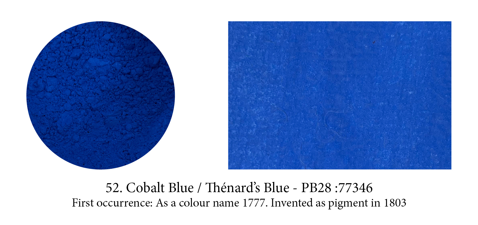
In 1742, Swedish chemist Georg Brandt showed that a blue color was due to a previously unidentified metal, cobalt. The first recorded use of Cobalt Blue as a color name in English was in 1777. It was independently discovered as an alumina-based pigment by Louis Jacques Thénard in 1802. Thénard knew the famous Sevres potteries used salts containing cobalt (smalt) to produce their blue glazes, and in 1802, from a mix of cobalt salts and alumina, he produced a pigment called at first Thenard’s blue. (Those chemists who have had their names attached for a while to a colour (Orr White, Perkins Mauve, Rinman Green, etc.), have often seen the colour’s name altered to something else in time.) With a purer tint than Prussian Blue, Cobalt Blue was immediately taken up by artists.

Maybe Scheele and Sattler are very pleased History has forgotten them as they were behind two of the most toxic, arsenic ridden pigments ever invented: Scheele’s Green and the more durable, intense and totally irresistible, but even more toxic Emerald Green, created by Sattler. Paint sold under the latter name nowadays has none of the above ingredient of course, and only Scheele’s name remains connected to his green, Sattler who created Emerald is not… but the fathers of killer pigments they both were, as these lethal greens were soon found on anything from toys to furniture to wallpaper. Most probably responsible for the death of quite a few little ones and perhaps even Napoleon Bonaparte himself!
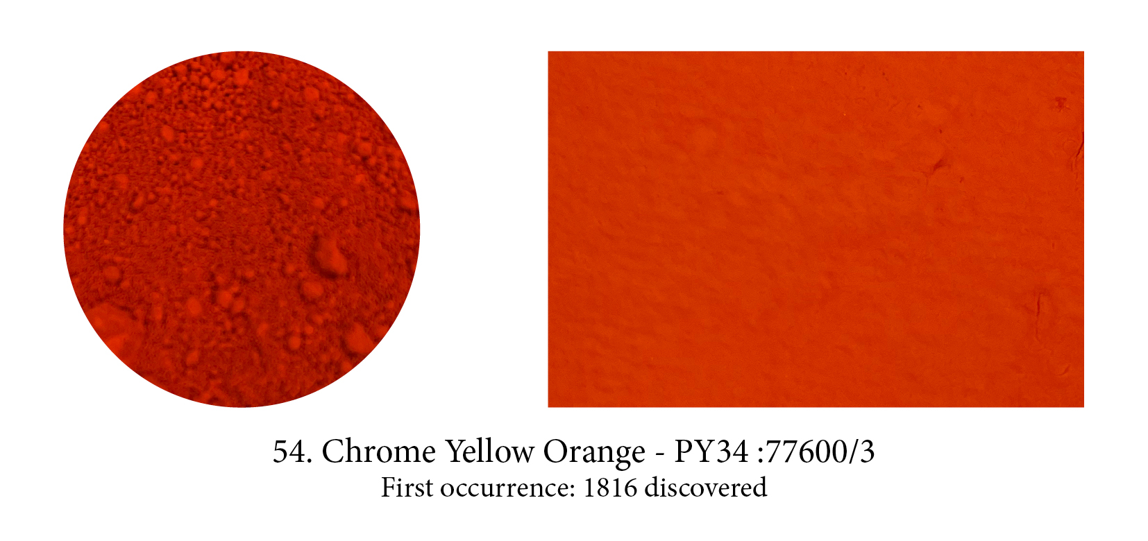
When chrome yellows and oranges were first introduced as pigments, they were an artist’s dream come true: bright and opaque. However, they darkened upon exposure to light. Still, it enjoyed a brief history of widespread use among 19th artists, such as Turner, Manet, Cézanne, Monet, and Pissarro. Cézanne, like Pissarro and Monet, used the neutralising effect of combining three primary colours—ultramarine, vermilion and chrome yellow—to make coloured grays. Soon replaced by cadmium colours, they are back on our palette nowadays, as modifications to the original form of the pigments, make them lightfast and resistant to change.

We had waited enough for that one! But, by 1828, the dream came true… Prompted by a reward from the Société d’Encouragement de l’Industrie Française, chemists began researching and within weeks of each other, Guimet understood how to combine and heat a number of elements (china
clay, soda ash, coal, charcoal, silica and sulphur) to produce a cheap alternative to lapis and, too, a German professor, Gmelin, using a slightly different process. Are you surprised to hear the French Société gave the price to Guimet and the new pigment the name of French Ultramarine? Both commercialised their discovery, and the German version simply ‘stole’ the good old name Oltromarino. Today French Ultramarine still exists in tubes and is a slightly redder blue, but I have not been able to find out if that was the case already back then.

Three yellows were developed from Vauquelin’s element, chromium, all sold under the name Lemon Yellow, and were introduced to the artists’ palette around 1830. The most permanent of these was strontium yellow. Barium yellow was made much the same way, except barium chloride replaces the strontium salt. The third was zinc yellow. All three were semi-transparent; of which strontium yellow was the most opaque. Like all chrome colors, they tended to turn greenish in oil. Blockx preferred barium yellow as he found its permanence to be outstanding after thirty years and that it had an additional advantage of being mixable with all other pigments.

Europe was enamoured with chinoiseries at the time Zinc White appeared on the market and, as result, anything that came from China was both exotic and more fascinating it seems. I have found no less than ten ‘Chinese’ colours and only four actually connected to that part of the world. The astute Mr Winsor got onto the bandwagon too with his patented Chinese White, an “improved by heating at very high temperature” Zinc White which, if we are to believe their website, produced a “demand so high it is reported that London’s Rathbone Place was often blocked by carriages as eager clients tried to get their hands on this exciting new colour.” White, creating such a sensation… really? Isn’t that surprising?

Viridian, a transparent emerald green pigment, came to the rescue of painters in love with the colour but wishing a replacement for the deadly Emerald Green. Named after the Latin for green, viridis, it was first made in Paris by colourman Pannetier who only communicated his secret to Binet who also manufactured it. It is another chrome pigment, more vibrant than Chromium Oxide Green but both are expensive to produce though so had limited following. It has, however, been found on numerous French impressionist paintings and in paintings by van Gogh. Today Phtalo Green has
virtually replaced it.
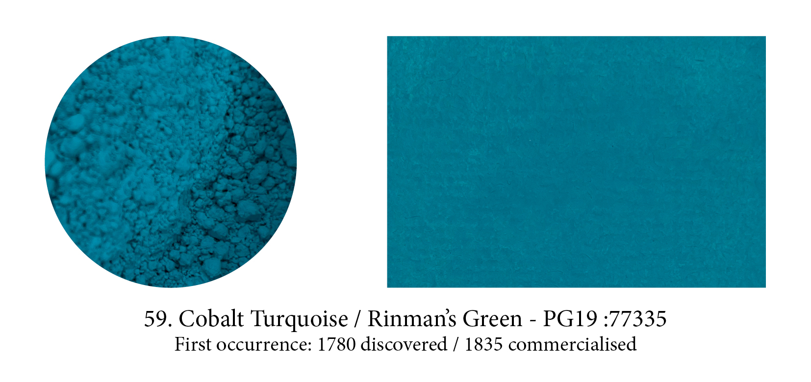
This bluish-green pigment is similar to Cobalt Blue, except that zinc oxide replaces wholly or partly the aluminum oxide in the latter. Although Church at the time described it as “one of the too rare pigments which is at once chemically and artistically perfect” he goes on to say that it was not in great favour because its colour can so easily be imitated by mixtures. (I would disagree, a vibrant turquoise is hard to mix!) Although it was discovered by Rinmann in 1780, it was not until after zinc oxide became available in large quantities, that this pigment became commercially viable.
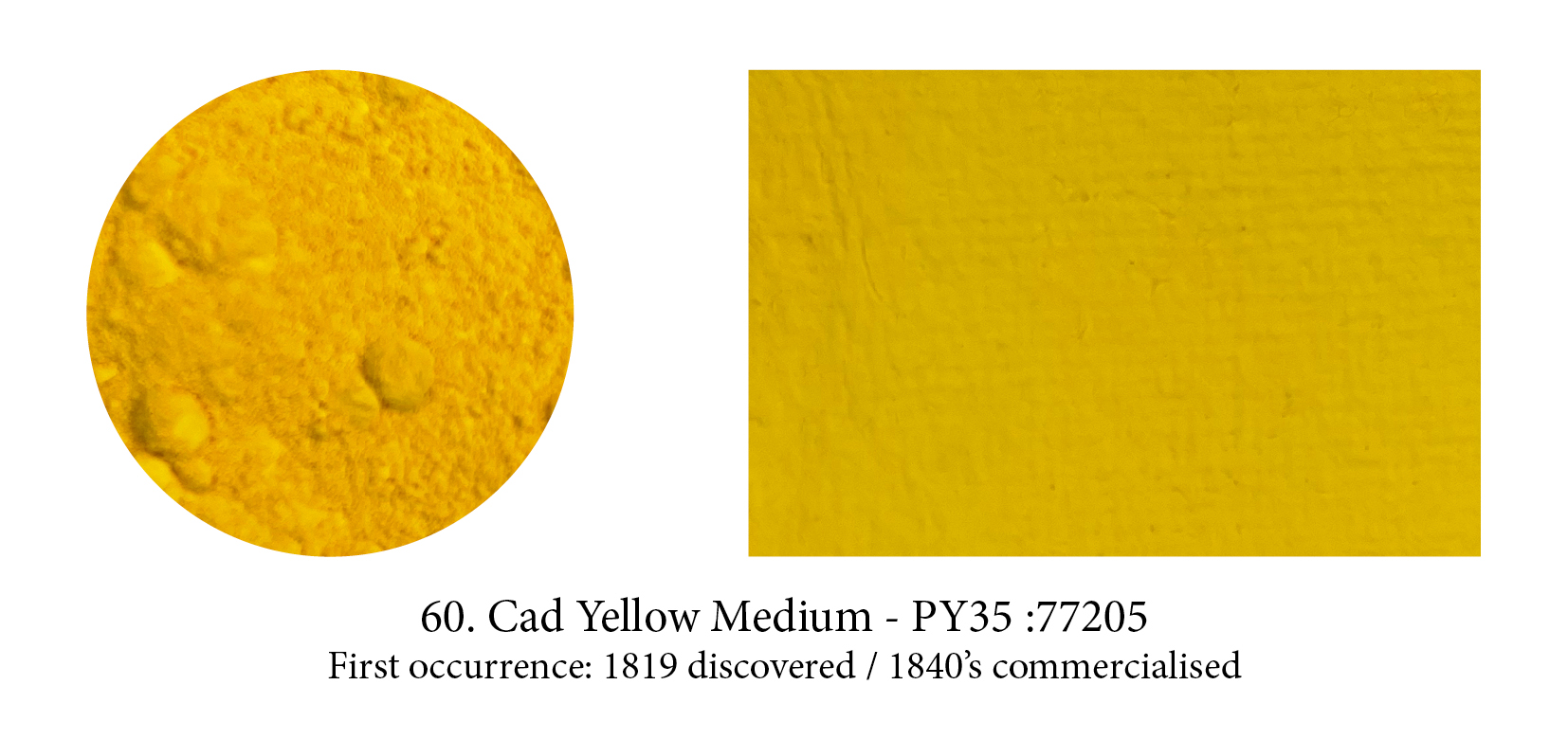
Synthetic cadmium sulfide was suggested as a pigment in 1819 by Stromeyer, although it was not commercially available until the 1840s due to the scarcity of the metal, a bluish-white metallic element, required for its manufacture. Yellow in its pure state, cadmium sulfide can be turned into orange, red, deep red even black by merely replacing the sulphur in the lattice with increasing amounts of a totally transparent stuff, selenium, which broadens the spectrum which can be absorbed…. My, I can nearly hear you say: that’s a lot of chemistry! But, still, transparency giving us all these hues, that quite something, no?
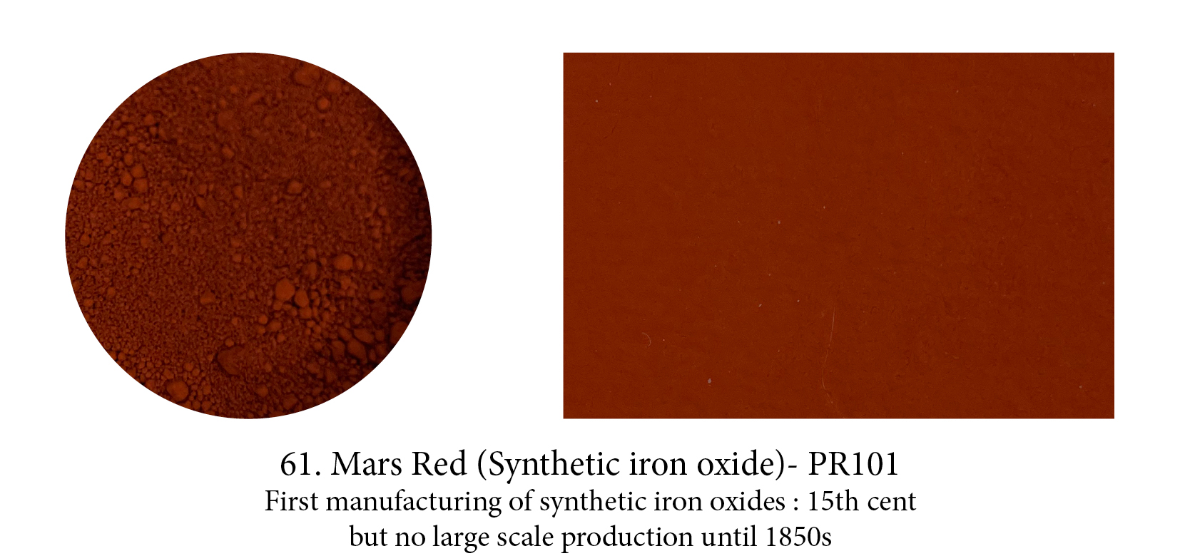
Mars colours, made from iron sulfate mixed with alum then precipitated with an alkali, were the result of a new method of pigment manufacture. Varieties of Mars Yellow were the starting
point for the preparation of the other colours which are heated to various degrees, with increasing temperature promoting the colour change through orange, red, scarlet.
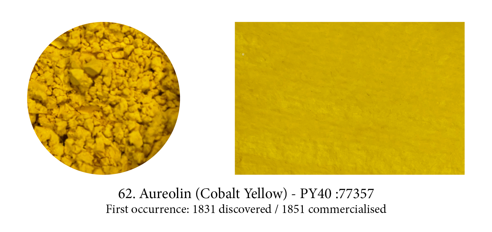
Cobalt, the mineral, is capable of producing a range of different hues – perhaps the most commonly known is Cobalt Blue yet a variety of other colours can be produced; a range of violets, teals and even a yellow (via a reaction between potassium nitrite and cobalt salts, creating a crystalline mass.) These all became important in the art world. But, whereas all its family seems content to be called Cobalt, something happened when it came to christening the yellow… the Middle English aureole, halo, was chosen: a name which came from golden in Latin, feminine of aureolus. (An early marketing trick, I believe.)
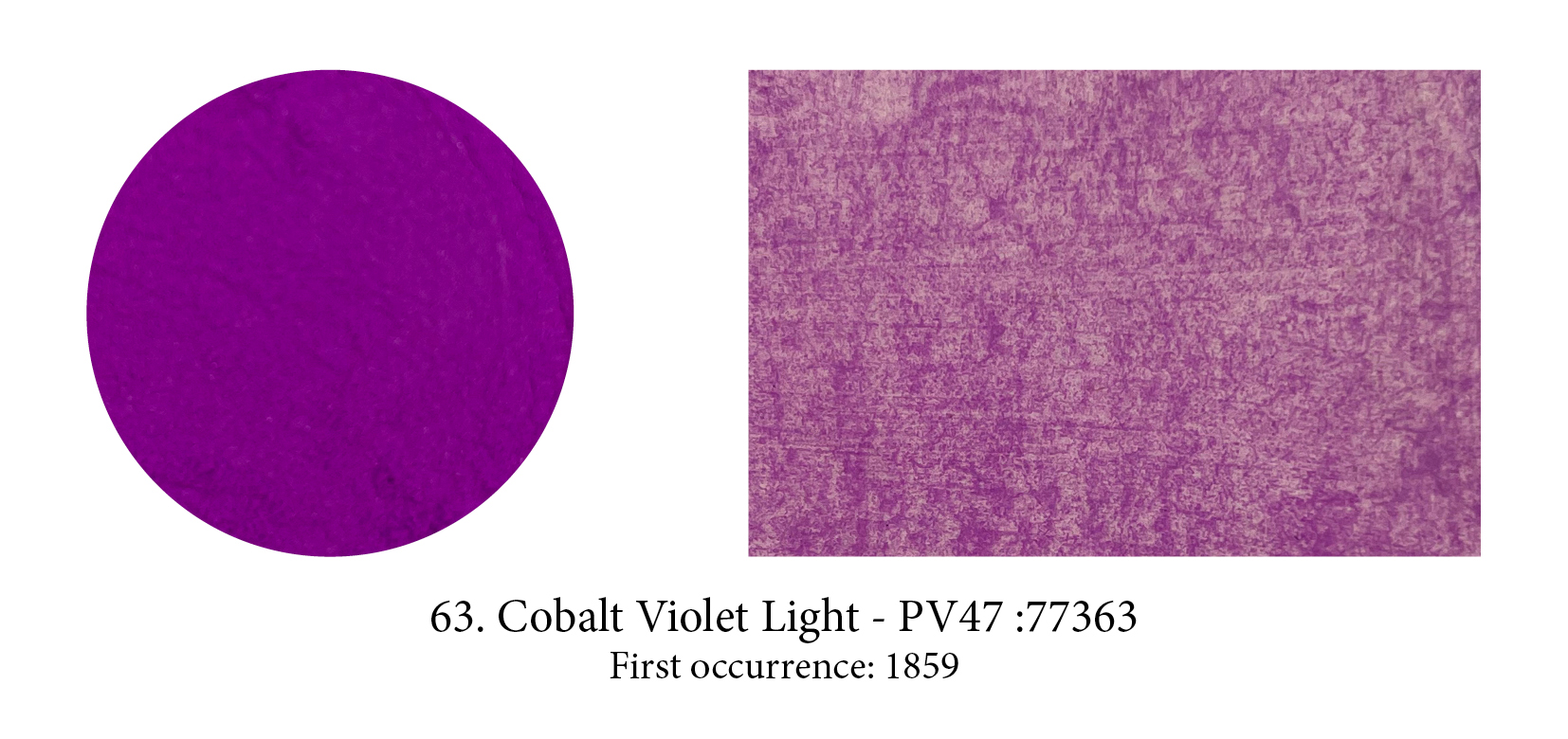
Purple… finally! This colour was probably the most elusive one to produce and, apart from the historical Tyrian Purple dye/lake derived from sea snails of the family Muricidae, and not only prohibitive in price but prohibited often for those that were not Byzantine or Roman Emperors, there was none to be had… ready-made. (You can always mix of course.) So that when Cobalt Violet appeared it made quite a sensation… there’s also quite a few shades of it.

I included this pigment, perhaps not a very well know or used one, more to show that unbeknownst to us there is often a whole family of pigments made from the original one. Ultramarine actually comes in reds, violets and pinkish ones like this one. These hues are obtained by tweaking the original pigment. Violet is obtained by heating a mixture of Ultramarine Blue and ammonium chloride. This pink by treating Ultramarine Violet with gaseous hydrochloric acid at 200°C for four hours or at a higher temperature with gaseous nitric acid.
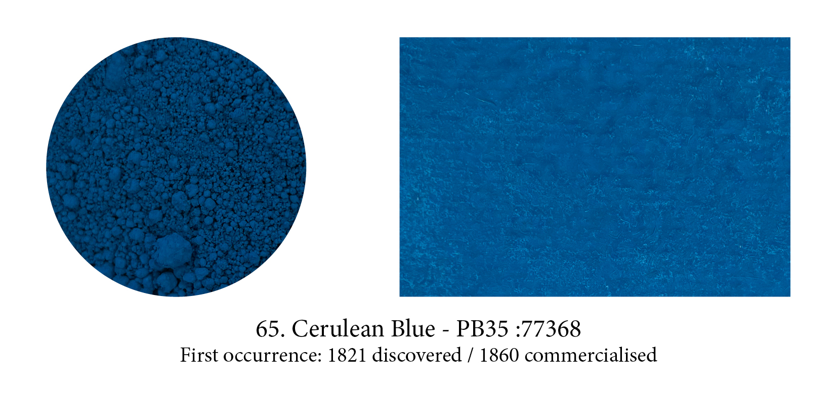
The Romans chose caeruleus, derived from caelum meaning both the blue of the sky and the Heavens, as a perfect generic word to describe all blues, including their synthetic one (whether the previously named ‘Egyptian’ Blue came from Egypt, Scythe, Cyprus or later from Pozzuoli, in Italy.) Over the ages, men forgot how to make this celestial blue… but the name was revived from the old Latin one in the 19th century in honour of a new pigment developed, a cobalt tin oxide compound.
That most heavenly Cerulean Blue is still found on our tubes today.
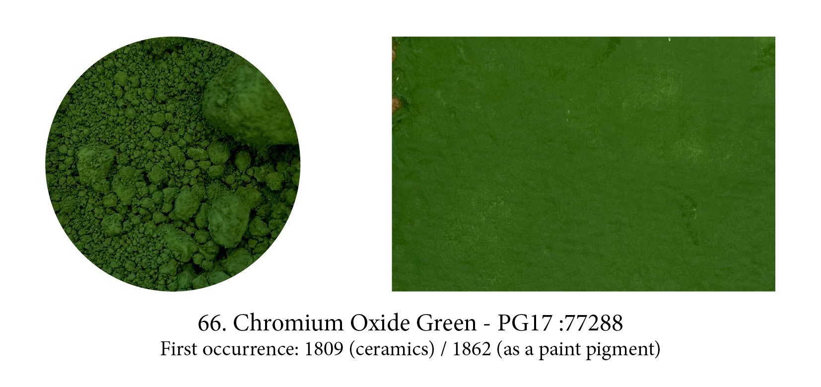
Chromium Oxide Green is one of four oxides of chromium. This “sesquioxide” one is darker and has an olive green tinge that its more vibrant cousin, the “hydrated” Viridian, doesn’t have. It’s very stable, offers high covering power which means its arrival rendered all the shifty, complicated copper greens unnecessary. The pigment requires 100% oil and must stand for a few hours after mulling, when it will again absorb almost as much oil as before… the result is a very slow drying paint!

Although carbon is the material of virtually all our first blacks (think charcoal, soot, etc.) the Carbon Black in your tubes today comes from a process, formed from the incomplete combustion of natural gas, developed in America for a black more suitable for watercolour. It was widely employed by 1884 and has a finer grain than other blacks allowing it to spread better. (Maybe that’s the reason but it does feel much higher tinting too.)

First synthesised by two German chemists, C. Graebe and C. Lieberman, who reported their discovery in 1868. This one is important in the history of organic chemistry, for alizarin was
the first of the natural dyestuffs to be made synthetically (indigo was soon to follow). Its discovery caused a famine in France and, worldwide, an almost complete disappearance of the
madder-growing industry.
BTW Crimson here is used as a reference to colour and has no relation to the Kermes dye… which is confusing!
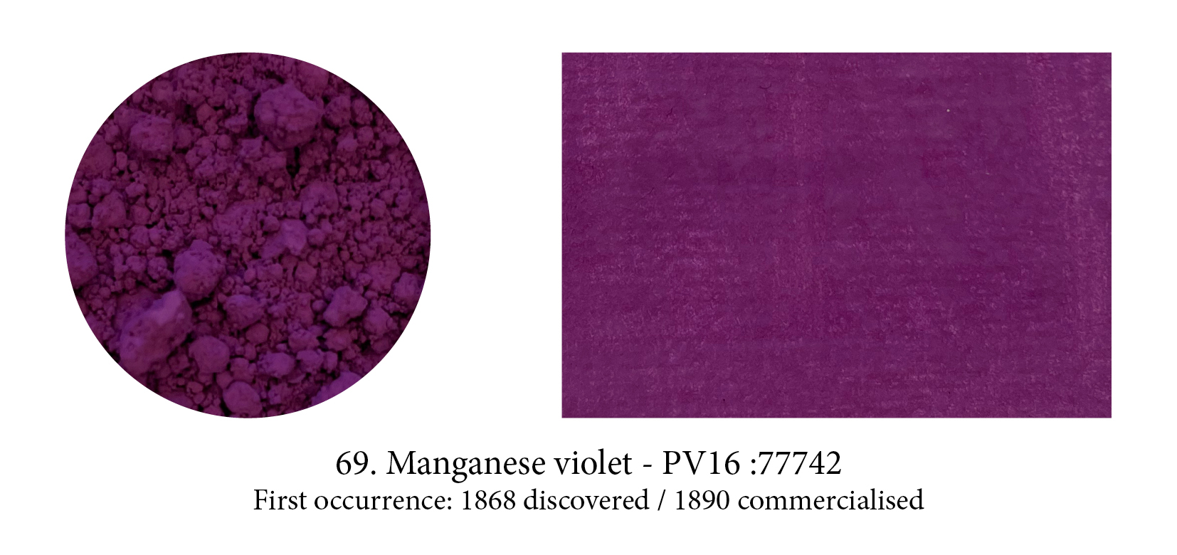
The Impressionists fell in love with this colour, especially Monet who declared it ”the true color of the atmosphere.” And indeed Manganese violet, rather than Cobalt, is to be seen in all the purple shadows and mauve specks of light that enliven his haystacks and waterlilies. He also predicted that three years hence everyone was going to work in violet but, in truth, few found its low tinting strength much to their liking… nor the colour!
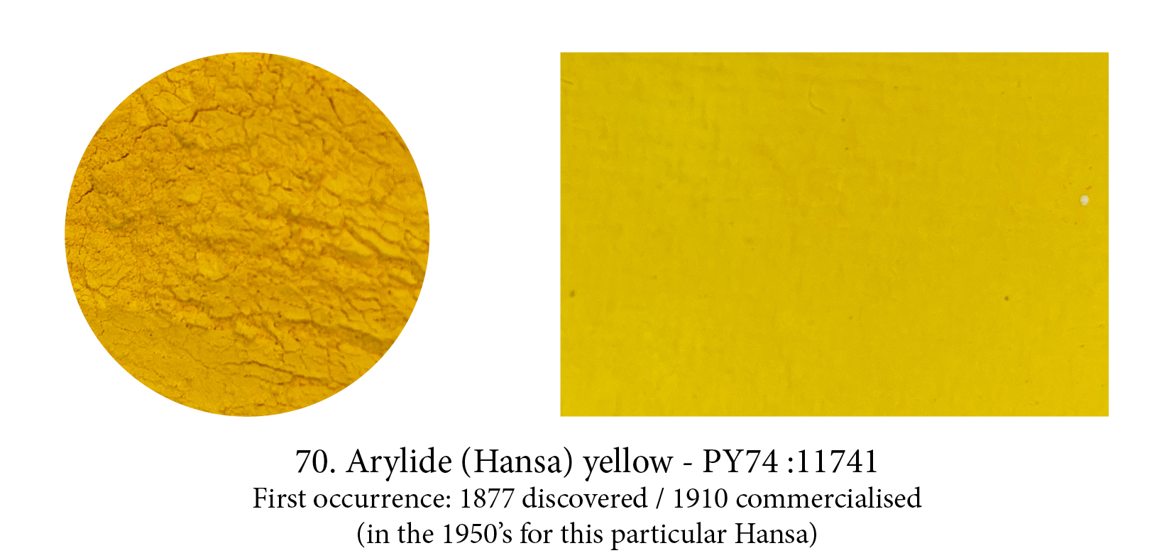
After the discovery of how to synthesise colours, chemists were able to understand better how to build molecules and soon many new colours appeared on the market. The very first azo pigment was Tatrazine Yellow (used in this timeline to simulate Indian Yellow) but there are around 30 azo pigments, primarily monoazos, in the Arylides… almost exclusively yellow. Relatively inexpensive, yet offering only moderately good colourfastness, Hansa Yellow Medium is often bought instead of the dearer and toxic Cadmium Yellow Medium but, unlike it, it’s semi- transparent.
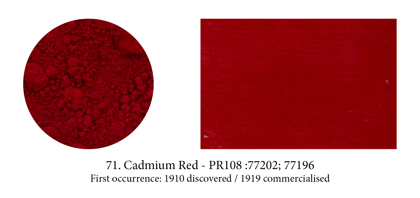
Although this pigment became an overnight success with artists, the TRUE Cadmium Red is hard to define… First of all it could be a hue but not labeled as such (I’ve seen such things), but even if you made sure what was in your tube was a true Cadmium Red, correctly labelled PR108, you would find dozens of red options under that heading. Each with a different shade, from light to dark, from cool to warm… and yet all genuine Cadmium Reds ‘called’ PR108! (Which explains the hue variations you might have noticed from company to company as each has picked the one they liked best.)
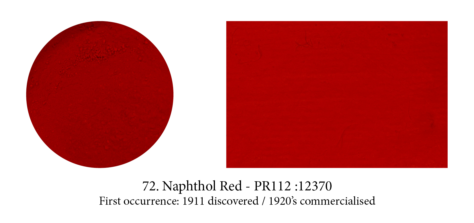
Naphtol is a registered trademark of Hoechst AG; the generic label for the same compounds manufactured by other companies is naphthol, with a second h. The word is from the Greek for “mineral oil”, and salutes the origin of these pigments in petroleum. Developed and patented in 1911, the naphthol compounds represent the single largest group of azo dyes and pigments. (In fact, about 20% of all synthetic organics available and over 50 in the red category alone, are naphthol pigments.) Originally used as cotton dyes, they were soon laked as pigments and were first used in artists’ paints in the 1920’s.
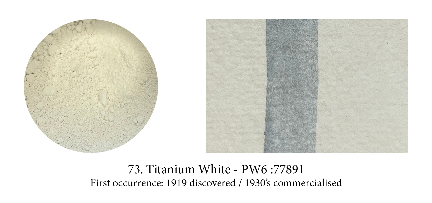
This pigment is really titanium dioxide and generally referred to as a natural pigment and, yes, there is plenty of the titanium ores around —but to get the stuff into a usable bright white pigment requires extensive facilities and power. We were not capable of manufacturing it before the 1920s, when a hydrocarbon-driven modern industrial process finally got it done. After that it struggled to get a place on the shelves, whether in hardware or artists’ stores. Nowadays, out of concerns for lead poisoning, it has almost entirely replaced Lead White on the artists’ palette. But does this pigment make a good substitute? Many think not!

Cooler and more vibrant than Cerulean or Cobalt Blue, genuine Manganese Blue is a clear greenish azure blue colour. But, today, the one you buy is a hue based on the now obsolete Manganese Blue made of Barium Manganate which no one produces anymore due to environmental concerns and its toxicity. This beautiful pigment has probably had the shortest lifetime of any!

Phthalo blue or copper phthalocyanine, is an organic blue dyestuff that was developed by chemists under the trade name “Monastral Blue” and presented as a pigment in1935, claiming that it was the most important blue discovery since Prussian blue in 1704, and artificial ultramarine, in 1824, and was a superior pigment to both.
It’s true it’s an ideal pure blue for it absorbs light almost completely except for the green and blue bands. Watch out for its high tingting strength though which could also deceive you into thinking that pigment is opaque (in masstone it often does look like opacity so it’s confusing.) Phthalo blue or green, both high tinters, are in fact very transparent…
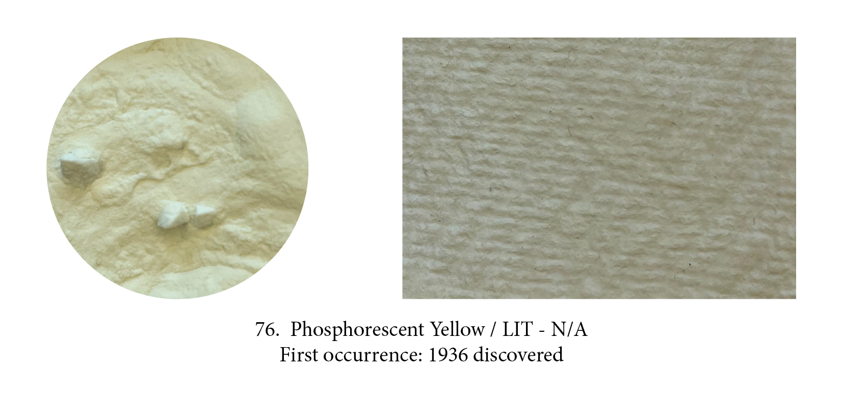
A luminescent pigment was discovered in 1936 when radioactive Radium was first used to create phosphorescent material. Phosphors are a chemical that absorbs energy (the incoming photons excite the phosphor molecules) and re-emits it as visible light, in a way they create their own light as the molecules release the energy they have stored! The one used here is a creation of Stuart Semple who claims it is “the world’s glowiest glow pigment.” It came out in 2018 but many other photoluminescent paints were available before. Phosphorescent pigments are usually green or yellow.

Phosphorescent and luminescent paints are rarely used by artists let’s face it, but fluorescents, who made such in hit in the psychedelic 60’s, are again on the up and up, however. These yellow, pink, orange, red, blue, green tantalising ones (there’s even a white in the Flashe range!) are even more exciting to peer into a jar of. They are not without limitations however — poor lightfastness (they are resin encapsulated dyes) and incompatibility in oil as that binder destroys those unique emitting properties —, yet they are proving irresistible to some artists.
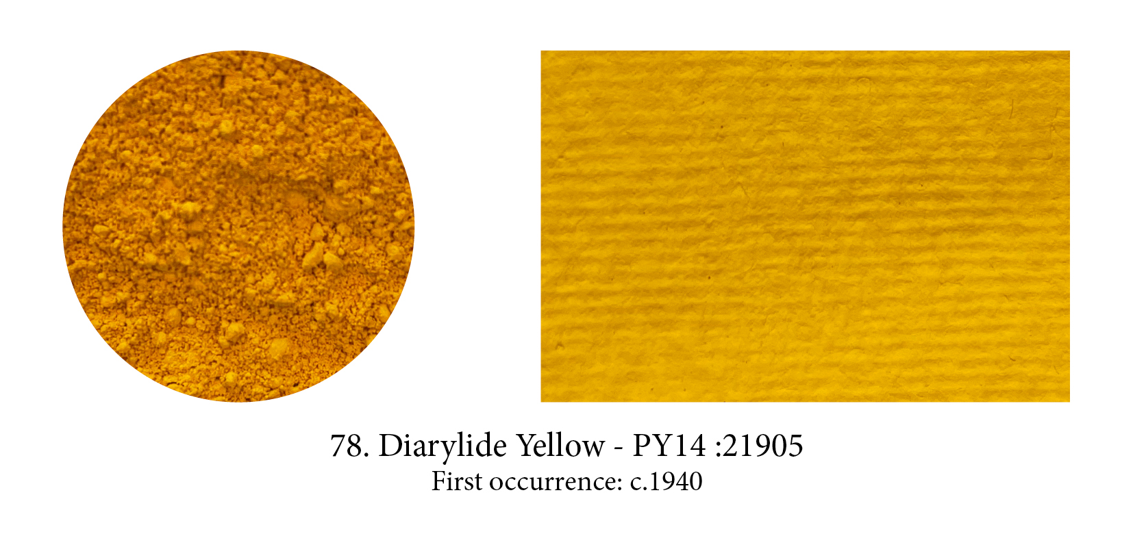
A group of around 30 synthetic ‘diazo’ (diarylide) pigments were first patented as early as 1911 but largely developed around 1940. Variations in the hue arise from differences in the atoms arranged around the outer (end) carbon rings. Although they are often more saturated and have higher tinting strength than the arylides, the doubling of the molecule unfortunately also significantly reduces the lightfastness so that diarylide pigments are more important in printing inks than artist’s paints.
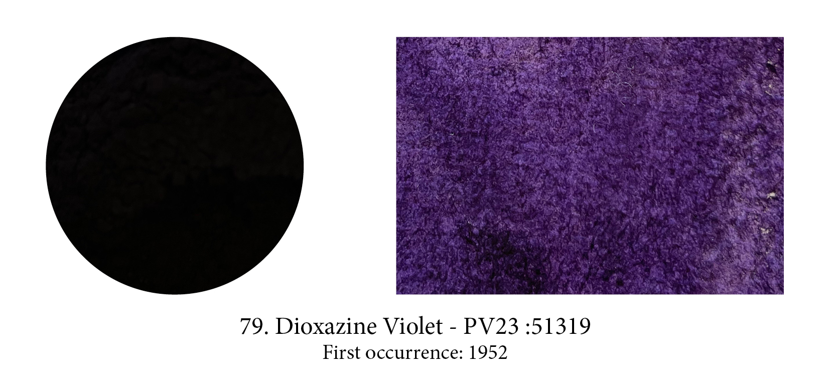
See how dark is this pigment!
From the large polycyclic pigments family, a small group of chloranil derived colorants include one very important pigment, Dioxazine Violet or Purple. Developed in 1952 by Hoechst AG as a dye, and now used in plastics and automotive finishes to warm the color of Phthalo Blue, this pigment is obtained by dissolving the dye in a very hot acid, then washing and salt grinding the precipitate that results. The pigment exists in two crystal modifications, a red and a blue shade, which have the same color index name, are poorly distinguished by manufacturers, and are apparently confused in the lightfastness testing literature too.

The Perylenes are another pigment family in the polycyclic tribe, which was first available as a vat dye around 1912 before becoming available as an artist pigment in the late 1950s. Their structure is a mesh of seven interlocking carbon rings, linked to two outer carbon rings by nitrogen atoms. Differences in color arise from modifications to these two outer rings. Available colors are limited to moderately saturated scarlets, reds, dark maroons and a very dark green. All the perylenes are nontoxic, mid valued, transparent and strongly staining pigments with very good to excellent lightfastness.
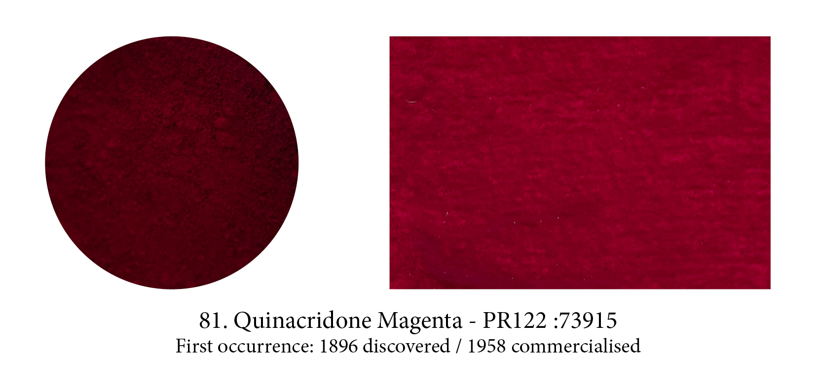
This large family of modern, moderately saturated and highly colourful pigments was repeatedly noticed in chemical research since 1896, but not recognised as useful pigments until 1955. The first quinacridones were marketed in 1958 as automobile colourants and artists’ paints (including the beloved and now obsolete Quinacridone Gold), which were promptly adopted by New York abstract expressionist painters. Their delicious hues range from golden yellow, through reddish orange, red, coral, rose, magenta, to a reddish violet. In 1996 Winsor & Newton proudly launched their Permanent Carmine, a quinacridone, which is the closest match to the original carmine and has the additional properties of being stable and permanent.
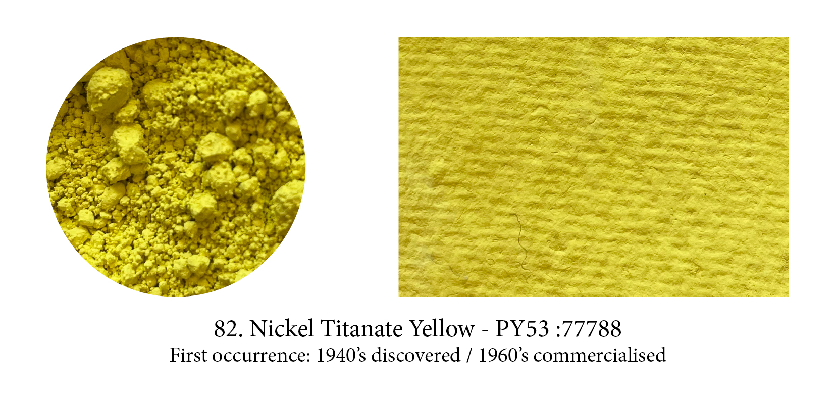
An inorganic pigment, sometimes called just Titanate Yellow, it might be the coolest yellow available. It is very pale and may show a faint greenish cast. The host pigment is titanium but nickel gives this pigment its colour. Nickel itself (an abbreviation of Nicolaus in German) was an evil genius who lived in the mountains and found no other pleasure that to put under the miners’ pickaxes a useless mineral (rather than the hoped-for copper) and also emanated the most toxic vapours!
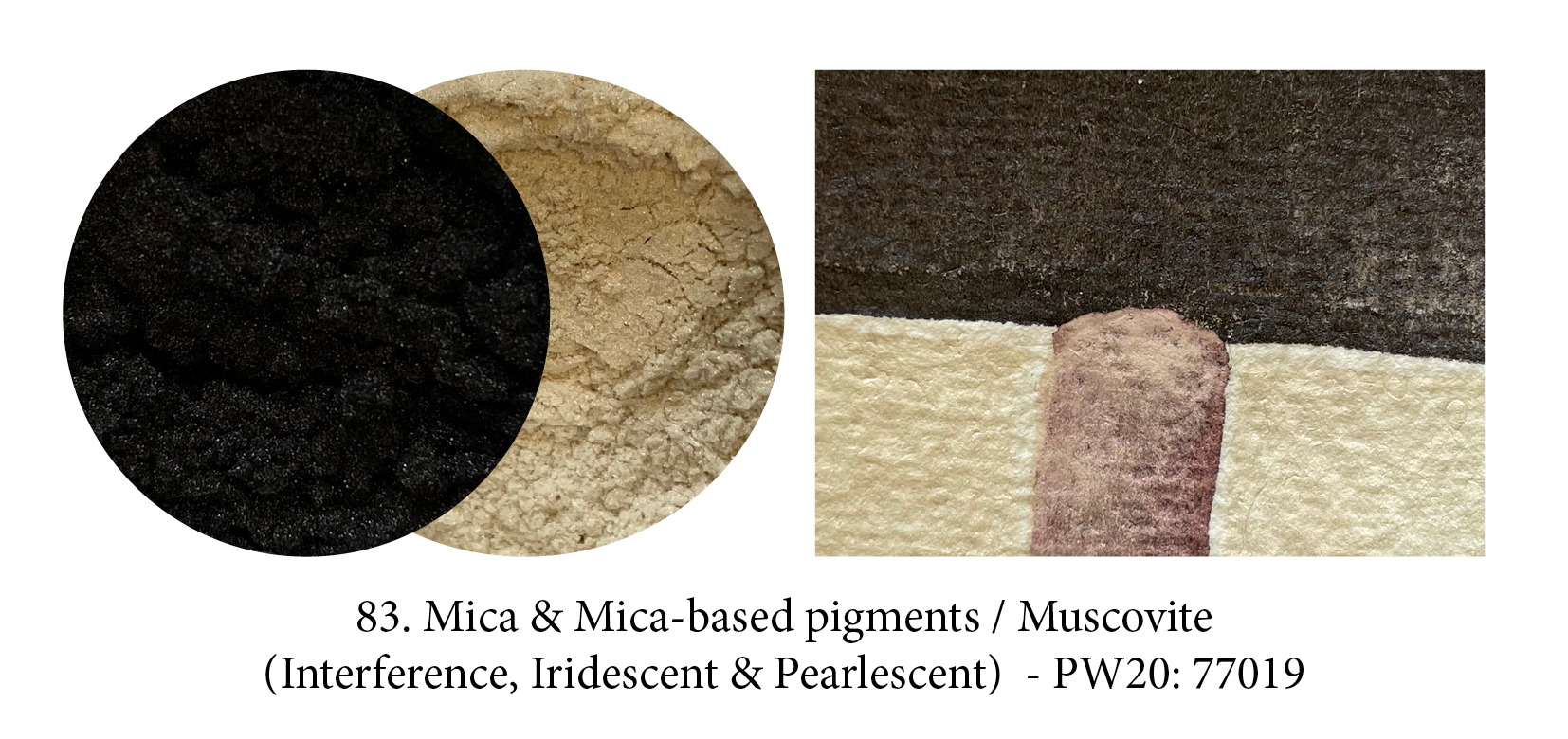
Micas, found in nature in thinly layered laminae, exists in their own right as pigments. They are translucent to opaque with a vitreous or pearly luster, and range from white to green, red to black. Although human use of mica dates back to prehistoric times, mica-based pigments created a revolution not so much when they came out in the 1970s, but when multilayer systems on mica were successfully developed in the 90’s. Opals, rainbows, soap bubbles, mother of pearl, butterfly iridescences could now be reproduced in paints too by attaching colour to mica flakes which had undergone surface treatment. What you see here is natural black mica on the one hand and a pearlescent red pigment made using white mica.
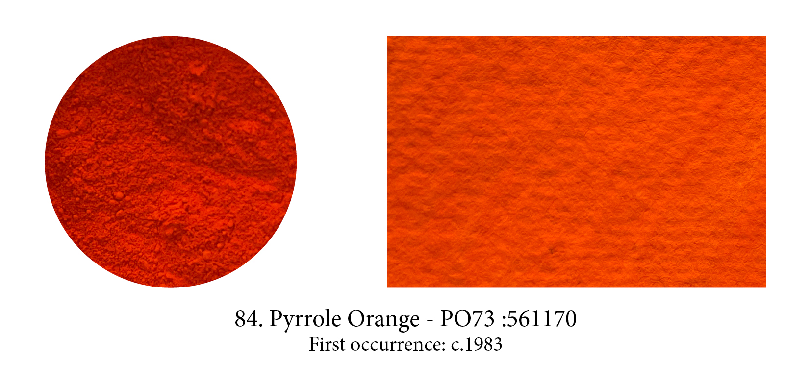
Pyrrole Orange is a yellow-shade cousin of Pyrrole Red, better known perhaps as Ferrari red. When it was developed by Ciba-Geigy it revolutionised the automobile paint industry as red tended to develop a dusty, chalky look prior to it. Both share important qualities for artistic purposes as they are highly opaque (a rarity in modern synthetic pigments), are highly lightfast, very pure and non-toxic. For that reason alone, I suspect these two pigments will, one day, overtake the Cadmiums in the same hues.
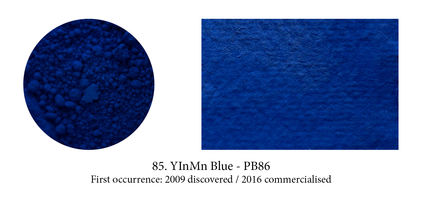
Prussian Blue was the first blue pigment to be discovered by accident in a lab, but, recently, another one saw the light of day in the same manner. In 2009, the chemist Mas Subramanian and his students at Oregon’s State University were investigating new materials that could be used for manufacturing electronics. A graduate student noticed that one of their samples turned a bright blue color when heated, to which Subramanian responded: “Luck favors the alert mind,” a quote from Louis Pasteur. They named the colour YInMn blue, after its chemical makeup of yttrium, indium, and manganese, and released the pigment for commercial use in 2016. Derivan first turned it into paint, I believe, but it is dear and, so far, of limited impact in the art world.

Will Anish Kapoor be remembered as the man who acquired in 2014 the exclusive rights to the blackest shade of black ever made: Vantablack, which he promptly renamed “Kapoor Black”? The response of his entire community has been something along the lines of: “Give it your name pal, no worries there but a colour… that belongs to all of us!” Stuart Semple’s response went one step further… to buy his new PINK you have to swear “ you are not Anish Kapoor, you are in no way affiliated to Anish Kapoor, you are not purchasing this item on behalf of Anish Kapoor or an associate of Anish Kapoor. To the best of your knowledge, information and belief this paint will not make its way into the hands of Anish Kapoor.”

This “super black micronized pigment in a proprietary acrylic matt base” was Semple’s answer to Anish Kapoor’s Vantablack appropriation. It ‘only’ absorbs up to 99% of visible light, compared to Vantablack’s 99.965%. No more than anyone else can I get Kapoor’s black baby, and so contended myself with this one but having seen the real deal in the Forbes pigment collection I can tell you Semple’s has none of that “falling in a hole” feeling. Also “Vertically Aligned NanoTube Arrays” is quite a deliciously frightening name for a black… that black! (Plus it’s my only acronym.)
I have been following closely the fascinating development by Onya Mc Causland and The Coal Authority (UK) of paint from recycled ochre residues captured from the treatment of polluting mine water. The pigment is the result of released pyrite minerals which are transported to the surface when the mines flood. These, in contact with air, oxidise in the insoluble ferric form and the hydrated iron oxides then start to precipitate and form ochre particles. Too, I am delighted to close this timeline with a ‘new’ pigment which is the same as the first and oldest one in human hands: Red Ochre.
