WHAT?
II. What’s in paint?

One morning I woke up and told my husband: I’m going to write a book about colour! To which Vianney replied, being the tireless supporter of my wildest dreams (and privy to my darkest hours of doubt): That’s a great idea, but… do you know anything about colour? No, of course not, I don’t, which will make it so much more interesting… Ah, he replied, of course.
The fun had only just begun! A decade and many colour wheels later, I can share that what I’ve loved most about this research is that: “When we try to pick out anything by itself, we find it hitched to everything else in the universe”1 as John Muir, naturalist and environmental philosopher, so well understood. One rabbit hole has led into another, one question or puzzlement into researching subjects so far out of my league (or even interests) that I can now declare with certainty what’s been the most fascinating about this journey is… how everything is fascinating! I’ve travelled to no-known holiday destinations to see a bit of rock, learnt about painting’s best practices or tried my hand at natural dyeing, and those have been my happiest holidays. I’ve read entire books about just blue, red, or yellow, and many others about colour for painters, deadly colours, the secret of colours, the anatomy of colour, the poetry of colour, colour psychology, philosophy, vision, chemistry, food, and language. Chromatopia, chromaphilia and chromophobia have been on the menu, while obscure articles about the making of terebinth, 99 million-year-old dinosaur’s bird wings found preserved in amber, or the working of the retina became daily fares. Not all my research was this narrowly focused either, and along the way, I did expand my general knowledge of history, geography, art… or even royalty! I quickly understood too there were many, many things I would never know or understand—due to my own limitations, no doubt—but also because there was so much we didn’t know or understand… and perhaps never would. That mysteries abound, surround us, live in us, live under our feet, under a leaf and up there in the galaxies is probably the most exciting thing about tugging a little bit at something “hitched to everything else in the universe.” Along the way, it makes you more observant yet slowly turns you into a daydreamer.
Nevertheless, I didn’t give up! And, many years and adventures later, the proof is under your eyes, but I must confess I did get a bit sidetracked, so that, in the end, this is not a book about colour… not really. Perhaps more about my love of materials, art, and beauty (and, invisibly underlying all this, Vianney’s love for me.) In truth, as much as I enjoy the endless delights of our natural and man-made coloured world or playing with colours myself: matching, choosing, wheeling or mixing them, I’ve discovered no lasting interest in Colour (but I have fallen in love with Pigment.) Does that come as a surprise to you? Maybe then, we need to discuss this ambiguous word, the source of so much confusion…

Some might, in a rainbow, see a creation deity, a female Serpent jumping from one waterhole to the next. Others will understand Iris, goddess of the rainbow, is delivering a message to the gods or that the God of Judaeo-Christianity is reaching out to us humans, offering a covenant, a truce pact of sorts, while others, more prosaically, will wonder where the pot of gold might be… Meanwhile, Wikipedia informs us that it is a “meteorological phenomenon caused by reflection, refraction and dispersion of light in water droplets resulting in a spectrum of light appearing in the sky, taking the form of a multicoloured circular arc.”
Some painters were horrified at Newton’s “unweaving of the rainbow”, which not only forced them to revise their understanding of primary colours but somehow divided these into two categories: the Divine “primitive, impalpable colours” and those from the Material, fallen world, the colours on their palettes, precisely.2 Many simply lamented that science was killing the mystery of it all… I tend to side with Nobel-winning physicist Richard Feynman, that there is no boundary between knowledge and mystery, in fact that: “[…] science knowledge only adds to the excitement, the mystery and the awe of”… anything we are contemplating!3
But back to our rainbow. Does it exist? If your next question is, What about angels? Unicorns? Then yes, they, rainbows, have a more certifiable existence as I can only imagine that all of us, on every continent, have seen a rainbow. If they are a trick of the mind, we are all tricked equally. However if your next question had been: What about the colours of the rainbow? Do they exist? Then your question would have led us into quite another category of enquiry, and the answer would have been no. The dramatic arc in the sky does not exist, but we sure experience it!
Let me explain this further and accept my apologies in advance as, any minute now, I might shatter all your illusions about Colour and must get a bit technical (but don’t kill the messenger yet; it’s exciting stuff, I promise, and hopefully useful too.)
As we’ve seen, Pigment, being the colour ‘vector’, is probably the most indispensable ingredient of paint, but pigments are not Colour, merely an incarnation of it—if you could even say that. You can’t bump into Red in the middle of the night, nor could you in plain daylight, for that matter. But you could bump into your jar of red pigment in the middle of the night and, the top being loose, end up with the material all over you (just a thought, hey, no need to try out this experiment!) Your body might be all gritty, and your sheets turned into an impromptu artwork, yet you still could not see red… until dawn.

Because, most of the time, to ‘exist’, Colour needs its agents:
1) Light (any source of light will do: the Sun, your bedside lamp or, much more romantic and how previously so many had to look at art in dark dwellings and churches, candlelight, yet these variations in the spectrum of light emission will somewhat modify colours of course… see above);
2) a Surface, Light will impact. (Without the luminary of our galaxy and a planet recipient of this illuminating bounty, there would be no colour. Everyone understands the former, but I only really ‘noticed’ the background of a moon landing picture a few years ago and… it’s pretty dark out there! So that the sun can shine all it wants, but if it doesn’t shine onto something, its colourful wavelengths are all but useless);
3) Finally, for Colour to be, there needs to be Us, or any other vision-gifted being.

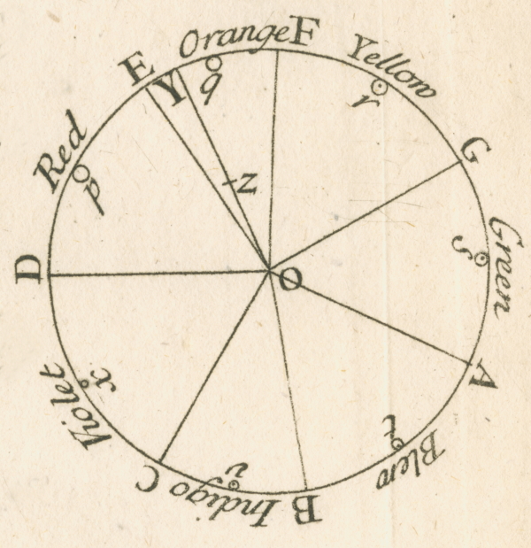
Should we thank Theia, goddess of sight and the shining ether for the bright, blue sky? As, indeed, one day, Fiat Lux! Light was to be, the Earth’s atmosphere, offering us protection from its ardent rays, to receive it and the scattering, understood by Rayleigh, to manifest the blues of the sky. Eventually, a million million years later, Eyes were given to enjoy its endless variations… isn’t that lucky? Another million-million years after this phenomenon first began, another miracle happened. The sky must have been indeed blue, as England was enjoying a sunny day (that’s the miracle, of course), which allowed Isaac Newton to witness from its rays entering a small aperture in his shutters how the ‘white’ light illuminating our planet magically fanned out, when divided by a prism, into a band of colours. Promptly, he decided upon seven hue categories, representing them as he could perceive them on the spectrum’s band but… twisted in a circle. The colour wheel was born! Perhaps a spiritual quest for a cosmic order or the hope that colours could interpret the music of the spheres made him pick this number. Sadly, and even if parallels can be found between music and colour (some even see colours and shapes through sound or hear music when they look at colours), 7 colours = 7 notes was Isaac Newton’s invention, really. Nowadays, no one seriously thinks of indigo as a separate colour from the blues or suggests that musical tones and colour tones have similar frequencies.
After that, it took a few more inspired guesses but, considering the before timeline, no time at all to understand that Light’s rays were wavelengths, in fact, and that when these interact with Surface, something happens. Something quite different, depending on the landing pad’s chemistry, structure or both (otherwise everything would be the same colour and that would be mighty dull, right?) So, on some surfaces, the rays scatter—via multiple refractions and reflections—while on other surfaces they are absorbed, a process by which the radiant energy raises the molecules in the surfaces to a higher energy state (exciting!), then these backscatter the wavelengths they don’t absorb. Scattered or backscattered—however bounce-back wavelengths that eventually hit our eyes are produced—when entering through our pupils, they will impact the retina, in fact, layers of neural tissue that line the back of our eyeballs. Retinas are very complex but, simply put, the job of a human retina is to code this information via three different types of photoreceptors: retinal ganglion cells (which provide a stable representation of ambient light intensity), 75 to 150 million rods (working on levels of grey) and about 7 million cones (who take care of colour.) Officially, these guys talk RGB, and we’ll come back to that. Both cones and rod cells contain thousands of photopigments, not very different from the thousands of pigment nanoparticles in your paint either! It is these light-absorbing chemicals, which change when they absorb light, that transmit small electrical signals, via the optic nerve, to the visual centres of our brain, which then decode and, in the end, interpret what they ‘see’: “Oh isn’t this a happy red mess!” As to why our brain actually gives us that experience, however, is still a mystery. “Even enthusiasts for the new neuroscience of consciousness admit that at present no one has any plausible explanation of how experience—the feeling of the redness of red!—arises from the action of the brain.”4
Pretty amusing. Just as there are pigments out there, getting excited… there are pigments in there doing the same! You could extend the parallel by saying that just as you are mixing pigments on your palette, your eyes are mixing colours up in your brain… A nice image, but not quite an accurate one as, while you are combining small amounts of very material particles, your eyes are synthesising wavelengths and colour sensations. 400 nanometers will ‘feel’ purple, for example, while 580 ‘feels’ yellow. The retina can both be impacted by that 580 wavelength directly or interpret two wavelengths (red at 700 and green at 530, for example) simultaneously and come up with a sensation of median yellow and… good luck with that on a palette!
I find transparent/white Light containing all the colours nearly as baffling a fact as colours being a virtual reality in the minds of us vision-gifted animals. Still, it gets even more surreal as we ponder the limits of our perceptual reality. When I emphasised earlier the human retina, it is not only because other animals perceive wavelengths we do not, as these are off our eyes’ colour charts (or “visible spectrum” as it is called, a tiny portion of the electromagnetic spectrum—about 0.0035 per cent) but because most sentient beings see truly differently from us. Had we evolved from the night or owl monkeys, which are monochromats, we would see roughly a hundred shades of grey. Had we come from the spider monkey, which has only two types of cones but, born female, we would have had a chance between trichromacy and dichromacy. As a male or not-so-lucky female dichromat, our vision would still have added the steps from yellow to blue, and the combination of those, plus the greys, would already have opened the door to tens of thousands of colours (even if we would probably confuse quite a few, such as green and red.) But having evolved from Old World primates, chimpanzees, we ended up with a trichromatic vision, which multiplied the colours a dichromat can see, again by a hundredfold.

So our lot in life is really not bad, not bad at all, in fact. With the two to three million colours we have at our disposal, we shouldn’t complain. Yet, some cold-blooded species like snakes, amphibians or insects have infrared vision and many, many animals, including mammals, can actually perceive the ultraviolet end of the spectrum. So we’re kind of missing out really. But, had we evolved from a dinosaur, it seems, or a hummingbird, for sure (and I’m pushing it there but, you know, for argument’s sake), the exponential explosion, by another 100%, of our then tetrachromatic visual palette would have turned our colour space into a square rather than the sort of triangle it is and, as a result, turned our whole planet into a true LSD experience. I’m not sure I could cope with 24/7 psychedelic vision, it sounds a bit exhausting quite frankly, but the sobering truth is that, whatever your vision opens the door to, the world out there is still colourless.

Whether you choose to see it like that (an intellectual proposition quite difficult to experience—as above artwork brilliantly demonstrates) or rally with those who emphasise that a subjective approach is all we have so that our experience of colour is enough to make it valid, it is entirely up to you! As long as you also understand that emotional, cultural and other filters (such as limited colour vision or even simply a different coloured background around a colour, for example) might so distort the readings of the experience in question as to make it quite unique to each and every one of us.5
Whatever your philosophical approach, as painters, you will have to deal with both Light and Vision’s many tricks and infinite complexities and Surfaces’ many tricks and infinite complexities. And there aren’t even distinct words to distinguish immaterial/additive Colour from material/subtractive Colour… except to add those confusing adjectives! Tough life, the artist’s one!
(Which is why I’ve decided, in this book, to capitalise Colour when I’m referring to immaterial additive Colour (vs all the pretty colours); and, likewise, to capitalise Pigment when discussing its material/subtractive counterpart.)
Would understanding how Colour ‘happens’ help somewhat? Maybe not, maybe for some, yes, so here goes anyway… skip that bit if it adds to your distress (I won’t be offended), but, to me, it was truly helpful to get this straight to understand certain pigment characteristics.
As described earlier, “physical” and “chemical” colours are produced from an interaction of Light with Surface (either by scattering or absorbing then backscattering the wavelengths the Surface doesn’t absorb.) On the other hand, two sources, luminescence and incandescence, result from a spontaneous emission of coloured light given certain conditions.

Let’s get rid of one we will not encounter later as, and even if thermochromic paints exist, and we’ll get to those, their ‘pigments’ have nothing to do with incandescence. Incandescence is an emission of coloured light from a body brought to a specific temperature. The colour of a star or candle is and remains to this day immaterial and, however sexy an incandescent paint sounds and, no doubt, would be, there are none.
Luminescence is more complex as it regroups all light production by ‘something’ that absorbs energy, goes through an excited state, and then returns to its initial state whilst emitting light, i.e. colour. Its subcategories are Electroluminescence (the conversion of electric energy into visible light), Chemiluminescence (the release of light from a chemical reaction), Bioluminescence (the production and emission of light by a living organism) and Photoluminescence (light emission from any form of matter after the absorption of photons). Photoluminescence further divides into phosphorescence and fluorescence, and… might this remind you of some paint labels? I’m sure you know they exist, even if artworks glowing in the dark or being three times brighter and noticed 75% sooner than those with conventional colours might not be your drug of choice. Truth be told, not many painters use these, and most paints will be made from the first two, “physical” and “chemical” pigments, the colour of which originate from an interaction of light with matter.
The first of the two others, the physical structural colours, are obtained from dispersion, diffusion, diffraction and interference. If you remember the description of a rainbow’s phenomenon, it used pretty much those tactics too, but it’s while observing butterfly wings’ and peacock feathers’ microscopically structured surfaces, which reflect and refract Light when it falls on them, that we understood how to replicate those structures. Quite a few animals, in fact, have iridescence, pearlescence or even interference colours (what paintmakers call a “flip-effect” as these give us different hues when we look at them from different angles) on their wings, feathers, shells, possibly not just to look awesome either. For instance, Darwin’s intuition about this has been proven correct (now that we can measure the colours we can’t see, i.e. colourfulness from a bird’s perspective), as one gets closer to the tropics, birds seem to need more colourful displays in year-round green and luscious forests to identify one another (and the danger of being seen in bare trees in winter doesn’t exist there either) so that many use several different colouration mechanisms to do so (both chemical and physical pigments can coexist.)6
Without going into more of this, you are probably noticing, again, that some pigment jars/paint tubes also bear the above words: iridescence/interference/pearlescence. All of these contain pigments we understood how to make only recently. For them to exist, we first needed microscopes powerful enough to comprehend the above phenomenons and, then, had to invent processes sophisticated enough to reproduce what Nature had so generously titillated our eyes with all along… a very long road! But we’re getting there, and we’ve understood not only how to coat translucent and reflective ultra-thin mica platelets with layers of pigment to create some of these effects but also that varying the thickness of the pigment layers and the nature of the pigments could produce different colours and effects.

Entirely transparent materials, microscopically sculpted to reflect and refract, are even on their way in the form of paint. In an exhibition at Kew Gardens in 2021, I was lucky enough to see some of these “Pure Structural Colours” as Professor Andrew Parker and the scientific crew at Oxford University who had just designed them named them. They should be on the art market one of these days. In artworks, used sparingly, it is hard to see the difference between these and interference paints, quite frankly. But used on their own, on large surfaces, they can impact with a pure orange and a hot pink or a violet and a lime green virtually simultaneously as your angle of vision is always shifting somewhat. They produce a sensation, an emotion, really, which reminded me oddly of my first encounter with an all-Klein Blue canvas, and I can’t wait to see what artists will do with those.

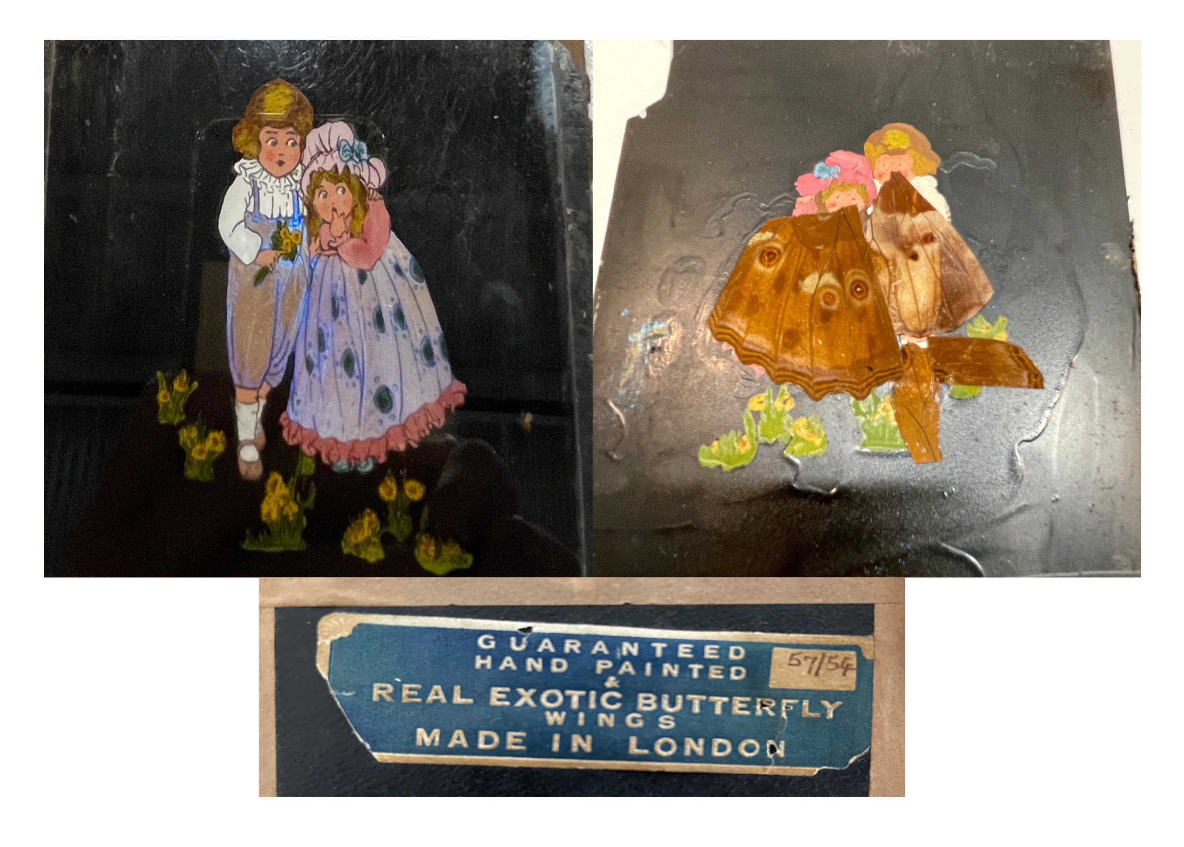
Even if you’re impressed, even amazed at entirely transparent structures being soon tubed as paint, you might classify the above pigments as gadgets too, effects you would never use in your works and yet these have fascinated artists since time immemorial. Our love of ‘bling’, of anything that shines and shimmers, goes back a long way… The use of white mica for its pearly lustre and black mica for its glittering specks dates back to prehistoric times—there seems to be examples of that usage in Australia around 65,000 years ago. Gold and other metallic pigments have been used since Antiquity— and soon became not only a symbol of divine power (gold shone as bright as the noon-day sun god Ra or Huangdi, the mythological Golden Emperor of ancient China) but, of course, of wealth (from thrones and crowns to watches and toilet seats!) and, eventually, became… our actual money—not to mention the attraction for the precious shiny stones often set in it. In Asia, ink, thanks to the addition of shellac, would pick up the light in such a precious way and in Japan, where a fondness for lacquered sheens seems to have been even more prevalent, the use of oyster shells to make Gofun Shirayuki, a white pigment that can be buffed to a shine, goes back centuries too. More recently, however, one artist in particular seems to have found entirely frustrating the absence of a pigment that could render the fascination he had with butterfly wings. So much so that Otto Marseus van Schrieck, a Dutch-born painter active in the later part of the seventeenth century, decided to actually glue real wings to his Flowers, Insects and Reptiles composition. Pressing those into a painted white wet background, the structure of the scales would get stuck in it and, yes, would keep some of its iridescence. (He would then fill in the gaps, painting the missing bits with ordinary paint.)7
None of the above for you? You must play in the league of the “Surface gets hit by Light and activates chemical colours” then, and we will get into these in depth in the WHICH? section, as most hues in tubes find their origin in that process.
One last thing before we dive in. Did you notice I use “surface” and “pigment” as virtual synonyms? For those of you a bit in love with pigments (myself included), turning our incarnators-of-colour into mere surfaces might seem something of a sacrilege, but truth is, defining this polymorphous stuff, which goes under the name of Pigment, is a challenging affair. You could call it the material hidden in plain sight, but it’s not hiding. If anything, it’s something of a show-off, yet so omnipresent as to become un-seen, a case of “A rainbow every morning who would pause to look at?” (as Charles Scott Sherrington quite rightly mused.)8 Definitions in various dictionaries honestly struggle to give a coherent and all-encompassing meaning. They usually make variations on the theme of a substance (sometimes it seems to need to be a natural one, sometimes anything goes) that gives ‘something’ (by being added or present) a colour.
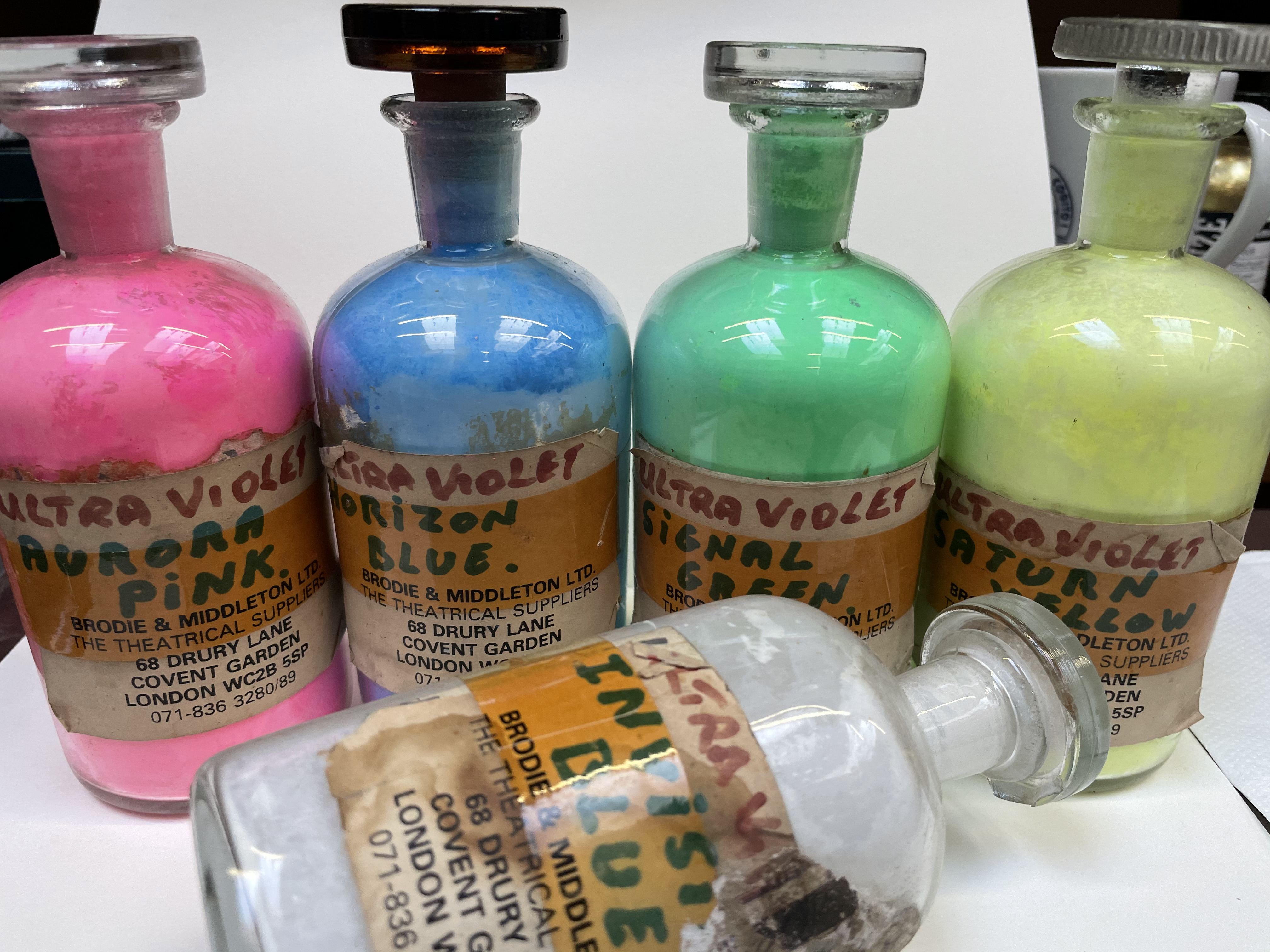
Etymologically, pigment comes from the Latin pigmentum, which means drug/spice and the colour material. So, for centuries, all these, which often travelled the same routes, were also sold in the same place, usually an apothecary. Maybe that explains why pigment shares with pimiento, chilli, the Latin root pingere, meaning to paint. And, while this doesn’t automatically imply these excited characters have a hot colour, of course, it does reveal that the word at least comes more from a pile of little particles we can turn into paint with the help of a binder than from the colour of the world at large. A technical sort of word that I think has mainly kept that resonance and one I will use henceforth to talk of these fascinating “portable surfaces” you can turn into paint. But keep in mind that surfaces are not always portable, endlessly complex, and never a passive material, perhaps more a process of sorts.9

You now understand why this book will not go from colour to colour. In the material world of Pigment, this gives us no information of interest, as the meaningful differences lay elsewhere.
The first section, WHEN?, will tackle a chronological approach to what I decided was the most relevant 88 art pigments. (The first thing I did during my M.A. was a timeline of pigments, as I had never really seen one.10) Choosing the happy few, which had mattered most to artists over the centuries, was tricky. Putting my hands on some of these even more, as some historical ones are truly rare finds. Still, luck was on my side when I sorted Cornelissen’s archives and got a first-hand experience of totally obsolete pigments. It was also revealing to organise them into colour wheels and see how our palettes improved over time.)
The second section, WHICH? will dive into the characteristics of pigments, answering, I hope, some fundamental questions about the behaviour of your paint.
Both are just organising options for the messy complexity of the actual world. I could have approached them quite differently. In my M.A. thesis, pigments emerged as songlines, each with a theme: Definitions and Regulations; Seeing a World in a Particle of Pigment, Infinity in the Palm of your Hand; Provenance; Manufacturing and Manufacturers, Do pigments have sex? (they have families after all) and could they be sexist?; Aesthetic and Moral Values, etc. So there is no right way to organise what is essentially the same information, but for the purpose of this book and painters, the above two approaches seemed to me the way to go… I hope you’ll enjoy learning more about and better understand the pigments in your paint via those two entries.
Jump to the next section of the book by clicking here
Alternatively click on the Table of Contents to browse the sections.
You can also subscribe to my blog at the bottom of this page,
and you’ll receive Hues in Tubes in your inbox… as it gets published!
Additional information & references
- Muir, J. (1911) My First Summer in the Sierra. Houghton Mifflin, Boston, U.S.A. (p.110 of the Sierra Club Books 1988 edition.) ↩︎
- A distinction well explained by John Gage in the excellent Colour and Meaning: Art, Science and Symbolism, (1999) p.138. University of California Press, Berkeley and Los Angeles, California, U.S.A. ↩︎
- Feynman, R. on Beauty of a Flower. [Online]. [Accessed 20th November 2024]. Available at: https://fs.blog/richard-feynman-on-beauty/ ↩︎
- Noe A. (2009) Preface to: Out of our heads: Why you are not your brain, and other lessons from the biology of consciousness. Hill and Wang, a division of Farrar, Straus and Giroux, New York , U.S.A. ↩︎
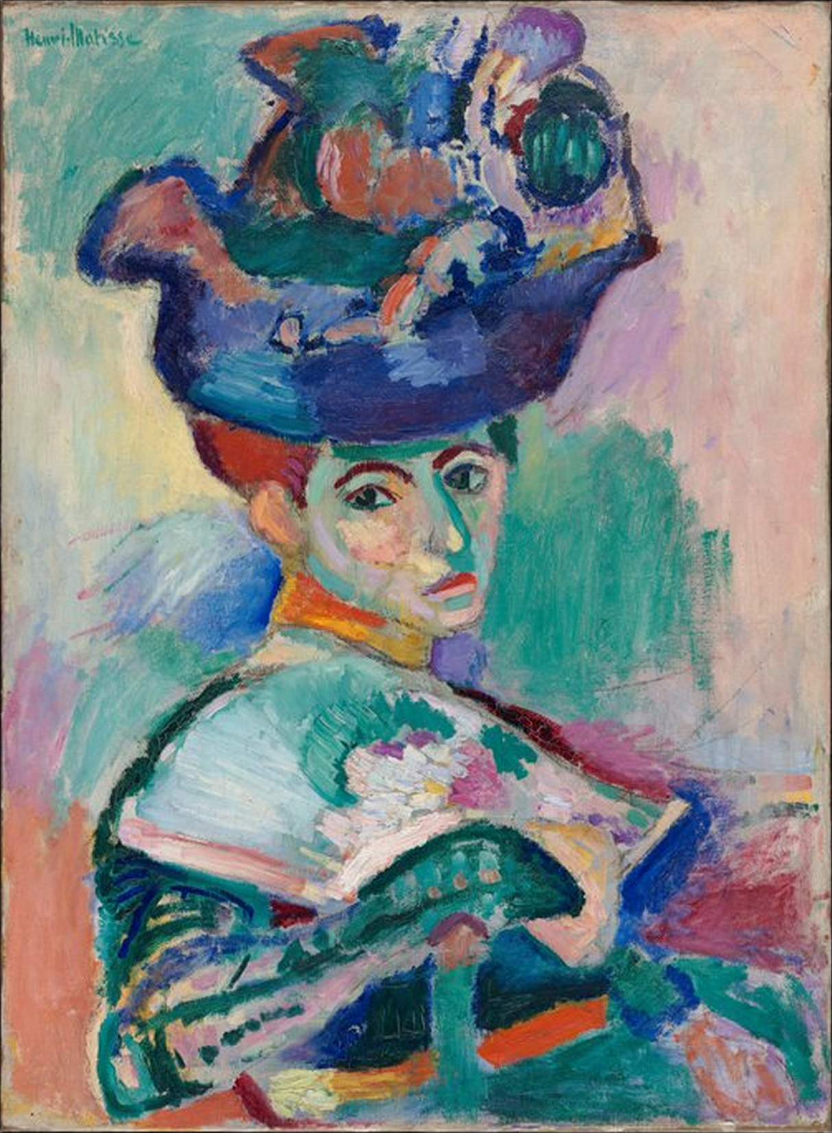
- If you had first seen a reproduction of Matisse’s Woman with a Hat in a black and white art book, nothing would have seemed amiss to you… However, you might have been shocked when you saw the original! This is explained by Picasso well: “ Colours are only symbols; reality is to be found in lightness alone.” Matisse discovered this principle, and while “not straying from the anatomical structure”, he used colours more as an emotional tool but with the appropriate luminance contrast and use of shading. Different parts of the visual system analyse colour and luminance (as anatomically distinct as vision is from hearing), and some might (and in this case, artists), the author of Vision and Art: The Biology of Seeing, suggests, have a more developed “Where system”, the colour-blind system in charge of motion and depth perception, spatial organisation, figure/ground segregation… very useful to those who draw indeed! Livingstone, M. (2002) Vision and Art: The Biology of Seeing, p.118 & 169. Abrams, New York, NY, U.S.A. ↩︎
- Jaynes, C.H. (Apr 18, 2022) Darwin’s Theory That Tropical Birds Are More Colorful Proven by Recent Study. [Online]. [Accessed 20th November 2024]. Available at: https://www.ecowatch.com/tropical-birds-colors-darwin.html ↩︎
- [Online]. [Accessed 20th November 2024]. Available at: https://blogs.fitzmuseum.cam.ac.uk/hki/2020/04/30/paint-and-butterflies-conserving-and-researching-a-painting-by-otto-marseus-van-schrieck/ ↩︎
- Sherrington C.S. (1937) Gifford Lectures, later published as Man on His Nature, Cambridge University Press, Cambridge, England. [Online]. [Accessed 20th November 2024]. Available at: https://archive.org/details/in.ernet.dli.2015.188837/page/n3/mode/2up ↩︎
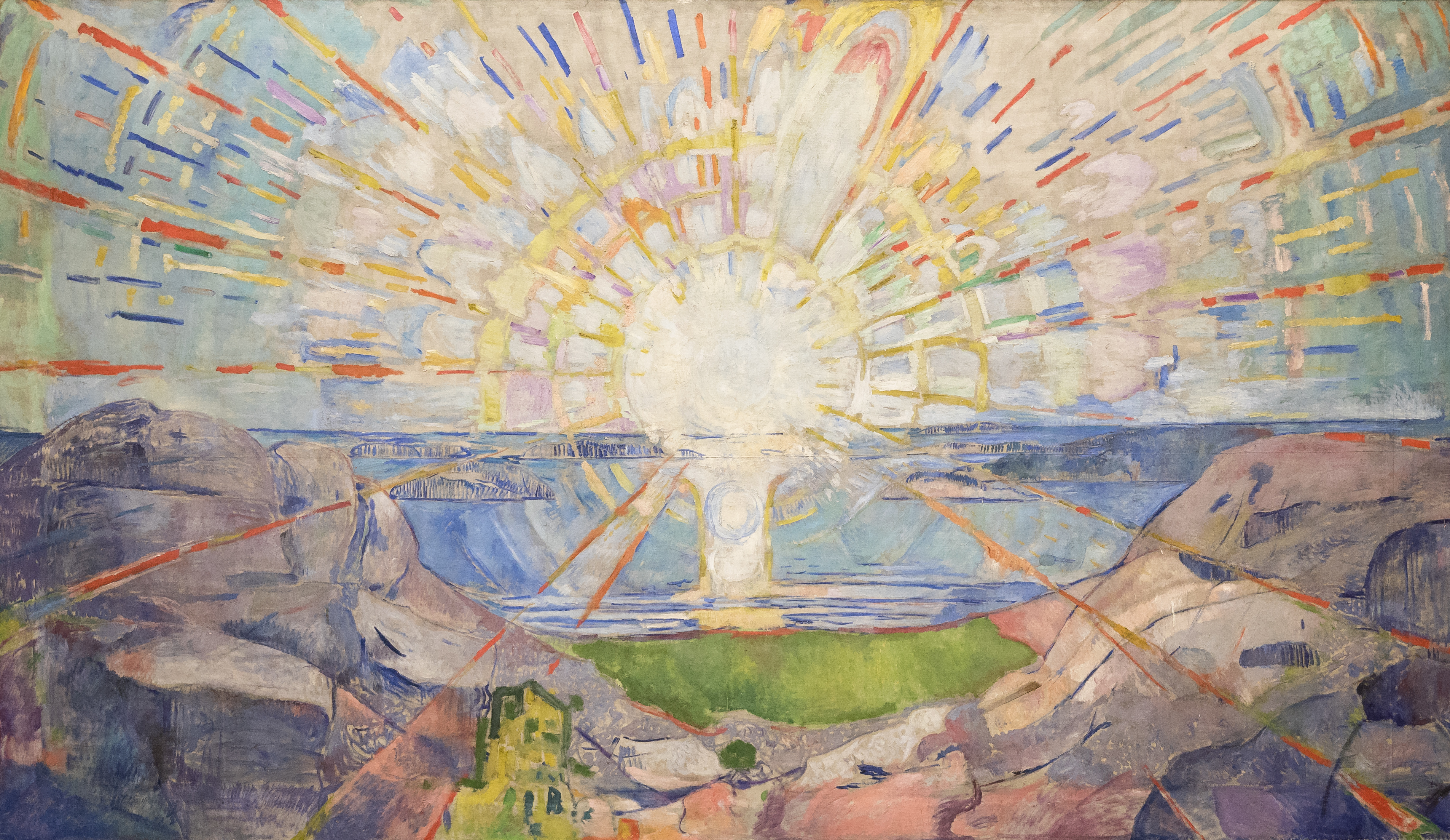
- Why do I reproduce here Emil J. Bisttram’s painting? It translated perfectly a romantic image of mine. You can laugh at it if you will, but when I watch the sun rise, just as it pops out from behind my favourite horizon, for a few minutes, I, like anyone, can see its circle haloed with prismed shards. Knowing what I now know, I imagine these little rainbows escaping from the sun’s centre as wands of wavelengths in the hands of light emissaries who, as they touch this tree, this patch of grass—until now, masses operating only in values of darkness—give it back all the myriad subtle nuances which make our world so colourful. In matters of minutes where there was, in truth, nothing, that little black dot on a yellow leaf jumps to your eyes, that branch of carmine leaves when the rest of the tree is still green gets noticed, that rainbow lorikeet flashing by on its winged journey too… A gracious daily ritual on both sides of engaging in the task at hand, illuminating our world, and accepting all the Light’s hues to be revealed through receiving them. Are we the ones responsible for understanding the chemistry and physics behind all this astounding diversity? Is this our job in the Universe? Perhaps not; perhaps we were only given eyes to enjoy, relish, and not break down the magic. Yet, is the joy in contemplating the endless diversity of those ‘surfaces’ diminished one iota by understanding (a bit) what is happening there? I don’t feel so… (And if you would like a less abstract representation, I’ll give you Edvard Munch’s Solen, below.) ↩︎
- It turns out there are a few here and there, including a remarkable one in the north cloisters at UCL, in London. To know more about that project go to: https://www.ucl.ac.uk/slade/research/projects/the-pigment-timeline ↩︎
Discover more from in bed with mona lisa
Subscribe to get the latest posts sent to your email.

Very interesting topic! So much to think about with light and color. Thanks for sharing 🙂
My pleasure!