WHICH?
Pigment Characteristics
Bless consciousness, for making blue different to me than it is to you.
Maria Popova1
It was meant to be a quick one here to explain what last week’s PBk7 business was all about, but there’s so much noise out there regarding naming colour that I thought I’d expand on this confusing issue just a wee bit.
Long, long ago, it might have been some Christmas uninspired idea from a relative or something, I received a Paint by Number set. I have totally forgotten the artwork I was supposed to paint in, some animal perhaps, but not the sense of annoyance this provoked. Maybe I instinctively knew back then that the equation number = colour would not do it for me. It’s not that I unsubscribed then and there from Rational Painting emails or threw in the bin my priceless Munsell Colour Set (it would be many decades, of course, before I would hear of either), but a deep feeling that “describing and looking at the world could not work like that” was there, as early as then. Life proved me right. Numbers and colours are no great match! At least not for those who have to work hands-on with the materiality of colour, as people using paint must do.

This said, some visual artists have it easy. To accurately describe a colour they want, graphic designers or illustrators can use percentages of CMYK (Cyan, Magenta, Yellow and K for blacK to avoid possible confusion with blue) with perhaps the addition of a Pantone® as a fifth or even sixth colour if their clients are into fluoros and glitters—as these and quite a few other colours cannot be obtained by an overlay of the four basic printing inks.2 It could also be that this other client is super specific about having his exact “Tiffany Blue” on his packaging/ribbons/stores’ furnishings, etc., so Pantone has devised a unique code and formulas for it on all surfaces. (BTW, Pantone’s “1837 Blue” was chosen for Tiffany Blue as the year 1837 marks the founding of the company… just in case you saw poetry in numbers.) Amazingly, this system is universally agreed upon in the printing world, so we can talk it all around the globe and get that precise colour every single time.

A web designer, on the other hand, to accurately describe a colour in the additive world of ‘Light’ or digital colours, talks in RGB. (Just like our eyes officially do, except that in reality, it’s a bit more complicated, as their peak sensitivity is to yellow, green and violet, but… let’s not go there.) RGB is the colour space of all our screens, and our designer will probably use a 6-digit, 24-bit, hexadecimal “Hex number” to best represent her RedGreenBlue world. For example, #123456 stands for 12 Red + 34 Green + 56 Blue. Hex numbers cover the entire gamut of what human eyes can, theoretically, distinguish, i.e. 16 million colours… at least, that’s what computer screens have been sold to us as offering. The reality, for most of us, is apparently much closer to a couple, maybe three million, and I have a bit of a hard time believing people who claim to see 100 million colours… how would they know? Have they even counted them? But, in one of my previous lives, long ago when screens were still in black and white, and I needed (and could!) invent CMYK colours in my head, we one day invested in a graphic designer’s dream. A huge square book in which all the combinations of the four printing inks were printed in increments of 5%. A beautiful object it was, but not that useful as, truth be told, we could hardly tell them apart. 1%, also referred to as Delta 1, is the one step observable by an untrained human eye (some highly trained colour wizards can perceive 0.5), but even 5% is challenging when you want to pick or match a colour and soon enough we all returned to making colour choices in our heads… which is where it happens anyway, right?
Above are but three of the most used systems. There are others, usually for more specific purposes.3

Meanwhile, other visual artists have a harder time… Painters, despite working like printers in the subtractive world of colour, do not just mix C, M, Y and K on their palettes. For one, we only understood and agreed on those primary colours not so long ago, but, more significantly (and perhaps why it took us so long to get there), these were not available as pigments until very recently. No pure Yellow for the Egyptians, no pure Magenta for the Romans, no pure Cyan for the Renaissance artists… these precise hues aren’t really even available as ‘pure’ mono-pigmented paints today! Secondly, the richness of available art pigments must be much more enticing than these weird starting points in colour space as—and although I’ve sold a few tubes of primary cyan, magenta and yellow as some companies produce them—I’ve never met an artist painting with just those three colours or creating all his mixes from them.

Still, we need to describe colour obviously in that world too. So how do we go about it? When I came across the above image on the net, it amused me because whoever that guy on the left is—and I could have an educated guess: Dulux product & sales manager, maybe? Interior decorator? Instagram poet?—he is no fine art painter! These wrestle with colour all day long, of course. It’s their despair and delight, in short, their medium, their language if you will, but while creating, they’re talking to themselves, so they don’t need to name what they see. When the need happens, they don’t reach for the above tutti frutti salad of bananas, limes and tangerines… meaningless colour references for many European masters who, on top of it, most probably never even encountered a banana in their lifetime!
However, nothing much has changed since Josef Albers’ oft-quoted line was written a century ago:
“If one says “Red” (the name of a colour) and there are fifty people listening, it can be expected that there will be fifty reds in their minds. And one can be sure that all these reds will be very different.”4
So, when painters or paintmakers want to source a specific pigment perhaps or need to record a particular hue (names, as we will see, are delightfully unreliable), there are two notations they sometimes use.
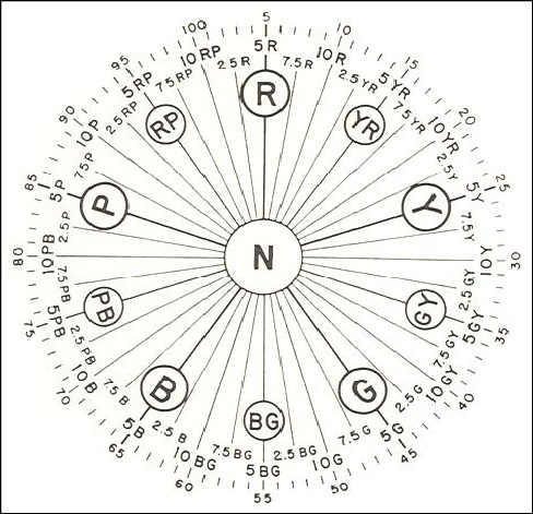
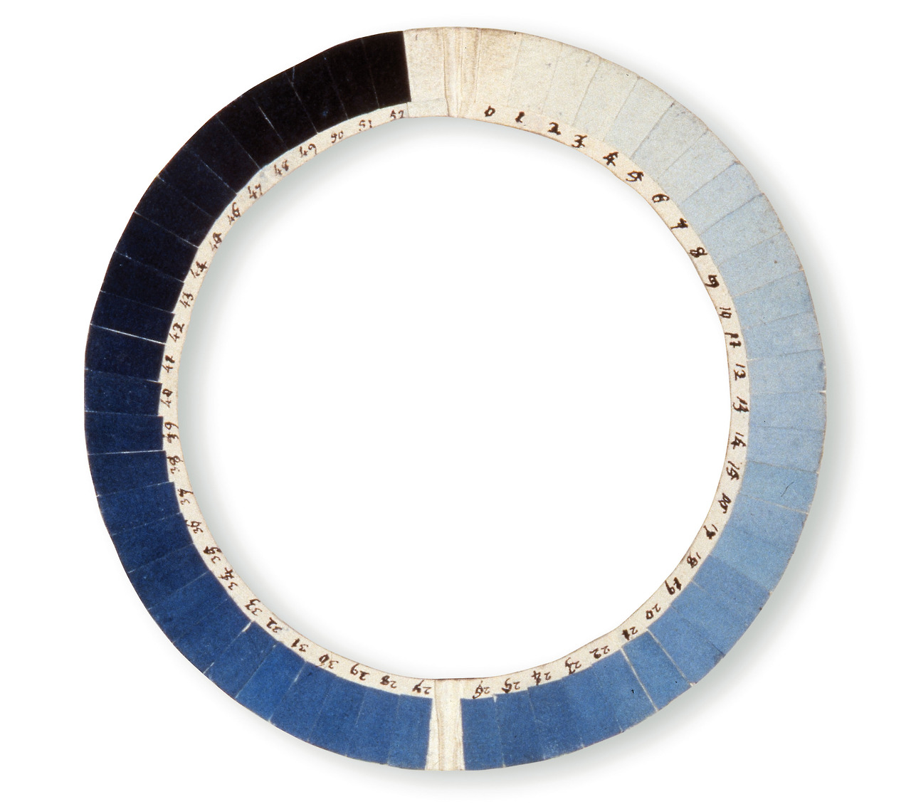
If they are total beginners and have a teacher so-minded, or are highly trained and precise about their colours, some painters use the Munsell notation system, which works perfectly well. I find it a great way to apprehend the concept of colour space, but in all other regards find it exhaustingly pedantic and far from the reality of a person holding a palette and brush. I doubt you’ll ever hear in a studio: “Oh, let’s add a little 5GY 8 / 10 in that corner. It will be so very fresh!” (The 5GY being the name of the hue, a straight green-yellow, the 8 its value, so a pretty light one here and /10 telling you it has quite a high chroma nevertheless.) They could, of course, but then painting would become entirely technical, which it isn’t. There are techniques and definitely a craft to it, but on the whole, it’s a much more intuitive affair, I feel, in which each colour chosen calls for another one, a lighter tone perhaps? A dash of this? A stroke of that? More paint? While artist Bridget Riley compares painting to translating “a text unknown even to yourself”, artist Stephane Galienni compares the brush to a painter’s white cane blindingly finding its way on the canvas, both quite fitting images.
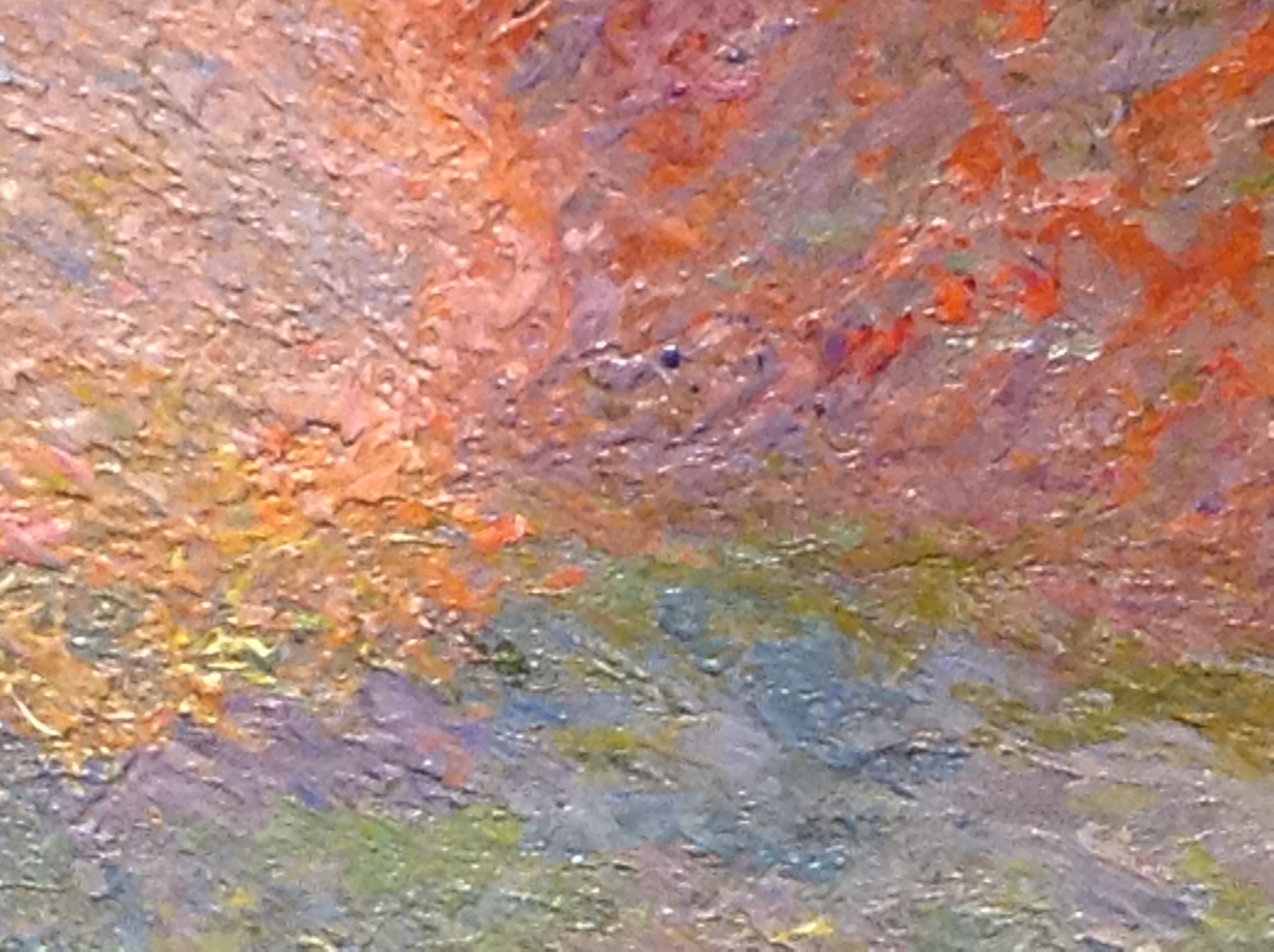
Seen up real close, as I was often allowed to when I helped my mother with large works, it is quite fascinating what a world can live in just a few centimetres… infinitesimal colour variations that make the painting sing in tonalities so much more exciting than the overlapping of Cyan Magenta Yellow and blacK pixels, I can tell you!
This said, far from me the idea of belittling Munsell’s notation system.5 He was the first to set up a way for us to give precise coordinates of colour, and, once you get the hang of it, as I’ve now understood, you can 1) order your French fries just as you like them (if only!) 2) organise your palette around those hue families and navigate your colour world quite efficiently along the chroma and value ley lines, saving yourself a lot of paint and pain along the colour mixing way.6 Yet, this approach is not for everybody…

The second notation and widely used system available is the Color Index’s Name and Code. Usually referred to as the C.I. Number, it gives the official “name” of any pigment and its constitution number. The first letter identifies the family of colourant: P for pigment, N for natural (these are usually attributed to plant or animal dyes that were turned into lakes and, more rarely to Earth pigments), D for dyes and S for solvent dyes. The next letter/letters describes the hue family. This prefix is followed by a number which is the individual’s identifier. N/A (not applicable) or N/R (not rated) means it has not been given a colour index name or number, and most historical pigments are in that category.
In the fine art paint world, you only encounter P(igment), and N(atural). PBk stands for Pigment Black, PBr for Brown, PB for Blue, PV for Violet, PR for Red, PO for Orange, PY for Yellow, PG for Green, PW for White, and a PM for metallic pigments. The same abbreviations apply to the natural colours: NBk stands for Natural Black, etc. The letters are followed by digits, the pigment’s serial number in the International Color Index. PY83 is a Diarylide Yellow, for example. The 83 has no meaning. It only follows PY81 and precedes PY87, two other Diarylide yellows it so happens (numbers for discontinued pigments are not used again, so there are gaps.) Since 1925, pigments have been accredited thus by the Society of Dyers and Colourists of the U.K., now in collaboration with the American Association of Textile Chemists and Colorists and in any brand worth its salt these days, you should find that Color Index reference on your tubes somewhere.7
What is rarer to see—although I’m noticing less and less so—is the full constitution number that the Colour index also provides and which describes its chemical constituents. For example, above Diarylide Yellow’s full name is PY83 – 21108, while the other two Diarylide yellows mentioned are PY81 – 21107 and PY87 – 21107:1, respectively.
Sadly, if you wanted to use these cryptic codes as a reference for a specific colour or quality, you would encounter two significant problems. Firstly the initial numbers can be the same (and dutifully printed on the label), but the missing sub-numbers might differ… making all the difference in quality and price! (Pure Cadmium Red is PR108. However, PR108:1 is the name of Cadmium Barium Red, a less saturated and more economical version of 108 used in cheaper brands but not always labelled correctly… one wonders why?) So, it pays to get to know your labels and your brands to understand what you are getting for your dollars, as serious companies mostly label the contents of their tubes correctly. They also have a good name they have worked decades to get, so you can, on the whole, trust them to offer you a quality pigment/paint.

Secondly, that system is not a colour notation system at all. If it was, it could give artists some certainty about getting a specific hue, but that’s not what that code is about. C.I. ‘names’ only reference and describe the chemical constituents of a pigment. So take our PR108 seen above. Even if you ensured it was a genuine Cadmium Red, correctly labelled PR108, you would find dozens of red options under that heading. Each with of different shade, from lighter to darker, from cooler to warmer… and yet all under the PR108 code! (Which explains the variations in hue you might have noticed from company to company as each has picked the one they liked best.) One could now rephrase or paraphrase Alberts, thus: “If one sees “PR108” (the chemical name of a pigment) and there are fifty people making paint, it can be expected that there will be fifty reds in their minds. And one can be sure that all these reds will be very different!”
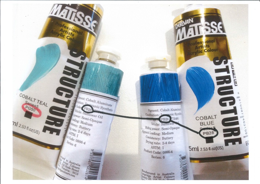
Also, as a matter of choice, some paint companies use, for example, variations of the blue pigment PB28 both in their Cobalt Blue and their Cobalt Teal—picking chemically similar cobalt aluminates with different hues. Yet, in another brand, you’ll see the tube of teal mentioning a different pigment, usually a green one named PG50, so that even when you’re chasing a pigment and not a hue, the whole thing can be somewhat disconcerting.
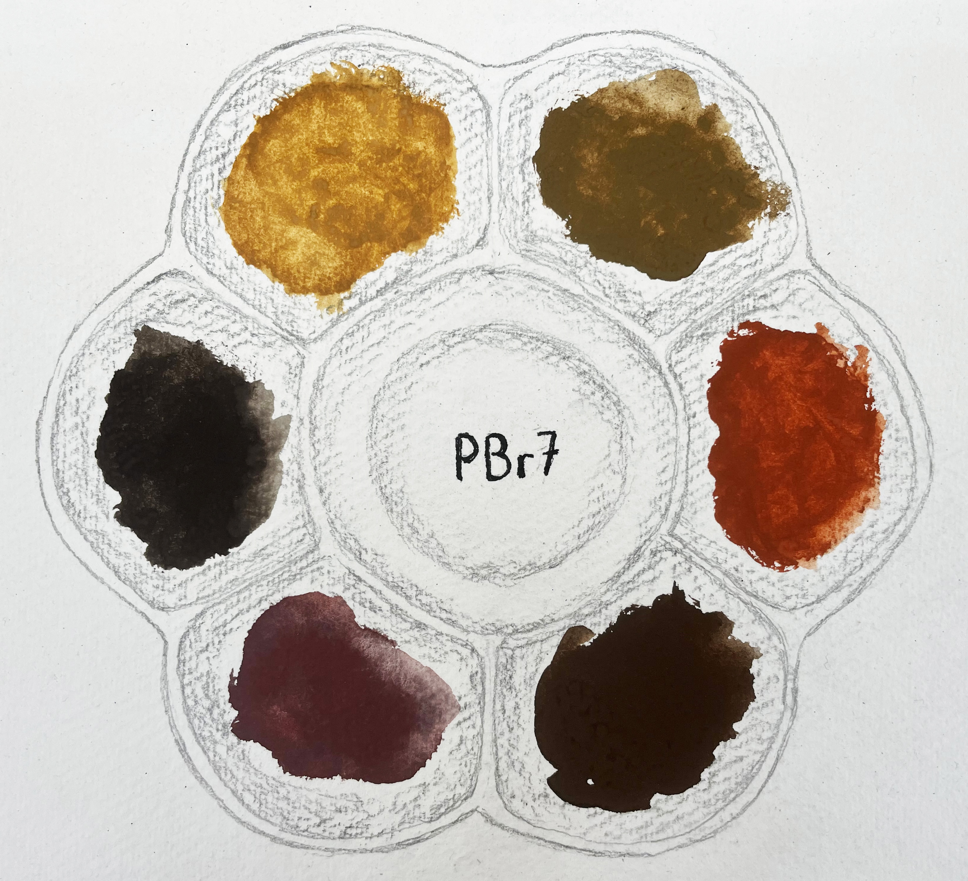
I first came across those differences in the Earth pigments which, with chemistries essentially similar, offer wild colour variations resulting mainly from their origin and different degrees of calcination. Other things can also impact, such as particle size and shape, as we shall soon see, while minor differences of trace elements, metals or other compounds in the iron oxides’ composition can play a part but not enough to give them another C.I. Name. To illustrate my point I’ve represented a few below, all watercolours from the extensive Daniel Smith range.
Voilà! So much for CI names which make you sound pretty savvy if you can roll them out from memory (I can’t) but aren’t so helpful to describe our colours. In parenthesis, I’m happy to admit right now that however necessary colour classifications and codes might be, they don’t really count as ‘names’ in my opinion. Although, for imprecise precision’s sake, I understand they are useful and do their job in their respective worlds. If nothing else, because our memories, pretty poor at remembering colours, probably could not deal much better with memorising millions of words to describe them. Indeed it is only recently that most languages have developed more than a handful of them which we don’t even always agree on! (The French turquoise (teal?), marron (definitely brown) or pourpre (a dark Magenta perhaps) is ever so different from the English turquoise, maroon or purple, for example. Something which took me a long time to notice, even doing the job I do. Perhaps you see in your brain the colour of your mother’s tongue… even if the tube shows you something else!)
Despite all their limitations, words will be used; there is really no other way… but our rainbow will not suffice. Even adding a few adjectives such as light or dark, as in light blue vs dark blue—and a ‘normal’ blue in the middle, perhaps?—or cool vs warm or even hot, it all remains unacceptably vague. Your light blue is undoubtedly ever so different from my sky, pale or even baby blue. All three light blues, right? If we want to share a language, we will need to leave behind ‘common’ words and enter the fantastic realm of ‘proper’ names. (We shall dive into this in the last part of the book, WHYEVER?)
P.S.: Pigments used in pencils, pastels (oil or soft), inks and other art materials are often quite anonymous. I’ve never come across a pencil labelled with its pigment content and most of these supplies will only have a pretty proprietary name or even just an number. It’s not that pigments do not enter in their composition but it seems only art paints explicitly reveal their content. Possibly because they are the most noble of mediums, using high quality ones, or possibly that’s only tradition…
Jump to the next section of the book by clicking here
Alternatively click on the Table of Contents to browse the sections.
You can also subscribe to my blog at the bottom of this page,
and you’ll receive Hues in Tubes in your inbox… as it gets published!
Additional information & references
- Popova, M. (2024) Some Blessings to Begin with. [Online]. [Accessed 1st February 25]. Available at: https://www.themarginalian.org/2024/12/31/some-blessings-to-begin-with/?mc_cid=5bed3a174b&mc_eid=419ea97f96 ↩︎
- To be precise, even Pantones can’t always do the trick as they might work well for printing a single object but not for a whole book. Recently, I had the pleasure of listening to Dr Juraj Lipscher, one of the authors of The Book of Colours (Das Farbenbuch) and, to render accurately the pigments in their book, they had to use not only CMYK but also 8 extra Pantone colours! A true labour of love that one… ↩︎
- I won’t even go into the more evolved three-dimensional coordinates system, which is the CIE Lab Space, as this one lives in the additive world and basically involves measuring colour with acutely precise spectrophotometers… an instrument you must agree is NEVER seen in an artist’s studio at all. Yet it functions pretty much like the Munsell system, and is relevant to the paint world since both system and instruments are usually employed to check the consistency of pigments, the consistency of each batch produced, and to ‘read’ differences between various stages of lightfastness testings. ↩︎
- If you would like to understand better Munsell and his system, please go to a blog on this website: https://inbedwithmonalisa.com/2018/12/10/munsell-chips-anyone/ ↩︎
- First published in 1925 by The Society Of Dyers and Colourists of the UK and currently managed in collaboration with the American Association of Textile Chemists and Colorists, it forms the official index of all commercially available colourants. Most pigments artists might use today can be found there, along with those for every other industry. ↩︎
Discover more from in bed with mona lisa
Subscribe to get the latest posts sent to your email.

One Comment Add yours