
Until a couple of months ago I hardly knew and cared even less about Albert Henry Munsell. Researching colour I had come across some of his beautifully painted charts and somehow knew he was relevant to colour theory but, despite the fact that he was obviously a name among only a handful or two that seemed to really matter, I had decided the man and his grammar were probably old hat by now. I didn’t worry too much that he was not on my radar as he did not seem to be on any of the artists’ I meet in my store either.
In truth, I have to admit I did know one artist who used his system. He would post pictures on Instagram of his huge palette with cryptic comments to the tune of: “Have been mixing my colours for three hours, excited to begin painting.” Being the impulsive sort, I thought him a bit mad, or obsessive –which in a way was quite right because those using that system to get the absolute, spot on, exact shade they want their paint to be are in that category absolutely. And then again why not, sometimes there’s a good reason to be pedantic, (let’s say you’re working on a huge painting and need that exact colour again a few weeks later), but more generally because, once you get the hang of it as I’ve now understood, you save yourself a lot of paint and pain.
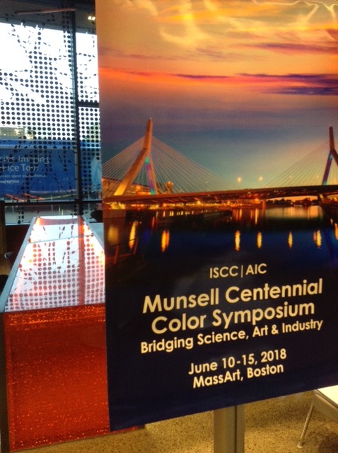
Earlier this year, as I landed in Boston a bit excited and somewhat fretful too, I knew my indifference to and ignorance of Alfred would de facto come to an end as I had signed up for a five day long Munsell Centennial Colour symposium. I could have researched him beforehand but had decided that if five entire days would not give me a better understanding of that one, I should probably best give up colour research altogether! The symposium was offered by the Inter-Society Color Council and L’Association Internationale de la Couleur –originally a French organisation, now international. I had asked to join, had been accepted as a member on presentation of my threadbare experience, but expected to easily make myself small by dissolving in a sea of thousands of colour enthusiasts. Well, the totality of this very successful year’s gathering was more in the region of 200 participants –which was fabulous as we got to talk to virtually everyone over the course of the five days– and virtually everyone was a specialist in some aspects of colour. At a glance that first evening I got the feeling that, unlike myself, for some if not most gathered in the large atrium of MassArt, the Massachusetts College of Art and Design, having fun during five days was not uppermost on their mind. Academics or not, they had crossed the world (27 countries represented) to give serious presentations and talks in which their reputation was at stake and their point of view would be weighed, debated, perhaps even dismissed. They also seemed to know or know of most of the other colour geeks gathered there. I scanned the programme I had just been given: “Reflectance Reconstruction using a Multi-illuminant based Multispectral Imaging System”, “Practical application of Browns and Greys based on a Vector Concept”, “Color Processing in Artists and Non-Artists Participants in Relation to Individually Determined Photopigment Opsin Genotypes”… I grabbed a glass of wine… Lord, what was I doing here?
To my surprise, I knew more than I thought. Little bits of my past as graphic designer, publisher, educator helped in obvious as well as in less predictable areas and having researched colour quite a bit over the last three years I could just hang in there and follow whatever was presented. However, having also let my search meander down myriad rabbit holes, My Big Colour picture is, at this stage, more like a plate of spaghetti than a filing cabinet. Sometimes I tug at one strand and discover that it moves on the other side! I do not know what the scientists gathered in Boston would think of such an approach but Munsell, who is remembered for saying: “Color anarchy must be replaced by systematic color description” would, I reckon, totally disapprove.
Which brings us back to Albert… Born in 1858 in Boston, the young (and quite good looking don’t you think?) man was gifted. He went on to further studies at the newly established Massachusetts Normal Art School as it was then called and, whereas most students were content with studying one year there, he ran through the four years they offered. The School had been established to support the Massachusetts Drawing Act of 1870 and its aim was to provide drawing teachers for the public schools as well as training professional artists, designers, and architects. You might exclaim: “Oh delight a publicly funded university (which it still is by the way and now the only free art school standing in the United States) offering everyone drawing skills!” The truth had a more business-oriented flavour however. Boston at the time was at the heart of the American industrial revolution. Textile manufactures, railroads and retailing boomed there but skills were lacking. Especially in technology and draftsmanship. Civic and business leaders got together, founded the now world-renowned MIT, Massachusetts Institute of Technology, as well as Munsell’s school and, to be fair to them, the not-so-business-orientated wonderful Boston Museum of Fine Arts too.
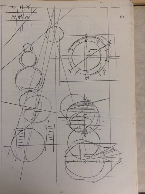
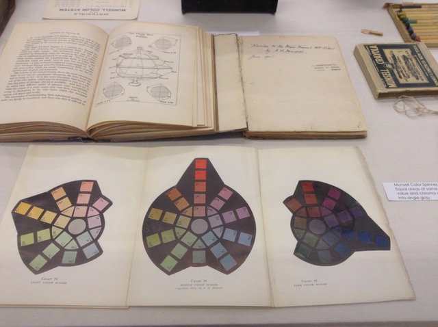
 From prize student, Albert turned teacher in the same establishment and it was there that his passion for teaching colour to his students and children in general, made him develop both a concept for understanding colour and a system to communicate it with precision. A sound approach seemed to have been his aim but quite a playful one too. In 1899 he filed a patent for a colour globe on which the colours of his rainbow were at their strongest at an imaginary line equidistant from its poles, dividing it into a progressively lighter northern and progressively darker southern hemisphere. This one is the first of his 3D representations. (I do not know if above were preparatory drawings but I found them bound with the typed version of his journal that, among other wonderful treasures the MassArt library has in its archives, we were given to see and the liberty to handle.)
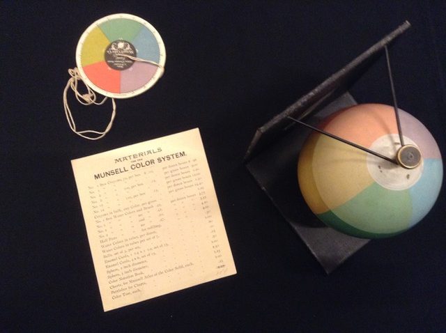
Next to the bubble is another invention of his, a disk that, when spun, will show youif the percentage of colours you have chosen for any given artwork will produce a delightful neutral grey. And when I say delightful, I mean delightful to Alfred. Because the man not only classified and ‘notated’ colours as you shall understand soon, but he also approved or disapproved of art or design in which colours are “poorly related and do not balance in neutral gray.” Of course that’s what his 6 primaries in equal shares produce but it also seems, perhaps after a sojourn in beautiful grey Paris, that Alfred had developed a taste for colour harmony that would imply that a “neutral” result would be the best possible outcome. It is, however quite difficult to see if the proportion of colours in an artwork will produce the sought for grey. But not if you have one of these!


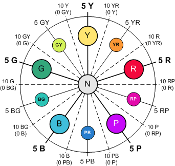
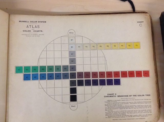
Later he also devised a “Color Tree” to represent the colour space occupied by the chosen ten hues of his system… Ten? well, he decided green definitely deserved to be up there with the best but that purple too needed a space of its own. In truth, he did like the decimal feel of it all! So five ‘primaries’ they are: Yellow, Red, Purple, Blue and Green + five intermediate YR: Yellow-Red, RP: Red-Purple, etc.
 In-between each of these the tertiaries which he names the ten Second Intermediate hues. YR-Y: Yellow-Red yellowish, R-YR: Reddish Yellow-Red, etc. Finally, in order to further refine this, he creates eighty Special Intermediate Hues, numbered from 1 to 10, like so.

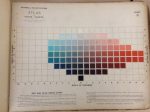
These hundred visual steps are the foundation of Munsell’s notation system and cover the first of the three colour characteristics he tackles: Hue. These steps were, as far as humanly possible judged equal by himself and his team and, reviewed later on with the help of more precise machines, were found to have been pretty accurate in fact… ha the good old eye! Munsell, being Munsell however, he did not give all hundred of them cute little names: “Can we imagine musical tones called lark, canary, cockatoo, crow, cat, dog, or mouse because they bear some distant resemblance to the cries of those animals?” No, no, no is the answer. Munsell’s notation will be modern and pragmatic. His ten major hues will occupy clockwise a circle in which all ten ‘pure’ colours will sit at 5. Increments of five steps have brought all of them to their full hue and another five will take them towards the next tertiary. For example, pure Yellow in 5Y will carry its course either towards Yellow-Red Yellowish in five steps or towards Green-Yellow Yellowish in five steps where, in both cases, it will get another name.
The beauty of the decimal system is… that you can go on subdividing and subdividing easily. But, if this notation throws you off somewhat, it might be because like me
1) you hate numbers… Just get used to them, they are numbers tis all and it’s easy enough to put them back in their spot in your set which might be the only reason you’ll need to handle them. (Plus nothing in the whole wide universe can stop you from giving them sweet names of your invention instead!)
2) I’ve picked a colour wheel going in the other direction… reading clockwise the progression of hues as on my racks of paints! OMG, I can hear you cry! OK, OK, if you insist, here’s one going the ‘wrong’ way AND it also shows all the subdivisions… in colour! (Thanks be given to TheLandofColor.com)
Onwards to Value, Munsell’s second colour characteristic. Value, the amount of light reflected from pigments, is the trunk of our colour tree, the core of our apple. This tree has its roots in extreme darkness (value 0) and grows to extreme whiteness (10) at its top. 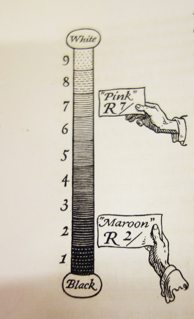 Black via a scale of achromatic neutral greys slowly turns into white and the whole concept is pretty easy going if only applied to these two colours –by the way, neither 0 nor 10 are ever represented in the charts or the chips as they would endlessly be white or black. Where it gets more interesting is that all colours have a value too of course. It is –quite– easily found with a perforated value scale and, if you have an interest, do yourself a favour and buy one of these. They do reduce the guesswork to a minimum.
Let’s have a look at our five chosen ones. Not surprisingly, ‘pure’ yellow is the lightest colour and ‘pure’ purple the darkest (actually I’ve learnt at the conference that, in fine art paints, Prussian blue has the darkest value of all, darker even than most blacks!) ‘Pure’ blue and red –are we surprised that those two would compete?– are both at 4 and green just a little above them. Of course, there are many lighter or darker reds or yellows and so the number that follows the hue notation, which is the value one, will vary accordingly but ’pure’ yellow will be notated 5Y 8/, while ‘pure’ red will be 5R 4/.

What comes after the / is Chroma which is the vividness of the hue. Some call this saturation which is correct too but it has no relationship to the pigment saturation so this term might be confusing to you. Chroma is the last measurement needed to accurately describe a colour and assign it a precise location outwards on any given branch of the tree but, in my opinion, it is also by far the most difficult to assess. Many paint companies are kind enough to give us a chromatic evaluation of their paints (go to Gamblin’s, for example, it’s really extensive) and some of these, nowadays, hit the 16 or even 20 mark –some fluorescent paint even go to 30– whilst back then the highest chroma, ‘Pure Red’, was valued by Munsell only at 10. Although it is quite easy to see if a colour is vivid or not, I have to admit I find the seemingly endless intensity scale too esoteric for me to be able to rate any colour precisely on it. (Plus I’m sure there’s a device out there which works that one out perfectly and I’m quite happy to give it the job!)
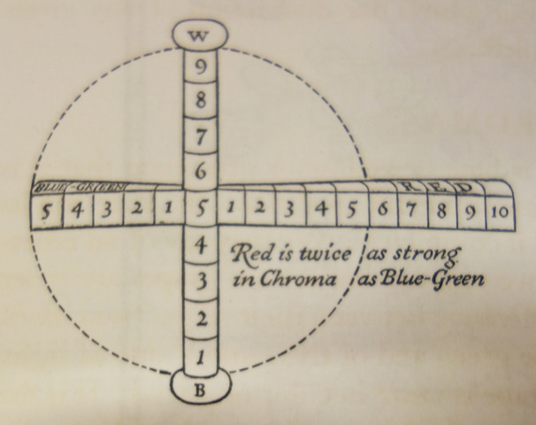
Combining the above three notations will give you a full Munsell colour name or notation, let’s say 5GY 8 / 10. The 5GY will name its hue, a straight green-yellow, the 8 is its value, so a pretty light one here and /10 tells you it has nevertheless quite a high chroma. Just like that, you might not be able to 100% accurately visualise the green I’ve picked but, forget about the notation, close your eyes and think about it… a light but bright yellow-green, hum you might not be that far either.
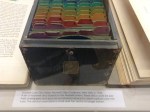
Of course, for precision’s sake Munsell’ system was complemented with chips hand painted in gouache which could help you pick your preference then name that colour to a printer or a manufacturer on the other side of the world. In our day and age of computers which include all manners of colour notations, this might not be as amazing to us but, back then, it was a grand premiere! 
 And something that all manners of makers and organisations seized… Munsell chips, fried to perfection, anyone?


The Munsell colour chips books are still being used and if not hand painted anymore, are lavishly produced by Xrite, who do the Pantone ones too. Among them are a few declensions you might not expect, such as a whole one about Foliage or Skin tones or Soil hues (archaeologists use it a lot!) The skin one was missing in Boston and when I asked about it, the Xrite rep answered: “Just look at the soil one, they’re pretty much the same. Then he added poetically, “Dust to dust… you know!”
 However useful to industry, Alfred’s greatest accomplishment was perhaps to make us all see the third dimension of colour for the first time, not as a perfect sphere, circle, triangle, star, etc. but as something annoyingly awkward and irregular. Even the brightest yellow can only take that many steps before it becomes white, while for the darkest purple to turn black that is even truer but for red there are many more intermediate hues and somehow that must be represented… He did. In 2D like above or through a sweet drawing
 and in 3D with the help of his Colour Tree (here as a do it yourself version.)
Where I think his system works best of all though is… in our minds. Once you’ve made a mental picture of the whole thing, you can navigate your colour space so comfortably that it even works smoothly in paint! Truth be told, Munsell’s is not a painting system at all –only a colour and description one– but it can be used by painters most effectively and so, of course, I had to attend the Munsell colour mixing session in Boston presented by two artists and seriously serious Munsell mixers: Graydon Parrish and Steve Linberg. The tandem often works together and has a website called… Rational Painting! Google it and join if you will, but a little warning: they are better at paint that at website building. People in the audience –yes they were all the professionals I talked of earlier– would approve or not of swatches of paint trying to approximate a colour and make little remarks to themselves in the vein of “Delta 1 for sure, no, no maybe only 0.5.” (Delta 1 is the one step observable by ‘normal’ human eyes; trained eyes can see 0.5) I left somewhat unconvinced that my crew of artist friends would be rational enough to enjoy the exercise BUT I did give it another go.
 I asked the one artist that I knew used the Munsell system, Hobie Porter, to give us a talk and a little workshop one day and Oh Magic! Oh Colour Space Beauty! it all clicked into place. Not just for me, for all of us. SO, you pick paints whose pigments are not too distant in hue from Munsell’s primaries and secondaries… Hobie’s choice in oils was
and, as you can see, his 13 starting points to which he added Titanium white, Raw umber, Burnt umber and Burnt sienna already expand on Munsell’s ten primaries + secondaries. The Rational Painters in Boston gave us a suggested list of 24 paints but the principle is the same however rich or lean your palette is. When you want a certain colour, you start from the one closest to it, modify its hue by mixing the second closest to it if need be and then you go on to alter the value. To achieve that you can choose to go Munsell all the way which is via a range of achromatic greys made of black and white mixed and some companies like Golden or Gamblin offer these ready made under the name N2 / N4 / N6 / N8 or Neutral Grey 2, 3, etc. You could also choose, as this artist suggested, to use white plus your own mixed black (raw umber + ultramarine blue in his case.) Whichever path you take, you will lower the chroma of your mix and you’ll have to adjust perhaps again your hue, then your value, etc.
You might not want above colour wheel at all but I would suggest that you at least pick mono-pigment paints since you will mix your paints a fair bit while you walk the pigmented road towards your desired hue and so should start with the ‘cleanest’ colours possible. If you go for totally different starting points that’s also fine as long as you are aware of where they sit in colour space. Remember too that, whatever you do to your initial colour –shade it or tint it–, this will automatically lower its chroma as you can never make your paint more saturated! So starting with a highly chromatic range of paints is probably a good idea… if you like highly saturated colours of course!
Fan or not of his approach, interested in colour mixing that way or not, I still think a little homage was due to Alfred this year of all years, as a century ago the Father of Color Science –as he is often remembered– passed away and also because the foundation he created just before his death has kept alive a colourful legacy which is still vibrant, scientifically correct and worth celebrating in style!

Munsell’s first Colour Tree…
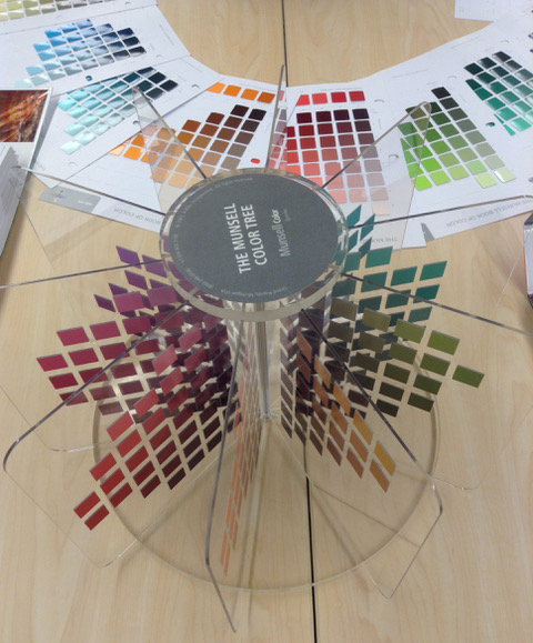
… has come a long way!
PS: While we are at it, I would like you to have a thought for his son AEO –Alexander Ector Orr Munsell on the right of his father here– who wanted to be a doctor but ended up giving up his studies in order to manage his father’s foundation and who, despite this huge personal sacrifice and relentless work for the Colour Cause, is best remembered for being a Marxist and giving all of his family money away!

Discover more from in bed with mona lisa
Subscribe to get the latest posts sent to your email.

Finding your post was a fun coincidence for me. I have a post on my blog publishing later this morning that mentions Munsell and color acuity. It’s fascinating to learn more about him.
i enjoyed this article tremendously, thank you. I took a class with a portrait artist several years ago who used Munsell’s system to create gorgeously accurate skin tones. He didn’t provide enough explanation for me to grasp its brilliance and so I learned how to mix the colours but without understanding why. Recently, I stumbled across a video on YouTube that unlocked the system. Your article has added to the illumination of understanding Munsell now awake in my mind.
Thank you so much Shelley, it’s always a pleasure to get a comment and that someone has found one’s research helpful… especially to understand this somewhat complex Munsell system!