If one says “Red” (the name of a colour) and there are fifty people listening, it can be expected that there will be fifty reds in their minds. And one can be sure that all these reds will be very different. Josef Albers
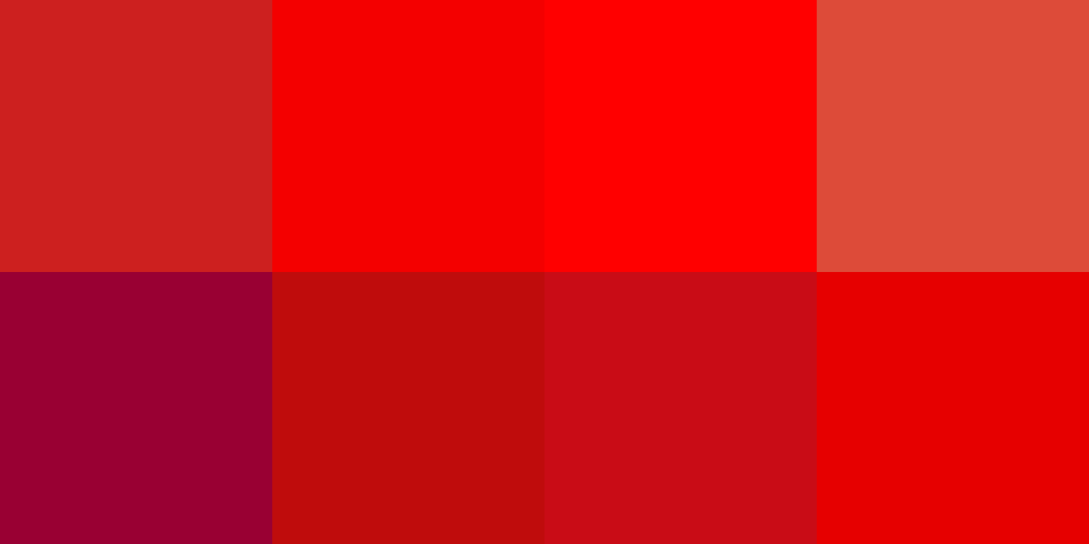
Obviously our rainbow is not going to suffice… even with the addition of a few adjectives such as light or dark, as in light blue vs dark blue (and a ‘normal’ blue perhaps in the middle?) or cool vs warm or even hot (just for pink) it all remains unacceptably vague. Your light blue is undoubtedly ever so different from my sky, pale or even baby blue –and all three are light blues right? So, somehow, we’re going to have to be a bit more precise…
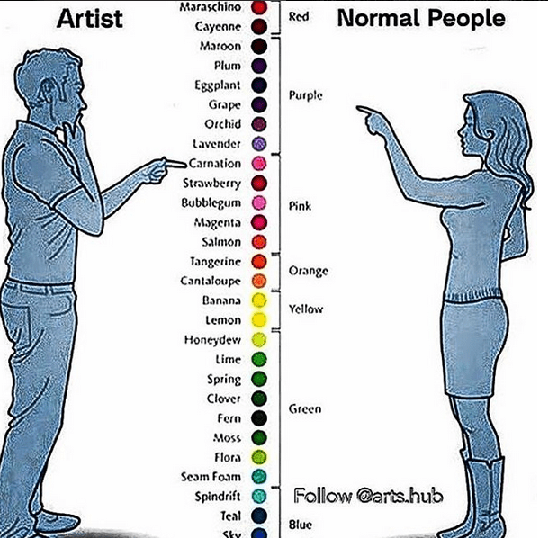
When I came across the above image on Pinterest it amused me because, whoever that guy on the left is –and I could have an educated guess: Dulux product & sales manager maybe? interior decorator? Instagram fanatic? poet?– he is is NO visual artist! Visual artists wrestle with colour all day long of course. It’s their despair and their delight, in short their medium, their language if you will but, while creating, they’re talking to themselves so don’t really need to name what they see. Still sometimes –when sourcing perhaps a specific pigment or needing to reproduce / share their vision– they want to dialogue with the rest of the world and need words to talk colour. When that happens they don’t reach for the above tutti frutti salad of bananas, limes and tangerines… which would, on top of it, have been totally meaningless colour references for many European masters who most probably would never have had encountered any of these in their lifetime!
Some visual artists have it easy…
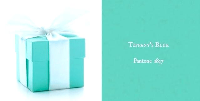
To accurately describe a colour, a graphic designer, an illustrator can use percentages of Cyan, Magenta, Yellow and Black with perhaps the addition of a Pantone number as a fifth / sixth colour if his client is into fluros or glitters –hues that cannot be obtained by an overlay of these 4 coloured inks– or if this other client is superspecific about having his exact “Tiffany blue” on that packaging (and btw Pantone “1837 Blue” was chosen for it as the year 1837 marks the founding of Tiffany… just in case you didn’t find a number poetry enough.) This system, amazingly, is universally agreed upon in the printing world and so we can talk it all around the globe and get that precise colour every single time.
To accurately describe a colour, a webdesigner working in the additive world of “light” or digital colours would probably use a 6 digit, 24 bit, hexidecimal “Hex number” that will represent best his Red, Green and Blue world… For example #123456 stands for 12 Red + 34 Green + 56 Blue. Hex numbers cover the entire gamut of what our eyes can, theoretically, distinguish; ie 16 million colours.
I’ll have to admit though that however useful these classifications and codes names are and there are many others (these are just the two most common ones!!) they don’t really count as ‘names’ in my opinion. They’ll have to do though, if nothing else because our limited memories –pretty useless at remembering colours– probably could not deal much better with memorising millions of words for colours. Indeed it is only recently that most languages have developed more than a handful of them! This is another fascinating area of study I shall not get into now but you can read more about it here.
Meanwhile, other visual artists have a much harder time…
Painters, despite working like printers in the subtractive world of colour, do not just mix C,M,Y and K on their palettes. For one, the first three were not available until very very recently. No pure yellow for the Egyptians, no pure Magenta for the Romans, no pure Cyan for the Renaissance artists… they do not even exist as totally “pure” usable monopigments today! Secondly, painters are usually quite fussy about their paint. Does some vanity also play a part in their choice of colours? YES, they usually want their works to be around for a little while, and NO they cannot resist a new colour when it comes on the market and opens a whole new colour space! No more than Van Gogh could resist that new Geranium Lake could artists in the 1960’s resist the fluos. The geranium faded, so will the fluros (and the most lavishly printed art book) but it was fun to use and beautiful while it lasted! However, lightfastness aside, over the centuries only a very limited number of pigments were found suitable. Not every pigment can make a paint and certainly not an interesting paint with the required vivacity of tone, mixing permanence, covering and colouring power, siccativity, fineness and compatibility with other pigments!
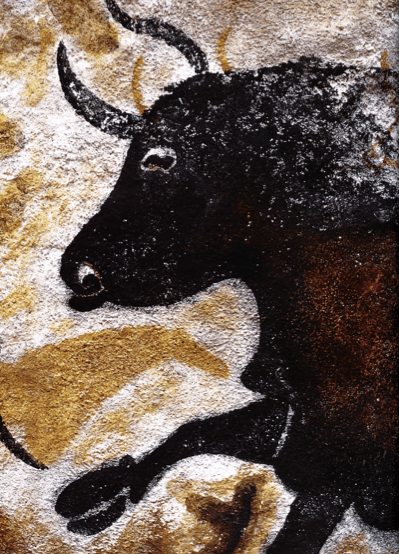
Men have known this for a very long time and have devoted themselves to appropriating colour for as long as they’ve been around it seems. Traces of trial and error, trial and improvement, trial and success can be found even in our oldest remaining marks. To the amazement of researchers, when they recently analyzed the frescoes at Lascaux with a new non-invasive apparatus, where they expected charcoal –an easily sourced but not very interesting paint pigment– they found complex mixtures of scarce manganese oxide minerals, including groutite, hausmannite and manganite. How exciting is that! Can we comprehend to what length these forefathers and mothers had gone to obtain such knowledge of pigments? How far and for how long trade routes to source these colourful beauties had existed? In that precise case, and if indeed those minerals came from there, the closest known Mn-rich geological site is a good 250kms away from the site!
So is it any surprise the names of artists’ paints are so much more interesting and diverse than basic red, blue and green, mostly avoiding too the vaguely descriptive / bubblegummy terms used above and in most household paint catalogues. It’s not a better lexicon, in truth the accuracy and clarity of paint names is poor but I love those names which reflect our messy, complex, quest for colour. A chase which took place all over the world of course, with a result that a colour called Vert Anglais in French (maybe by a painter after an overdose of English meadows and lawns!) goes under the rather dull name of Permanent Green in English. How do I know? It’s because the pigment they contain, PG7, is on both tubes and that this “code-name”* is a mighty useful classification to helps us clarify what is what behind the pretty labels and across linguistic variations. Still, for now, I will mainly stick to the English ones… there’s already plenty fun in them!
And so where to begin our grand tour?
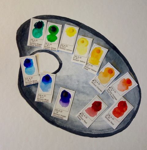
You might think dozens of artists would have had such a strong connection with a colour that their names would be all over the tubes but, strangly enough, there are probably more paint-makers’ names on these than painters’… Mr Winsor alone has given himself a Lemon, Yellow, Orange, Red, Violet, Blue (red and green shade mind you), Emerald and Winsor Green (how on earth are we to know what these colours look like?) but I could only find on their colour charts a Van Dyke Brown, a Payne’s and a Davy’s Grey on the painters side. To be fair I should at least mention here that Davy’s Gray (sometime misspelt Davey) was originally a slate pigment developed by them, W & N, for the 18th century English drawing master, Henry Davy, rightly but sadly best remembered for his use of the colour. Perhaps as a result of its greenish grey hue which might not be to many’s liking or because it can quite easily be mixed, it’s a colour not found on many charts.
Which is not the case of course with Mr Payne’s grey. (DO get the spelling right as Pain’s grey –I got that one on a teacher’s materials list recently– might just remind some of a certain bestseller recently published.) Payne’s grey is a mixture and a hue left today for the appreciation of paintmakers. Indigo/Prussian blue, crimson lake and brown/yellow ochre/raw Sienna for some while elsewhere simply black and Ultramarine/Phtalo blue is mixed but however they get there, it’s definitely a most yummy bluish black result which can be appreciated in William Payne’s watercolours as in so many artist’s works since.
It is usually the use of a colour that eventually leads to it being attributed to a painter. They did not invent them of course, at most it was a technique they developed with a pigment as in the case of the charming Antoon van Dijck (better know in England as Sir Anthony Van Dyke) who eventually gave his name to a very transparent brown natural earth containing usually over 90% of organic matter and which he used to glaze the shadows of his paintings, making them unmistakable. But Van Dyck learnt the trick from Rubens who mixed that same brown with gold ochre to make an even warmer glaze and, in the nineteenth century, this colour was still often referred as “Rubens brown” but, and I’ve no idea how, Antoon won the naming game in the XXth century.

Neither Payne, Rubens, Van Dyke nor Veronese had the slightest idea in their time that their names would end up on paint tubes containing synthetic pigments that were of course not even invented then! Veronese I think might have the biggest shock should he arrive now and see the hue that bears his name. Take that Veronese green in the Flashe range and, there, a happy mix of PW5, PW6, PG7 and PY4 has replaced what was a honed technique of layering flake white as a base then verdigris + lead tin yellow with some more lead white as a second layer then copper resinate (a generic mix of green salts of copper, Venice turpentine and wax) to top it all.
If above sounds like a recipe you probably should not ingest, you are correct! Lead white and yellow are pretty lethal by themselves but verdigris, much appreciated for its bluish shade until it was discovered it invariably darkened to brown, is, like all copper pigments when combined with flake white, highly toxic. No death from Veronese green has ever been recorded though, which cannot be ascertained about another green made in a similar way but to which the Swedish chemist Scheele decided to add a little… arsenic! Scheele’s green is a bad memory by now and it’s even worst copper-acetoarsenite “improvement”, the more durable, intense and totally irresistible Emerald Green too. Paint sold under the latter name nowadays has none of the above ingredients of course and only Scheele’s name remains connected to his green, Sattler who created emerald is not… but the fathers of killer pigments, they both were! Scheele’s and that brilliant emerald green became such winners at the time that everything and anything, from furniture to toys to… wallpaper was covered in that toxic mixture. Were you under the impression there was no way a wallpaper could kill anyone? Well, you might be wrong… The debate is still going strong but Napoleon Bonaparte, who until recently was believed a victim of stomach cancer, might just be the one and only wallpaper victim! (What a fate after having conquered –and lost– most of Europe!) So the story goes: recently a lock of his hair revealed substantial traces of arsenic… his bedroom’s wallpaper was gold Fleur de Lys embossed on a Vert Empire background as it so happens and would have suited a ex-dictator… other rooms were entirely painted in that green… the weather is very humid on the island of Saint Helena… wallpaper and paint damages fast there as a result… all charming above substances can activate given the proper conditions… up to you to invent the rest!


Back to our artists and now for something more charming but still… green, which seems to be the overall winner of this naming game! Hooker’s green -named after botanist and illustrator William Jackson Hooker-is a simple mixture of Prussian blue and Gamboge which was turned into a commercial paint long after his lifetime. Why it bears his name though is that Hooker, who tirelessly painted delightful botanical plates as those above was weary of mixing these two colours all day long and asked his pigment dealer to premix them and save him some time. For Hooker that green was the best starting point for all leaves and foliage. These days it’s still available but as a hue (true Gamboge does not happen anymore and the mixture is often PW6 + PB 15:3 + PG 7, i.e. Anthraquinone Blue, Nickel Azo Yellow and Quin Magenta, for a dark masstone and rich blue-green undertone) and indeed it is most useful.
The last two greens I must mention are more recent ones: Carl Plansky of Williamsburg oils created a mix of natural earth, cadmium yellow and Prussian blue, “a somber earthy green with surprising blue undertone” and named it, as a homage I presume, Courbet green. Richard Frumness, a friend of his, has added that pleasant green to his range of R&F oil sticks but I have not found it anywhere else. While Sam Golden, also a friend of the above two, did not but there’s a singular Jenkins Green in his range. A rich, warm, green blend they created just for painter and abstract phenomenist Paul Jenkins, then must have liked it enough to commercialize it.
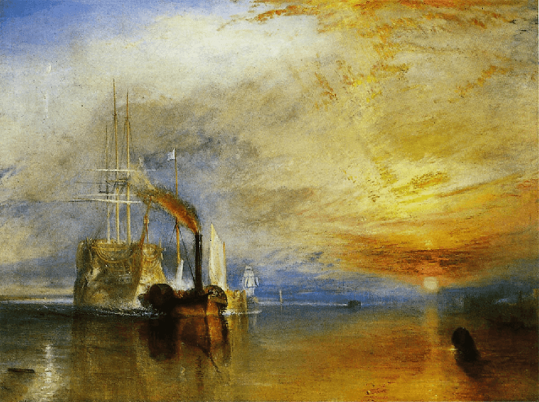 And then there’s yellow… Turner’s yellow. Or should I say Turner’s many yellows… he did use just about any pigment he could put his hands on! And, despite his famous answer to his painter-maker’s concerns over some of them: “Your business Winsor is to make colour. Mine is to use them” that’s not even the full story as Turner made a lot of his watercolours himself, mixing his pigments with gum arabic along with a tad of gum tragacanth and varying levels of sugar or honey. And yes, he loved his yellows: Gamboge, Quercitron Yellow, Ochres, Indian Yellow, King’s Yellow aka the highly toxic Orpiment replaced later by Chrome Yellow when Vauquellin produced a whole a range of yellow shades from Chrome Lemon to Chrome Deep Yellow, all of these were found at some stage on his palette… So which shade should THE Turner Yellow be?
In the artist’s days, the same Scheele mentioned above and who’s name is attached to the green of ill repute had, as a side line to isolating chlorine and oxygen, come up with a yellow pigment which he tried to sell, unsuccessfully, under the name “Turner’s patent yellow.” And today, Winsor and Newton label an opaque, rich yellow mix: Turner Yellow, “a colour closely resembling the toxic genuine Gamboge and King’s Yellow colours Turner frequently used.” But in truth there isn’t a one and only genuine Turner yellow. Turner had “yellow fever” as his contemporaries suggested and that’s a disease which we all know makes you totally undiscerning when it comes to the hue, and that’s that I’m afraid!

There is no way I can round up this ‘painters by numbers’ post without mentionning Klein, Soulages and Kapoor… artists who have built (or broken?) their carrers on a unique colour.
Despite a short one, Yves Klein’s repetitive, gimmicky perhaps –you might call them commercial– works has assured him best recognition… and the colour helps! The blue that bears his name was not made by him, he was no chemist, and few know that’s it’s actually just Ultramarine; the exact same pigment found in your tube. What he, in collaboration with Edouard Adam his Parisian art paint supplier, did with it though is quite remarkable… ultrasaturating it and mixing it with a matte, synthetic resin he made that colour sing, he made it dance! It is virtually impossible to look for a long time at one of his works, it is that dense, and yet it is impossible not to look, it is that exciting. All things considered, any artist who makes us take the time to look at colour deserves a pigment called after him… International Klein Blue (IKB) it is!

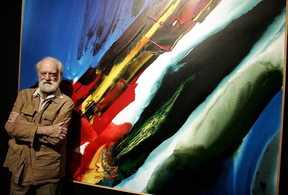
The last two are battling for second position with black, and who knows which one posterity will remember best? Will it be Anish Kapoor who, in 2014, acquired the exclusive rights to the blackest shade of black ever made: Vantablack, which he promptly renamed “Kapoor Black”. This new carbon-based pigment can absorb 99.96% of the light that hits it, something like staring into a black hole… apparently! The only problem with the above transaction is the word exclusive –meaning no one else, no other artist, but him can use it. The response of his entire community has been something along the lines of: “Give it your name pal, no worries there but a colour… that belong to all of us!” People might forget… or his career might not survive the anger and the spite, I’ve no idea what it will be but personally I ain’t putting my money on this black… however yummy.
I would rather put it on ‘Outrenoir’ and the delicious man behind a quietly productive lifetime of works exclusively… black. Pierre Soulages, who will turn 100 next year, is still working as far as I know. Still pursuing his practice which he has baptised Outrenoir. In French, Ultramarine becomes Outremer which means… “beyond the seas.” Here Outrenoir takes us “beyond black”, in a different country from Black, a country of endless depth created by playing with the light reflected off the infinite textures Pierre creates. Some days, it is precisely to that country I want to go…
I was going to continue this “What’s in a name?” exploration in a Part 2, delving into how some colours are labelled by their geographical origins, what they are made of (or not, when it was just tooo terrible!), etc., etc…. HOWEVER it turned into a talk I gave as part of A Colourful Year in my store and repeated in a condensed format at the meeting of the Australian Colour Society in Melbourne. I was pleased to hear it was well received and, as a result, I have launched into turning this material into a book so please… bear with me for now!
PS: If you can come up with other painters’ paint name… please let me know!
* The Color Index Name Code is the official name of a particular pigment given by the Color Index International. The first 2 letters describe the general pigment colour and the number is the individual pigment identifier. N/A (not applicable) means that pigment has not been given a color index name or number. For eg. PW = Pigment White; PBk = Pigment Black; PO = Pigment Orange; etc. until PM which stands for Pigment Metal.
Discover more from in bed with mona lisa
Subscribe to get the latest posts sent to your email.

I think “Brilliant ” is your colour!
Excellent post — thanks for sharing.
A most delightful sojourn thru the trailing hues and more hues of colour… Ahhh… yes … thank you
Have just discovered your blog – absolutely fascinating! Is the book you mention in the post above finished? Thanks so much for all your writing