I always found bucket lists an idiotic first world annoyingly greedy ‘even-if-it-costs-the-Earth-I-want-to-have-it-all’ sort of thing. Until I realised I had one! Mine of course, haha, is of the more educated type. My wish list comprises to be able to touch the medieval manuscripts in the Cambridge collection and A. Boogert’s sole copy of his Traité des couleurs servant à la peinture à l’eau kept in the Bibliothèque Méjanes in Aix-en Provence, or to visit the Gamblin factory or…. the Forbes pigment collection.
All of these can only be accessed if you are a professional in the field with an excellent reason to need to manipulate these rare books or that pigment sample. They are NOT open to the public. And so, basically, my wish list grows while I wait for miracles!

One of these appeared as a side offer to the trip to the Munsell colour symposium last year which, held in Boston, offered to the first few lucky participants to answer, a visit to the Forbes. As soon as I read that, I booked my ticket! The collection has had other homes, but its present abode is nothing short of amazing. The Fogg Museum hosting it is one of the three Harvard Art Museums. Built for “the enlightenment of scholars, conservators and museum professionals” in 1927, the building was already an unusual combination of rather grand, if massive, formal American architecture with, at its heart, an Italian Renaissance courtyard… a fake as it turns out, built for the sake of students presumably unable to make it to Europe to see the real thing in Montepulciano. Recently though, under the guidance of Renzo Piano, it has doubled its size and turned what should be the roof above the courtyard into an expanse of sky and a forest of steel beams. The light plays too with the imposing monochrome Calder which gently sways in the space, and the result is truly one of the most successful marriages of stone and steel I have been given to see.
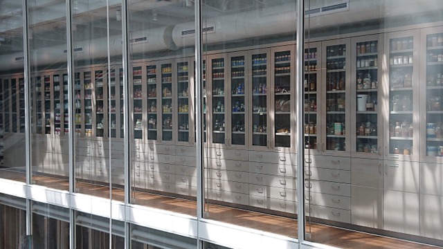
One would assume the pigments to reside in a vault underground or at least in the lower ‘historical’ section of the building but not at all. There they are at the top, aligned in lab-like glass cabinets along a narrow corridor paneled with glass too so that you can see it (the collection) from the courtyard even if you can’t see them (the pigments). I presume the glass has UV protection, or they’ll know soon enough if some of these treasures are not lightfast! When you reach the fourth floor and finally enter Ali Baba’s colour stash, with the sun shining through the ceiling, hitting the beams and scattered by all this glass, it is breathtaking –if virtually impossible to take a good picture in there! (If you ever needed such a thing, acquire An Atlas of Rare and Familiar Colour in which most prominent pigments are represented in a very pared-down sleek setting but exactly as they are preserved in the collection.)
And I say most because, if by the time Forbes retired in 1944, he had acquired and received some near 2000 specimens, since 2007, the collection has grown by another thousand. The curators then, quite rightly, decided that to remain relevant to its original aim of being a repository of all pigments used by artists and a reference for professionals worldwide, they had to invest in the addition of all the ‘modern’ pigments. Whilst Forbes collected his in Italy, on a visit to Japan, found some on a colourman’s shelves in an old store, received a few more from Singer Sergeant’s palette or an eccentric’s ‘Curiosités’ cabinet, nowadays they tend to come directly from the pigment manufacturers: BASF, Kremer, Sun Chemicals or even from the art store down the street! Not quite as romantic but then…
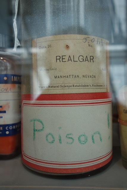
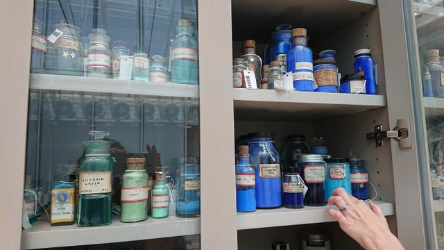
As expected –and anticipated– I meet there some old acquaintances but some I discover too. A bit like seeing for the first time old pen friends you know so much about but have never seen for real. Here are the ancient blues: indigo, genuine ultramarine, Egyptian frit, Mayan blue; the fiery –and mostly deadly– reds: Vermillion, Cinnabar, Realgar, Cochineal, the not less toxic Emerald Green or lead white. One can even admire ‘in the flesh’ a piece of Mummy and ‘in the particle’ the striking YInMn Blue.

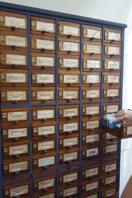
What I was not prepared for in the least however was that random, mumble jumble of old measuring devices, pig’s bladders, tubes, bottles, phials, boxes, shakers, trays, Petri dishes on the shelves behind these scientific looking doors. Furthermore, every little or large bottle has a different shape, colour, original label and cap: twist, seal, plug, cork, glass. Some look so rusted that you have to wonder if they have ever been opened. But yes is the answer as every item is strung now with a neat little label complete with barcode and all the pigments –their characteristics, spectra, etc.– are in a database accessible to professionals, often restorers, in need of such information. If in the mood, you can check it yourself here.

The displays are informative… for those who already know what they are looking at! I was slightly shocked to find little jars of toners, which my puritan artistic self found somehow out of place. Also wasn’t quite sure how writing inks (made of dyes which are neither lightfast, nor pigmented) were allowed to sit next to Encre de Chine (ie Indian ink which is a real artist’s medium) or, even worse, next to Speedball screenprinting inks (altogether a different thing closer to a oil paint.) In my art stores these are on quite different shelves but… not here. Meanwhile Japanese sumi-e sticks made of… Indian ink, well, Encre de chine which is… well, from Japan and should really be on that shelf are… at the other end of the corridor!
Truth is, I believe I was taken by surprise as I had no idea the collection is obviously happy to accept all these colour derivations which are not pigments per se. It has also chosen to extend far beyond these anyway into the world of plants, roots and minerals from which they are produced and further into plasters, resins, oils, waxes, mastics, solvents, glues… The delightful filing cabinets even mention samples of commercial boards, fragments of wood panels, etc.
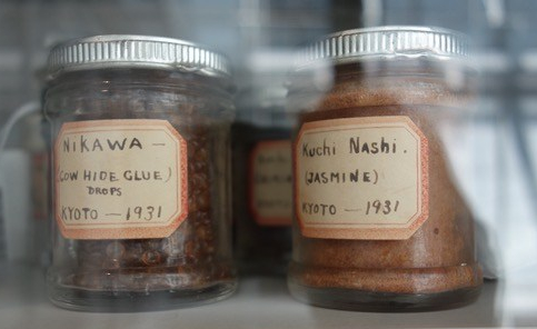
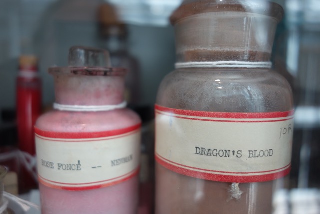
In a strange sort of way, maybe intended, these eclectic displays reflect the messy, random way we obsessively searched for colours and the ingredients they could combine with to make our lovely paints and other materials we can use to make Art. They most certainly draw their very own map of the world: berries from Persia, cowhide glue from Kyoto, plaster lime from Florence and Meudon white, wood cuttings from Brazil, pink earth from Constantinople, a ball of raw Indian yellow, lapis from Lazuli, copal from Zanzibar and madder root grown in… E.W. Forbes’s garden!

In another strange sort of way, possibly intuited by Renzo Piano, the whole building reflects the Forbes collection. In part classical and gracious, its warm stone arches resonating with the shelves on which sleep ancient rocks, eternal ochres and ambers, dragon’s blood in native reeds. While the recent addition to the museum, industrial, powerful, talks the same language as the lab-produced fluorescents, the Lithol red used by Rothko or the sublimely dark vertically aligned carbon nanotube arrays of the controversial Vantablack.

All too soon for my taste, the visit is over. Our little group is at the end of the corridor by the time I’m not even halfway through this display of earthly delights. Reluctantly I move on, utterly frustrated I cannot stay another two hours just to read all the labels and soak in the rare presence of these divine colours some of which, most probably, I will never see again. Grateful for the opportunity I was too and so understanding that a conservators’ job (the gracious Alison Cariens) does not encompass showing for hours her ‘office’ to mere mortals, however enthusiastic.
OK, so now I’m going to have to admit that I’m as greedy as all the other bucket-listers out there and even not quite sure I can cross off the Forbes pigment collection from my list. Actually, might leave it there just in case I get a second, more leisurely, chance because you see… dragons have blood and miracles do happen!
Discover more from in bed with mona lisa
Subscribe to get the latest posts sent to your email.

Chère MonaLisa, vous pigmentez nos vies, merci et bravo….!
et vous la mienne! Merci mon premier lecteur et grand amour…
Oh Sabine! Extraordinary things are tucked away in wonderful places in the U.S.A. and the Fogg Museum is definitely one of those places. So lovely that the colours where perfectly displayed in the light and so wonderful that you’ve seen it and shared all those photos with us. Thank You. Edith and Sophie. XX
>