WHICH?
PIgment Characteristics
Finally, some pigments are powerful, and some are weak and having said that, I’ve said it all.
Unlike the total neophyte I was at the time, she who went to her first oil painting class with a mishmash of damaged tubes and samples given to her by reps (I had no intention of investing a cent in materials as I was only sitting the class to learn more about oil mediums and had no real interest in ever painting in oil) you mustn’t jump to obvious conclusions: “Wow this brand is much better than that one!” just because the tinting strength of that colour is so much powerful than that other one.
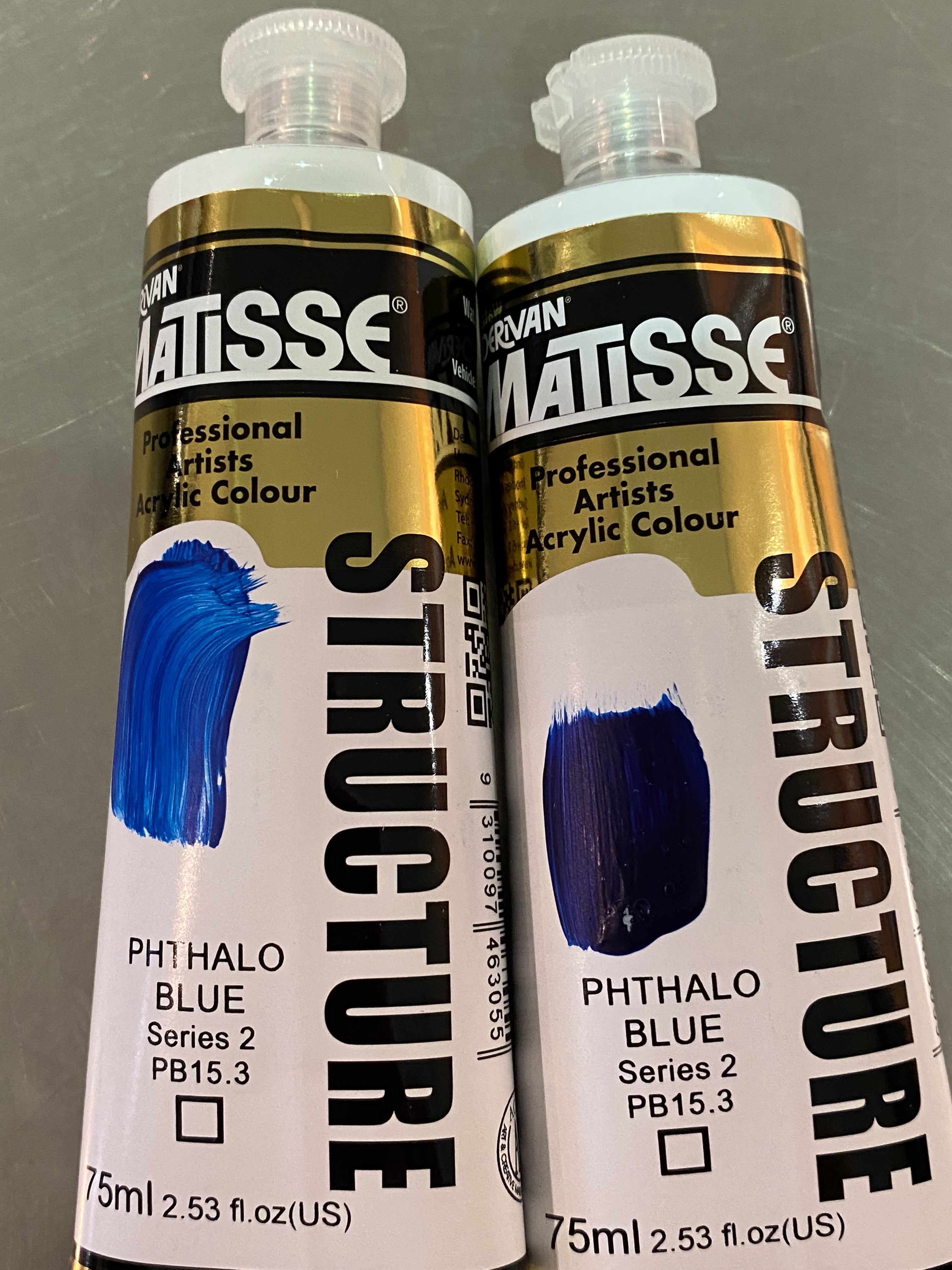
Obviously, lighter colours, say yellow, are a weaker tinting material overall. Yet, even in the light hues, some pigments have incredible tinting strength (if little hiding power), and some do not—and of course, it has yet again something to do with the shape and size of the particles; fine dye-like particles increase tinting strength, it seems. But, as previously with the weight of the pigment, there is nothing much to deduce from that info about quality or do with it—other than getting to know them because otherwise, you might be in for a shock. Dioxazine Purple, whom we’ve just talked about is one of these powerful characters. In spite of usually sitting in a lot of binder, a hint of it on the brush and everything turns violet! But be aware, too, that high tinting strength could deceive you into thinking that the pigment is opaque. In masstone1, it often does look like opacity, so it’s confusing; for example Phthalo Blue or Green, also high tinters, are very transparent. (Check out the two hand-made swatches on the tubes below in the same brand/pigment but not the same amount of paint, obviously. Hard to believe it’s the same colour, right?)

So now a confession. While talking of opacity/transparency, sheen, and tinting strength, I have slowly but surely slipped from characteristics of raw pigments into behaviours of pigments in binders. It’s not so much that binders will change everything (they don’t) or that different binders will impact in different ways (they do), but that without a binder, you can’t really talk about opacity/transparency, sheen or tinting strength… at all!
More about it after we finally make pigments! make paint! and discover how binders, indeed, impact pigments.
P.S.: It’s not because I’ve run out of pigment opposites that I close this section. I could have overlooked some, of course, but I could also have come up with some amusing ones, such as Some pigments are masculine, some are feminine… which would have opened an interesting debate on Do pigments have a sex? (They have families, after all.) But, even though I’m sure we can all agree on pigments being sexy, according to us Westerners, the answer would have been a flat NO. Are we sensuous enough to pick up the distinctions, I wonder? Because, according to the Chinese, there was no question of gender identity when it came to Realgar and Orpiment, two of their most favoured pigments. Realgar was xionghuang 雄黃, literally ‘masculine yellow’; its partner was jiguanshi, 鸡冠石, Orpiment, feminine yellow. As argument to the defence’s case, these two are often seen in bed together, or shall we say embedded into one another, partners in real life—a mineral life for them you will have understood. It’s also true that you can make one from the other. No rib is needed there, some just like it… hot! 5 hours in a crucible and, hey presto, Orpiment has turned into Realgar. After the op, some call it Burnt Orpiment, but I like Ruby of Arsenic, its other name, better (definitely more sexy too!)
Any other candidates? Not that I can find. A natural pigment vs its synthetic counterpart never brought a distinction of this nature, nor did variations of the same pigments as in Han Blue/Purple or Egyptian Blue vs Green, for example. Orpiment & Realgar seem to be a weird exception. Case closed, I’m afraid.


See you in the next section, HOW? (That will be fun!)
Jump to the next section of the book by clicking here
Alternatively click on the Table of Contents to browse the sections.
You can also subscribe to my blog at the bottom of this page,
and you’ll receive Hues in Tubes in your inbox… as it gets published!
- The masstone of a paint is its colour applied thickly enough to completely cover a surface so that below colours are not visible. The undertone is when we can see those underlying colours, as the paint has been spread thinly. Certain pigments, such as the Cadmiums and Cobalts, have similar masstones and undertones. The more transparent organic pigments, such as Quinacridones or Phthalos, can deliver quite a surprising undertone. ↩︎
Discover more from in bed with mona lisa
Subscribe to get the latest posts sent to your email.

You are hilariously fun to read! If only all information could be as enjoyably presented.
Oh thank you!! Praise that warms my heart, as yes, I do try to keep it light, even as I also try to fit in all the needed, and sometimes complex, info!!