HOW?

Materials dictate their terms and conditions. You (unfortunately, perhaps) might not be aware of having ticked “I agree” to a 24-page document when you decided to play with a new binder, but in truth… You have! And it will let you know soon enough. It certainly did so to some poor pigments who had to step down their pedestal. Malachite is such a pigment. Ground fairly coarsely, it could display its vibrant green in a fresco or egg tempera and was used for centuries. In Japan, where it was used as a watercolour, it was purposefully ground in three finenesses, allowing artists to achieve dark, medium, and light tones. Yet, in the finer grind required by oil paint, Malachite turned so pale as to lose the interest of painters entirely. It was then relegated to background use, layered with transparent copper resinate to revive it.1 Smalt, the poor man’s blue, also liked a coarser grind and turned a pale grey in oils, while genuine Ultramarine becomes so transparent that, to painters’ despair, it would regain opacity and full presence only when blended with a touch of Lead White.
But don’t think this happened only back then. Genuine Prussian Blue, due to a particular sensitivity to alkaline environments, cannot be found in any acrylic range (it’s always a mix of other pigments), while the slightly acidic oil and watercolour binders suit it well. Zinc White, a relatively modern pigment happy as Larry in acrylics or watercolours, is increasingly recognised as the cause of severe cracking in oils and was abandoned by several manufacturers in recent years alone. While, try as we may, we don’t seem to be able to make a fluorescent oil paint that keeps its fluorescent qualities… which is the whole point, of course, of these otherwise quite standard hues. (Nor, for that matter, do they keep their fluorescent quality when combined with other pigments in acrylic mixes.)
Therefore, selecting the correct pigments for your binder of choice is essential, and most of it is fairly obvious: transparent pigments are happy in watercolour, while stable pigments are needed for high-temperature applications, such as encaustic.
Ready to tackle the multi-dollar question: “How do binders affect our perception of pigments?” To recap: particle size matters, shape matters and will mostly dictate transparency/opacity, sheen, and sometimes hue, but now comes along this character who will intimately surround our lovely little particles and scatter light as well… of course! As we’ve seen that a binder could modify even the lightfastness of a pigment from good to fugitive, so have no doubts that it can alter other attributes of it too.2 Let’s discover this one…
The particle’s ability to scatter light can be measured and then given a refractive index or RI, as it is usually labelled. This index tells us how much the particle has bent a ray of light, i.e. refracted it when it was hit by it. Binders, too, are given refractive indexes, and the larger the difference is between those two indexes, the more light is scattered, and the more we will perceive the paint as opaque. That is the case of our Titanium White, which has a very high refractive index, while Zinc White, with a much lower refractive index, closer to oil or acrylic’s indexes, appears far more transparent.
Binders each have their RI obviously, but the difference between them is hardly significant: 1.5 for Beeswax, 1.465 for acrylic, oil and gum Arabic, 1.54/to 1.67 for casein and 1.525 for egg yolk, with the result that, sitting in whichever wet paint, there will be no dramatic shifts in how we perceive the same pigment. A pigment will not be more transparent or luminous when sitting in a watercolour binder, for example… I’m sorry to disappoint, but that’s a myth. Opaque pigments are opaque (Cadmium Yellow’s reflexive index is 2.4, Titanium White’s 2.6 and both remain opaque in watercolours), while others are semi-opaque (Cobalt Blue’s 1.7, Cerulean Blue’s 1.8) or even transparent (Phthalo Blue or Green is 1.4) and that remains more or less true whatever binder they are dispersed in.
On the other hand, transparent pigments sometimes shift towards more opacity in certain binders. Burnt Umber could be a good example of that. A transparent pigment in Sennelier’s pigment range, it remains transparent in watercolour yet becomes semi-opaque in their oils and acrylics. Derivan describes their Burnt Umber in the Matisse acrylics range as semi-transparent, while Langridge considers his opaque in oils, and Qor judges them semi-transparent in their watercolours. Gosh! (Again!) To me, at least, it seems like much hair-splitting. For one, this business of semi-opaque/semi-transparent is already a bit of an acquired, if not taste, at least sight, and I would assume most of us could not make that subtle difference (nor know which of the two terms actually to use, they seem so virtually interchangeable.) For two, buy a tube and try it out… you’ll know everything you have to know about that pigment in that binder by the end of it, I promise you (and I’m not saying this to sell you one!)
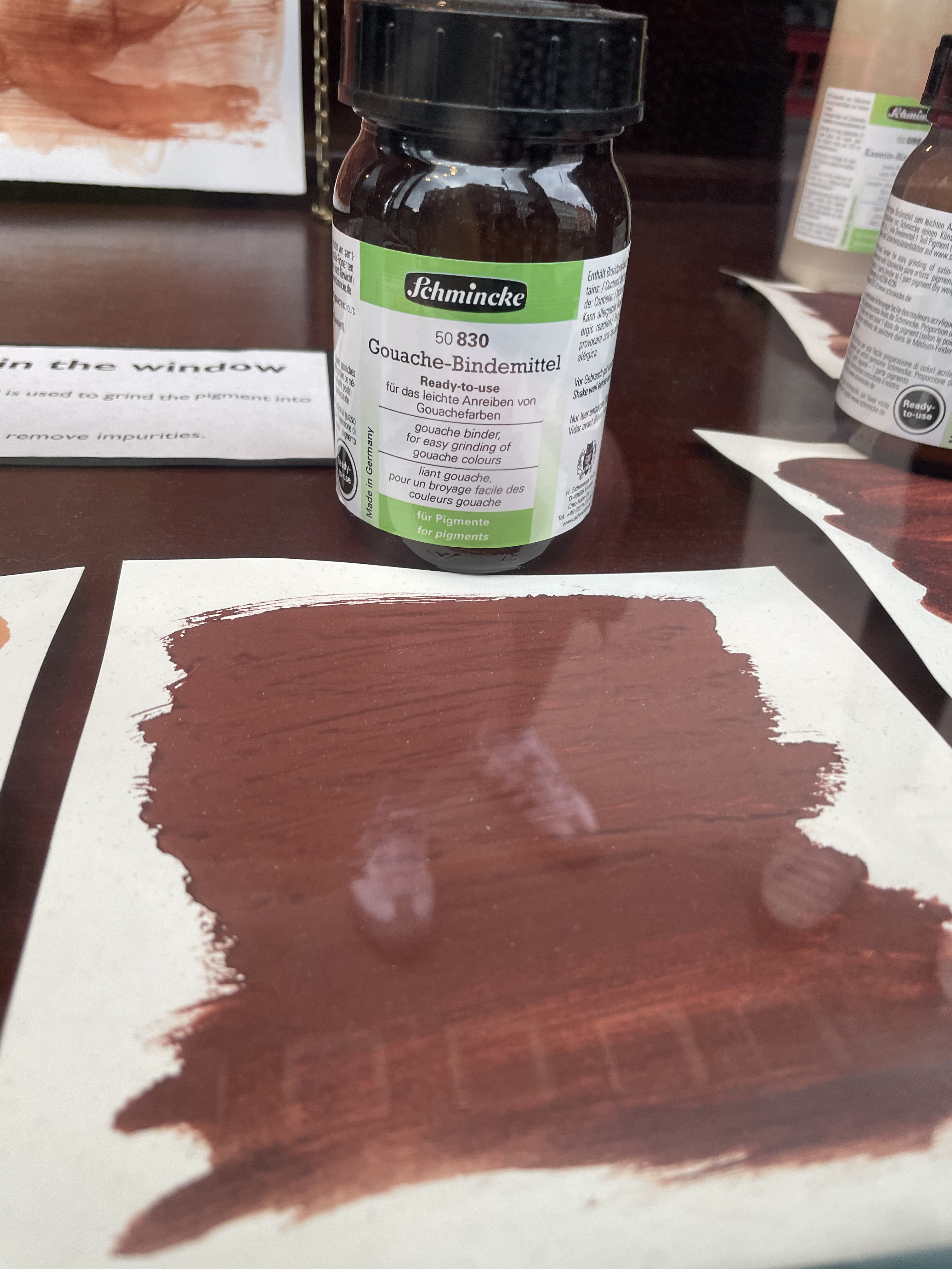
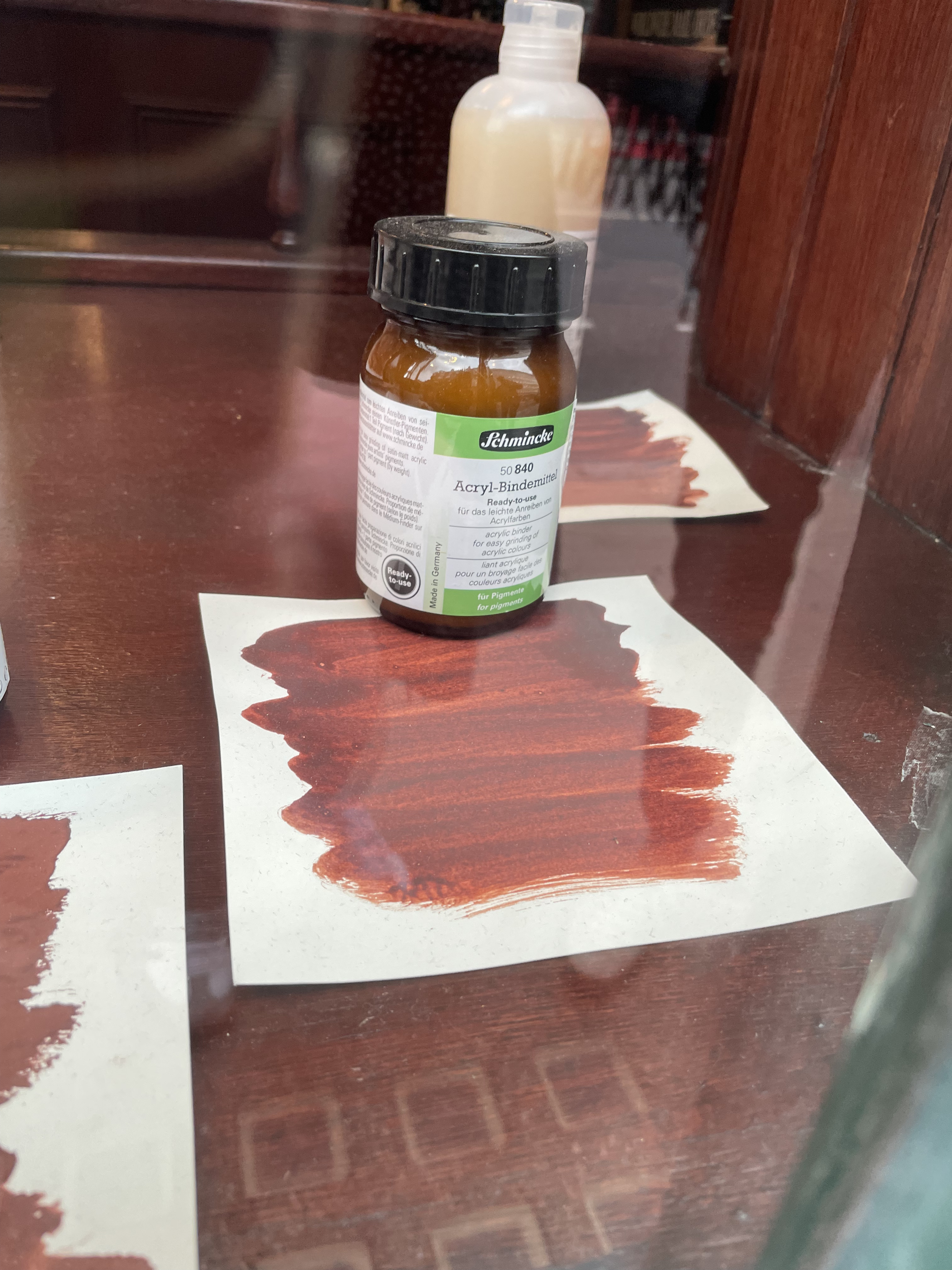
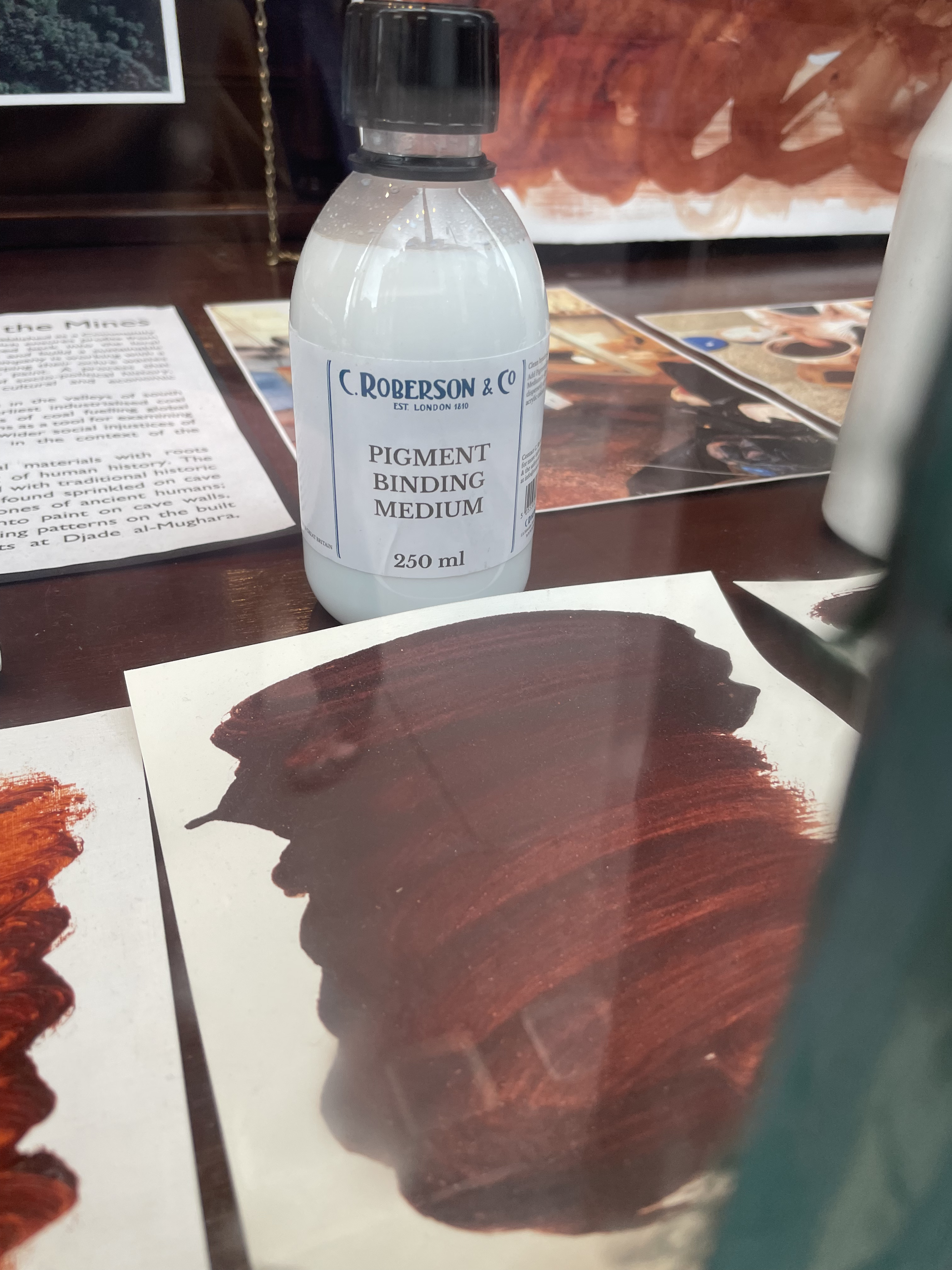
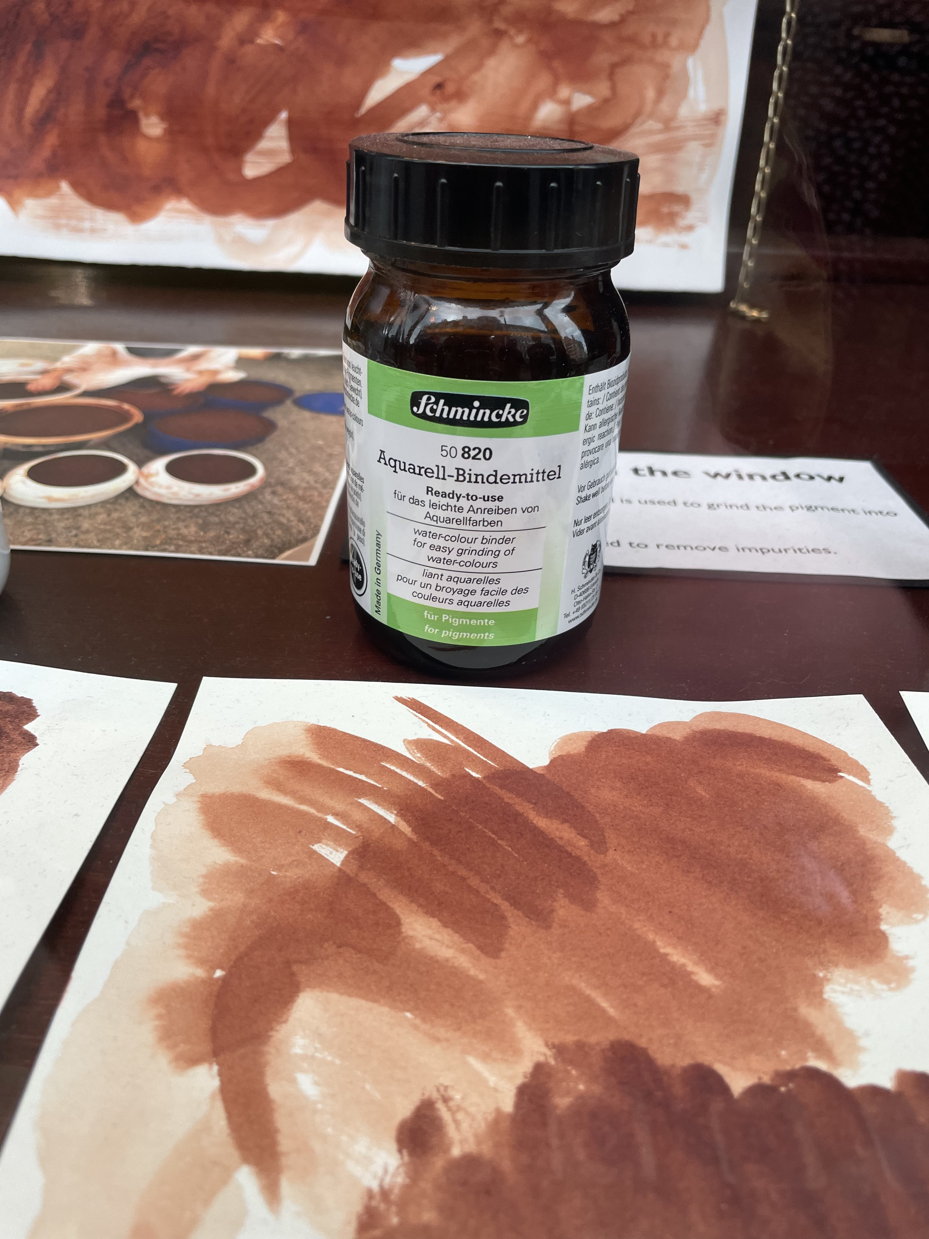
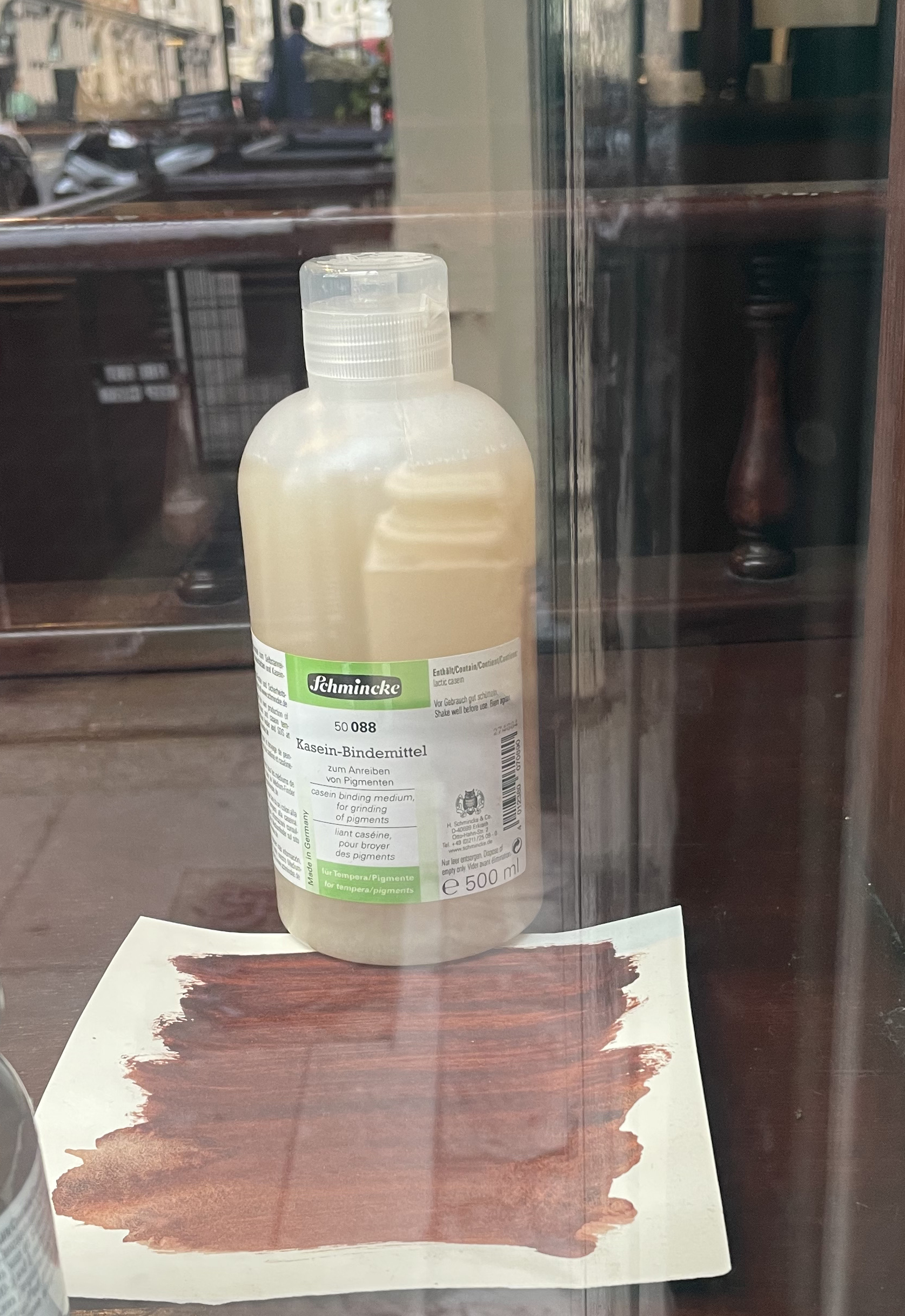
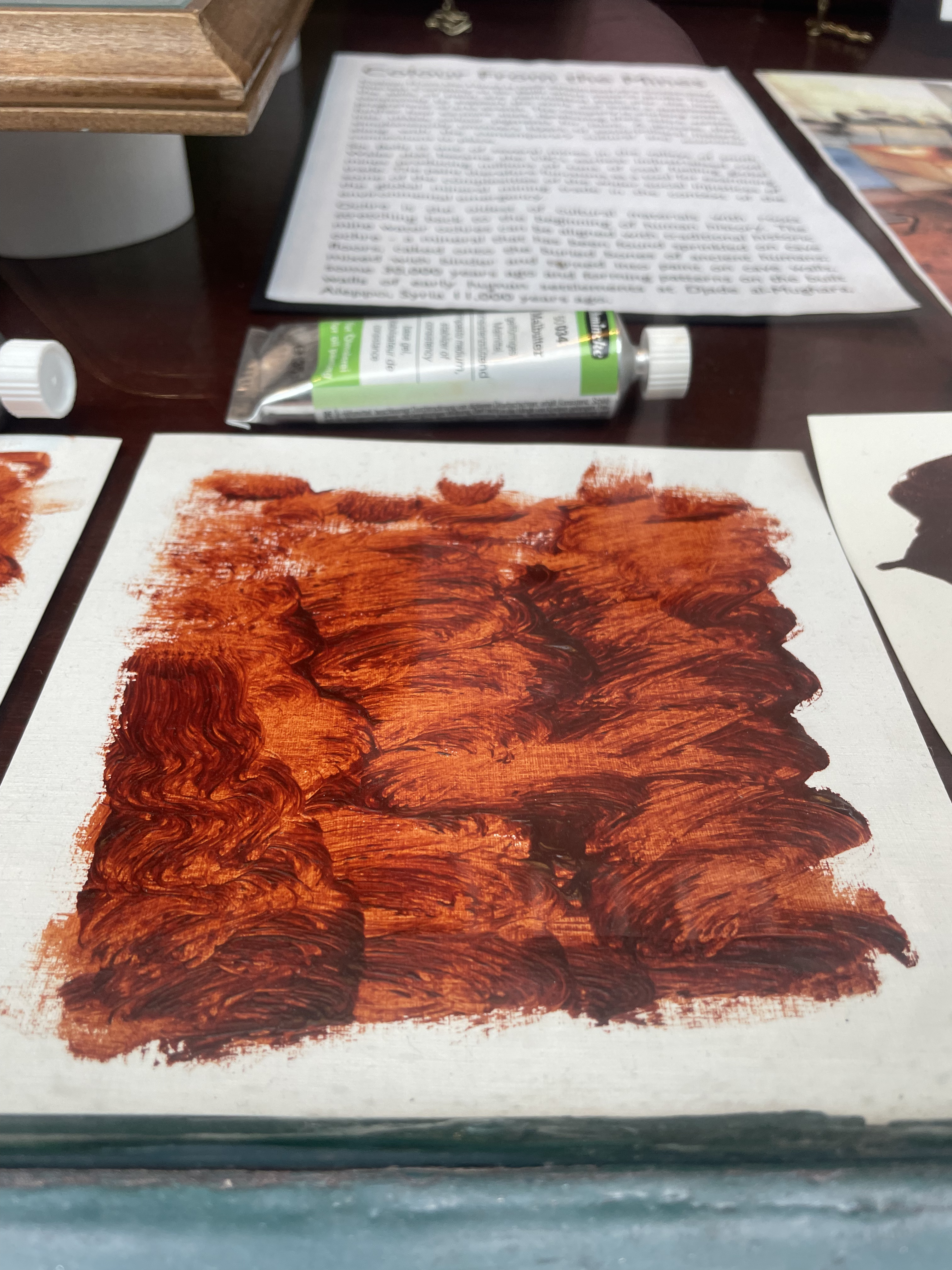
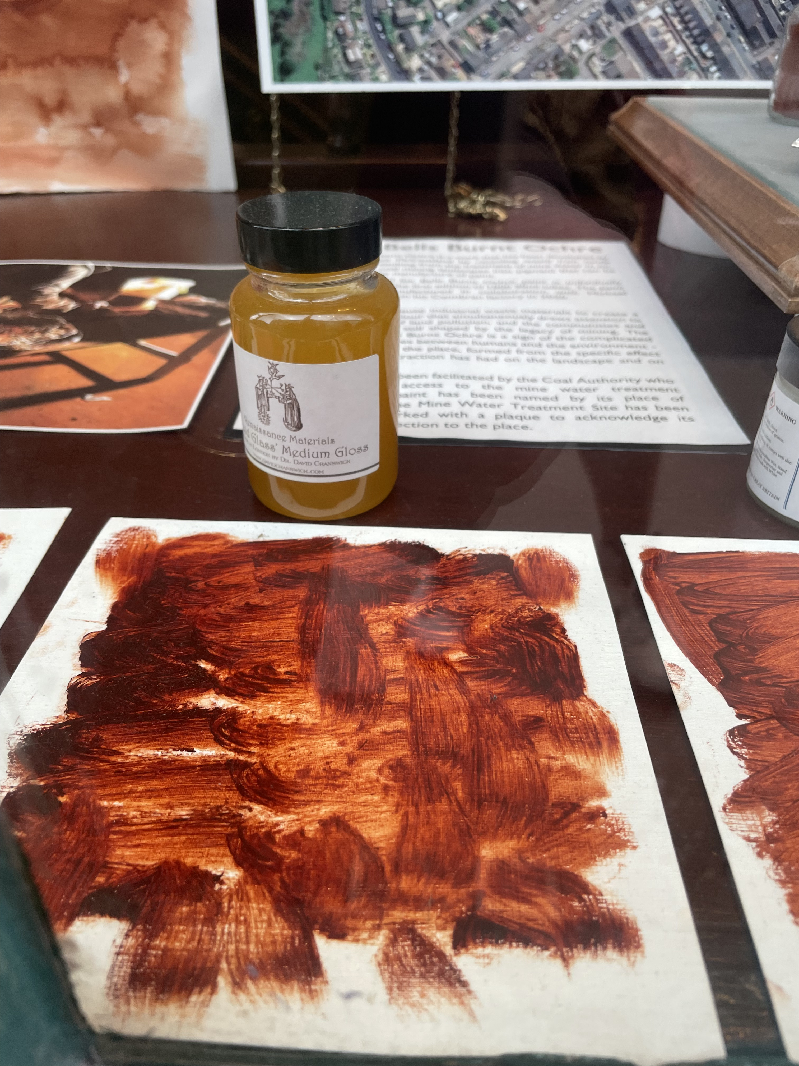
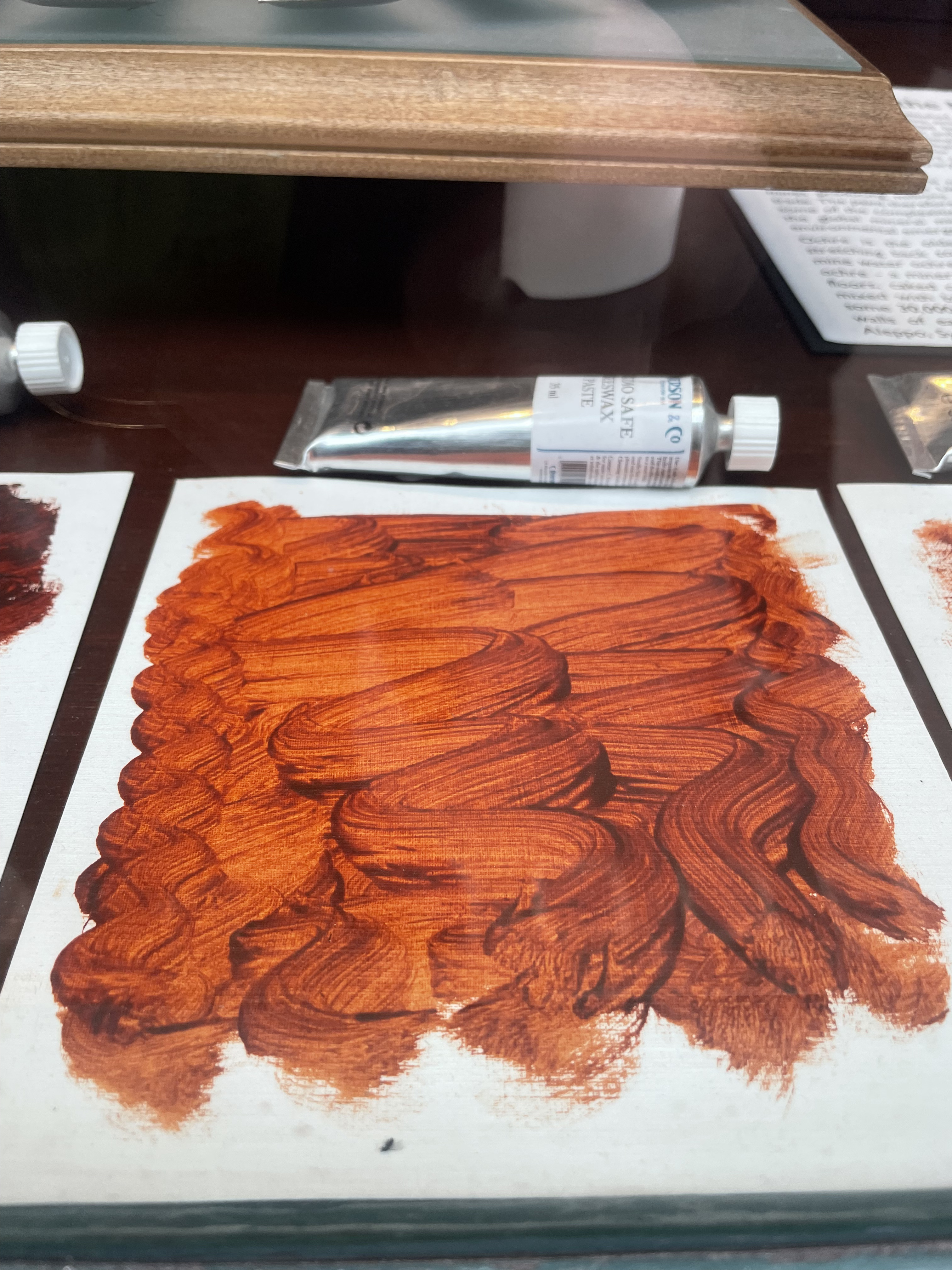
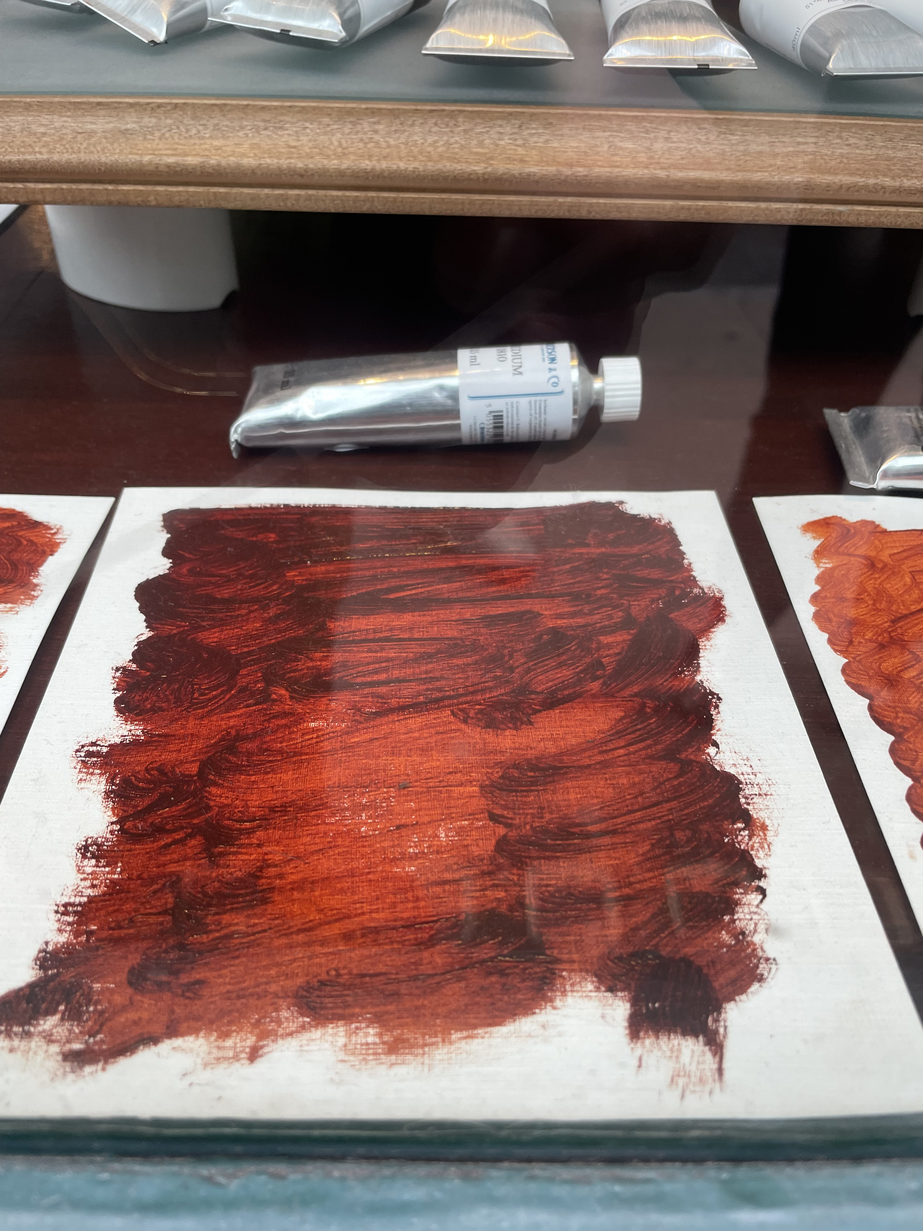
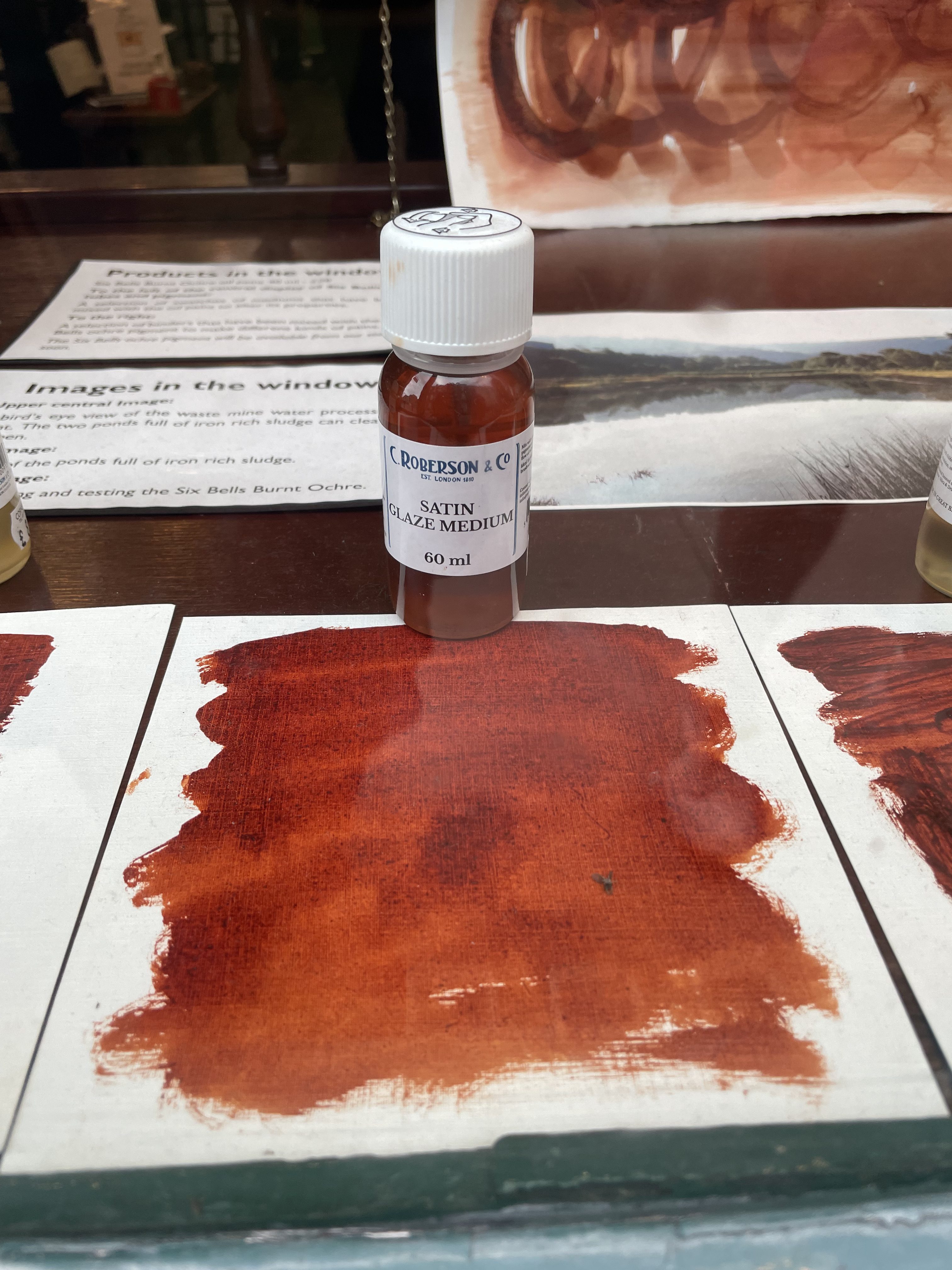
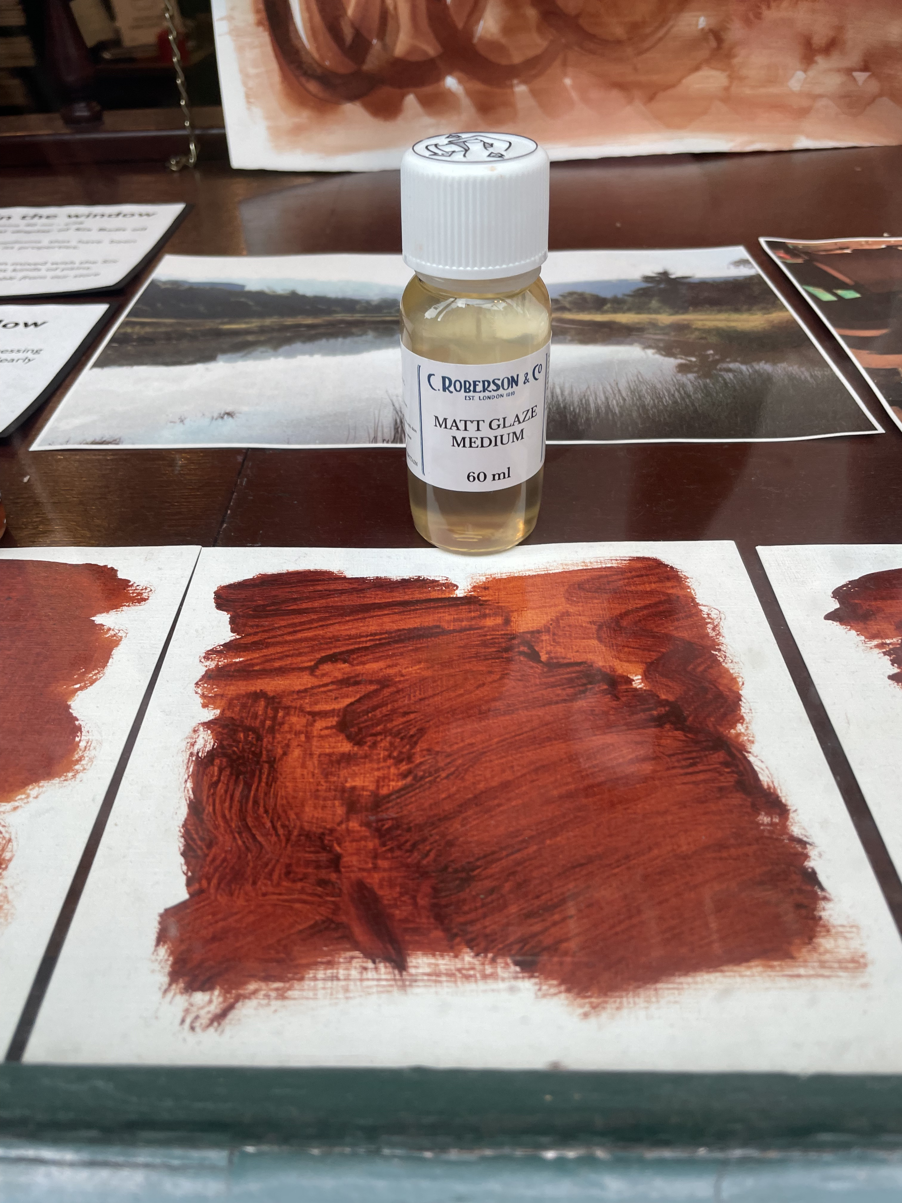
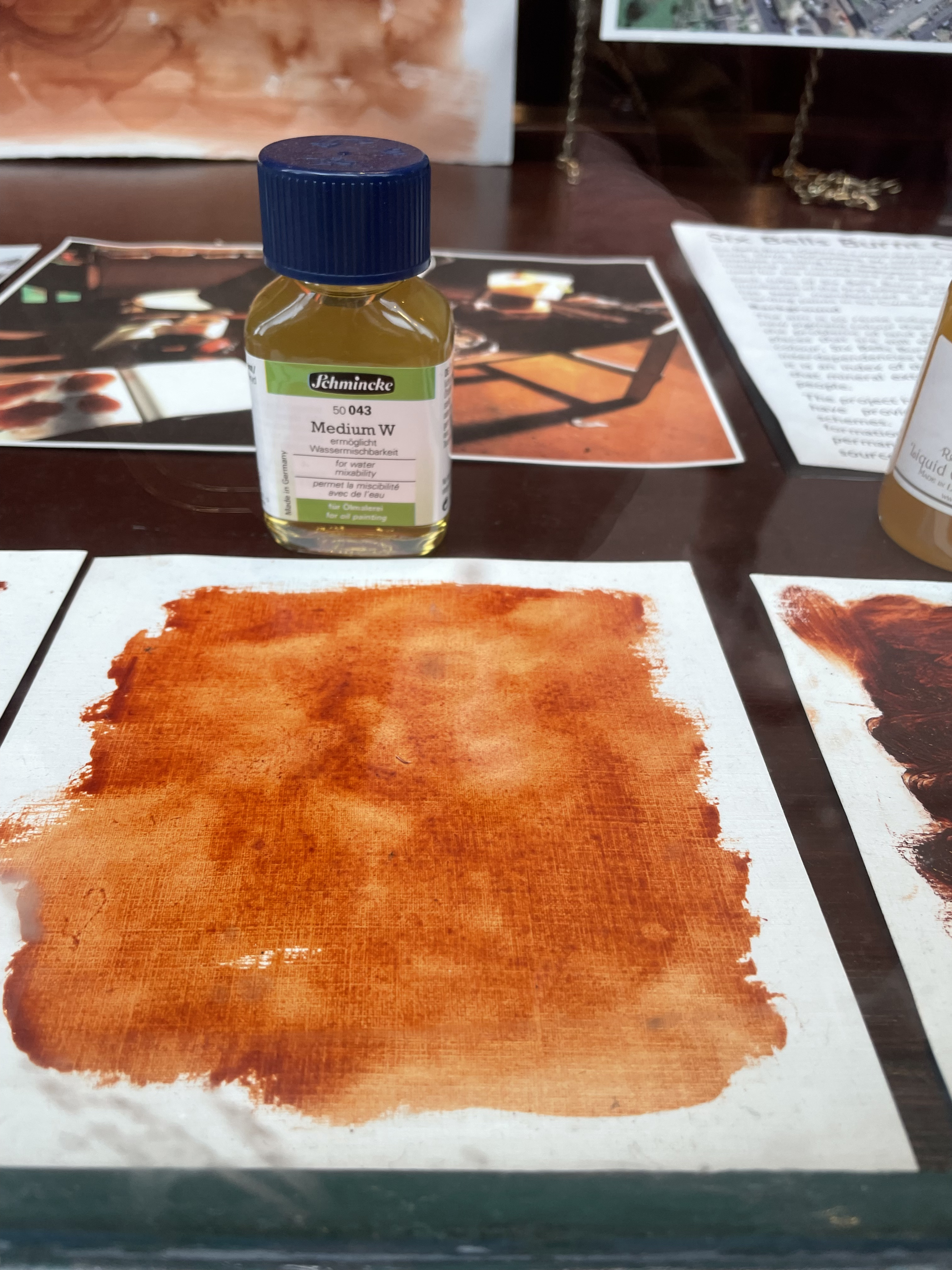
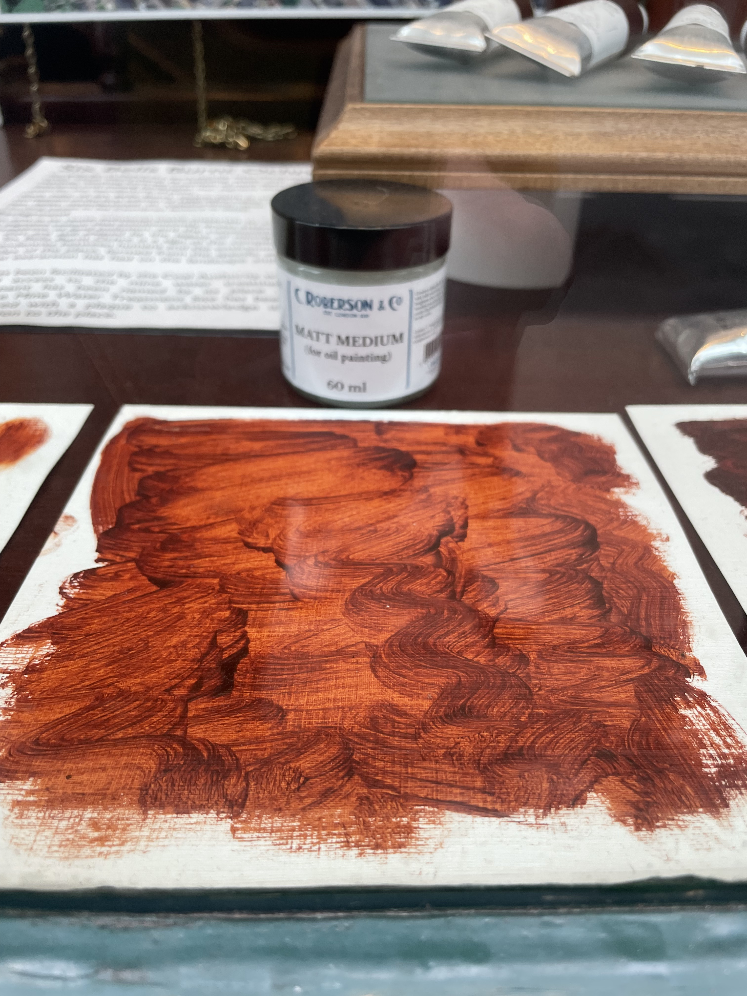
To be fair, I must add that the same pigment in different binders sometimes shifts when the paint dries. Have a look below at how Six Bells Red Ochre performs in virtually all binders imaginable, (and a variety of mediums) and, indeed, there’s a wild difference there (in hue too, it seems, but I’d guess that’s most probably due to its transparency… could also be the density of each sample, of course.

I’ll come back to the subject (you must be dying to know more now about what happens when the paint dries) and clarify why some paints, indeed, dry darker/lighter and some with a gloss/matt finish, but really now how long can you keep up the suspense on a book about paint and… not get to the most fun part… WHYEVER, indeed, did all these pigments/paints end up with these crazy names!
Jump to the next section of the book by clicking here
Alternatively click on the Table of Contents to browse the sections.
You can also subscribe to my blog at the bottom of this page,
and you’ll receive Hues in Tubes in your inbox… as it gets published!
Additional information and references
- These artists with little understanding of Van Eyck’s fine-on-coarse particle trick, most obviously. ↩︎
- On the other hand, as the artist Yves Klein noticed, and anyone ogling pigment can too, pigments have ‘more colour’, are more exciting and intense before you add any binder. Seeking to keep these qualities in a paint, Klein, collaborating with his colourman Edouard Adam, managed to develop a truly unique binder (a synthetic fixative resin called Rhodopas M60A), one that would resist the absorption of light waves and deliver maximum reflectiveness. Klein used ‘his’ binder exclusively with his favourite colour, blue, as the man seemed quite obsessed with the hue. (Don’t quote me on that, but I have never heard of that resin binder used with any other pigment by anybody.) It took more than resin to create this fantastic mat, sexy paint, however. In fact, the lapis of old, more transparent, could never have produced this result; only artificial ultramarine can go there. ↩︎
Discover more from in bed with mona lisa
Subscribe to get the latest posts sent to your email.

Great article! Thank you!
Thanks Ed for being such a faithful follower!!! Love to you both S