I. PIGMENTS – b) What is a pigment?
 Pigments are small particles of pure colour, insoluble in either oils, resins or water. As soon as you mix these with any kind of binder to make a paint or a paste you will somewhat alter the dazzling beauty and full strength of the colours. Moreover you might find two kinds of chlorophyll pigments in spinach which gives it a deep green color and two accessory pigments beta-carotene and lutein, both yellowish-red pigments, try as you might you will never make a useful paint out of these… shame when you think how much men have wanted to paint beautiful landscapes and how few green pigments there were for all those centuries past but, as most, these pigments are not suitable for an artist’s purpose, mainly because they are not lightfast enough to do the job.
Dyes are also colouring materials but soluble. They are not used in artists’ paints unless they are attached to an insoluble particle. When a dye, chemically or electrically is attached to a particle, preventing it from bleeding or migrating it is called a lake. That lake can then be ground like any mineral pigment. (The whole thing is quite a process really and has only been worth it for rare colours, like red. Rose Madder Lake is probably the most famous one in an artist’s palette.)
Without light, we can’t see colours… do they exist in the dark, do they exist at all? Or are they produced “for our eyes only” as soon as a minimum light can play with the pigments of our planet? Yes, in a way that is how the miracle of colour happens. And other living beings see other colours (the infra reds, the ultra violets) that we do not. However… they do “exist”!
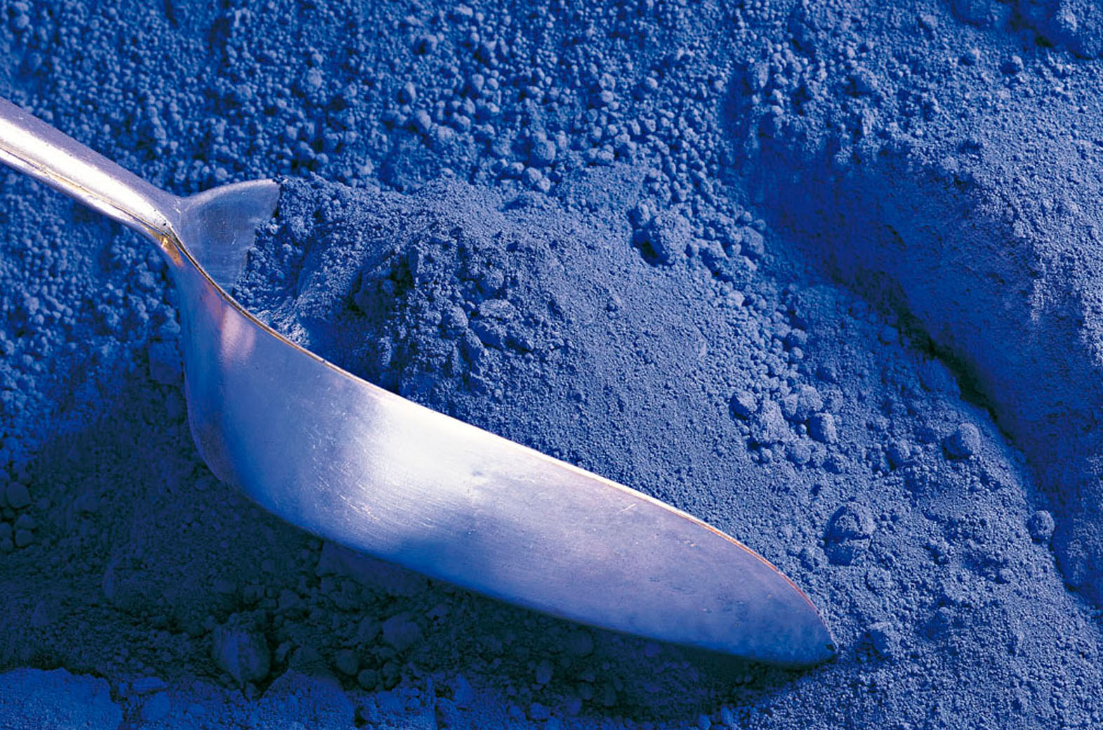
All pigments with rare exception, have crystalline structures that dictate their colour, and even small changes at this level can alter which wavelengths are absorbed or reflected. Phtalo blue for example, has two types of crystal formations, responsible for the red or green shade. Minor changes to the crystal lattice of Quinacridones is responsible for its broad range that runs from the reds to the deep magentas and violet. Cadmium sulfide, which is yellow in its pure state, is made progressively redder and redder by replacing the sulphur in the crystal lattice with increasing amounts of selenium. This substitution broadens the amount of the spectrum that can be absorbed, and if enough selenium is added cadmium can actually appear black.
As you probably know, when you work with paint, you are working with what is quite confusingly (I think) called substractive colour. (Additive is when you work with coloured light, the convergence of which gives you white light.)
In the subtractive world of colour when you put down a colour on your canvas, you actually see it because it gets rid, “subtracts” the other colours’ wave lengths around it. When you add another colour to that one, it gets rid (or subtracts) other wave lengths etc etc with each new colour, which explains why soon enough you will get a beautiful… muddy brown! No wavelengths left really. Nothing much at all for you to see.
Pigments are classified in an amazing variety of way
1) For one, they have names! Their real real name (also know as their colour index name) is made of two letters –NR, for natural reds, PB for Pigment Blue, PBk for black, PBr for browns, etc. with green, orange, violet, white and yellow– followed by a digit or two, its serial number. PY 83 is Diarylide Yellow for example. They are christened thus by the Society of Dyers and Colourists and the American Association of Textile Chemists and Colorists. In any brand worth its salt these days, you should find that Color Index name on the tube somewhere.
Unfortunately, references for pigment are tricky too: the first numbers can be the same (and dutifully printed on the label) but the subnumbers differ making all the difference in quality and price!!! (Pure Cadmium red is labelled PR108 but PR108:1 is the name of Cadmium lithopone red an economical version of 108 used in cheaper brands but not always labelled correctly… hum I wonder why?) So, it pays to get to know your labels and your brands to understand what you are getting for your dollars as serious companies label the contents of their tubes properly, they also have a good name they have worked decades to get and so you can mostly trust them to offer you a quality pigment/paint.
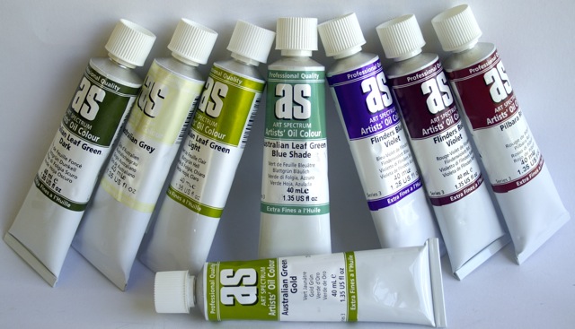 Of course paint in tubes is not always mono-pigmented and some “colours” are made of more than one pigment… when you see an “Australian olive green” or a “Flinders Blue Violet” well that’s evocative but usually not the name of a pigment. (Most answer to the delightfully charming Napthol, Phtalocyanine, Quinacridone, Zinc, Dioxazine, Nickel Azo, Indanthrone, Diarylide, Cadmium, Pyrrole, Anthraquinone or Perylene this or that). And while there can be some further confusion because of certain historical names like Vermillion, Madder Rose, or Ultramarine that have names that resonate poetically for us (and a generally accepted substitute pigment number that goes with it these days) mainly the names that make you dream like Southern Seas Blue are a mix and, in a weird way, the name does warns you about that. If you are aware of it, like the colour as it comes out of the tube and take care not mix it too much… perfect! However, when you buy a Cadium Red that’s what it should be, Cadium red pigment with whatever binder: linseed oil, polymer emulsion, Arabic gum etc. But… beware! Despite some companies trying hard to inform you, there still is no real international regulation to force paint producers to state anything on tubes except dangerous contents. The added fillers, extenders (needed some time in minute quantities to stabilize etc.) do not need to be mentioned with the result that you are often buying… nothing! AND, the names are sometimes used to label the hue. I sell the cheapest Red Cad in Australia: $12.25 for a 500gr tube!!! Yes, it’s cheaper but it not caviar, only some other egg fish not mentioned on the packaging… and that’s OK! (Well legal anyway…) These mixes of cheaper pigments to produce an approximation of a Cad red colour are not only cheating the client, they also makes it hard, when you use them, to get any clean colour out of them, especially when mixed with others of the same calibre as the more pigments you’ll mix, the less interesting your colour will become… remember how frustrating it was as a kid when your paint always muddied ? Even if you are not using kid’s paints, on a more subtle scale not so great quality paints or premixed colours will do this to you…
2) Pigments are also classified according to their characteristics:
1) Vivacity of tone, 2) Sensibility to light, 3) Mixing permanence,
4) Covering power, 5) Colouring power, 6) Siccativity, 7) Suspension power, 8) Fineness, 9) Compatibility with other pigments and techniques, 10) Resistance to bad weather, 11) Stability in high temperature, 12) Toxicity, 13) Weight, 14) Density… the reason we need all these classifications is that there are no two similar pigments which explains why some tubes are heavier than others, some you need a minute little blob vs a big splash because their tinting power is so great, some colours are more opaque than others, some need a trickle of stabilizer etc. Lightfastness is also given a rating of I if they are considered excellent or II if they are very good. Where lightfastness ratings have not been obtained according to ASTM test protocol, “N/A” is used. In those cases, data from pigment manufacturers and an appropriate description assigned under permanency is sometimes available from the paint company.
The pigment’s opacity for example comes from each of its particle’s ability to scatter light, which relies primarily on a particle’s refractive index and size. The larger the difference in the refractive index between a particle and its surrounding medium, the more light is scattered and the underlying layer obscured. Conversely, the closer these numbers are, the more transparent a particle will appear. The high refractive index of Cad yellow and Titanium white, for instance, is almost solely responsible for their tremendous hiding power and sense of opacity, while Zinc white and Hansa yellow appear more transparent because their refractive indexes are considerably closer to that of an acrylic polymer.
Also, as a particle becomes smaller it scatters light more effectively until a certain optimal size is reached, after which this aspect begins to drop off sharply. Titanium white for example if carefully manufactured to optimise its particle size for maximum light scattering and hence opacity. A 1 cm wide crystal of titanium dioxide is completely transparent, and it is only as the crystals gets smaller that scattering becomes dominant and we sense the pigment as inherently white. Should Titanium Dioxide be ground even further, down to a nano particle scale, it would actually become completely transparent. (By the way this is how they get the transparency in some colours, like the lovely transparent Red Oxide.)
Finally, yes! although not labelled as such some pigments are more expensive than others –that’s why all professional paints have series!! Gold and clays would hardly cost the same… but why is this not obvious anymore? When painters needed to travel to Venice in order to buy the pigments to paint the commissioned altar piece for the Florence monastery, certain pigments were part of the contract they were so dear: the Ultramarine, the Cochineal red…
So far all these differences between pigments defines them but has no implications on the quality of the paint… All artist ranges have some cheaper pigment series, some dearer. And today’s pigments being mainly synthetic are in fact cheaper than ever, making most colours available to us at affordable prices. There is however many more tricky differences in between brands… when you notice for example that some tubes are heavier than the same pigment in another brand it’s most probably because they have far more pigment and no filler. Because of the extreme disparity in tinting power between one pigment and another, student grade paints often takes low tinting colours as their starting point and bring the quantity of pigment down (and the quantity of fillers up) in the other colours to match this one. And in a way, for the beginner, it makes things easier. For kids it’s fine… for anyone wanting seriously to study painting and learn the technique, it’s absurd to buy these ones, I think.
3) Pigments are further classified as:
– Mineral, Earth or Inorganic pigments. These pigments range from abundant, inexpensive pigments like the earths ones: iron oxides, ochres and clays offering a palette ranging from browns to reds to yellows, even in some places some natural violets or greens, chalk or kaolin -a white stone- to semi-precious or even precious stones like gold and lapis-lazuli. Inorganic pigments can also be synthetically manufactured (iron oxide, carbon black, etc) or may also be produced using a combination of these two processes.
Some very early chemistry made use of not so friendly iron and arsenic ores to produce Flake (lead) White or Naples Yellow for example. And some modern organic pigments are still both mined and manufactured: the Cadmiums, Cobalts, and Titaniums. The last fifty years also saw the addition to the palette of many new pigments attached to mica and other metals or ground glass creating the lovely iridescent (pearly) and interference metallic hues.
– Organic pigments are made with something that was once alive: as in plants (roots, bark, charred wood, leaves and stems, seeds and blossoms all have been used to produce colour) or animals (carmine lice or cochineal, marine snails, oysters, egg shells, ivory, bones crushed or charred…). Organic pigments can be natural, as above or manufactured, as made from complex hydrocarbons. Examples of ancient organic manufactured pigments are indigo and Indian yellow, while modern manufactured organic pigments, having been originally derived from petroleum, coal tar and natural gas, now include almost any shade imaginable. Many of these pigments have their roots in the chemistry of the last two centuries although widespread production didn’t really begin until after the war. Even though they have only been available for several decades, organic pigments have demonstrated remarkable abilities to withstand the impact of light and weather.
4) Some companies/books prefer to refer to modern vs historical pigments:
Some books label pigments as “historical” all those that existed before 1704 –when the first synthetic mineral pigment, Prussian blue, was invented by chemistry and calling those developed afterwards “modern” pigments. Many companies however seem to label these days as “modern” only the very recent organic synthetic pigments…. can’t really help you there, I’ve hunted high and low but a clear, definitive definition of where modern begins I have not found… yet!
The “Historical” inorganic earth pigments: ochres, oxides, etc. are still around as their cost is not high. These colors are usually very opaque with a low tinting power and definitely found at the end of the ranges to separate them from the synthetic pigment paints… another rather confusing presentation for most beginning artists looking for their red oxides in the red section, the Umbers and Siennas with the yellows, etc.
Besides those earth colours, all the others “historical colours” including those previously derived from plants, roots, shells, etc. are now produced in a lab –synthetically– and so are labelled under the umbrella of “organic colours”… which is really a bit confusing. Also, when some basic ingredient has been totally altered, serious companies make sure theirs are referenced as hues, i.e. an interpretation of the original colour. Among them Naples Yellow, Terre Verte, Van Dyck Brown, Sap Green, Aureolin… to name a few of the most famous ones. Today’s Naples Yellow for example is not made with lead anymore (except in a couple of companies) but an interpretation of that colour is produced synthetically and so, a hue is available… slightly different from brand to brand… this, and the fact that these hues are often clustered together on the colour charts or even in the stands can be somewhat adding to the confusion!
As a rule, most of the very recent additions, the Hansas, Pyrroles etc. are less opaque than the earlier ‘modern’ Cadmiums for example. Still, better to get to know them well as, with all pigments, some of these modern ones are opaque and some are not, some are tinting and some are not depending on their nature. These days information is much more freely available and many companies now have charts or indexes on the tubes to let you know what’s what… at the very minimum the pigment index classification should be there… if not, hum, I would worry a bit.
 Are you falling in love with pigments? Then…
click if you want to know more about Historical pigments
click if you want to know more about Modern pigments
click if you want to know more about Binders and making your own paint
click if you want to know more about Colours and families of pigments


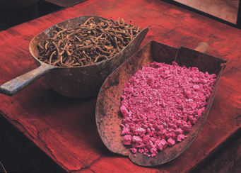
Hiya, im looking to use the Madder Root image you have in a magazine, do you know where its from? Thankyou in advance for your help.
Rosie
HI Rosie, unfortunately (as most picts here are my own) this one is a ‘steal’ from the internet. If it intersted you I would be happy to send you a lovely picture I took of an old madder pigment jar from the Museum d’Historei Naturelle in Paris but it doesnt show the roots, just the pigment… if you care to receive it please send me an email address… Cheers Sabine