WHYEVER?
Hues in Tubes… and how they made a name for themselves
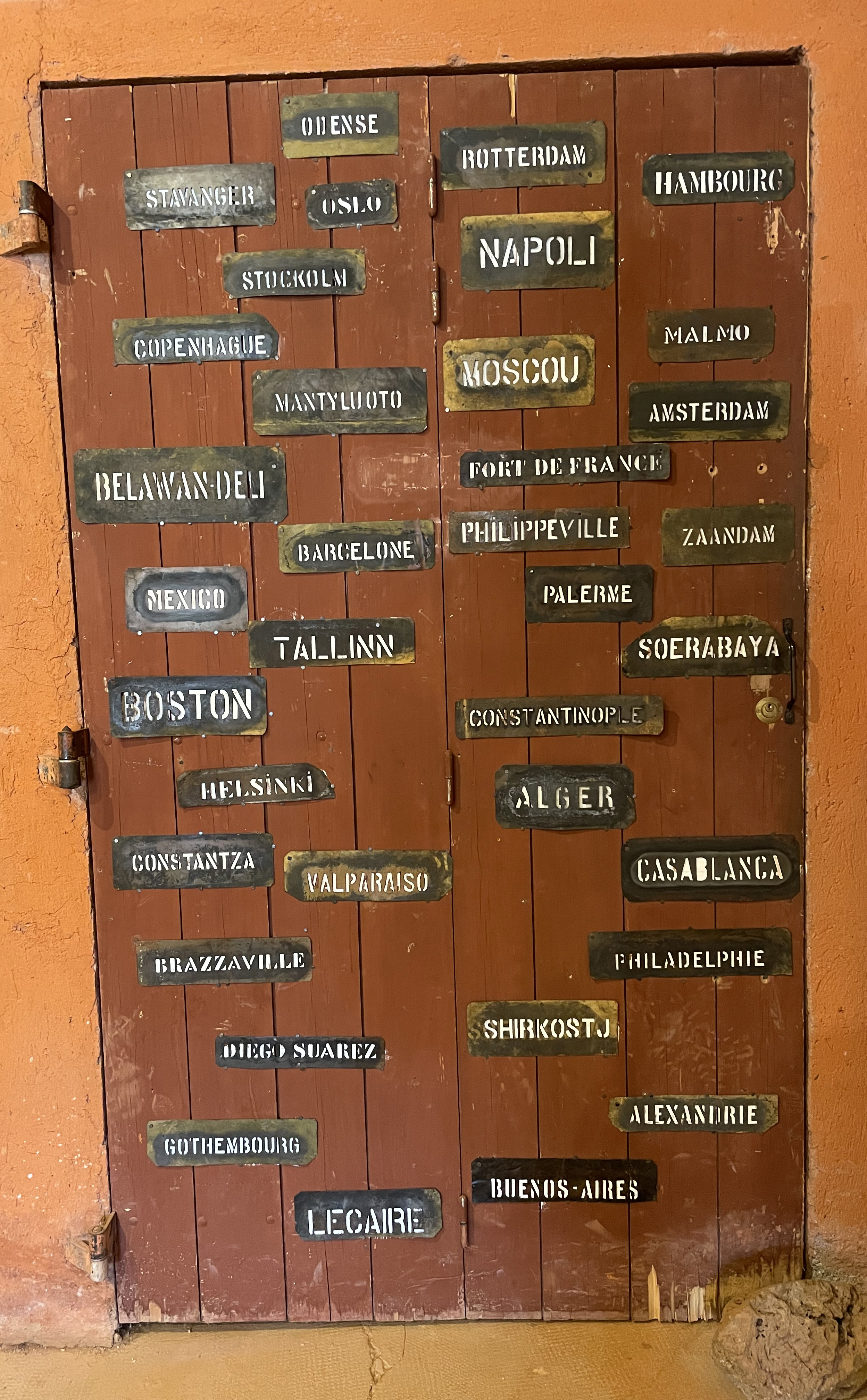
Pigments are hodophiles, they like to travel! You might dream of art materials made by local hands from locally sourced pigments which were gathered loving and ceremoniously by indigenous people who have been doing so for a million moons on precisely that little bit of planet you live and make art on, and, hey, I do know of a few artists working with such materials so they prove it’s at least sustainable for them and possibly for more of us in the future… but these are rare occurrences. Plus, even if you shun acrylics (plastic!) and oils (solvents!) in favour of the more ‘natural’ watercolour or gouache, gum Arabic only ‘grows’ on two species of the acacia tree, mainly in Sudan and throughout the desertic Sahel, and, without it, more or less forget making that paint of yours. (You can use the sap of your local cherry trees, but… you’ll still need a cherry tree!) That was the truth then, and, maybe surprisingly, it’s still true now. Not everything can be gathered, produced or grown everywhere, and perhaps we should thank the gods in their diversity, know-how, and expertise to have spread the love and goodies all over the planet. Plus, are you not happy to have this exhibition in New York next month? And delighted that a collector from Japan wishes to take home your artwork? In truth, if all goes well, these pigments might go around the globe quite a few times… when your retrospective finally happens, or this family moves to Australia—taking with them their precious painting, of course!
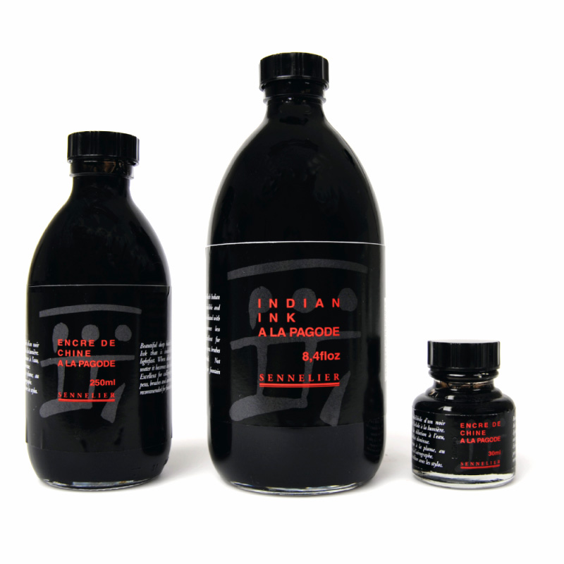
You might remember how, ever since I reached for that tempting bottle of Encre de Chine on my parents’ dresser—with consequences too black and permanent to be remembered, even now, without terror—I have come to know ink comes from China. However, years later in England, to my surprise, I discovered the same product had turned into Indian ink! I don’t think it ever came from India, not that India didn’t produce ink, it did, but that deep black soot + fish glue ink with a slight sheen we know under the name definitely originated in China. The confusion maybe came from some of the ingredients having possibly an Indian provenance, but others reckon it occurred as ships from the Far East were unloaded in India, then goods reloaded on other ships destined for various destinations. There, the origin of this particular good was perhaps lost, literally, in translation… traded via Arabian ports, it happened to gum Arabic too!
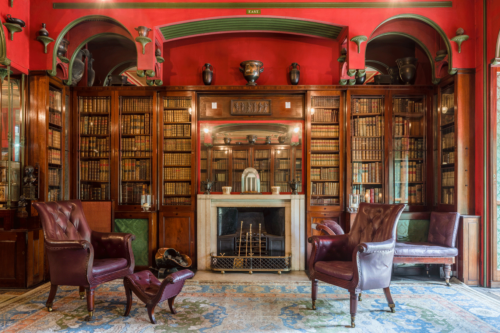
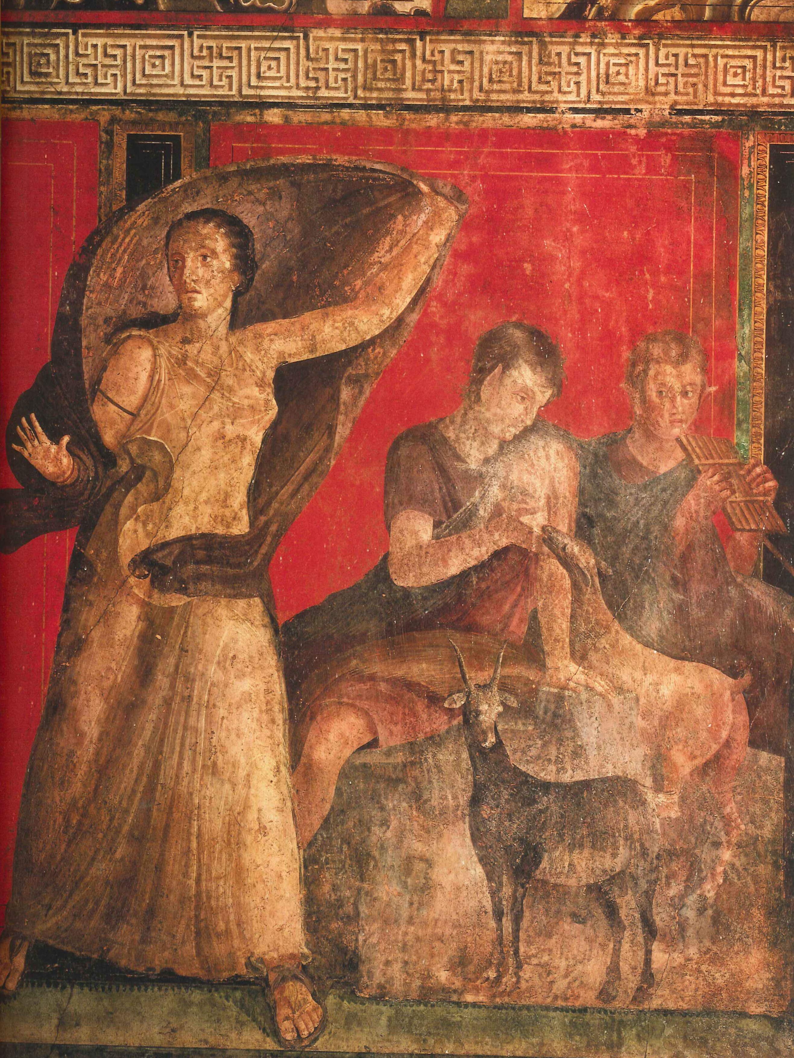
Isn’t it lovely when museums offer some clarity about the pigments used in the artworks displayed? During a visit to Athens’ Acropolis Museum, I was delighted to be treated to an elegant display of them, containing two discoveries (had never heard of Conichalcite nor of Tiggavari as art pigments) and an “experimental reproduction” of a Kerotakis, i.e. a “ceramic pot with a hanging metal plate of lead or copper in its interior that was filled with a small amount of vinegar. After ten days, the action of acid vapours from the vinegar would create a crust over the metal surface, which was removed by scraping. The material that was retrieved was then grinded (sic) in a mortar and washed with water thus producing Lead White or Verdigris.”1
There, I discovered too that Verdigris, in Greek, is called “ioz chalkou” (from poison/venom/corrosion/rust + copper.) An apt name, you might agree, and similar to Verdigris’ Latin’s aeruca or aerugo etymology, which also combines copper and rust. Yet our current word for the pigment comes from the French and means nothing of the sort. For centuries, the manufacture of Verdigris was quite intensive in the Montpellier area of the South of France, and so, indeed, why not a French name? Still, Verdigris is a translation from the French “vert de Grèce”, “green from Greece”, with no relationship to France whatsoever. In fact, indicating an entirely different origin… Greece. Greece? Why on earth… Greece? (Ioz chalkou she cried to the gods of the Parthenon to no avail whatsoever!)
Besides those rather well-known ones, other colour names indeed reflect the pigments’ true geographical origins. In more or less obvious ways, though, as some sought more prestigious origins for themselves and are deliberate confusions! Hear for yourself…
Gamboge, a deep yellow made from the crystallised resin of Garcinia Gummy-Gutta, a sort of latex tree, takes its name from where it grew: Camboja—the antique name of Cambodia. (I’ve come across, once, that it was the other way round with the pigment giving its name to the country… could be, as there are more examples of this later.)
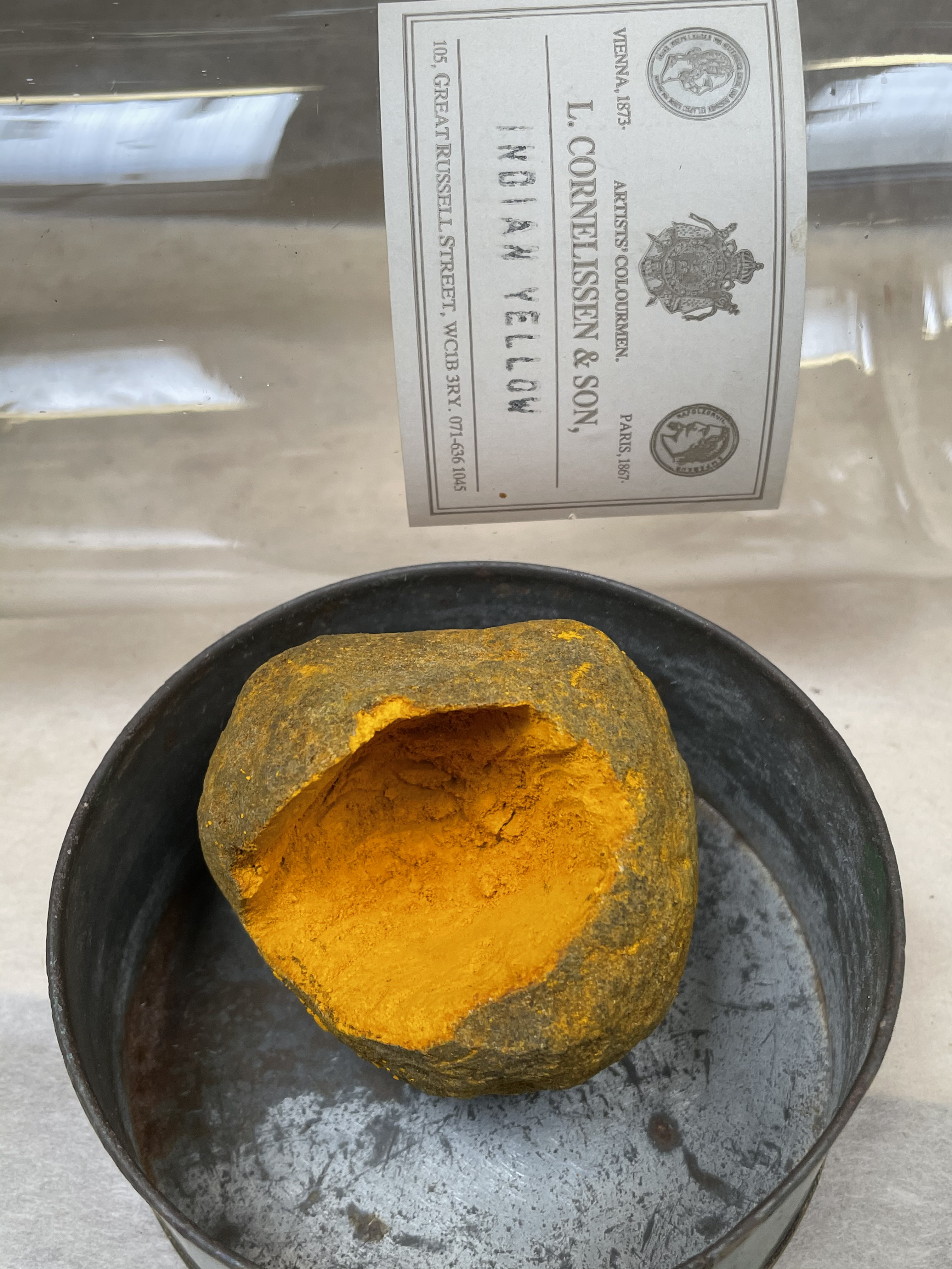
Indigo, from the Greek Indikos, means “from India,” and we have come across Indian Red, which, too, indeed came initially from there. However, another “Indian” pigment, a yellow, probably travelled along with the Mughal miniaturists from Persia, and that Indian pigment is… another crazy story2. Painters everywhere in Europe loved the golden hue of Indian Yellow, and maybe they even knew it landed on their palette via Calcutta, but what on earth was it made from? Had they spoken Persian, they would have been given a clue as gogili, a name used for it in India, was a corruption of the Persian term gaugil, meaning “cow-earth.” It mainly went under other names, however: peri, piuri, purrée, none of them quite preparing us for Indian Yellow’s recipe… despite its most curious and pungent scent. Suggestions were made: a particularly smelly plant? Something to do with camel urine? Or could it be based on castoreum, an anal secretion beavers use to mark their territories? An odd one, for sure. Finally, curiosity took over, and the director of Kew Gardens sent Sir Mukharji, an Indian expert in art materials, to check out its production in the village of Mirzapur, where it supposedly was made. He came back with this tale. Indian Yellow resulted from feeding only mango leaves to some poor cows, he reported, heating their dark yellow urine to reduce the liquid and turning the dregs obtained into orange-sized balls left to dry in the sun. Victoria Finlay, journalist and author, travelled to Mirzapur in 2002 but could find no trace or memory of such a practice ever happening there, concluding that the story might simply be “an example of somebody gently, and literally, taking the piss.”3 Some suggest, more kindly, that Sir Mukharji, perhaps not finding anything to report, made up this story so as not to lose face. But he was a most respectable scientist, so I don’t think we should buy either scenario. I certainly don’t anymore since the blessed day when sorting Cornelissen’s pigment archive, I came across a jar containing not one but two Indian Yellow balls. Opening the jar was like entering a barn! Even a century after it was made, the deliciously intense, warm even, cow/straw/piss smell attacked my nostrils immediately. Legend or not, it came to pass as a pigment in 1890, when production stopped thanks to an anti-animal cruelty law passed, we are told. Yet is that even the reason? Or had we found some less complicated ways to produce more lightfast and cheaper yellow pigments to replace it? I can think of a few arriving in the paint box around that time…
We shall never know for sure, but I do know that past those few colours, provenance names become even more outlandish!
To my ears, Hansa yellow, also tubed as Arylide yellow, sounded like another Modern organic pigment straight out of a lab. And yes that’s where Hansa was born, in 1909, but its name is not a chemical compound, not at all. Its father, a Dr Hermann Wagner, apparently had grand ambitions for that newborn and named it after the Hanseatic League, a medieval commercial and defensive confederation of merchant guilds and market towns strung along the Baltic and into the North Sea. This league held formidable power and dominated maritime trade along those routes from the 12th till around the 15th century. Our third thalassocracy (after the Phoenicians’ purple one and Venice’s supremacy as a pigment importer) got its name from Hanse, later spelt Hansa, the Old High German word for a convoy. A word that was applied to the bands of merchants travelling between those cities, whether by land or by sea. Might you be amused if I point out that another German company has used the old German name for its convoys of people, this time in the air… Lufthansa, of course (and their logo is… a happy Hansa yellow!)
To wrap up the yellows, I’ll start with Naples Yellow, but there must warn you from the start that opinions differ as much as the hue of this pigment does (from very light to dark yellow.) This always soft yellow, however, composed of heated lead and antimony, is one of the oldest synthetic pigments, one also available in nature, if rarely so, under the name of Bindheimite. Many books talk of the pigment existing on the flanks of Mount Vesuvius above Naples, hence the name supposedly. While a few authors, offering no alternative origin, seem to think this a poor explanation. Yes, other yellowish minerals occur there, sulphur being one of them evidently, but none of the natural pigment was ever found on the volcano. You might have to take a guess on that one or take a holiday in Naples to check it out for yourselves. (And there could be worst assignments!)
While in that part of the world, though, do not miss the opportunity of visiting the ruins of Pompeii and Herculaneum, which both gave their names to deep dark red earth pigments—a colour used lavishly in the frescoes that have survived the cataclysm, by some miracle and for our greatest delight. Pompeii and Ercolano Red are more Colour names than a specific pigment from those sites, though, and some researchers even believe the Earth pigments used there mainly came from Tuscany, some 500kms away. But those deep reds became so popular in England when the cities were first excavated that they probably promptly gave their name to pigments. It certainly was, for a while, quite the reds to paint your house with.
Possibly too, at the time, the pigments on the walls weren’t even red!
Take, for example, the well-named Villa dei Misteri and its famous frescoes. Performing arcane rituals, the enigmatic figures represented all share the same deep red backgrounds. It is pretty evident that the most elaborate, exquisite villas, such as that one, must have belonged to wealthy citizens who could afford Minium—a pigment whose price was capped at 70 sesterces such was the demand for it—so it’s certainly been used in those mysterious rooms. But, as always and already back then, all reds were costly. Even Sinope, a high-quality ochre at a tenth of the price, was not cheap. So that’s a consideration of importance, yet red it had to be, it seems, so shortcuts were found, and experts mostly agree quite a few of the reds we see elsewhere are, in fact, only Burnt Yellow Ochre or even just a red wash over Yellow Ochre. Evermore unusual, however, is the story of other ‘fake’ reds, banal Yellow Ochres, yes, but which have turned a glorious Pompeian Red thanks to the lethal gases the volcano emitted. It is estimated that it could account for nearly half the reds of the sites. Now tell me, how’s that for in situ calcination!!
Although many ready-made lake pigments were sold under the Florentine or Venetian attribute (the Italian provenance indicating to artists a higher quality), a similar case of confusion between where a pigment was used and its possible geographical place of birth seems to exist in the name Venetian Red, amusingly. There are sources of red and yellow Earth pigments close to Venice, and, of course, it could have also been imported by or traded in the busy city, but it seems that no, Venetian Red came from… England! Not the pigment, hey, but the name is thought to have been coined by English visitors as they noticed that this particular “light [red was] very much admired and used by the Venetians.” But which red exactly are we talking about? Certainly not the dark brick one which comes out of a tube of Venetian Red today… Alas, the vagueness of it all!
This being said, and let us thank Atlas, the god of maps this time, the names of most Earth pigments do accurately state where on Earth they were found: Cassel Brown, Cologne Earth, or less precisely Cyprus Umber, French Yellow Ochre, English Red Earth, Spanish Brown, etc. (Sometimes, though, these are and were even back then named thus more from tradition than any true birthplace.) And have you wondered earlier how Six Bells Red Ochre got its name? Well, that’s the delightful name of the village it comes from in South Wales. Yet, on that subject, and in the same leap of faith, it would be understandable to take for granted that Terra di Campane, a black pigment, came at some stage anyway from some sweet Italian village named Campane. But no! Its name literally means “earth from bells”, which is precisely what this pigment was made of: a crust that forms on the moulds they used to cast bells in! Precisely where did this interesting harvest happen? No one seems to have a clue… in Italy somewhere, I imagine, but I’m past guessing at his stage.
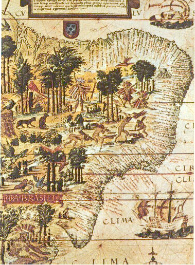
If some faith is left in you, however, and you are game for another leap, you might want to jump on the assumption that Brazilwood, a tropical redwood that produced a fiery red dye and sometimes a lake, came from… Brazil. Medieval painters loved it—perhaps to excess, as word has it from several conservationists who have studied the Turin shroud that the pigment used for the face of Christ is Brazilwood in an alum base. (However, having just mentioned faith, I might skip entirely giving a personal opinion.) The wood at the time came, in fact, from Malaysia, Sri Lanka, and India and was known as Sappanwood, but later, when Brasil was ‘discovered’, the Portuguese colonisers soon discovered a tree belonging to the same genus. One which grew there in abundance. Because of its colour, they named it brasil, “glowing coals” in Portuguese. Or maybe that’s another lure, as Sappanwood was known in Europe for centuries prior under the very similar name of Brezel-wood (oddly, the Asian species still bears both names.) Whatever its origin, it wasn’t long after landing there that the Portuguese started calling that bountiful land “terra do brasil.” Eventually, the term was shortened to “Brasil” and became the official name of their New World colony. The only pigment known to have given its name to a whole country? Not at all… nearby Argentina got its name from what could have been another spoil (had there been any) and another pigment: Argentum, aka Silver. The searches for the elusive shiny one in Argentina are not as well known as the multiple El Dorado expeditions but, eventually, and despite finding none, the metal gave the country its name!
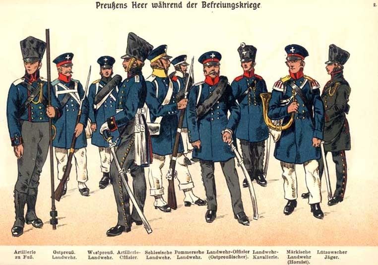
As we’ve already seen, magenta was a colour name given after a little town in Italy where the French won a battle and in the same vein, perhaps traumatised as we all were in France about Germanic invasions, I always thought Prussian Blue came from the colour of the Prussian uniforms. It turns out it’s the other way around in more ways than one. Prussian Blue, you might remember, was a pigment created totally by chance and, yes, blood did play a crucial part in the chemical reaction that created the compound iron ferrocyanide, but again, on the whole, peacefully. Despite the presence of cyanide groups, the pigment is not even toxic to humans.
Thing is, the blue was so damn pleasant, high tinting (ten times more than Ultramarine!) and stable that people were desperate to turn it into a dye—a rare exception, that way round. Yet, luck gave it to us, not an understanding of the chemistry behind the pigment, so a lot of trial and error went into that one. By the time the French were preparing to fight back the Prussian invasion in 1813, however, they had just perfected a Prussian Blue wool dye and, his husband away, Empress Marie-Louise, signed the contract to dye all the uniforms with it. The name stuck to that Bleu Marie-Louise despite the poor quality of it then.
Prussian Blue is not a toxic pigment, but in the hands of Scheele, the same chemist behind Scheele’s Green and seemingly on the planet with a karmic mission to destroy as many people as possible via colour… it took a far more sinister twist. He discovered that mixed with diluted sulphuric acid, the pigment turns into a colourless gas. You might know better his hydrogen cyanide in its soluble form, however, where the charming concoction answers to the name of Prussic acid or cyanide. Despite its slight almond smell—and, for sure, a few desperate wives/husbands who, thanks to it, turned into merry widows—the poison, on the whole, had mostly and often accidental, fatal consequences. From its many misuses as a pesticide to it being the cyanide used in the Jonestown collective suicide, not to mention the crystallised version of prussic acid, Zyklon B (the gas used in the death chambers of Auschwitz or Treblinka), it is a real shame this one didn’t just remain a beautiful deep blue pigment for more gentle people such as artists. And yes, it was discovered in Berlin, then the capital of Prussia, and so did go under both Berlin and Prussian Blue for a while—both of them geographically correct.
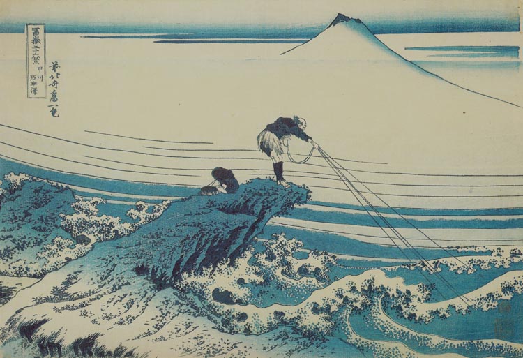
But that’s not the end of that story, as the pigment made quite a wave in the art world… a wave that rippled from Berlin all the way to Japan. The Dutch, who produced it too, sold it in Europe under the name of Chinese Blue. They eventually brought it to China in 1763, and when it made its way to Japan, the Japanese named it “the blue imported from China.” But one has to wonder under what name they sold it to the Chinese in the first place. Surely not Chinese Blue? And surely it was not Antwerp Blue either, a weak variety of Prussian Blue made in the city at first, because when you understand Hokusai used to woodblock print his Great Wave off Kanazawa, out of eight colours, four just for different shades of Prussian blue, you know it was the real stuff he was using! His innovative use of the pigment was an immediate success, and in his next project, Thirty-six Views of Mount Fu, some were printed exclusively in Prussian Blue.
Ah! Ha! And so Prussian Red was also discovered in Berlin? Sorry… but no. Until the French Revolution, Burgundy Ochre was refined by the Dutch. Somehow, that little trip up north turned it into Prussian Red (go figure) or English Red (renamed Bruno d’Inghilterra, English Brown, by the Italians.) Now, am I kidding you? Are you kidding me?
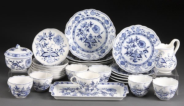
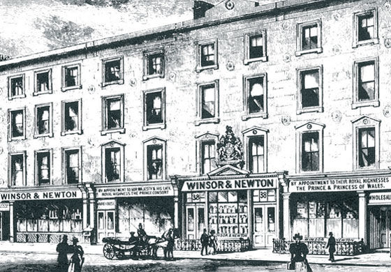
But not at all, my dear reader, and were you not surprised to hear that Chinese Blue was, in fact, Prussian Blue, a very high-quality Prussian Blue… not Chinese in the least, of course, but the same blue as used on china porcelain not “Made in China” at all either but in Meissen! Europe was enamoured with chinoiseries at the time, and, as a result, anything that came from China was both exotic and more fascinating, it seems. I have found no less than ten ‘Chinese’ colours, and only four (purple, green, vermillion and yellow) actually connected to that part of the world. The above-mentioned commercially minded Mr Winsor got onto the bandwagon too with his patented Chinese White, an “improved by heating at very high temperature” Zinc White which, if we are to believe their website, produced a “demand so high it is reported that London’s Rathbone Place was often blocked by carriages as eager clients tried to get their hands on this exciting new colour.” White, creating such a sensation… Isn’t that surprising?4
On the other hand, Afghanistan doesn’t seem to have exercised the same exotic fascination, and a precise land or country is never mentioned in conjunction with lapis lazuli. It was no secret where genuine Ultramarine came from, however. Marco Polo even visited the Sar-i Sang (or Sar-e Sang) quarry in Badakshan back in 1271, but far, far away from “beyond the seas” is as precise as its name went. Meanwhile, its blue rival Azurite, a mineral pigment found mainly in Hungary, often went—to distinguish it from Oltramarino—by the name of Citramarino, a blue from this side of the seas.
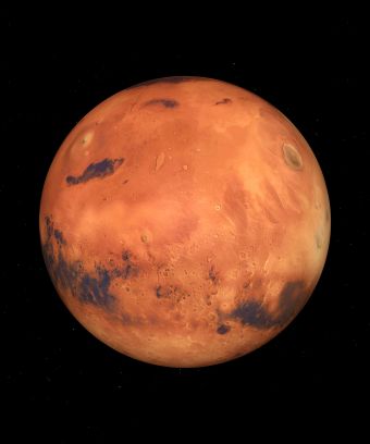
I hope you’ve enjoyed this short round-the-world trip and, at this stage, I’m sure I’ve pretty much lost us all so that if I told you the Mars colours come from Mars, you might even believe me or at least pretend so that I stop this list! (Of course, that’s precisely where they got their name from… from the god of war, who gave it to the planet—which has so much iron oxide on its surface that it is nicknamed the red planet.) When the time came at the end of the 19th century for chemist-inventors of artificial iron oxides to choose names for them, they had this idea of revisiting the old alchemical name for synthetic yellow iron oxide, croccus martis. Eventually, they liked it so much that they used Mars as a family name for all the hues they created, combining the idea of strength, iron oxide and… colour in one go. Colours we would most definitely call ‘earthy’, however!
Hues in Tubes,
everything you’ve always wanted to know about PAINT
without daring to ask the shop assistant
is now available in its entirety on this website…
Jump to the next section of the book by clicking here
If you would like to begin the book at the beginning, please click here
otherwise, to browse the sections, go to the Table of Contents
Additional information & references
- You can see the image of this here ↩︎
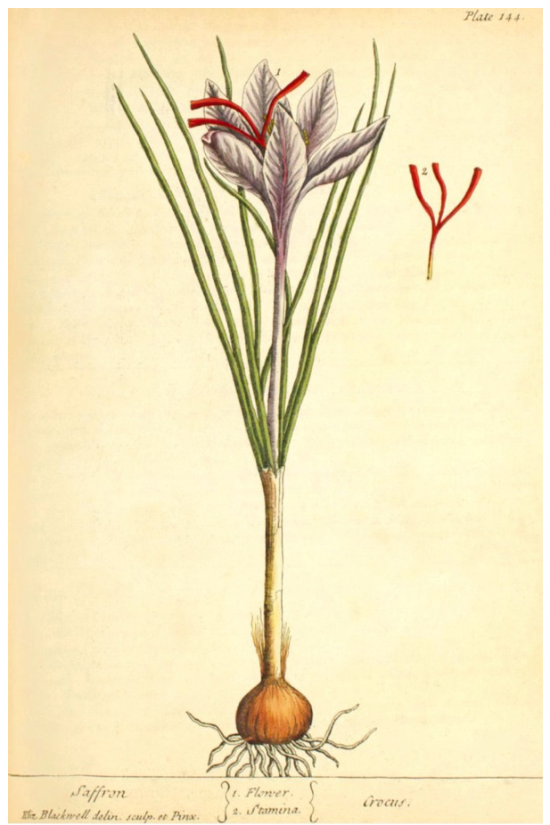
- Persian Yellow, when rarely mentioned, is actually saffron—also a glairy pigment—and indeed from Persia. ↩︎
- Finlay, V. (2004) Color, A Natural History of the Palette. New York: Random House ↩︎
- Yes and… no. Because Lead White blackened when exposed to air, so that this fantastic (and, in truth, only) white pigment in oil did not suit watercolours. Zinc oxide, although known and used for centuries, did not make it on the artists’ palette until watercolours became just the rage in the 18th century, especially in England. It then, eventually, and under the name Zinc White, made its way into all the other paints. ↩︎
Discover more from in bed with mona lisa
Subscribe to get the latest posts sent to your email.

One Comment Add yours