WHATEVER!
When the Muse is spent, the dance over… paint must settle in the final movement the painter or chance (or both!) has chosen for it.1 If She is patient enough, and you’re one of the lucky ones, She might even enter a Muse-um. (That’s a sort of retirement home for Muses where you get looked at a lot, but also really well looked after!) The painter’s job might be finished, but the paint’s job has, weirdly, only just begun as an altogether quieter time starts: film making. As we saw, some paint films are virtually non-existent; within seconds, the binder+pigment is absorbed by the support or has evaporated, leaving the work dry. Acrylic paint films might be touch dry in hours, yet don’t take for granted the curing period is over. A sad story I will never forget is that of an art student who left her completed artworks over the summer in her studio but stacked them… front to front. After a hot and muggy month, when she returned to the place, she found them irremediably stuck to one another! She was ready to kill us (who sold her the paint), to sue the paintmaker (probably the very best one), but… it was all the fault of these little hooks in polymer emulsions that reach out to one another. Usually, we are grateful that they do such a great job of bonding thus, as it creates a very tough paint film, but obviously not in that instance!
Other paint films, like oil’s, will never dry because… that’s not what oil paint does. In contact with air, oil slowly oxidises. In the first days, a phase of self-oxidation happens, which allows you to add another layer quite quickly (2 to 10 days, depending on conditions). When the painting is finished, the slow second phase of “oxidative polymerisation” begins. For the artist waiting to varnish that work, the prescribed six to twelve months is long enough a wait. Yet, it seems that even centuries later, the process is going on and that air and oil, ever so gently, are still ‘doing their thing’… a very, very gentle pas de deux by then!
What we have also discovered recently is that air was not always enough. Some pigments in oil need light too. Cobalt Blue, Raw Umber, Phthalo Green, Ultramarine Blue or Lamp Black don’t mind being left to dry in a dark cupboard and will oxidise there just as fast as in full light, but it can take Tit/Zinc White or Cadmium Red up to 90 or even 135 days to dry in the dark as opposed to only 10 on a bright wall. You would think that, by then, pigments would have stopped their idiotic-syncrasies, but not at all. In fact, the binder might be exhausted (the artist and you too, poor reader!), the paint film utterly dry and yet all the chemical ingredients of any given particle be as active as before and, as we’ve seen, still at play.
Yet, however fast or slow drying your paint is, it is a well-known and easily observed fact that watercolours will dry paler, acrylics darker, while oils—which never dry at all—will remain virtually unaffected by the process. We are not talking about sheen here, only value and chroma. The problem is that these slight shifts definitely give our eyes a feeling that “the colour has changed.” For artists switching from oils to acrylics, for example, the change implies quite a learning curve in expectations of matching their fresh paint to the adjacent dry one. (I’ve come up with the idea, not scientifically proven in the least, that the reason could be the acrylic binder’s colour. The white sending back to our eyes a subtly lighter tone than the dry version will, later, when the binder has turned transparent.) If you are a Munsell fan or think it might be worth your while to become one just for this, you can notate your fresh paint mixture and reproduce it more easily. Artists who tackle massive works and might not be going back to that orange garment for a few weeks sometimes use the system to replicate an exact shade. It works. If you’re not that kind… well, perhaps don’t worry too much about the shift or… paint faster? I know that’s lame, but what else can I suggest?
The reason for the shift in watercolours comes from the disappearance of the water component and most of the paint film. Think of the magical tones of a stone in water. Put it in your pocket, and a few hours later, you’ll wonder why you even bothered. It looks so dull, its colours flat. First step: return it to the creek! (Or perhaps grind it into a pigment?) Second step: put more paint and less water next time; that should help somewhat, but mostly, understand that your watercolours are a unique paint, one with a dissolving binder—gum Arabic—which is usually used on a very specific support, paper. Watercolour paper is sized differently depending on the brands/qualities, yet, in all good ones, the fibres will open up in the wetting process and accept the mixture of dissolving sizing, dissolved binder and pigment. Most particles will be trapped within when the water evaporates, and the fibres close up again. Gone the water, gone most of the binder—usually, less than 20% to start with in casein, tempera and watercolour, with only around 5% left at the end. What remains on the surface are half trapped/half emerging pigment particles. There is no paint film to speak of here. A phenomenon happens then, similar to making paint with too much pigment and insufficient binder. A rough surface is produced, which scatters light more randomly. That diffused reflection blending with the colour of the pigments makes them seem lighter while turning the whole surface matt and, yes, fragile too.
Water also evaporates from acrylic paint, but not the binder, leaving behind a strong, flexible film that encapsulates all the little particles and adheres them firmly to non-absorbent surfaces such as canvas, wood, aluminium panels, etc. Other binders coat the particles and form an adherent film through different processes (oxidisation in oil paint and cooling/fusing/burnishing in encaustic, for example). While this bonding is the primary purpose of a binder, reflecting light is also an automatic result of its presence.
We saw the above binders had quite close reflective indexes, and it turns out that their indexes are also close to those of quite a few pigments, which means that at the boundary of particle and binder not much light will be scattered, and absorption of light increased. But the significant difference between casein, tempera, and watercolours on the one hand and polymer emulsion, oil, and beeswax on the other is, of course, that the dried paint film has not only retained the binder (indeed, it is composed mainly of binder: on average 80% in acrylics, over 70% for oil) but also that it thoroughly covers all the particles, creating a smooth(er) surface capable of reflecting light more coherently. This phenomenon of specular reflection—if you enjoy smart words, there’s another one—we inherently perceive as glossy. Remember how enticing that pebble under the water was? Well, acrylic, oil, and, up to a point, beeswax create the same feeling for our eyes, making the minuscule coloured rocks embedded in their film seem darker but wonderfully more intense and chromatic.
All of the above will be changed again, but of course, if and when you varnish (mat, satin, semi-gloss, gloss?) and if and when you put your artwork behind glass too. So if the result doesn’t quite suit you… don’t despair; just hit the varnish can!
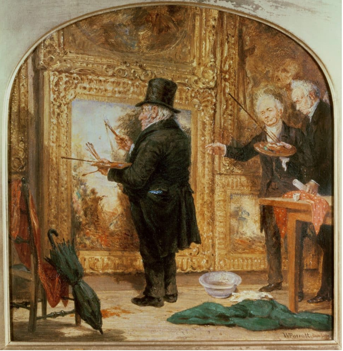
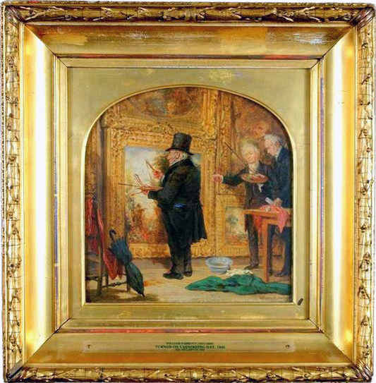
A little afterthought about varnishes… (I’m sure you could see it coming.) You might think varnishes are simply this unifying, protective overcoat and shouldn’t be addressed here as they are not really part of the paint film, but let me tell you 80% of the thousands of questions the Golden material specialists team receive every year are about… varnishes! Sarah Sands, who used to be the head of the materials team at Golden, thinks it’s because varnishes not only come on top of your painting (and by that, she also means this layer is often left to the last minute… vernissage, the French word for a show’s opening, comes from vernis, varnish, which confirms the practice is an old one) but also late in your career even. How’s that so? Well, at art school—if you went—they probably taught you that varnishing oils was a must (yet you had to wait up to a year, and that’s asking a lot from an impatient young artist) but acrylics… no, not really. Until that is, you have your first big show/reputable gallery and begin to wonder: “Maybe, now that my paintings are worth a bit, I should protect them and varnish them?” At that stage, the photographer is booked for the following week, the transporter is coming a few days later, you rush to buy the first bottle you see on the shelf and… do an awful job of it! Although you will have to test until you find “your” varnish (in fact, two varnishes which dissolve in different solvents so as to alternate them would be even better as thus the paint film will not be touched if you need to remove the top varnish at some stage), the product can’t do it all… as you’ve probably noticed in other areas of your artistic journey! Practice will make perfect, perhaps, and some artists eventually do get this impeccably smooth surface, yet it’s not the varnish that should be admired but the varnisher. Presumably, someone with obsessive skill development and control of conditions/materials was holding the brush.
Don’t panic… you will get the hang of it and an acceptable result soon enough, though. Also, there are so many options available that, in truth, it’s a bit criminal to miss this last stage in your painting for lack of trying! Why bother at all? Well, because you don’t know what destiny your artwork will have. It may end up over a chimney, in a smoker’s home, rain may leak from that ceiling over it, or heavens forbids someone trips, it drops, the surface gets scratched, etc… you get it. Varnishes are final layers (harder than paint) that coat and protect your artwork (up to a point.) It will bear the first brunt, and if any of the above happens, a restorer (or your good self) can remove the varnish and reapply coats of varnish on top of it… good as new! But varnishes yellow in time, don’t they? Yeees and no. Probably not in your life time if you’ve used a good product and the artwork is treated reasonably well… so I wouldn’t worry too much. Also, that’s what varnishes are for. They collect dust, they yellow… you clean the ‘painting’ (the varnish actually) or remove the varnish and reapply… done!2
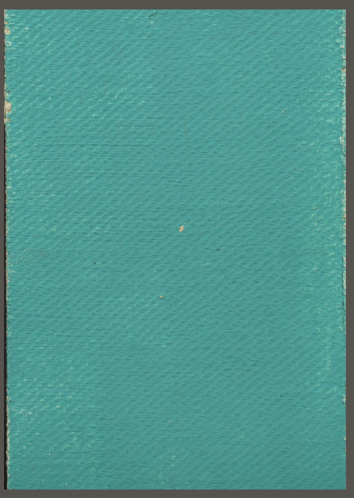
All the above precautions now expressed (so you can’t blame me) and technical issues put aside, there might be some aesthetic considerations for not varnishing at all. You’re the artist, you choose, and Georgia O’Keeffe chose not to. After having meticulously experimented with her paints, producing hundreds of paint-on cards (such as the one above) to note each pigment’s opacity, tinting strength, drying time, etc., she made her single thin layered works with the intention that the canvas be seen and the subtle textures be felt, not rendered somewhat uniform under a flattening varnish. Oil paint dries, on the whole, with a glossy sheen. Nevertheless, when worked so thinly, I would guess that, even with subtle variations, the paint film would mostly render a mat, dry effect. And so when Georgia discovered, hanging her 1946 show at MoMA, that four of the loaned paintings had been cleaned and varnished by their owner (and I can only presume a gloss varnish was used as matting agents used in satin and matt varnish were not an option then I believe), she requested these be cut from their stretchers and burnt! Somehow, someone managed to change her mind and… we are very grateful they did.
Despite your best precautions, exposure to light and atmospheric conditions will take their toll, chemical alterations (Ultramarine disease!3 Crazing! Alligatoring!4 ), corrosion, and tarnishing will happen and yet, somehow, thousands of these heavily impasto-ed or ever so thin paint films (we’re sometimes talking hardly a millimetre) encapsulating coloured rocks and miraculously holding onto a support have survived and, more or less graciously, stood the test of Time — we even fall in love with the amber tones of dirt on them as they become iconic patinas!
These ‘films’ are the conveyors of worlds, thresholds between inner and outer dimensions and yet, while we bask in the delight of contemplation, the excitement of colour, we see the maiden, notice the rose, lose ourselves in the imagined, realistic or even abstracted landscapes of the artist’s mind and forget entirely, as we should, pigments, binders, supports… all these agents and bearers of beauty. (Although the passionate girl I’ve become, who used to greet reverently Giotto, Titian or Gainsborough, now sings in museums (in her head, mind you) Hello Dragon’s Blood! Hello Ultramarine! Hello Prussian Blue! Knowing what I now know has certainly added a je-ne-sais-quel level of intimacy with the artworks I love.)
I feel the need to add a little note about frames (can’t help it, having been a framer these last two decades), but it is something of an after-after-thought…
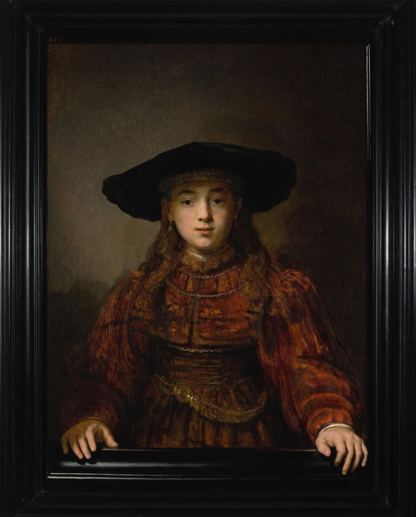
Nothing can quite prepare you for the shock of meeting “in real life” a painting you know, maybe love, for the first time. Siri Hustvedt equates it to a “visual adventure”5, I would agree. Seeing a picture of a lioness in the wild, has nothing much in common with the response your whole body is going to have when… you meet a lioness in the wild! So many things jump at you all at once: textures unknown, details impossible to see on reproductions, colours quite different from them too, but perhaps, most of all, for me, is the size. Works are never quite as I had envisaged them. That first encounter is so exciting, like meeting a pen-friend after years of correspondence, yet so often tainted by the frame around the work. Frames, perhaps even more than signatures, are… dangerous. The little touch of red in a corner, turned into a surrounding presence, can work beautifully (after all, it’s perhaps why the painter added that little “red dot” somewhere in the work so that we notice it.) It could just as well kill it. Not only the colour, mind you but the shape of the frame plays an interesting part. Some draw your gaze in, some pull it out. Both can work, and tastes do change… Van Gogh imagined his Potato Eaters in a gold frame (really?!), perhaps only because gold meant ‘good enough for gold’ at the time, but how can we look today at a small painting of a haystack, barely more than a sketch the size of a book, in a wide, ultra-ornate gilded frame and not wince? Not only because an overpowering, shiny frame hardly lets the little one inside breathe but also because the Impressionists chose plain, often white frames for their works to set themselves apart from previous generations of painters. They might have been weary of the distraction bling brings but also wanted to purposely break down the “abstract boundary or zone between the vulgar surrounding world and the sort of spiritual life of art” a frame was supposed to delineate. In 1881, a journalist sympathetic to their cause, Jules Claretie, went so far as to assert that “the most original aspect of these revolutionaries is the surrounds of their works, which are white. Gold frames are left to old painters, tobacco-chewing daubers, opponents of light paintings.” And yet (now that their works are worth many times their weight in gold), these have ended into the very golden frames they mocked! O tempora, o mores.
In the last two decades I have given framing consultations, I’ve seen the downfall, from elegant to cheap, of the simple square black and white profiles (Ikea’s fault?) Gone, too, the shabby chic look, the beachy timbers, even gold (and most certainly silver) are virtual no-nos in the part of the world I live in… it’s all about raw pale timber, preferably oak. No frame is always a better choice, I believe, than a bad/cheap/recycled and not really suitable one (and you should really trust me there as I have nothing to gain by that, on the contrary), but it must be admitted that a frame can be changed and, perhaps, regularly should be… in museums too?
Hues in Tubes,
everything you’ve always wanted to know about PAINT
without daring to ask the shop assistant
is now available in its entirety on this website…
Jump to the next section of the book by clicking here
If you would like to begin the book at the beginning, please click here
otherwise, to browse the sections, go to the Table of Contents
Additional information and references
- “The paint itself there’s a lot of chance there cause you can’t plan how a drip, or how a particular glob of paint is going to have three different colours in it. It’s really a game of manipulating chance.” Cecily Brown Louisiana channel, [Online]. [Accessed 2 March 2025]. Available at: https://www.youtube.com/watch?v=pZyIbJHCHDk&feature=youtu.be ↩︎
- More on my website https://inbedwithmonalisa.com/paints-f-oil-5-varnishes/ ↩︎
- “Ultramarine disease”, probably due to the chemical activity of the lazurite, is when blue sections of a painting become dull and turn grey. (Gambardella, A. et al. (2020) How did the old masters make ultramarine? University of Amsterdam. [Online]. [Accessed 8 January 2025]. Available at: https://phys.org/news/2020-05-masters-ultramarine.html) ↩︎
- “Crazing” is the formation of crevices in surfaces that develop as acrylic paints and mediums dry, while Bitumen has an ‘alligatoring’ tendency, i.e. the paint film crackles into scales further down the track…(Harley, R.D. (1970) Artists’ Pigments 1600-1835, p.141. Butterworth & Co. London, UK) ↩︎
- Hustvedt, S. (2005) Mysteries of the rectangle, Essays on Painting, p.xxi. Princeton Architetctural Press, New York,N.Y. U.S.A. ↩︎
Discover more from in bed with mona lisa
Subscribe to get the latest posts sent to your email.

One Comment Add yours